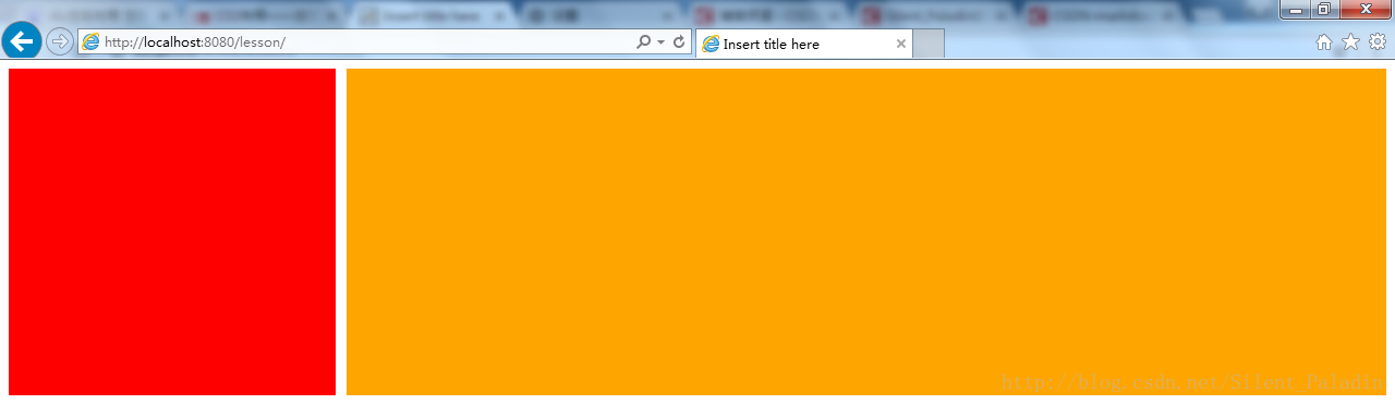
实际项目开发过程中遇到页面 DIV 左右布局的需求:左侧 DIV 固定宽度,右侧 DIV 自适应宽度,填充满剩余页面,由此引申出本文的几种解决方案
1 左侧 DIV 设置 float 属性为 left,右侧 DIV 设置 margin-left 属性等于或大于左侧 DIV 宽度
<!DOCTYPE html>
<html>
  <head> <meta charset="UTF-8"> <meta http-equiv="X-UA-Compatible" content="IE=Edge"> <title>Insert title here</title> <style> .left { float: left; width: 300px; height: 300px; background-color: red; } .right { background-color: orange; margin-left: 310px; height: 300px; } </style> </head> <body> <div class="left"></div> <div class="right"></div> </body> </html>
实际效果:
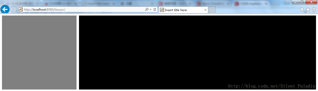
2 左侧 DIV 设置 float 属性为 left,负边距 100%,右侧 DIV 中嵌套一个 DIV,页面内容放入嵌套的 DIV 中,右侧内嵌 DIV 设置 margin-left 属性等于或大于左侧 DIV 宽度
<!DOCTYPE html>
<html>
  <head> <meta charset="UTF-8"> <meta http-equiv="X-UA-Compatible" content="IE=Edge"> <title>Insert title here</title> <style> .left { float: left; width: 300px; height: 300px; background-color: gray; margin-right: -100%; } .right { float: left; width: 100%; } .right-content { height: 300px; margin-left: 310px; background-color: black; } </style> </head> <body> <div class="left"></div> <div class="right"> <div class="right-content"></div> </div> </body> </html>
实际效果:
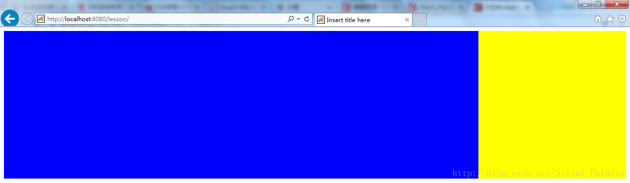
3 如果将需求修改为右侧固定宽度而左侧自适应宽度
<!DOCTYPE html>
<html>
  <head> <meta charset="UTF-8"> <meta http-equiv="X-UA-Compatible" content="IE=Edge"> <title>Insert title here</title> <style> .left { float: left; width: 100%; height: 300px; background-color: blue; margin-right: -300px; } .right { float: right; width: 300px; height: 300px; background-color: yellow; } </style> </head> <body> <div class="left"></div> <div class="right"></div> </body> </html>
实际效果: