-webkit-gradient 做一个渐变的背景
<!DOCTYPE html>
<html lang="en">
<head>
    <meta charset="UTF-8">
    <title>Title</title>
    <style>
        /*<!--webkit支持的背景-->*/
    .box{
        width: 200px;
        height: 200px;
        border: 10px solid pink;
        padding: 20px;
        /*background: url("image/00-more.png") no-repeat;*/
        background: -webkit-gradient(linear,left top,right bottom,from(green),to(pink),color-stop(50%,yellow));
        background-origin:content-box;  //定义背景位置是内容位置
        background-clip: content-box;  //然后将内容之外的背景裁减掉
    }
    .dv{
        width: 100px;
        height: 100px;
        border: 1px solid black;
    }

    </style>
</head>
<body>
<div class="box">

    <div class="dv"></div>
</div>

</body>
</html>
主要理解background这个下面的代码
意思是 做线性渐变linear 从左上角到右下角 top left / right bottom ,然后是from() to () 从绿色到粉红色的渐变,这样就可以形成一个渐变的背景了
如果需要三个渐变 那么用color-stop 是颜色的步长,就是增加了一个渐变在50%的地方,从顶部到中间 然后从中间到底部
有个小问题就是div定义的时候 w:200 h:200 这个是不包括boder 和padding的尺寸的
如果div的w:200 ,border-width:3px padding:10px 那么整个就是226px 这个是个之前没注意的问题 ,现在记下来
设计二重渐变
<!DOCTYPE html>
<html lang="en">
<head>
    <meta charset="UTF-8">
    <title>Title</title>
    <style>
        /*<!--webkit支持的背景-->*/
    .box{
        width: 200px;
        height: 200px;
        border: 10px solid pink;
        padding: 20px;
        /*background: url("image/00-more.png") no-repeat;*/
        background: -webkit-gradient(linear,left top,left bottom,from(green),to(pink),color-stop(0.5,#000),color-stop(50%,#ffffff));
        background-origin:content-box;
        background-clip: content-box;
    }
    .dv{
        width: 100px;
        height: 100px;
        border: 1px solid black;
    }

    </style>
</head>
<body>
<div class="box">

</div>

</body>
</html>
这个二重渐变其实多加了个color-stop

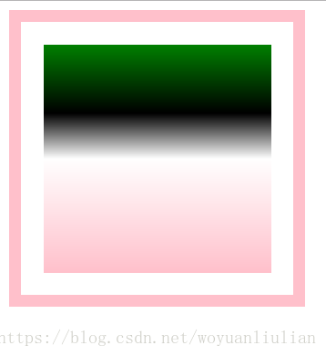
<!DOCTYPE html>
<html lang="en">
<head>
    <meta charset="UTF-8">
    <title>Title</title>
    <style>
        /*<!--webkit支持的背景-->*/
    .box{
        width: 200px;
        height: 200px;
        border: 10px solid pink;
        padding: 20px;
        /*background: url("image/00-more.png") no-repeat;*/
        background: -webkit-gradient(linear,left top,left bottom,from(green),to(pink),color-stop(0.3,#000),color-stop(50%,#ffffff));
        background-origin:content-box;
        background-clip: content-box;
    }
    .dv{
        width: 100px;
        height: 100px;
        border: 1px solid black;
    }

    </style>
</head>
<body>
<div class="box">

</div>

</body>
</html>