设计师经常喜欢帮文字设置一些好看的效果 比如阴影
text - shadow
text - shadow : none | [ < length> {2,3} && <color>?] #
解析:
none : 不做阴影 默认值是none
[ < length> {2,3} && <color>?] # : 或者两到三个 length 值 再加上颜色color 其中颜色这个值是可选的 这里有# 号 说明可以加上多个shadow
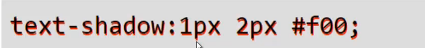
第一个值 1px是x轴的偏移方向
第二个值 2px是y轴的偏移方向
并且它的阴影是 #foo这个样子的

这里的第三个 px 是阴影的模糊半径
根据语法 这个color是可以不写的 它不写的时候 这个阴影的颜色就是这个文字的颜色
设置阴影
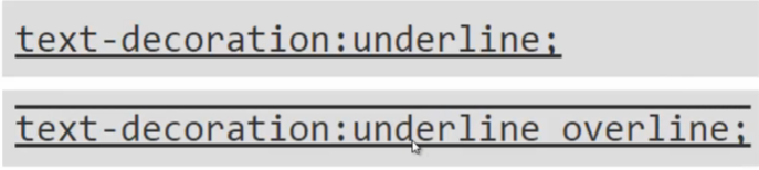
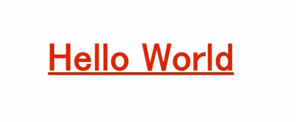
text - decoration
text - decoration : none | [ underline || overline || line-through ]
none : 不加下划线
underline :下划线
overline : 上划线
line - through : 在文字的中间划一条线