【此文涉及颜色来自:https://blog.csdn.net/F_zmmfs/article/details/80699722】
新建xml文件:项目右键——新建——other——如图
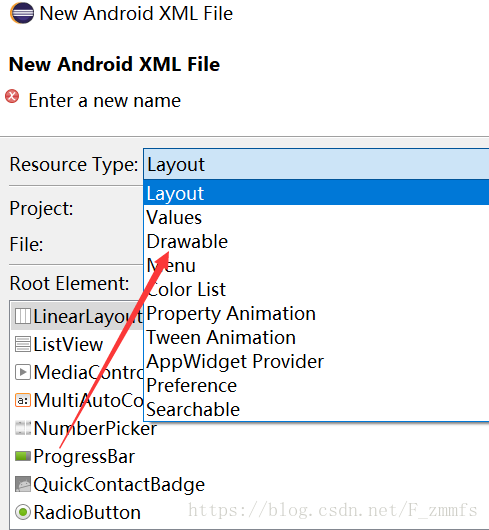
填写文件名 下面的root Element选择shape
在res/drawable下找到并双击打开
【shape标签】
<?xml version="1.0" encoding="utf-8"?>
<shape xmlns:android="http://schemas.android.com/apk/res/android"
    android:shape="rectangle">

    <!-- 圆角设置 -->
    <corners
        	 android:radius="26dip"
        	 android:topLeftRadius="26dp"
             android:topRightRadius="26dp"
             android:bottomLeftRadius="26dp"
             android:bottomRightRadius="26dp"/>
    <!-- 边框宽度及颜色 -->
    <stroke android:width="2px" android:color="@color/plum" />

    <!-- 空间内部填充 -->
    <solid android:color="#E6E6FA" />

    <!-- 留空 -->
    <padding
        android:left="10dp"
        android:top="10dp"
        android:right="10dp"
        android:bottom="10dp"/>
    <!-- 渐变色
    	startColor,开始的颜色,endcolor渐变最后的颜色,centerColor中间的颜色
		style有三种,linear(线性),radial(放射性),sweep(扫描性)
		linear从一个方向到另一个方向
		当angle=0时,渐变色是从左向右。
		然后渐变方向随angle增加而逆时针方向转,当angle=270时为从上往下,且只有type为center时有效 –>
		radial 从一个点开始的渐变
		android:centerX    Float.(0 - 1.0) 渐变点x轴相对位置。
		android:centerY!    Float.(0 - 1.0) 渐变点Y轴相对位置。
		这两个属性只有在type不为linear情况下起作用。
		android:useLevel="true| false"默认为false,且只有当其为false时才有渐变效果
     -->
    <gradient
    android:startColor="#ffffff"
    android:centerColor="#000000"
    android:endColor="#000000"
    android:useLevel="true"
    android:angle="270"
    android:type="radial"
    android:centerX="0"
    android:centerY="0"
    android:gradientRadius="90"/>
    <!-- 描边 -->
    <stroke
    android:width="dimension"   //描边的宽度
    android:color="color"   //描边的颜色
    // 以下两个属性设置虚线
    android:dashWidth="dimension"   //虚线的宽度,值为0时是实线
    android:dashGap="dimension" />      //虚线的间隔

</shape>
如何引用:
在main_activity.xml文件中
选择对应控件
添加:
android:background="@drawable/文件名"