前言
为了能更快的创建一个好看的应用,Flutter提供了一系列的组件。有基础组件(Basics Widgets),质感组件(Material Components)等,本篇将介绍常用的基础组件。
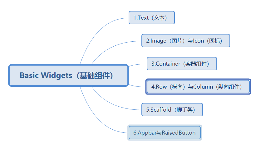
目录
看到上面的目录,从事Android开发的同学是不是很熟悉,Flutter中组件和Android中非常的类似,毕竟都是出自Google,下面来看个效果图。
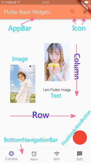
这里用到了目录中的所有基础组件,下面结合代码简单作简单的介绍。
import 'package:flutter/material.dart';

void main() => runApp(new MyApp());

class MyApp extends StatelessWidget {
  @override
  Widget build(BuildContext context) {
    return new MaterialApp(
      /*脚手架*/
      home: new Scaffold(
        /*容器,对子组件位置大小进行约束*/
        body: new Container(
          /*设置边距*/
            margin: const EdgeInsets.all(40.0),
            /*横向布局*/
            child: new Row(

              children: <Widget>[
                /* 图片组件,此处是从网路加载*/
                new Image.network(
                  "https://img03.sogoucdn.com/app/a/100520024/da58bb2c90efff416f494eecc4a5be17",
                  width: 100.0,
                  height: 200.0,
                ),

                new Container(
                  margin: const EdgeInsets.all(30.0),

                  /* 纵向布局,图片文本垂直排列*/
                  child: new Column(
                    children: <Widget>[
                      new Image.network(
                        "https://img02.sogoucdn.com/app/a/100520024/2b6acc84f93b40d33eba7c6be37efea7",
                        width: 100.0,
                        height: 200.0,

                      ),
                      /*文本*/
                      new Text("I am Flutter Image")
                    ],
                  ),
                )
              ],
            )
        ),

        /*顶部导航栏*/
        appBar: new AppBar(
          title: new Text('Flutter Basic Widgets'),
          backgroundColor: Colors.deepOrange[300],
          actions: <Widget>[
            /*系统提供Icon*/
            new IconButton(icon: new Icon(Icons.search), onPressed: null),

            new IconButton(icon: new Icon(Icons.star), onPressed: null)
          ],
        ),

        /*底部导航栏*/
        bottomNavigationBar: new BottomNavigationBar(

          items: <BottomNavigationBarItem>[
            /*导航栏条目*/
            new BottomNavigationBarItem(
              icon: new Icon(Icons.camera),
              title: new Text("Camera"),
              backgroundColor: Colors.deepOrange[300],
            ),

            new BottomNavigationBarItem(
              icon: new Icon(Icons.access_alarm),
              title: new Text("Alarm"),
              backgroundColor: Colors.deepOrange[300],
            ),
            new BottomNavigationBarItem(
              icon: new Icon(Icons.wifi),
              title: new Text("WIFI"),
              backgroundColor: Colors.deepOrange[300],
            ),

            new BottomNavigationBarItem(
              icon: new Icon(Icons.sms),
              title: new Text("SMS"),
              backgroundColor: Colors.deepOrange[300],
            ),

          ],

          /*选择颜色*/
          fixedColor: Colors.deepPurple[300],
          currentIndex: 0,
          /*固定模式:title和icon都显示*/
          type: BottomNavigationBarType.fixed,

          /*变化模式:title只有在选中时显示*/
          //type: BottomNavigationBarType.shifting,
        ),

        /*浮动页面右下角的按钮*/
        floatingActionButton: new FloatingActionButton(

          backgroundColor: Colors.red,

          onPressed: null,
        ),
      )
      ,
    );
  }
}
1.Text 文本,
显示单一静态(不可编辑)的文本,类似Android中的TextView,IOS中的label。Flutter中Text提供了两个构造函数,首先介绍下上面代码中的new Center。
new Center:将子组件放置在自己的中心位置。
Text构造函数:
<!--第一种-->
Text(String data,{ Key key, TextStyle style, TextAlign textAlign, TextDirection textDirection, bool softWrap, TextOverflow overflow, double textScaleFactor, int maxLines })


<!--第二种,通过TextSpan(拓展文本)构造-->

Text.rich(TextSpan textSpan,{ Key key, TextStyle style, TextAlign textAlign, TextDirection textDirection, bool softWrap, TextOverflow overflow, double textScaleFactor, int maxLines })
2.Image和Icon
2-1.图标Icon:
在上面的代码中使用到了很多的系统图标,这些图标的类型都是IconData,通过Icons即可获取。
2-2.图片Image:
Flutter中获取图片的方式提供了以下几种:
<!--从ImageProvider获取图像,后期文章中介绍-->
Image()

<!--本资源文件 -->
Image.asset()

<!--文件形式 -->
Image.file()

<!--内存中 -->
Image.memory()

<!--网络中获取 -->
Image.network()
目前 Flutter的Image支持以下图像格式:JPEG,PNG,GIF,动画GIF,WebP,动画WebP,BMP和WBMP。
3.Row 和 Column
Row:横向布局,Column:纵向布局。这里和Android中的LinearLayout(线性布局)的 horizontal(横向)与 vertical(纵向)是一样的效果。
上图中Image1 和 Image2 + Text 所在的区域就是Row布局,子组件横向排列,区域2 ,Image2 + Text垂直纵向排列。
3.Scaffold(脚手架)
实现基本的Material Design可视化布局结构。Scaffold类提供了很多的Material 组件。
AppBar,通常显示在使用appBar属性的应用顶部。
BottomNavigationBar,通常使用bottomNavigationBar 属性在应用程序底部显示,此功能向图中所示一样,无法做定制,只能以图片和文本形式存在。
BottomAppBar,通常使用bottomNavigationBar属性显示在应用程序的底部,用来构建定制化的底部导航栏或者布局。
FloatingActionButton,圆形按钮,通常使用floatingActionButton属性显示在应用程序的右下角。
SnackBar,通常显示在应用程序底部附近的临时通知。
结尾
上述就是Flutter中基础组件的介绍,用法都是很简单。每个组件都是一个以类的形式存在。使用的时候通过new Text()这种形式来创建组件对象。下篇将介绍Flutter中其他的常用的组件。