HTML知识点整理
- 置换元素:浏览器根据标签和属性来决定元素的具体显示内容,如 img input textarea select object video 等
Form
-
<input type='radio'>的选择变化可由onfocus属性控制 -
<select>的变化可由onchange属性控制selectedIndex对应当前选中option的index:select.options[selectedIndex]指向当前选项select.value存储的是当前选中option的value
HTML5
- 视频
//<video> 与 </video> 之间插入的内容是供不支持 video 元素的浏览器显示的
<video src="movie.ogg" width="320" height="240" controls="controls" id="video1">
Your browser does not support the video tag.
</video>

//video 元素允许多个 source 元素。source 元素可以链接不同的视频文件。浏览器将使用第一个可识别的格式
<video width="320" height="240" controls="controls" id="video1">
  <source src="/i/movie.ogg" type="video/ogg">
  <source src="/i/movie.mp4" type="video/mp4">
Your browser does not support the video tag.
</video>

//DOM控制视频的播放暂停
var myVideo=document.getElementById("video1");

function playPause()
{
if (myVideo.paused)
  myVideo.play();
else
  myVideo.pause();
} - 1
- 2
- 3
- 4
- 5
- 6
- 7
- 8
- 9
- 10
- 11
- 12
- 13
- 14
- 15
- 16
- 17
- 18
- 19
- 20
- 21
- 22
- 音频
<audio controls="controls">
  <source src="song.ogg" type="audio/ogg">
  <source src="song.mp3" type="audio/mpeg">
Your browser does not support the audio tag.
</audio>- 1
- 2
- 3
- 4
- 5
- 拖放
首先,为了使元素可拖动,把 draggable 属性设置为 true ,ondragstart 属性调用了一个函数, drag(event),它规定了被拖动的数据。dataTransfer.setData() 方法设置被拖数据的数据类型和值.ondragover 事件规定在何处放置被拖动的数据。默认地,无法将数据/元素放置到其他元素中。如果需要设置允许放置,我们必须阻止对元素的默认处理方式。这要通过调用 ondragover 事件的 event.preventDefault() 方法, 当放置被拖数据时,会发生 drop 事件,调用 preventDefault() 来避免浏览器对数据的默认处理(drop 事件的默认行为是以链接形式打开),通过 dataTransfer.getData(“Text”) 方法获得被拖的数据。该方法将返回在 setData() 方法中设置为相同类型的任何数据。被拖数据是被拖元素的 id (“drag1”), 把被拖元素追加到放置元素(目标元素)中.
<div id="div1" ondrop="drop(event)" ondragover="allowDrop(event)"></div>
<img id="drag1" src="img_logo.gif" draggable="true" ondragstart="drag(event)" width="336" height="69" />

function allowDrop(ev){
    ev.preventDefault();
}

function drag(ev){
    ev.dataTransfer.setData("Text",ev.target.id);
}

function drop(ev){
    ev.preventDefault();
    var data=ev.dataTransfer.getData("Text");
    ev.target.appendChild(document.getElementById(data));
}- 1
- 2
- 3
- 4
- 5
- 6
- 7
- 8
- 9
- 10
- 11
- 12
- 13
- 14
- 15
- 16
- canvas
//html
<canvas width='' height='' id=''></canvas>
//js
var c=document.getElementById('');
var cxt=c.getContext('2d');
cxt.strokeStyle='#eee'; //cxt.fillStyle
cxt.beginPath();
cxt.moveTo(i,j);
cxt.lineTo(i,j);
cxt.closePath();
cxt.stroke(); //真正描绘出路径 cxt.fill();
cxt.strokeRect(0,0,width,height); //画矩形 cxt.fillRect()- 1
- 2
- 3
- 4
- 5
- 6
- 7
- 8
- 9
- 10
- 11
- 12
- 地理定位
var x=document.getElementById("demo");
function getLocation()
  {
  if (navigator.geolocation)
    {
    navigator.geolocation.getCurrentPosition(showPosition);
    }
  else{x.innerHTML="Geolocation is not supported by this browser.";}
  }
function showPosition(position)
  {
  x.innerHTML="Latitude: " + position.coords.latitude +
  "<br />Longitude: " + position.coords.longitude;
}- 1
- 2
- 3
- 4
- 5
- 6
- 7
- 8
- 9
- 10
- 11
- 12
- 13
- 14
使用 getCurrentPosition() 方法来获得用户的位置, 如果getCurrentPosition()运行成功,则向参数showPosition中规定的函数返回一个coordinates对象.getCurrentPosition() 方法的第二个参数用于处理错误
- web存储
localstorage sessionstorage
- 应用缓存
通过创建 cache manifest 文件,可以轻松地创建 web 应用的离线版本,如需启用应用程序缓存,请在文档的 <html> 标签中包含 manifest 属性:
<!DOCTYPE HTML>
<html manifest="demo.appcache">
...
</html>- 1
- 2
- 3
- 4
每个指定了 manifest 的页面在用户对其访问时都会被缓存。如果未指定 manifest 属性,则页面不会被缓存(除非在 manifest 文件中直接指定了该页面)。manifest 文件的建议的文件扩展名是:”.appcache”。
请注意,manifest 文件需要配置正确的 MIME-type,即 “text/cache-manifest”。必须在 web 服务器上进行配置。
manifest 文件是简单的文本文件,它告知浏览器被缓存的内容(以及不缓存的内容)。manifest 文件可分为三个部分:
1. CACHE MANIFEST - 在此标题下列出的文件将在首次下载后进行缓存
2. NETWORK - 在此标题下列出的文件需要与服务器的连接,且不会被缓存
3. FALLBACK - 在此标题下列出的文件规定当页面无法访问时的回退页面(比如 404 页面)
//完整的 Manifest 文件

CACHE MANIFEST
# 注释:2012-02-21 v1.0.0
/theme.css
/logo.gif
/main.js

NETWORK:
login.asp

FALLBACK:
/html5/ /404.html- 1
- 2
- 3
- 4
- 5
- 6
- 7
- 8
- 9
- 10
- 11
- 12
- 13
一旦应用被缓存,它就会保持缓存直到发生下列情况:
1. 用户清空浏览器缓存
2. manifest 文件被修改
3. 由程序来更新应用缓存
如果您编辑了一幅图片,或者修改了一个 JavaScript 函数,这些改变都不会被重新缓存。更新注释行中的日期和版本号是一种使浏览器重新缓存文件的办法。
- Web Workers
当在 HTML 页面中执行脚本时,页面的状态是不可响应的,直到脚本已完成。web worker 是运行在后台的 JavaScript,独立于其他脚本,不会影响页面的性能。您可以继续做任何愿意做的事情:点击、选取内容等等,而此时 web worker 在后台运行。
var w;

function startWorker()
{
if(typeof(Worker)!=="undefined")
  {
  if(typeof(w)=="undefined")
  {
  w=new Worker("/example/html5/demo_workers.js");
  }
  //向 web worker 添加一个 "onmessage" 事件监听器,当 web worker 传递消息时,会执行事件监听器中的代码
  w.onmessage = function (event) {
    document.getElementById("result").innerHTML=event.data;
    };
  }
else
  {
  document.getElementById("result").innerHTML="Sorry, your browser does not support Web Workers...";
  }
}

function stopWorker()
{
w.terminate();
}- 1
- 2
- 3
- 4
- 5
- 6
- 7
- 8
- 9
- 10
- 11
- 12
- 13
- 14
- 15
- 16
- 17
- 18
- 19
- 20
- 21
- 22
- 23
- 24
- 25
现在,让我们在一个外部 JavaScript 中创建我们的 web worker。在这里,我们创建了计数脚本。该脚本存储于 “demo_workers.js” 文件中:
var i=0;

function timedCount()
{
i=i+1;
postMessage(i);
setTimeout("timedCount()",500);
}

timedCount();- 1
- 2
- 3
- 4
- 5
- 6
- 7
- 8
- 9
- 10
以上代码中重要的部分是 postMessage() 方法 - 它用于向 HTML 页面传回一段消息。当我们创建 web worker 对象后,它会继续监听消息(即使在外部脚本完成之后)直到其被终止为止。如需终止 web worker,并释放浏览器/计算机资源,请使用 terminate() 方法
- 服务器发送事件
- 新增表单元素
datalist:规定输入域的选项列表
keygen:密钥对生成器
output:定义不同类型的输出
CSS知识点整理
- 标准盒模型宽度=margin+border+padding+width
IE盒模型宽度=margin+width
利用box-sizing:border-box可变成IE盒模型
左栏定宽,右边两栏各占50%
.parent{display:flex}
.first{width:200px}
.second, .third{width:100%} - 双翼三栏布局
- 主栏左浮动,width:100%
- 左栏左浮动,margin-left:-100%
- 右栏左浮动,margin-left:-右栏宽度
- 主栏内容的包裹层左右外边距设为左右栏宽度
- 三栏的父元素清楚浮动 overflow:hidden
- 动画
animation: mymove 5s infinite;
@keyframes mymove{
0% {transform: scale(1,1);}
25%{transform: scale(2,2);}
50%{transform: scale(1,1);}
75%{transform: scale(2,2);}
} - 不给宽高实现水平垂直居中:
 position:absolute;
 transform:translate(-50%,-50%);
 left:50%;
top:50%;- 1
- 2
- 3
- 4
给出宽高三种垂直水平居中法:
 position:absolute;
 left:50%;
 top:50%;
 margin-left:-width/2;
margin-top:-height/2;- 1
- 2
- 3
- 4
- 5
 position:absolute;
 left,right,top,bottom:0;
margin:auto;- 1
- 2
- 3
 display:flex;//父元素

margin:auto;//子元素- 1
- 2
- 3
个人认为居中还是flex最好用啦!
- CSS实现右三角形
border:10px solid transparent;
border-left:#f00;
width:0;
height:0;- 1
- 2
- 3
- 4
- float使行内元素脱离文档流的同时也变成块级元素
- css可继承属性
文本相关属性:font-family, font-size, font-style,font-variant, font-weight, font, letter-spacing,line-height,text-align, text-indent, texttransform,word-spacing
列表相关属性:list-style-image, list-style-position,list-style-type, list-style
还有 color
注意:font-size继承的是计算后的像素值,如果父元素font-size:80%(*16px),那么子元素继承的是0.8*16px, 而不是 0.8*0.8(*16px)
Flex布局
容器:
display:flex/inline-flex
flex-direction:row/row-reverse/column/column-reverse
flex-wrap:nowrap/wrap/wrap-reverse
flex-flow:row nowrap
justify-content:flex-start/flex-end/center/space-between/space-around
align-items:flex-start/flex-end/center/baseline/stretch
align-content:flex-start/flex-end/center/space-between/space-around/stretch //多跟轴线对齐方式- 1
- 2
- 3
- 4
- 5
- 6
- 7
项目:
order:<integer>
flex-grow:<number>
flex-shrink:<number>
flex-basis:auto|<length> //定义了在分配多余空间之前,项目占据的主轴空间
flex:0 1 auto
align-self:flex-start/flex-end/center/baseline/stretch //覆盖父元素的align-items属性- 1
- 2
- 3
- 4
- 5
- 6
具体可参看阮一峰的教程,总结的很好!
CSS3
-
如果要实现背景透明而文字不透明的效果不能用opacity,可使用背景色rgba来调整
-
选择器
p:nth-child(n): p的父元素的第n个子元素是p元素 (p:first-child, p:last-child,p:only-child)
p:first-child 选择属于父元素的第一个子元素且这个子元素是<p>元素。
p:only-child p的父元素只有一个子元素,并且这个子元素是p元素
p:nth-last-child(2) 同上,从最后一个子元素开始计数
p:nth-of-type(n): 选择属于p的父元素的第n个<p>元素(p:nth-first-type, p:nth-last-type,p:only-of-type)
p:only-of-type p的父元素可以有多个子元素,但是只能有一个p元素
div+p: 选择紧接在<div>元素之后的<p>元素
div~p:选择前面有div元素的p元素(div和p是兄弟元素)
[title~=flower]: 选择 title 属性包含单词 “flower” 的所有元素
[lang|=en]: 选择 lang 属性值以 “en” 开头的所有元素
a[src^=”https”]: 选择其 src 属性值以 “https” 开头的每个<a>元素
a[src$=”.pdf”]: 选择其 src 属性以 “.pdf” 结尾的所有<a>元素
a[src*=”abc”]: 选择其 src 属性中包含 “abc” 子串的每个<a>元素
[target]: 选择带有 target 属性所有元素
:not(p): 选择非<p>元素的每个元素。 - border-radius
- border-image
- border-shadow:x y blur color
- 渐变背景图
background-image:-webkit-linear-gradient(left,blue,red 25%,blue 50%,red 75%,blue 100%);- 1
- 裁剪背景图, 规定背景的绘制区域
background-clip:text/border-box/padding-box/content-box;
//text:从前景内容的形状(比如文字)作为裁剪区域向外裁剪,如此即可实现使用背景作为填充色之类的遮罩效果- 1
- 2
-
文字透明可看见背景图
color:transparent; -
background-size:length/percentage/cover/contain
percentage:父元素的百分比
cover:背景图像扩展至覆盖背景区域(可能看不见部分图像)
contain:扩展至最大尺寸(可看见全部区域) background-attachment:scroll/fixed/inheritbackground-orign:padding-box/border-box/content-box规定背景图片的定位区域background-position:top center/x% y%/x y- word-wrap:normal/break-word
- text-shadow
- 自定义字体
<style>
@font-face
{
font-family: myFirstFont;
src: url('Sansation_Bold.ttf'),
     url('Sansation_Bold.eot'); /* IE9+ */
font-weight:bold;
}
div
{
font-family:myFirstFont;
}
</style> - 1
- 2
- 3
- 4
- 5
- 6
- 7
- 8
- 9
- 10
- 11
- 12
- 13
animation:moveName duration timing-function delay iteration-count animation-fill-mode direction;
time-function: linear/ease/cubic-bezier(p1x,p1y,p2x,p2y)
iteration-count: n/infinite
animation-fill-mode:动画结束以后,会立即从结束状态跳回到起始状态。如果想让动画保持在结束状态,需要使用animation-fill-mode属性:forwards,backwards表示回到第一帧的状态,none是默认值,回到动画还没开始的状态
direction: normal/alternate(反向轮播)
@keyframes moveName
{
0%:   ……
50%:  ……
100%: ……
}- 1
- 2
- 3
- 4
- 5
- 6
模拟 文字逐个显示,且最后光标闪动
@keyframes typing { from { width: 0; } }
@keyframes blink-caret { 50% { border-color: transparent; } }

h1 {
    font: bold 200% Consolas, Monaco, monospace;
    border-right: .1em solid;
    width: 16.5em; /* fallback */
    width: 30ch; /* # of chars */
    margin: 2em 1em;
    white-space: nowrap;
    overflow: hidden;
    animation: typing 20s steps(30, end), /* 动画分30步,不是平滑过渡 */
               blink-caret .5s step-end infinite alternate;
}- 1
- 2
- 3
- 4
- 5
- 6
- 7
- 8
- 9
- 10
- 11
- 12
- 13
- 14
动画播放过程中,会突然停止,默认行为是跳回到动画的开始状态, 如果想让动画保持突然终止时的状态,就要使用animation-play-state属性
div {
    animation: spin 1s linear infinite;
    animation-play-state: paused;
}

div:hover {
  animation-play-state: running;
}- 1
- 2
- 3
- 4
- 5
- 6
- 7
- 8
- 给有宽高的元素设置阴影 box-shadow
box-shadow:x y opacity color;- 1
- 元素属性平滑地过渡渐变用 transition
transition: property duration timing-function delay;- 1
也可同时设置多个属性的过渡
transition:width 1s,height 2s;  //当不知道确切高度时可用max-height,用auto会突变
transition:width 1s,height 2s 1s; //添加delay可让动画按顺序执行- 1
- 2
- 转换 transform(旋转、缩放、移动或倾斜)
transform:translate(10px,10px)
transform:rotate(10deg);
transform:scale(2,4);
transform:rotateX(10deg);//3D转换,绕x轴旋转- 1
- 2
- 3
- 4
- style.borderTop 驼峰法
-
style.top/style.left
若想获取style.top/style.left的值必须以js显示定义style.top/style.left的值,或者以内联形式定义属性的值,否则获取不到。
通过全局方法 getComputedStyle(element[,伪类]).getPropertyValue(prop) 和IE下的element.currentStyle().getPropertyValue(prop)可以获取到所有的样式,包括继承的,所以就算是一个空标签用这个方法也能获取到上百个样式,getComputedStyle获取到的样式只能读 不能写,style.padding可以写,getPropertyValue同getAttribute -
滤镜属性的模糊效果
-webkit-filter:blur(4px); - calc() 计算属性
calc()能让你给元素的宽高做计算,你可以给一个div元素,使用百分比、em、px和rem单位值计算出其宽度或者高度,比如说“width:calc(50% + 2px)”,这样一来你就不用考虑元素DIV的宽度值到底是多少,而把这个烦人的任务交由浏览器去计算。 - 创建多个列来对文本进行布局 - 就像报纸那样 columns
columns:column-width,column-count
column-gap: 列之间的间隔
column-rule: 2px dotted red //列之间分割线的样式
伪类和伪元素
伪类的效果可以通过添加一个实际的类来达到,而伪元素的效果则需要通过添加一个实际的元素才能达到,这也是为什么他们一个称为伪类,一个称为伪元素的原因。伪元素创建的抽象元素不存在于文档语言里(可以理解为html源码)
这里用伪类 :first-child 和伪元素 :first-letter 来进行比较。
p>i:first-child {color: red}
<p>
    <i>first</i>
    <i>second</i>
</p>
//伪类 :first-child 添加样式到第一个子元素- 1
- 2
- 3
- 4
- 5
- 6
如果我们不使用伪类,而希望达到上述效果,可以这样做:
.first-child {color: red}
<p>
    <i class="first-child">first</i>
    <i>second</i>
</p>- 1
- 2
- 3
- 4
- 5
即我们给第一个子元素添加一个类,然后定义这个类的样式。那么我们接着看看伪元素:
p::first-letter {color: red}
<p>I am stephen lee.</p>
//伪元素 ::first-letter 添加样式到第一个字母- 1
- 2
- 3
那么如果我们不使用伪元素,要达到上述效果,应该怎么做呢?
.first-letter {color: red}
<p><span class='first-letter'>I</span> am stephen lee.</p>- 1
- 2
即我们给第一个字母添加一个 span,然后给 span 增加样式,也就是添加了一个元素来达到效果,这就是和伪类不同之处。
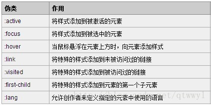
伪类种类
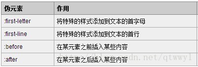
伪元素种类
- 伪类 :target
//点击链接设置 #func 的样式
<div id='test'></div>
<a href='#test'></a>
<div id='func'></div>

#test:target~#func{
    ...  //样式
}- 1
- 2
- 3
- 4
- 5
- 6
- 7
- 8
3D轮播
perspective:3000px; //定义3D元素距视图的距离
transform-style:preserve-3d;
transform:rotateY(60deg),translateZ(500px);- 1
- 2
- 3
如果css3 animation动画出现卡顿怎么办?
1. 改用 transform 的css3属性(translate scale),因为用css3属性会自动开启GPU加速,提高动画的流畅度
2. 如果是在页面刚开始加载的时候并没有加载完全就执行了动画,那就可以让动画延迟执行