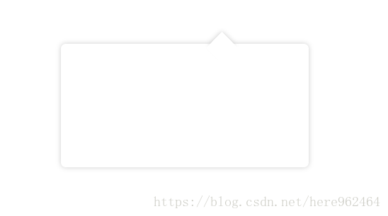
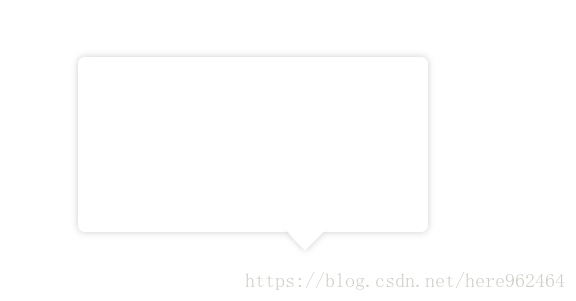
效果图:
css样式
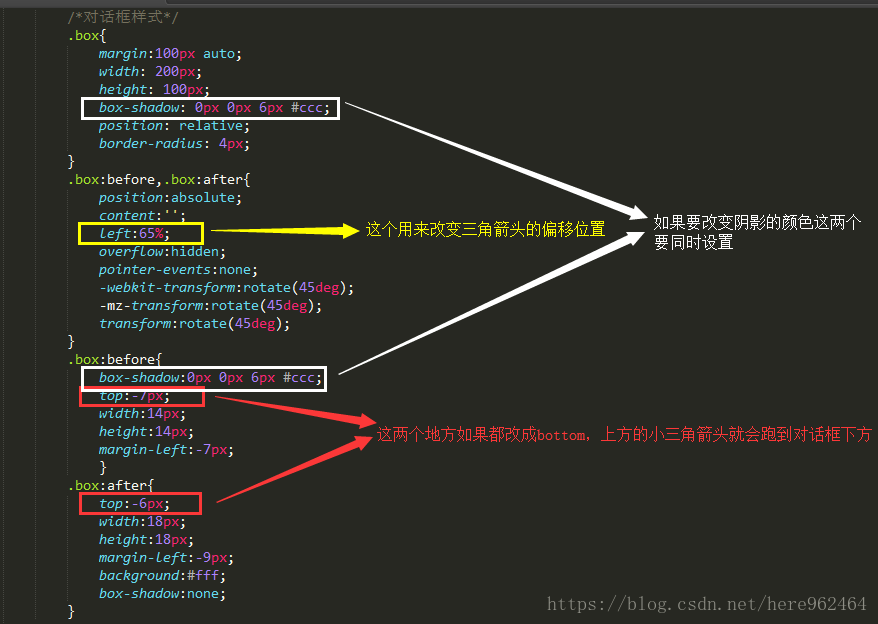
/*对话框样式*/
        .box{
            margin:100px auto;
            width: 200px;
            height: 100px;
            box-shadow: 0px 0px 6px #ccc;
            position: relative;
            border-radius: 4px;
        }
        .box:before,.box:after{
            position:absolute;
            content:'';
            left:65%;
            overflow:hidden;
            pointer-events:none;
            -webkit-transform:rotate(45deg);
            -mz-transform:rotate(45deg);
            transform:rotate(45deg);
        }
        .box:before{
            box-shadow:0px 0px 6px #ccc;
            top:-7px;
            width:14px;
            height:14px;
            margin-left:-7px;
            }
        .box:after{
            top:-6px;
            width:18px;
            height:18px;
            margin-left:-9px;
            background:#fff;
            box-shadow:none;
        }
HTML:
<div class="box"></div>重点是我要解释一下样式里面几个比较关键的地方: