1、视口设置viewport 'width=device-width'
2、像素比 devicePixelRatio
3、常用meta设置
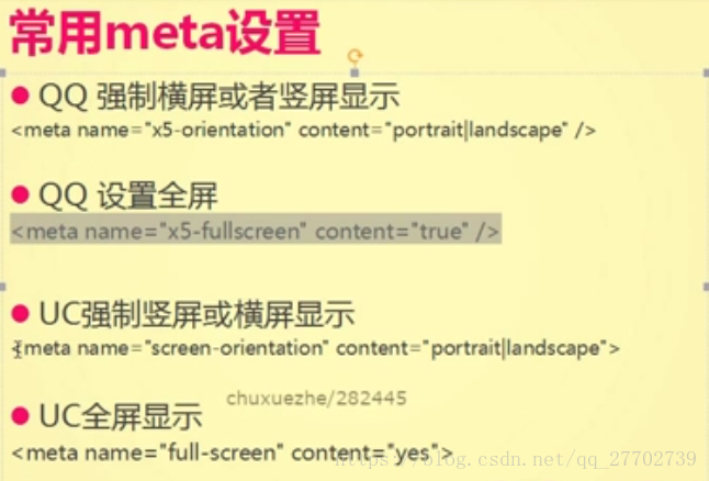
禁止识别电话号码
<meta name='format-detection' content="telephone=no,e-mail=no" />拨打电话和发邮件
href = 'tel:' href='mailto:'
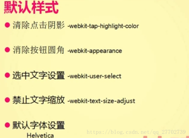
清除点击阴影
-webkit-tap-highlight-color: 颜色值
清除按钮圆角
-webkit-appearance:none
boder-radius:0;
默认字体:
所有设备都会有的英文字体:Helvetica 这个就够用了
文字缩放
-webkit-text-size-adjust:100%;
选中的文字
-webkit-user-select:none; //在事件中再兼容安卓
其他问题
font-boosting //文字过小,自动放大,人性化的设置,一段我们没有给它设置高度的时候,在webkit内核下,会被自动放大
解决方法: 1、设置高度
2、设置最大高度,max-height
干掉页面的额滚动条
html{height:100%,overflow:auto;}
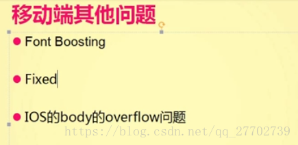
body能左右拖动的问题,在body下面嵌套一个div{height:100%;overflow:auto}
适配的问题
% 高度不好确定
viewport initial-scale = 1.0
通过jq生成viewport
var $w = window.srceen.width
var targetW = 320;
var meta = document.createElement('meta');
meta.name = 'viewport';
meta.content = '.......'
var scale = $w/targetW
document.head.appendChild(meta)
rem适配
/*移动端默认样式css.css*/
*{
  margin:0;
  padding:0;
}
html,body{
  width:100%;    /*滚动条的设置*/
  height:100%;
  overflow: hidden;
}
a,input,button{
  -webkit-tap-highlight-color: raga(0,0,0,0);
}
input,button{
  -webkit-appearance: none;
  border-radius:0;
}
body{
  margin : 0;
  -webkit-user-select: none;
}
body *{
  -webkit-user-select: none;
  font-family: Helvatica;
}
body{
  -webkit-text-size-adjust:100%;
}
ul{
  list-style: none;
}
img{
  border:0;
  vertical-align: top;
}
@r : 50rem ;
#header{
  height: 103/@r;
  background:#ef3239;
  position: absolute;
  width:750/@r;      /*滚动条的设置*/
  top:0;
  left:0;
  border-bottom: 1px solid #a82d31;
  a{
    width: 128/@r;
    height:88/@r;
    position: absolute;
    top:0;
    color:#fff;
    text-align: center;
  }
  #task{
    left:0;
    span{
      font-size: 37/@r;
      line-height: 88/@r;

    }
  }
  h1{
    text-align: center;
    font-size:39/@r;
    color:#fff;
    line-height: 88/@r;
    margin:0;
    span{
      font-size:26/@r;
      margin-right:16/@r;
    }
  }
  #refresh{
    right:0;
    span{
      font-size: 36/@r;
      line-height: 88/@r;
    }
  }
  span{
    color:#fff;
  }
}

#nav{
  height:105/@r;
  width:750/@r;
  position: absolute;    /*滚动条的设置*/
  top:103/@r;
  background: #fdfdfd;
  border-top : 1px solid #b0b0b0;
  border-bottom:1px solid #ccc;
  box-sizing : border-box;
  a{
    float: left;
    width:25%;
    text-align: center;
    height:103/@r;
    font-size:35/@r;
    line-height:103/@r;
    color:#848689;
    vertical-align: middle;
  }
  .active{
    color: #f23838;
    span{
      font-size:36/@r;
    }
  }
  #spanBox{
    width:37/@r;
    display: inline-block;
    vertical-align: middle;
    span{
      float:left;
      font-size:26/@r;
    }
    .glyphicon-chevron-down{
       top:-3/@r;
    }
    .glyphicon-filter{
      font-size : 37/@r;
    }
  }
}
#wrap{
  position: absolute;
  top:208/@r;
  left:0;      /*滚动条的设置*/
  right:0;
  bottom:0;
  overflow: auto;
}
#list{
  li{
    height:278/@r;
    border-bottom:1px solid #e0e0e0;
    box-sizing: border-box;

  }
  a{
    padding : 23/@r 23/@r 22/@r;
    height:235/@r;
    display: block;

  }
  img{
    width:235/@r;
    height:235/@r;
    float: left;
  }
  .spanWrap{
    float: right;
    width:432/@r;

  }
  .sTitle{
    font-size:28/@r;
    line-height:44/@r;
    color:#333;
    margin-top:5/@r;
    display: block;
  }
  .sPrice{
    display: block;
    font-size:38/@r;
    line-height:64/@r;
    margin-top:31/@r;
    color: #bb0d02
  }
  .sComment{
    font-size:28/@r;
    line-height: 47/@r;
    display: block;
    color:#808080;
  }
}
<!doctype html>
<html lang="en">
<head>
<meta charset="UTF-8">
<meta name="viewport"
content="width=device-width, user-scalable=no, initial-scale=1.0, maximum-scale=1.0, minimum-scale=1.0">
<meta name="apple-mobile-web-app-capable" content="yes">
<meta name="apple-mobile-web-app-status-bar-style" content="black">
<meta name='format-detection' content="telephone=no,e-mail=no" />
<title>Document</title>
<link rel="stylesheet" href="css/bootstrap.css">
<link rel="stylesheet" href="css/css.css">
<script>
window.onload = function(){
var html = document.documentElement;
var hWidth = html.getBoundingClientRect().width;
html.style.fontSize = hWidth/15 + 'px';
}
</script>
</head>
<body>
<div id="header">
<a id="task" href="javascript:;"><span class="glyphicon glyphicon-tasks"></span></a>
<h1><span class="glyphicon glyphicon-lock "></span>我的商城</h1>
<a id="refresh" href="javascript:;"><span class="glyphicon glyphicon-refresh"></span></a>
</div>
<nav id="nav">
<a href="javascript:;" class="active">综合<span class="glyphicon glyphicon-chevron-down"></span></a>
<a href="javascript:;">销量</a>
<a href="javascript:;">价格
<span id="spanBox">
<span class="glyphicon glyphicon-chevron-up"></span>
<span class="glyphicon glyphicon-chevron-down active"></span>
</span>
</a>
<a href="javascript:;" >筛选<span class="glyphicon glyphicon-filter"></span></a>
</nav>
<section id="wrap">
<ul id="list">
<li>
<a href="javascript:;">
<img src="./img/timg.jpg" alt="">
<span class="spanWrap">
<span class="sTitle">苹果(iphone) 16GB 金色 移动联通电信4G手机</span>
<span class="sPrice">¥4888.00</span>
<span class="sComment">好评96% 59091</span>
</span>
</a>
</li>
<li>
<a href="javascript:;">
<img src="./img/timg.jpg" alt="">
<span class="spanWrap">
<span class="sTitle">苹果(iphone) 16GB 金色 移动联通电信4G手机</span>
<span class="sPrice">¥4888.00</span>
<span class="sComment">好评96% 59091</span>
</span>
</a>
</li>
<li>
<a href="javascript:;">
<img src="./img/timg.jpg" alt="">
<span class="spanWrap">
<span class="sTitle">苹果(iphone) 16GB 金色 移动联通电信4G手机</span>
<span class="sPrice">¥4888.00</span>
<span class="sComment">好评96% 59091</span>
</span>
</a>
</li>
<li>
<a href="javascript:;">
<img src="./img/timg.jpg" alt="">
<span class="spanWrap">
<span class="sTitle">苹果(iphone) 16GB 金色 移动联通电信4G手机</span>
<span class="sPrice">¥4888.00</span>
<span class="sComment">好评96% 59091</span>
</span>
</a>
</li>
<li>
<a href="javascript:;">
<img src="./img/timg.jpg" alt="">
<span class="spanWrap">
<span class="sTitle">苹果(iphone) 16GB 金色 移动联通电信4G手机</span>
<span class="sPrice">¥4888.00</span>
<span class="sComment">好评96% 59091</span>
</span>
</a>
</li>
<li>
<a href="javascript:;">
<img src="./img/timg.jpg" alt="">
<span class="spanWrap">
<span class="sTitle">苹果(iphone) 16GB 金色 移动联通电信4G手机</span>
<span class="sPrice">¥4888.00</span>
<span class="sComment">好评96% 59091</span>
</span>
</a>
</li>
<li>
<a href="javascript:;">
<img src="./img/timg.jpg" alt="">
<span class="spanWrap">
<span class="sTitle">苹果(iphone) 16GB 金色 移动联通电信4G手机</span>
<span class="sPrice">¥4888.00</span>
<span class="sComment">好评96% 59091</span>
</span>
</a>
</li>
</ul>
</section>
</body>
</html>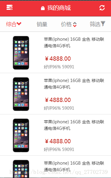
rem 就是根节点 html, 根据根节点的字体大小进行计算
html{font-size:16px} 1rem = 16px;
js 设置字体大小
$(function(){
    var html = document.documentElement;
    var hWidth = html.getBoundingClientRect().width;
    html.style.fontSize = hWidth/16 + 'px';
})
body内的rem换算是字号大小/hWidth/16
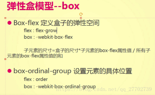
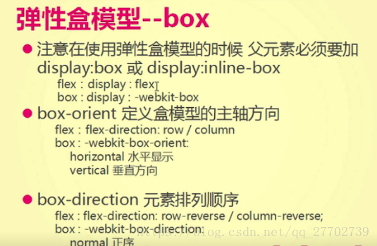
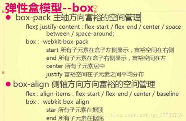
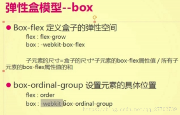
弹性盒模型
新版的flex 和老版的box(移动端暂时不支持新版的flex)
<!doctype html>
<html lang="en">
<head>
    <meta charset="UTF-8">
    <meta name="viewport"
          content="width=device-width, user-scalable=no, initial-scale=1.0, maximum-scale=1.0, minimum-scale=1.0">
    <meta name="apple-mobile-web-app-capable" content="yes">
    <meta name="apple-mobile-web-app-status-bar-style" content="black">

    <title>Document</title>
    <script>
        window.onload = function(){
            var html = document.documentElement;
            var hWidth = html.getBoundingClientRect().width;
            html.style.fontSize = hWidth/15 + 'px';
            //1rem = 50px;
        }
    </script>
    <style>
        /*移动端默认样式*/
        *{
            margin:0;
            padding:0;
        }
        html,body{
            width:100%;    /*滚动条的设置*/
            height:100%;
            overflow: hidden;
        }
        a{
            text-decoration: none;
        }
        a,input,button{
            -webkit-tap-highlight-color: raga(0,0,0,0);
        }
        input,button{
            -webkit-appearance: none;
            border-radius:0;
        }
        body{
            margin : 0;
            -webkit-user-select: none;
        }
        body *{
            -webkit-user-select: none;
            font-family: Helvatica;
        }
        body{
            -webkit-text-size-adjust:100%;
        }
        ul{
            list-style: none;
        }
        img{
            border:0;
            vertical-align: top;
        }
        .rows{
            display: -webkit-box;
            display: flex;
        }
        .rows div{
            -webkit-box-flex: 1;
            flex-grow: 1;
            width:0; /*不会影响flex-grow*/
        }
        .rows div a{
            font-size:0.44rem;
            color:#666;
            text-align: center;
            line-height: 1.04rem;
            display: block;
        }
        .rows div a:before{
            content:'';
            display: block;
            margin:0 auto;
            width:1.9rem;
            height:1.70rem;
            background-image:url('img/1.png');
            background-size: 1.90rem 1.70rem;
        }
        .rows:nth-of-type(1) div:nth-of-type(1) a:before{
            background-image:url('img/1.png');
        }
        .rows:nth-of-type(1) div:nth-of-type(2) a:before{
            background-image:url('img/2.png');
        }
        .rows:nth-of-type(1) div:nth-of-type(3) a:before{
            background-image:url('img/3.png');
        }
        .rows:nth-of-type(1) div:nth-of-type(4) a:before{
            background-image:url('img/4.png');
        }
        .rows:nth-of-type(1) div:nth-of-type(5) a:before{
            background-image:url('img/5.png');
        }
        .rows:nth-of-type(2) div:nth-of-type(1) a:before{
             background-image:url('img/6.png');
         }
        .rows:nth-of-type(2) div:nth-of-type(2) a:before{
            background-image:url('img/7.png');
        }
        .rows:nth-of-type(2) div:nth-of-type(3) a:before{
            background-image:url('img/8.png');
        }
        .rows:nth-of-type(2) div:nth-of-type(4) a:before{
            background-image:url('img/9.png');
        }
        .rows:nth-of-type(2) div:nth-of-type(5) a:before{
            background-image:url('img/10.png');
        }

    </style>
</head>
<body>
    <div class="rows">
        <div><a href="javascript:;">天猫</a></div>
        <div><a href="javascript:;">聚划算</a></div>
        <div><a href="javascript:;">天猫国际</a></div>
        <div><a href="javascript:;">外卖</a></div>
        <div><a href="javascript:;">天猫超市</a></div>
    </div><div class="rows">
        <div><a href="javascript:;">充值中心</a></div>
        <div><a href="javascript:;">飞猪旅行</a></div>
        <div><a href="javascript:;">领金币</a></div>
        <div><a href="javascript:;">拍卖</a></div>
        <div><a href="javascript:;">分类</a></div>
    </div>
</body>
</html>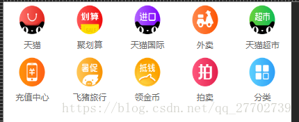
利用Less和Koala来计算rem
怪异盒模型
box-sizing:border-box(包容了边框)