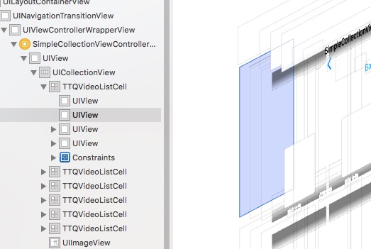
UICollectionView重要的概念
UICollectionView中有几个重要的概念,理解这几个重要的概念对于使用UICollectionView有很大的帮助,这个几个概念从用户的数据、布局展示的数据、视图展示的View、UICollectionView充当的角色这几个维度来展开讲解,这部分讲解的是偏概念的东西,如果你是一个实用主义者,那么可以直接跳到下一部分“UICollectionView和UICollectionViewFlowLayout”查看UICollectionView的简单实用,然后再回过头来回顾下这些概念,这样也是一个比较好的方式
用户的数据
用户的数据是UICollectionView中的DataSource,DataSource告诉UICollectionView有几个section、每个section中有几个元素需要展示,这点和UITableView中的DataSource是类似的
布局展示的数据
布局展示的数据是UICollectionView中的Layout,Layout告诉UICollectionView每个section中元素展示的大小和位置,每个元素展示的位置大小信息是保存在一个UICollectionViewLayoutAttributes类的对象中,Layout对象会管理一个数组包含了多个UICollectionViewLayoutAttributes的对象。Layout对应的具体类是UICollectionViewLayout和UICollectionViewFlowLayout,UICollectionViewFlowLayout可以直接使用,最简单的通过设置每个元素的大小就可以实现Grid布局。如果需要更多了定制设置其他属性比如minimumLineSpacing、minimumInteritemSpacing来设置元素之间的间距。
视图展示的View
DataSource中每个数据展示需要使用到的是UICollectionViewCell类对象,一般的通过创建UICollectionViewCell的子类,添加需要的UI元素进行自定义的布局。可以使用registerClass:forCellReuseIdentifier:方法或者registerNib:forCellReuseIdentifier:方法注册,然后在UICollectionView的DataSource方法collectionView: cellForItemAtIndexPath:中使用方法dequeueReusableCellWithIdentifier:获取到前面注册的Cell,使用item设置急需要展示的数据。
另外如果有特殊的Header/Footer需求,需要使用到的是UICollectionReusableView类,一般也是通过创建子类进行设置自定义的UI。可以使用registerClass:forSupplementaryViewOfKind:withReuseIdentifier:方法或者registerNib:forSupplementaryViewOfKind:withReuseIdentifier:方法注册,然后在UICollectionView的DataSource方法collectionView: viewForSupplementaryElementOfKind: atIndexPath:中使用方法dequeueReusableSupplementaryViewOfKind: withReuseIdentifier: forIndexPath:获取到前面注册的reusableView,然后设置需要展示的数据。
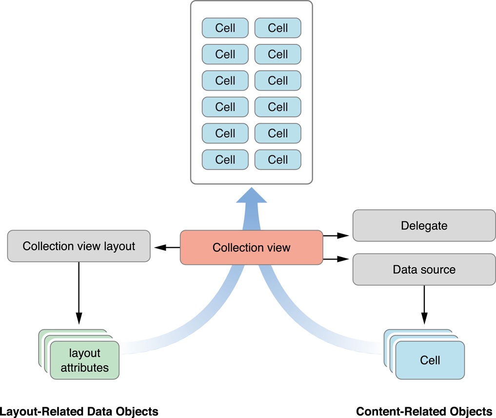
UICollectionView充当的角色
UICollectionView在这里面充当的角色是一个容器类,是一个中间者,他用于连接DataSource、Layout、UI之间的关系,起到一个协调的作用,CollectionView的角色可以使用下面的这张图来标识。
UICollectionView和UICollectionViewFlowLayout
UICollectionView已经为我们准备好了一个开箱即用的Layout类,就是UICollectionViewFlowLayout,使用UICollectionViewFlowLayout可以实现经常使用到的Grid表格布局,下面了解下UICollectionViewFlowLayout中常用的几个属性的意思以及如何使用和定制UICollectionViewFlowLayout。
UICollectionViewFlowLayout头文件中定义的属性如下:
@property (nonatomic) CGFloat minimumLineSpacing;
@property (nonatomic) CGFloat minimumInteritemSpacing;
@property (nonatomic) CGSize itemSize;
@property (nonatomic) UICollectionViewScrollDirection scrollDirection;
@property (nonatomic) UIEdgeInsets sectionInset;
-
minimumLineSpacing 如果itemSize的大小是一样的,那么真实的LineSpacing就是minimumLineSpacing,如果高度不一样,那么这个值回事上一行中Y轴值最大者和当前行中Y轴值最小者之间得高度,行中其它元素的LineSpacing会大于minimumLineSpacing

-
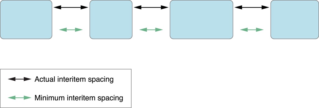
minimumInteritemSpacing 如下图所示,定义的是元素水平之间的间距,这个间距会大于等于我们设置的值,因为有可能有可能一行容纳不下只能容纳下N个元素,还有M个单位的空间,这些剩余的空间会被平局分配到元素的间距,那么真实的IteritemSpacing值其实是(minimumInteritemSpacing + M / (N - 1))
 -
itemSize itemSize表示的是Cell的大小
-
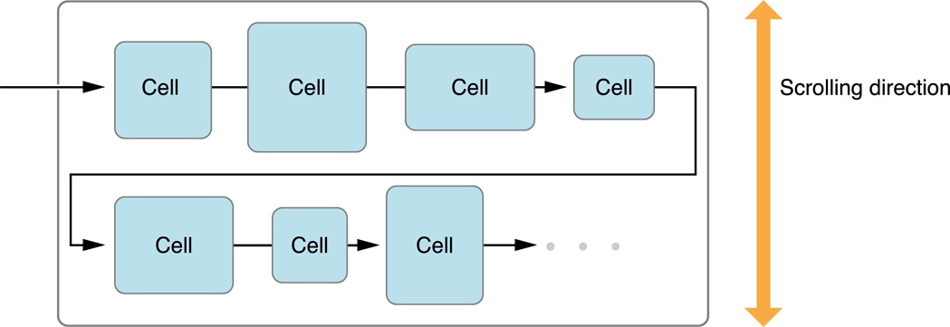
scrollDirection 如下图所示,表示UICollectionView的滚动方向,可以设置垂直方向
UICollectionViewScrollDirectionVertical和水平方向UICollectionViewScrollDirectionHorizontal
-
sectionInset 定义的是Cell区域相对于UICollectionView区域的上下左右之间的内边距,如下图所示

在了解了UICollectionViewFlowLayout的一些概念之后,我们实现一个如下的表格布局效果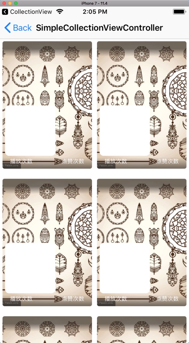

1. UICollectionViewFlowLayout初始化和UICollectionView的初始化
首先使用UICollectionViewFlowLayout对象初始化UICollectionView对象,UICollectionViewFlowLayout对象设置item元素显示的大小,滚动方向,内边距,行间距,元素间距,使得一行刚好显示两个元素,并且元素内边距为5,元素的间距为10,行间距为20,也就是上图的效果。 这边还有一个重要的操作是使用registerClass:forCellWithReuseIdentifier:方法注册Cell,以备后面的使用。
- (UICollectionView *)collectionView {
    if (_collectionView == nil) {

        UICollectionViewFlowLayout *layout = [[UICollectionViewFlowLayout alloc] init];
        CGFloat itemW = (SCREEN_WIDTH - 20) / 2;
        CGFloat itemH = itemW * 256 / 180;
        layout.itemSize = CGSizeMake(itemW, itemH);
        layout.sectionInset = UIEdgeInsetsMake(5, 5, 5, 5);
        layout.scrollDirection = UICollectionViewScrollDirectionVertical;
        layout.minimumLineSpacing = 20;
        layout.minimumInteritemSpacing = 10;

        _collectionView = [[UICollectionView alloc] initWithFrame:CGRectZero collectionViewLayout:layout];
        _collectionView.backgroundColor = [UIColor whiteColor];
        _collectionView.delegate = self;
        _collectionView.dataSource = self;
        [_collectionView registerClass:[TTQVideoListCell class] forCellWithReuseIdentifier:@"TTQVideoListCell"];
    }
    return _collectionView;
}
2. UICollectionViewDataSource处理
- 重写
collectionView: numberOfItemsInSection:返回元素个数 - 重写
collectionView: cellForItemAtIndexPath:,使用dequeueReusableCellWithReuseIdentifier:获取重用的Cell,设置Cell的数据,返回Cell - 重写
collectionView: didSelectItemAtIndexPath:,处理Cell的点击事件,这一步是非必须的,但是绝大多数场景是需要交互的,点击Cell需要执行一些处理,所以这里也添加上这个方法,在这里做一个取消选择状态的处理
// MARK: - UICollectionViewDataSource

- (NSInteger)collectionView:(UICollectionView *)collectionView numberOfItemsInSection:(NSInteger)section {
    return self.dataSource.count;
}

- (__kindof UICollectionViewCell *)collectionView:(UICollectionView *)collectionView cellForItemAtIndexPath:(NSIndexPath *)indexPath {
    TTQVideoListCell *cell = [collectionView dequeueReusableCellWithReuseIdentifier:@"TTQVideoListCell" forIndexPath:indexPath];
    TTQVideoListItemModel *data = self.dataSource[indexPath.item];
    [cell setupData:data];
    return cell;
}

- (void)collectionView:(UICollectionView *)collectionView didSelectItemAtIndexPath:(NSIndexPath *)indexPath {
    TTQVideoListItemModel *data = self.dataSource[indexPath.item];
    [collectionView deselectItemAtIndexPath:indexPath animated:YES];
    // FIXME: ZYT 处理跳转
}
3.数据源
数据源是一个简单的一维数组,如下
- (NSMutableArray *)dataSource {
    if (!_dataSource) {
        _dataSource = [NSMutableArray array];

        // FIXME: ZYT TEST
        for (int i = 0; i < 10; i++) {
            TTQVideoListItemModel *data = [TTQVideoListItemModel new];
            data.images = @"https://timgsa.baidu.com/timg?image&quality=80&size=b9999_10000&sec=1534329621698&di=60249b63257061ddc1f922bf55dfa0f4&imgtype=0&src=http%3A%2F%2Fimgsrc.baidu.com%2Fimgad%2Fpic%2Fitem%2Fd009b3de9c82d158e0bd1d998b0a19d8bc3e42de.jpg";
            [_dataSource addObject:data];
        }
    }
    return _dataSource;
}
4.Cell实现
在这个演示项目中,Cell是通过代码的方式继承UICollectionViewCell实现的
头文件:
@interface TTQVideoListCell : UICollectionViewCell

- (void)setupData:(TTQVideoListItemModel *)data;

@end
实现文件:
@interface TTQVideoListCell()
@property (nonatomic, strong) UIImageView *coverImageView;
@property (nonatomic, strong) UIView *titleLabelBgView;
@property (nonatomic, strong) UILabel *titleLabel;
@property (nonatomic, strong) UILabel *playCountLabel;
@property (nonatomic, strong) UILabel *praiseCountLabel;
@property (nonatomic, strong) UILabel *statusLabel;
@property (nonatomic, strong) UILabel *tagLabel;
@property (nonatomic, strong) TTQVerticalGradientView *bottomGradientView;
@property (nonatomic, strong) TTQVerticalGradientView *topGradientView;
@property (strong, nonatomic) UIView *highlightView;
@end

@implementation TTQVideoListCell

- (instancetype)initWithFrame:(CGRect)frame {
    self = [super initWithFrame:frame];
    if (self) {
        [self setupUI];
    }
    return self;
}

- (void)setHighlighted:(BOOL)highlighted {
    [super setHighlighted:highlighted];
    if (highlighted) {
        self.highlightView.backgroundColor = [UIColor colorWithWhite:0 alpha:0.5];
    } else {
        self.highlightView.backgroundColor = [UIColor colorWithWhite:0 alpha:0];
    }
}

- (void)setupUI {
    self.contentView.layer.cornerRadius = 4;
    self.contentView.layer.masksToBounds = YES;
    [self.contentView addSubview:self.coverImageView];
    [self.contentView addSubview:self.topGradientView];
    [self.contentView addSubview:self.bottomGradientView];
    [self.contentView addSubview:self.titleLabelBgView];
    [self.titleLabelBgView addSubview:self.titleLabel];
    [self.contentView addSubview:self.playCountLabel];
    [self.contentView addSubview:self.praiseCountLabel];
    [self.contentView addSubview:self.statusLabel];
    [self addSubview:self.tagLabel];
    [self addSubview:self.highlightView];
    // 布局省略了,具体可以查看git仓库中的代码
}

- (void)setupData:(TTQVideoListItemModel *)data {

    self.titleLabel.text = data.title;
    self.playCountLabel.text = @"播放次数";
    self.praiseCountLabel.text = @"点赞次数";
    [self.coverImageView sd_setImageWithURL:[NSURL URLWithString:data.images]];

    if (data.status == TTQVideoItemStatusReviewRecommend) {
        self.tagLabel.hidden = NO;
        self.statusLabel.hidden = YES;
        self.tagLabel.text = data.status_desc;
    } else {
        self.tagLabel.hidden = YES;
        self.statusLabel.hidden = NO;
        self.statusLabel.text = data.status_desc;
    }
}
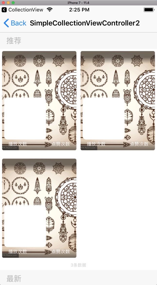
只要以上几个步骤,我们就能实现一个Grid的表格布局了,如果有其它的Header/Footer的需求,其实也只要增加三个小步骤就可以实现,下面就来实现一个带有Header/Footer效果的CollectionView
UICollectionViewFlowLayout的Header和Footer
UICollectionView中的Header和Footer也是会经常使用到的,下面通过三个步骤来实现,这三个步骤其实和Cell的步骤是相似的,所以十分简单
**1.注册Header/Footer **
使用registerClass:forSupplementaryViewOfKind:withReuseIdentifier:方法或者registerNib:forSupplementaryViewOfKind:withReuseIdentifier:方法注册
        [_collectionView registerClass:SimpleCollectionHeaderView.class forSupplementaryViewOfKind:UICollectionElementKindSectionHeader withReuseIdentifier:@"SimpleCollectionHeaderView"];
        [_collectionView registerClass:SimpleCollectionFooterView.class forSupplementaryViewOfKind:UICollectionElementKindSectionFooter withReuseIdentifier:@"SimpleCollectionFooterView"];
**2.获取Header/Footer **
- 重写
collectionView: layout: referenceSizeForHeaderInSection:返回header的高度 - 重写
collectionView: layout: referenceSizeForFooterInSection:返回footer的高度 - 重写
collectionView: viewForSupplementaryElementOfKind: atIndexPath:方法,使用方法dequeueReusableSupplementaryViewOfKind: withReuseIdentifier: forIndexPath:获取到前面注册的reusableView,然后设置需要展示的数据。该方法中的kind参数可以使用UICollectionElementKindSectionHeader、UICollectionElementKindSectionFooter两个常量来判断是footer还是header
// MARK: 处理Header/Footer

- (CGSize)collectionView:(UICollectionView *)collectionView layout:(UICollectionViewLayout*)collectionViewLayout referenceSizeForHeaderInSection:(NSInteger)section {
    return CGSizeMake(SCREEN_WIDTH, 40);
}

- (CGSize)collectionView:(UICollectionView *)collectionView layout:(UICollectionViewLayout*)collectionViewLayout referenceSizeForFooterInSection:(NSInteger)section {
    return CGSizeMake(SCREEN_WIDTH, 24);
}

- (UICollectionReusableView *)collectionView:(UICollectionView *)collectionView viewForSupplementaryElementOfKind:(NSString *)kind atIndexPath:(NSIndexPath *)indexPath {
    UICollectionReusableView *supplementaryView = nil;
    SectionDataModel *sectionData = self.dataSource[indexPath.section];
    if ([kind isEqualToString:UICollectionElementKindSectionHeader]) {
        SimpleCollectionHeaderView* header = [collectionView dequeueReusableSupplementaryViewOfKind:UICollectionElementKindSectionHeader withReuseIdentifier:@"SimpleCollectionHeaderView" forIndexPath:indexPath];
        header.descLabel.text = sectionData.title;
        supplementaryView = header;
    } else {
        SimpleCollectionFooterView* footer = [collectionView dequeueReusableSupplementaryViewOfKind:UICollectionElementKindSectionFooter withReuseIdentifier:@"SimpleCollectionFooterView" forIndexPath:indexPath];
        footer.descLabel.text = [NSString stringWithFormat:@"%@条数据", @(sectionData.items.count)];
        supplementaryView = footer;
    }
    return supplementaryView;
}
**3.Header/Footer类实现 **
继承UICollectionReusableView类,然后进行自定义的UI布局即可,下面实现一个简单的Header,只有一个Label显示分类的标题,注意需要使用UICollectionReusableView子类,才能利用CollectionView中的重用机制
头文件
@interface SimpleCollectionHeaderView : UICollectionReusableView

@property (nonatomic, strong) UILabel *descLabel;

@end
实现文件
@implementation SimpleCollectionHeaderView

- (instancetype)initWithFrame:(CGRect)frame {
    self = [super initWithFrame:frame];
    if (self) {
        [self addSubview:self.descLabel];
        self.backgroundColor = [UIColor colorWithWhite:0.95 alpha:0.6];;
    }
    return self;
}

- (void)layoutSubviews {
    [super layoutSubviews];
    self.descLabel.frame = CGRectMake(15, 0, self.bounds.size.width - 30, self.bounds.size.height);
}

- (UILabel *)descLabel {
    if (!_descLabel) {
        _descLabel = [UILabel new];
        _descLabel.font = [UIFont systemFontOfSize:18];
        _descLabel.textColor = [UIColor colorWithWhite:0.7 alpha:1];
    }
    return _descLabel;
}
@end
自定义Layout
自定义Layout为CollectionView的布局提供了最大的灵活性,使用自定义的Layout可以实现复杂的布局视图,下面会通过一个简单的例子来了解下自定义Layout,更加深入的内容可以查看ClassHierarchicalTree这个开源项目的代码进行学习,Demo项目中自定义布局实现的效果如下:
自定义Layout需要经过以下的几个步骤
- 预处理,该步骤是可选的,为了提高性能可以在这个方法中做预处理
- 提供ContentSize
- 提供LayoutAttributes,是一个数组,表示的是在UICollectionView可见范围内的item显示的Cell的布局参数
- 提供单独的Attributes,与IndexPath相关的的布局参数
作为一个最简单的实践,本文不做预处理,所以步骤只有后面三个,接下来逐个的展开来说
下面的代码中会使用到下面的几个宏定义的值得意思说明如下:
/**
 Cell外边距
 */
#define VideoListCellMargin 5
/**
 Cell宽度
 */
#define VideoListCellWidth ((SCREEN_WIDTH - VideoListCellMargin * 3) / 2)
/**
 Cell高度
 */
#define VideoListCellHeight (VideoListCellWidth * 265 / 180)
下面的代码中会使用到headerHeight表示的是头部视图的高度,datas表示的是数据源
@interface TTQVideoListLayout : UICollectionViewLayout

@property (nonatomic, strong) NSArray<TTQVideoListItemModel *> *datas;
/**
 头部视图的高度
 */
@property (nonatomic, assign) CGFloat headerHeight;

@end
提供ContentSize
ContentSize的概念和ScrollView中contentSize的概念类似,表示的是所有内容占用的大小,下面的代码会根据DataSource数组的大小和headerHeight的值计算最终需要显示的大小
- (CGSize)collectionViewContentSize {
    return CGSizeMake(SCREEN_WIDTH, ceil((CGFloat)self.datas.count / (CGFloat)2) * (VideoListCellHeight + VideoListCellMargin) + self.headerHeight + VideoListCellMargin);
}
提供LayoutAttributes
返回值是一个数组,表示的是在UICollectionView可见范围内的item显示的Cell的布局参数,如下图的Visible rect标识的位置中所有元素的布局属性
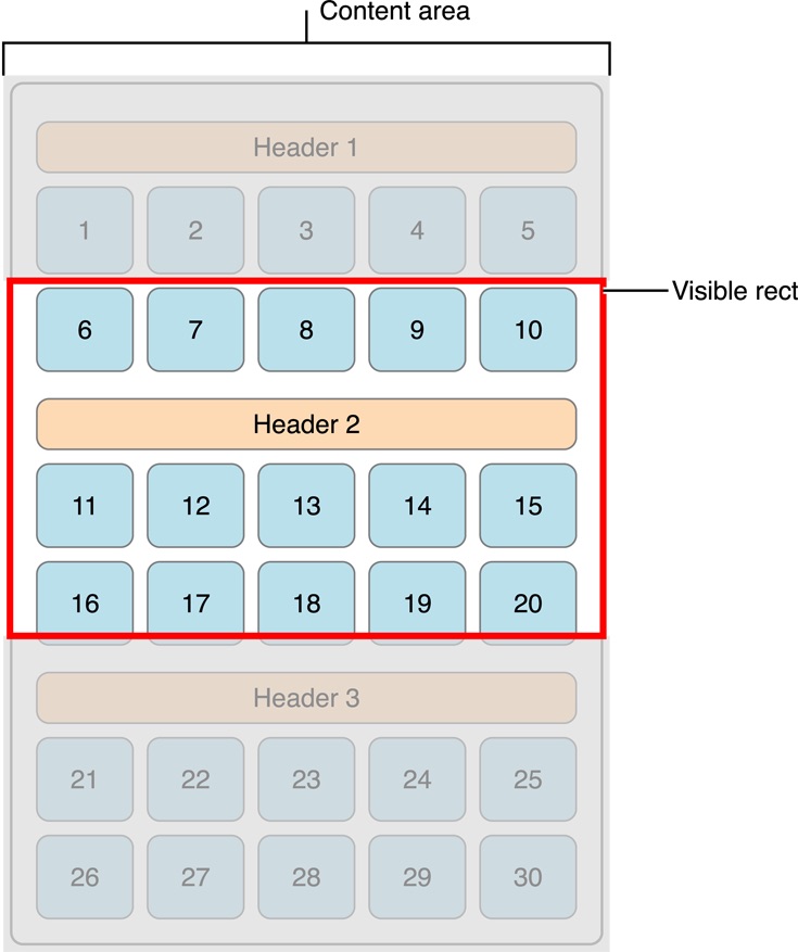
实现的方式很简单,通过对全部内容的布局属性的遍历,判断是否和显示区域的rect有交集,如果有交集,就把该布局属性对象添加到数组中,最后返回这个数组。
- (NSArray<UICollectionViewLayoutAttributes *> *)layoutAttributesForElementsInRect:(CGRect)rect {
    NSMutableArray *array = [[NSMutableArray alloc] init];
    for (NSInteger i = 0; i < self.datas.count; i++) {
        NSIndexPath *indexPath = [NSIndexPath indexPathForItem:i inSection:0];
        UICollectionViewLayoutAttributes *attributes = [self layoutAttributesForItemAtIndexPath:indexPath];
        if (!CGRectEqualToRect(attributes.frame, CGRectZero)) {
            if (CGRectIntersectsRect(rect, attributes.frame)) {
                [array addObject:attributes];
            }
        }
    }
    return array;
}
提供单独的Attributes
这个方法用于返回和单独的IndexPath相关的布局属性对象,根据indexPath中的row参数可以知道元素的位置,然后可以计算出相应所在的位置大小,然后初始化一个UICollectionViewLayoutAttributes对象,设置参数值,返回UICollectionViewLayoutAttributes对象即可
- (UICollectionViewLayoutAttributes *)layoutAttributesForItemAtIndexPath:(NSIndexPath *)indexPath {
    UICollectionViewLayoutAttributes* attributes = [UICollectionViewLayoutAttributes layoutAttributesForCellWithIndexPath:indexPath];
    if (indexPath.row < self.datas.count) {
        id item = self.datas[indexPath.row];
        if ([item isKindOfClass:[TTQVideoListItemModel class]]) {
            CGFloat originX = (indexPath.row % 2 == 0) ? (VideoListCellMargin) : (VideoListCellMargin * 2 + VideoListCellWidth);
            CGFloat originY = indexPath.row/ 2 * (VideoListCellMargin + VideoListCellHeight) + VideoListCellMargin + self.headerHeight;
            attributes.frame = CGRectMake(originX, originY, VideoListCellWidth, VideoListCellHeight);
        } else {
            attributes.frame = CGRectZero;
        }
    } else {
        attributes.frame = CGRectZero;
    }
    return attributes;
}
其它
Cell点击效果是很经常使用到的,这边主要讲下两种Cell点击效果的实现方式
Cell点击效果
有两种方法可以实现CollectionViewCell的点击效果,一种是设置CollectionViewCell的属性selectedBackgroundView和backgroundView;另一种是重写setHighlighted方法设置自定义的背景View的高亮状态
设置selectedBackgroundView和backgroundView
下图中的左边是点击效果,右边是普通的状态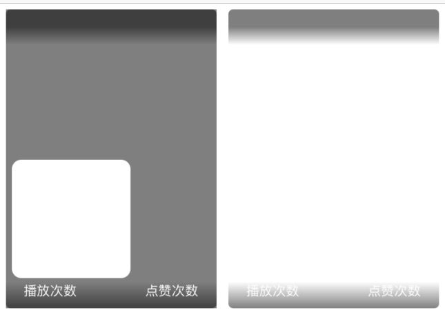
    UIView *selectedBackgroundView = [UIView new];
    selectedBackgroundView.backgroundColor = [UIColor colorWithWhite:0 alpha:0.5];
    self.selectedBackgroundView = selectedBackgroundView;

    UIView *backgroundView = [UIView new];
    backgroundView.backgroundColor = [UIColor clearColor];
    self.backgroundView = backgroundView;
 这种方式有一个局限性,如下图所示,设置的selectedBackgroundView和backgroundView是位于Cell的最底层,如果上面有自定义的图层会覆盖住selectedBackgroundView和backgroundView,比如Cell中设置了一个充满Cell视图的ImageView,点击的效果将会不可见。
重写setHighlighted方法
重写setHighlighted方法相对来说是一种灵活性比较高的方法,这种方式和自定义UITableViewCell的高亮状态很类似,setHighlighted方法中通过判断不同的状态进行设置任意的UI元素的样式,我们可以在Cell的最上层添加一个自定义的高亮状态的View,这样高亮的效果就不会因为充满Cell的UI而导致看不见了,代码如下
- (void)setupUI {
    // ......
    [self addSubview:self.highlightView];
    [self.highlightView mas_makeConstraints:^(MASConstraintMaker *make) {
        make.edges.equalTo(self);
    }];
}

- (UIView *)highlightView {
    if (!_highlightView) {
        _highlightView = [UIView new];
        _highlightView.backgroundColor = [UIColor clearColor];
        _highlightView.layer.cornerRadius = 3;
    }
    return _highlightView;
}

- (void)setHighlighted:(BOOL)highlighted {
    [super setHighlighted:highlighted];
    if (highlighted) {
        self.highlightView.backgroundColor = [UIColor colorWithWhite:0 alpha:0.5];
    } else {
        self.highlightView.backgroundColor = [UIColor colorWithWhite:0 alpha:0];
    }
}
效果如下图: 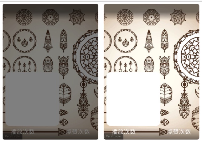
http://www.lnluqu.cn/
http://www.025invest.cn/
http://www.wx-detian.cn/
http://www.xintravel.cn/
http://www.fenghuicaifu.cn/
http://www.chinaytbzw.cn/
http://www.sydire.cn/
http://www.jnymkj.cn/
http://www.metrel-china.cn/
http://www.hongheqiche.cn/
http://www.zazhiku.cn/
http://www.yz-hysl.cn/
http://www.gutiangelun.cn/
http://www.lnjjpm.cn/
http://www.touraround.cn/
http://www.sunmoon88.com.cn/
http://www.13142js.cn/
http://www.caixiantang.com.cn/
http://www.poponet.cn/
http://www.zglogistics.cn/
http://www.zgxwzk.cn/
http://www.bjltsc.cn/
http://www.shshunfeng.cn/
http://www.hzwssy.com.cn/
http://www.daoyitang.cn/
http://www.rossicount.cn/
http://www.bjchange.cn/