版权声明:本文为博主原创文章,未经博主允许不得转载。 https://blog.csdn.net/qq_36671474/article/details/77371588
最近在做项目的时候,遇到了一个中间文字,两边横线的布局,如下图:
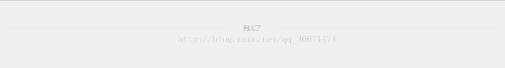
第一种:
代码如下:
<!DOCTYPE html>
<html lang="en">
<head>
    <meta charset="UTF-8">
    <title>Title</title>
    <style>
        body{background: #f0f0f0}
        .con{position:relative;height:1.875rem;line-height: 1.875rem;margin:2.47rem auto;text-align: center;}
        .con i{display:block;height:1px;background:#e1e1e1;position:absolute;top:0.9rem;width:100%;}
        .con p{
            display:inline-block;
            font-size: 0.75rem;
            color:#c1c1c1;
            background:rgba(240,240,240,1);
            padding:0 1.875rem;
            text-align: center;
            margin:0 auto;
            position:relative;
            z-index:2;}
    </style>
</head>
<body>
    <div class="con">
        <i></i>
        <p>到底了</p>
    </div>
</body>
</html>
这里使用了背景色和透明度,细心的人可能会发现,body设置的背景色刚好是‘到底了’的文字的背景色,同时也用了行内块、透明度以及相对定位来实现了的噢。
第二种:
后来,在网上找到了不同的方法,代码如下:
<!DOCTYPE html>
<html lang="en">
<head>
<meta charset="UTF-8">
<title>Title</title>
<style>
.order {
height: 60px;
line-height: 60px;
text-align: center;
}
.order .line {
display: inline-block;
width: 500px;
border-top: 1px solid #ccc ;
}
.order .txt {
color: #686868;
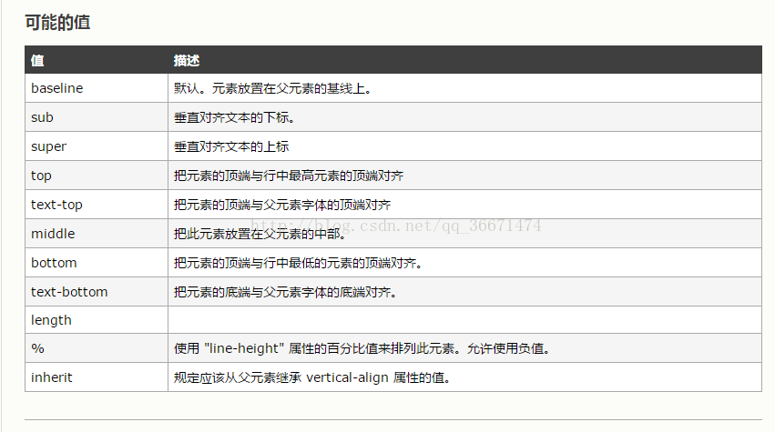
vertical-align: -4px;
}
</style>
</head>
<body>
<div class="order">
<span class="line"></span>
<span class="txt">产品清单</span>
<span class="line"></span>
</div>
</body>
</html>
第三种:
使用css伪类来实现
<!DOCTYPE html>
<html>
<head>
    <meta charset="utf-8">
    <title>CSS伪类实现中间文字两边横线效果</title>
    <style>
        .wrap {
            position: absolute;
            text-align: center;
            width: 100%;
        }
        .wrap div {
            line-height: 20px;
        }
        /*CSS伪类用法*/
        .wrap div:after, .wrap div:before {
            position: absolute;
            top: 50%;
            background: #ddd;
            content: "";
            height: 1px;
            width: 45%;
        }
        /*调整背景横线的左右距离*/
        .wrap div:before {
            left: 0;
        }
        .wrap div:after {
            right: 0;
        }
    </style>
</head>
<body>
<div class="wrap">
    <div>暂无数据</div>
</div>
</body>
</html>