python-3.7 pycharm serborn-0.9.0
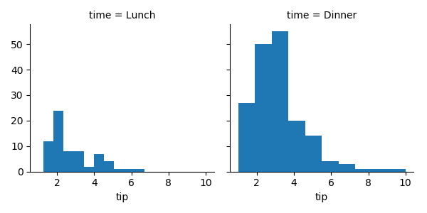
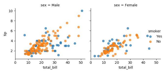
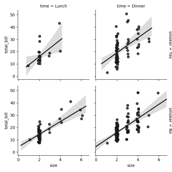
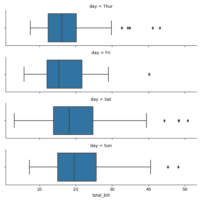
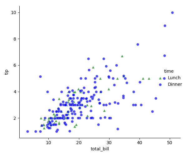
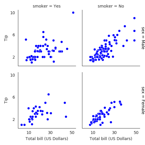
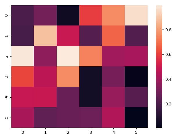
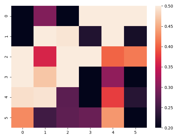
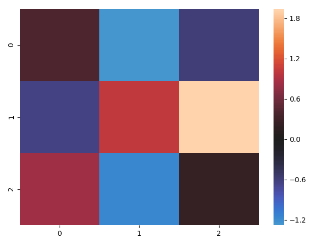
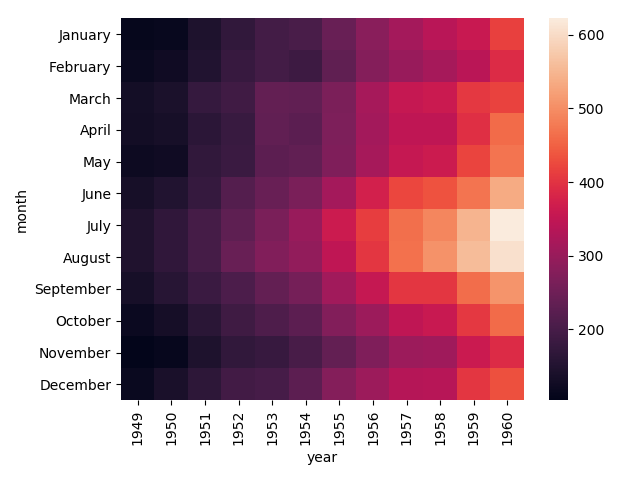
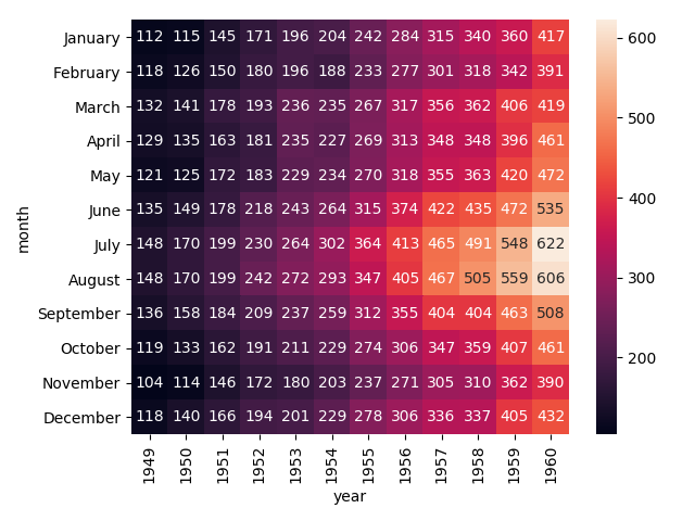
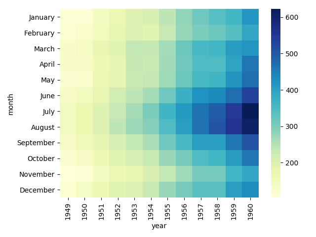
"""
    可视化库Seaborn
    时间:2018\9\13 0012
    seaborn基本操作
"""
from pandas import Categorical
import seaborn as sns
import numpy as np
import pandas as pd
import matplotlib as mpl
import matplotlib.pyplot as plt

print("""\n---------------------子集展示函数-------------------------------------
--------------------------------FacetGrid()----------------------------------------\n""")
"""
    1.展示的区域构造出来
    2.通过map函数构造实际的图
"""

tips = sns.load_dataset('tips')
print(tips.head())
g = sns.FacetGrid(tips, col = 'time')
g.map(plt.hist, 'tip')  # 条形图,横坐标
plt.show()

g = sns.FacetGrid(tips, col = 'sex', hue = 'smoker')  # 数据集,连个图表,参数,指标
g.map(plt.scatter, 'total_bill', 'tip', alpha = 0.7)  # 散点图,横坐标,纵坐标,透明度越小的越透明
g.add_legend()  # 添加图例
plt.show()

g = sns.FacetGrid(tips, row = 'smoker', col = 'time', margin_titles = True)  # 数据集,图表行,图表列,边缘标题
g.map(sns.regplot, 'size', 'total_bill', color = "0.1", fit_reg = True, x_jitter = 0.1)  # 图模型,横坐标,纵坐标,颜色深浅,回归线,摆动
plt.show()

print("""\n---------------------顺序问题-------------------------------------
--------------------------------FacetGrid(row_order=DateFrame)----------------------------------------\n""")
order_days = tips.day.value_counts().index
print(order_days)
order_days = Categorical(['Thur', 'Fri', 'Sat', 'Sun'])
g = sns.FacetGrid(tips, row = 'day', row_order = order_days, size = 1.7, aspect = 4)
g.map(sns.boxplot, 'total_bill')
plt.show()

"""
    paltte = 调色板字典
    s = 点大小
    linewidth = 线宽
    edgecolor = 边缘颜色
    hue_kws = {'marker':['^','o']}
"""
pal = dict(Lunch = 'green', Dinner = 'blue')
g = sns.FacetGrid(tips, hue = 'time', palette = pal, size = 5, hue_kws = {'marker': ['^', 'o']})
g.map(plt.scatter, 'total_bill', 'tip', s = 40, alpha = 0.7, linewidth = 0.5, edgecolor = "white")
g.add_legend()
plt.show()

"""
    g.set_axis_labels('X轴名称', 'Y轴名称')
    g.fig.subplots_adjust(wspace = 子图横间隔, hspace = 子图纵间隔)
"""
with sns.axes_style('white'):
    g = sns.FacetGrid(tips, row = 'sex', col = 'smoker', margin_titles = True, size = 2.5)
g.map(plt.scatter, 'total_bill', 'tip', color = 'blue', edgecolor = 'white', lw = 0.5)
g.set_axis_labels('Total bill (US Dollars)', 'Tip')
g.set(xticks = [10, 30, 50], yticks = [2, 6, 10])
g.fig.subplots_adjust(wspace = 0.02, hspace = 0.02)
plt.show()

print("""\n---------------------热度图-------------------------------------
--------------------------------sns.heatmap(ndarray)----------------------------------------\n""")
unifrom_data = np.random.rand(6, 6)
print(unifrom_data)
heatmap = sns.heatmap(unifrom_data)
plt.show()

'''
    调色板取值区间
'''
ax = sns.heatmap(unifrom_data, vmin = 0.2, vmax = 0.5)
plt.show()

'''
    中心值
'''
normal_data = np.random.randn(3, 3)
print(normal_data)
ax = sns.heatmap(normal_data, center = 0)
plt.show()

"""
    根据数据画热度图
"""
flights = sns.load_dataset('flights')
print(flights.head())
flights = flights.pivot('month', 'year', 'passengers')
print(flights)
ax = sns.heatmap(flights)
plt.show()
"""
    annot = True 热度图中加实际数字
    linewidths = 0.5 每个方格中间的间距
"""
ax = sns.heatmap(flights, annot = True, fmt = 'd')
plt.show()

"""
    改变右侧colorbar的颜色
    cbar = False 隐藏colorbar
"""
ax = sns.heatmap(flights, cmap = 'YlGnBu')
plt.show()