版权声明:本文为博主原创文章,未经博主允许不得转载。 https://blog.csdn.net/qq_31383345/article/details/53329294
突发奇想,做个录音的模块,结果折腾到一点钟,还在做话筒的动画.
最后发现微信还有bug,我也是醉了.有空再接着敲.
先上gif:
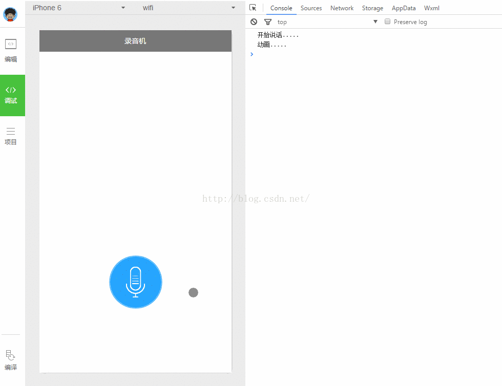
这还没完成,做完之后应该是水波纹的样子.无奈函数执行多次,动画只执行一次.还是先把锅甩出去.
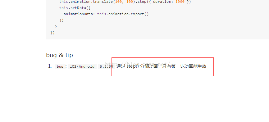
上微信开发文档的图:
代码先贴上:
1.index.wxml
<!--index.wxml-->
<view  class="voice-style" bindtap="startSpeak">
<image class="bg-style" src="../../images/voice_icon_speaking_bg_normal.png"></image>
<image class="bg-style" animation="{{spreakingAnimation}}" src="../../images/voice_video_loading_0.png"></image>
<image class="sound-style" src="../../images/voice_icon_speech_sound_1.png"></image>
<image class="sound-style" src="../../images/voice_icon_speech_sound_2.png"></image>
<image class="sound-style" src="../../images/voice_icon_speech_sound_3.png"></image>
<image class="sound-style" src="../../images/voice_icon_speech_sound_4.png"></image>
<image class="sound-style" src="../../images/voice_icon_speech_sound_5.png"></image>
</view>
/**index.wxss**/
.voice-style {
  margin-top: 400px;
  display: flex;
  position: relative;
  flex-direction: column;
  align-items: center;
}

.bg-style {
  position: absolute;
  width: 100px;
  height: 100px;
}
.sound-style{
  position: absolute;
  width: 37.6px;
  height: 60px;
  margin-top: 20px;
}
3.index.js
//index.js
//获取应用实例
var app = getApp()
Page({
  data: {
    spreakingAnimation: {},//放大动画
  },
  onLoad: function () {
  },
  //点击开始说话
  startSpeak: function () {
    var _this = this;
    var timer = setInterval(function () {
      console.log("开始说话.....")
      speaking.call(_this);
    }, 200);
  },
})
function speaking() {
  console.log("动画.....")
  var _this = this;
  var animation = wx.createAnimation({
    duration: 1000,
  })
  animation.opacity(0).scale(3, 3).step();//修改透明度,放大
  this.setData({
    spreakingAnimation: animation.export()
  })
}
在wx.createAnimation(OBJECT)中有几个参数还是得说说.
duration:动画持续时间,这个容易理解.
delay:延迟多久开始执行
timingFunction 设置动画效果
- linear 默认为linear 动画一直较为均匀
- ease 开始时缓慢中间加速到快结束时减速
- ease-in 开始的时候缓慢
- ease-in-out 开始和结束时减速
- ease-out 结束时减速
- step-start 动画一开始就跳到 100% 直到动画持续时间结束 一闪而过
- step-end 保持 0% 的样式直到动画持续时间结束 一闪而过
transformOrigin 设置动画的基点 默认%50 %50 0
left,center right是水平方向取值,对应的百分值为left=0%;center=50%;right=100%
top center bottom是垂直方向的取值,其中top=0%;center=50%;bottom=100%

demo源码下载
我的博客:http://blog.csdn.net/qq_31383345