来自https://www.jianshu.com/u/4312c933b9db 极客江南网易云课程
https://study.163.com/course/courseLearn.htm?courseId=1003864040
动画模块
动画模块的组成
- @keyframes 规则
- animation
以上两个组件基本完成css3的所有动画
其中@keyframes 是单独创建规则,独立标签(可以看做一个动画方法/函数)
而animation则是写在需要执行动画的标签下(如div)
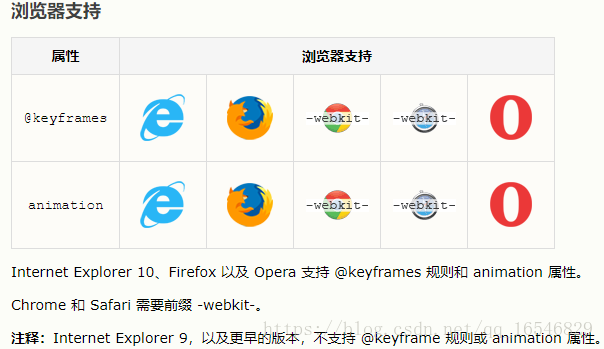
1)@keyframes 规则
- @keyframes 规则用于创建动画。在 @keyframes 中规定某项 CSS 样式,就能创建由当前样式逐渐改为新样式的动画效果。
- 用百分比来规定变化发生的时间,或用关键词 "from" 和 "to",等同于 0% 和 100%。
- 语法:
@keyframes animationname {keyframes-selector {css-styles;}} /*animationname:动画名称;keyframes-selector:阶段*/
例
@keyframes mymove
{
    0%   {top:0px; left:0px; background:red;}
    25%  {top:0px; left:100px; background:blue;}
    50%  {top:100px; left:100px; background:yellow;}
    75%  {top:100px; left:0px; background:green;}
    100% {top:0px; left:0px; background:red;}
}
2)animation
将所在标签与动画(@keyframes)绑定
| 值 | 描述 | 值示例 |
|---|---|---|
| animation-name | 规定需要绑定到选择器的 keyframe 名称。。 | mymove |
| animation-duration | 规定完成动画所花费的时间,以秒或毫秒计。 | 3s |
| animation-timing-function | 规定动画的速度曲线。 | linear:匀速 ease、ease-out、ease-in-out 超慢->很慢 cubic-bezier(n,n,n,n) 在 cubic-bezier 函数中自己的值。 可能的值是从 0 到 1 的数值。 |
| animation-delay | 规定在动画开始之前的延迟。 | 允许负值 以秒或毫秒计。默认值是 0 3s |
| animation-iteration-count | 规定动画应该播放的次数。 | n:次数 infinite:无限次 |
| animation-direction | 规定是否应该轮流反向播放动画。 | normal默认值。动画应该正常播放 alternate:动画应该轮流反向播放。 |
平时使用还是用简写模式比较方便
animation: name duration timing-function delay iteration-count direction;不可以简写的两个
| animation-play-state | 规定动画是否正在运行或暂停。默认是 "running"。 | paused规定动画已暂停。 running规定动画正在播放。 |
| animation-fill-mode | 规定对象动画时间之外的状态。 |
1.过渡和动画之间的异同
<!DOCTYPE html>
<html lang="en">
<head>
    <meta charset="UTF-8">
    <title>100-动画模块</title>
    <style>
        *{
            margin: 0;
            padding: 0;
        }
        div{
            width: 100px;
            height: 50px;
            background-color: red;
            /*transition-property: margin-left;*/
            /*transition-duration: 3s;*/

            /*1.告诉系统需要执行哪个动画*/
            animation-name: lnj;
            /*3.告诉系统动画持续的时长*/
            animation-duration: 3s;
        }
        /*2.告诉系统我们需要自己创建一个名称叫做lnj的动画*/
        @keyframes lnj {
            from{
                margin-left: 0;
            }
            to{
                margin-left: 500px;
            }
        }

        /*div:hover{*/
            /*margin-left: 500px;*/
        /*}*/
    </style>
</head>
<body>
<div></div>
</body>
</html>
1.1不同点
过渡必须人为的触发才会执行动画
动画不需要人为的触发就可以执行动画
1.2相同点
过渡和动画都是用来给元素添加动画的
过渡和动画都是系统新增的一些属性
过渡和动画都需要满足三要素才会有动画效果
动画模块-其它属性
.box2{
            width: 200px;
            height: 200px;
            background-color: blue;
            margin: 100px auto;
            animation-name: myRotate;
            animation-duration: 5s;
            animation-delay: 2s;
            /*
            通过我们的观察, 动画是有一定的状态的
            1.等待状态
            2.执行状态
            3.结束状态
            */
            /*
            animation-fill-mode作用:
            指定动画等待状态和结束状态的样式
            取值:
            none: 不做任何改变
            forwards: 让元素结束状态保持动画最后一帧的样式
            backwards: 让元素等待状态的时候显示动画第一帧的样式
            both: 让元素等待状态显示动画第一帧的样式, 让元素结束状态保持动画最后一帧的样式
            */
            /*animation-fill-mode: backwards;*/
            /*animation-fill-mode: forwards;*/
            animation-fill-mode: both;
        }
        @keyframes myRotate {
            0%{
                transform: rotate(10deg);
            }
            50%{
                transform: rotate(50deg);
            }
            100%{
                transform: rotate(70deg);
            }
        }
动画模块-连写
 div {
            width: 100px;
            height: 50px;
            background-color: red;
            /*animation: move 3s linear 2s 1 normal;*/
            animation: move 3s;
        }
        @keyframes move {
            from{
                margin-left: 0;
            }
            to{
                margin-left: 500px;
            }
        }
1.动画模块连写格式
animation:动画名称 动画时长 动画运动速度 延迟时间 执行次数 往返动画;
2.动画模块连写格式的简写
animation:动画名称 动画时长;
3D转换模块
/*
1.什么是2D和3D
2D就是一个平面, 只有宽度和高度, 没有厚度
3D就是一个立体, 有宽度和高度, 还有厚度
默认情况下所有的元素都是呈2D展现的
2.如何让某个元素呈3D展现
和透视一样, 想看到某个元素的3d效果, 只需要给他的父元素添加一个transform-style属性, 然后设置为preserve-3d即可
*/
/*想看到整个立方的近大远小效果, 就给ul的父元素添加透视*/
perspective: 500px;
注意点:
只要父元素被拉伸了,子元素也会被拉伸
注意点:
1.动画中如果有和默认样式中同名的属性, 会覆盖默认样式中同名的属性
2.在编写动画的时候, 固定不变的值写在前面, 需要变化的值写在后面
背景
/*
cover含义:
1.告诉系统图片需要等比拉伸
2.告诉系统图片需要拉伸到宽度和高度都填满元素
*/
background-size:cover;
/*
contain含义:
1.告诉系统图片需要等比拉伸
2.告诉系统图片需要拉伸到宽度或高度都填满元素
*/
background-size:contain;
1.什么是背景尺寸属性
背景尺寸属性是CSS3中新增的一个属性, 专门用于设置背景图片大小
背景图片定位区域属性
/*
告诉系统背景图片从什么区域开始显示,
默认情况下就是从padding区域开始显示
*/
background-origin: padding-box;
背景绘制区域属性
/*
背景绘制区域属性是专门用于指定从哪个区域开始绘制背景的, 默认情况下会从border区域开始绘制背景
*/
background-clip: padding-box;
多重背景图片
/*
多张背景图片之间用逗号隔开即可
注意点:
先添加的背景图片会盖住后添加的背景图片
建议在编写多重背景时拆开编写
*/
/*background: url("images/animal1.png") no-repeat left top,url("images/animal2.png") no-repeat right top,url("images/animal3.png") no-repeat left bottom,url("images/animal4.png") no-repeat right bottom,url("images/animal5.png") no-repeat center center;*/
background-image: url("images/animal1.png"),url("images/animal2.png"),url("images/animal3.png");
background-repeat: no-repeat, no-repeat, no-repeat;
background-position: left top, right top, left bottom;
CSS编写格式
1.行内样式
2.内嵌样式
3.外链样式 -- 企业开发用外链样式
4.导入样式
外链样式和导入样式区别:
共同点: 都是将CSS代码写到了一个单独的文件中
不同点:
外链样式, 在显示网页时, 会先加载CSS文件, 再显示页面
导入样式, 在显示网页时, 会先显示界面, 再加载CSS文件
外链样式是通过一个HTML标签引入CSS的
而导入样式是通过@import引入CSS的, 而@import是CSS2.1推出, 所以导入样式存在兼容问题
优先级问题
行内样式的优先级最高
其它写法谁写在后面就听谁的
边框圆角基本概念
background-color: pink;
/*
边框圆角的作用:
将原始的直角变为圆角
格式:
border-radius: 100px 0px 0px 0px;
第一个参数: 指定左上角的半径
按照左上/右上/右下/左下的顺序
*/
/*border-radius: 0px 0px 0px 100px;*/
/*如果省略一个参数, 会变成对角的值*/
/*border-radius: 100px 80px 40px;*/
/*如果省略两个参数, 会变成对角的值*/
/*border-radius: 100px 80px;*/
/*如果省略三个参数, 其它角会和它一样*/
/*border-radius: 100px;*/
/*如果指定的半径是当前元素宽高的一半, 那么就是一个圆形*/
/*border-radius: 100px;*/
border-radius: 50%;
 .father>.son {
            width: 200px;
            /*height: 200px;*/
            height: 100px;
            background-color: pink;
            /*单独指定某一个角的半径*/
            /*border-top-left-radius: 100px;*/
            /*border-top-right-radius: 100px;*/
            /*border-bottom-left-radius: 100px;*/
            /*border-bottom-right-radius: 100px;*/

            /*如果传递了两个参数, 那么第一个参数代表水平方向的半径, 第二个参数代表垂直方向的半径*/
            /*
            border-top-left-radius: 100px 50px;
            border-top-right-radius: 100px 50px;
            border-bottom-left-radius: 100px 50px;
            border-bottom-right-radius: 100px 50px;
            */

            /*border-top-left-radius: 50%;*/
            /*border-top-right-radius: 50%;*/
            /*border-bottom-left-radius: 50%;*/
            /*border-bottom-right-radius: 50%;*/

            /*
            斜杠之前的代表左上/右上/右下/左下的水平方向的半径
              斜杠之后的代表左上/右上/右下/左下的垂直方向的半径
              */
            /*border-radius: 100px 100px 100px 100px/50px 50px 50px 50px;*/
            border-radius: 100px/50px;
        }
绘制圆
/*规律: 如果边框的宽度小于圆角的半径, 那么内圆和外圆都是圆弧形状
如果边框的宽度大于或者等于圆角的半径, 那么内圆就会变成直角而不是圆角
*/
线性渐变
/*
            渐变不是一个新的属性, 而是一个取值
            默认情况下线性渐变是从上至下的渐变
            我们可以通过在颜色的前面添加to xxx修改渐变的方向
            to top
            to left
            to right

            */
            /*background-image: linear-gradient(to top right, red, blue);*/

            /*除了可以通过关键字控制渐变的方向以外, 还可以通过角度来控制渐变的方向, 角度是按照顺时针旋转*/
            /*background-image: linear-gradient(200deg, red, blue);*/


            /*30%以前不渐变, 从30%开始慢慢渐变到下一个颜色*/
            /*background-image: linear-gradient(red 30%, blue);*/
            /*background-image: linear-gradient(red 0%, red 30%,blue 30%, blue 60%, green 60%, green 100%);*/
            background-image: linear-gradient(to left ,red 0%, red 30%,blue 30%, blue 60%, green 60%, green 100%);
径向渐变
 div{
            width: 200px;
            height: 200px;
            margin: 100px auto;
            border: 1px solid #000;
            /*可以在颜色前面添加at和关键字来指定从什么位置开始渐变*/
            /*background-image: radial-gradient(at left top,red, blue);*/
            /*除了可以通过关键字指定从什么位置开始渐变以外, 还可以通过指定具体像素来指定从什么位置开始渐变*/
            /*background-image: radial-gradient(at 50px 50px,red, blue);*/

            /*也可以在颜色前面直接加上一个具体的像素来指定渐变的范围*/
            /*background-image: radial-gradient(150px ,red, blue);*/

            /*
            编写规范:
            如果既要指定扩散的范围, 又要指定起始位置, 那么把扩散的范围写在前面, 而起始位置写在后面
            */
            background-image: radial-gradient(50px at right bottom ,red, blue);
        }
伸缩布局
 ul{
            border: 1px solid #000;
            margin: 100px auto;
            list-style: none;
            /*
            在伸缩布局中, 默认伸缩项是从左至右的排版的
            */
            display: flex;
            /*
            主轴的排版的方向默认就是row, 默认就是从左至右
            */
            /*flex-direction: row;*/
            /*
            修改主轴的排版方向为从右至左
            */
            /*flex-direction: row-reverse;*/
            /*
            告诉系统把主轴的方向改为垂直方向
            注意点:
            1.默认情况下主轴是水平方向的, 但是也可以修改为垂直方向.只要看到flex-direction:
column/column-reverse就代表主轴被修改为了垂直方向
            2.如果将主轴修改为了垂直方向, 那么侧轴就会自动从垂直方向转换为水平方向
            */
            /*
            修改主轴的排版方向为从上至下
            */
            /*flex-direction: column;*/

            /*
            修改主轴的排版方向为从下至上
            */
            flex-direction: column-reverse;
        }
        ul>li{
            width: 100px;
            height: 100px;
            background-color: pink;
            text-align: center;
            line-height: 100px;
            font-size: 35px;
            margin: 20px;
        }
ul{
width: 600px;
height: 600px;
border: 1px solid #000;
margin: 100px auto;
list-style: none;
display: flex;
/*
justify-content:
用于设置伸缩项主轴上的对齐方式
如果设置为flex-start, 代表告诉系统伸缩项和主轴的起点对齐
*/
/*justify-content: flex-start;*/
/*justify-content: flex-end;*/
/*居中对齐*/
/*justify-content: center;*/
/*两端对齐*/
/*justify-content: space-between;*/
/*环绕对齐*/
justify-content: space-around;
} ul{
width: 600px;
height: 600px;
border: 1px solid #000;
margin: 100px auto;
list-style: none;
display: flex;
/*
通过align-items可以修改侧轴的对齐方式
默认情况下是以侧轴的起点对齐
*/
/*align-items: flex-start;*/
/*align-items: flex-end;*/
/*align-items: center;*/
/*
注意点:
和主轴不同的是, 侧轴没有两端对齐和环绕对齐
*/
/*基线对齐*/
/*align-items: baseline;*/
/*拉伸对齐*/
align-items: stretch;
}ul>li:nth-child(1){
/*padding-top: 50px;*/
/*
如果在伸缩容器中通过 align-items 修改侧轴的对齐方式, 是修改所有伸缩项侧轴的对齐方式
如果是在伸缩项中通过 align-self 修改侧轴的对齐方式, 是单独修改当前伸缩项侧轴的对齐方式
align-self属性的取值和align-items一样
*/
align-self: flex-end;
} ul{
width: 600px;
height: 600px;
border: 1px solid #000;
margin: 100px auto;
list-style: none;
display: flex;
/*
默认情况下主轴是水平方向, 侧轴是垂直方向
默认情况下主轴的起点在伸缩容器的最左边, 主轴的终点在伸缩容器的最右边
默认情况下侧轴的起点在伸缩容器的最顶部, 侧轴的终点在伸缩容器的最底部
我们可以通过flex-direction属性修改主轴的方向
如果flex-direction属性的取值是column/column-reverse
就代表将主轴的方向修改为了垂直方向, 那么侧轴就会立刻变为水平方向
*/
/*justify-content: space-around;*/
/*flex-direction: column;*/
/*align-items: center;*/
}ul{
width: 400px;
height: 600px;
border: 1px solid #000;
margin: 100px auto;
list-style: none;
display: flex;
/*
在伸缩布局中, 如果伸缩容器的宽度不够, 系统会自动压缩伸缩项的宽度, 保证所有的伸缩想都能
放在伸缩容器中
如果当伸缩容器宽度不够时, 不想让伸缩项被压缩, 也可以让系统换行flex-wrap: wrap;
默认情况下如果伸缩容器的高度比换行之后所有伸缩项的高度还要高, 那么系统会自动将剩余空间
平分之后添加给每一行
*/
/*宽度不够也不换行, 默认取值*/
/*flex-wrap: nowrap;*/
flex-wrap: wrap;
/*flex-wrap: wrap-reverse;*/
}ul{
width: 400px;
height: 600px;
border: 1px solid #000;
margin: 100px auto;
list-style: none;
display: flex;
flex-wrap: wrap;
/*
如果伸缩容器中的伸缩项换行了, 那么我们就可以通过align-content来设置行与行之间的对
齐方式
*/
/*align-content: flex-start;*/
/*align-content: flex-end;*/
/*align-content: center;*/
/*align-content: space-between;*/
/*align-content: space-around;*/
/*
默认情况下换行就是就是拉伸对齐
一定要注意: 在换行中的拉伸对齐是指, 所有行的高度总和要和伸缩容器的高度一样
所以会将多余的空间平分之后添加给每一行
*/
align-content: stretch;
} ul>li:nth-child(1){
/*
如果想调整伸缩布局中伸缩项的顺序, 那么我们可以通过修改伸缩项的order属性来实现
默认情况下order的取值是0
如果我们设置了order属性的值, 那么系统就会按照设置的值从小到大的排序
*/
order:-1;
} ul>li:nth-child(1){
/*
1.flex-grow作用:
当所有伸缩项宽度的总和没有伸缩容器宽度大的时, 我们可以通过flex-grow让系统调整伸缩项的
宽度, 以便于让所有伸缩项的宽度的总和等于伸缩容器的宽度
2.flex-grow计算公式
2.1计算剩余的空间
伸缩容器宽度 - 所有伸缩项的宽度
400 - 300 = 100
2.2计算每份剩余空间的宽度
剩余空间 / 需要的份数
100 / 6 = 16.66
2.3计算每个伸缩项最终的宽度
伸缩项的宽度 + 需要的份数 * 每份的宽度
注意点:
flex-grow默认值是0
*/
flex-grow: 1;
/*100 + 1 * 16.66 = 116.66*/
}ul>li:nth-child(1){
/*
1.flex-shrink作用:
当所有伸缩项宽度的总和比伸缩容器宽度大的时, 我们可以通过flex-shrink让系统调整伸缩
项的宽度, 以便于让所有伸缩项的宽度的总和等于伸缩容器的宽度
2.计算每个伸缩项需要压缩的宽度
2.1计算溢出的宽度
伸缩容器的宽度 - 所有伸缩项的宽度总和
400 - 600 = -200
2.2计算总权重
每个伸缩项需要的份数 * 每个伸缩项的宽度
1 * 200 + 2 * 200 + 3 * 200 = 1200
2.3计算每个伸缩项需要压缩的宽度
溢出的宽度 * 需要的份数 * 每个伸缩项的宽度 / 总权重
-200 * 1 * 200 / 1200 = -33.33
注意点:
flex-shrink: 默认值是1
*/
flex-shrink: 1;
}