感觉还是比较简单的,直接上图:
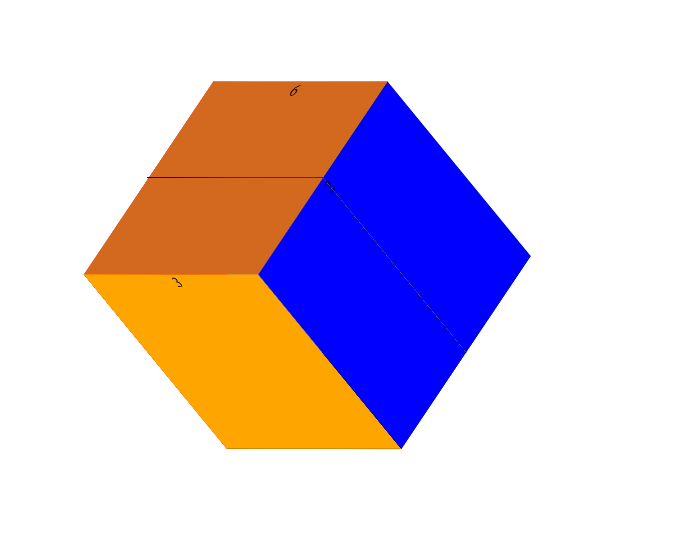
要做出的效果就是这个立体的正方体,然后再让它自己不停地转动
代码展示:
<!DOCTYPE html>
<html>
	<head>
		<meta charset="UTF-8">
		<title>旋转正方体</title>
		<style>
			*{
				margin: 0;
				padding: 0;
			}
			ul{
				width: 200px;
				height: 200px;
				position: relative;
				left: 300px;
				top: 250px;
				border: 1px solid black;
				background-color: white;
				transform: rotateX(-10deg);
				background-color: gray;
				transform-style:preserve-3d ;
				animation: change 6s linear 0s infinite normal;
			}
			@keyframes change{
				from{
					transform: rotateY(0deg) rotateX(0deg);
				}
				to{
					transform: rotateY(360deg) rotateX(360deg);
				}
			}
			ul li{
				list-style: none;
				width: 100%;
				height: 100%;
				position: absolute;
				text-align: center;
				left: 0;
				top: 0;
			}
			ul li:nth-child(1){
				background-color: red;
				transform: translate(-100px) rotateY(90deg);
			}
			ul li:nth-child(2){
				background-color: blue;
				transform: translate(100px) rotateY(90deg);
			}
			ul li:nth-child(3){
				background-color: orange;
				transform: translateZ(100px);
			}
			ul li:nth-child(4){
				background-color: green;
				transform: translateZ(-100px);
			}
			ul li:nth-child(5){
				background-color: black;
				transform: translateY(100px) rotateX(90deg);
			}
			ul li:nth-child(6){
				background-color: chocolate;
				transform: translateY(-100px) rotateX(90deg);
			}
		</style>
	</head>
	<body>
		<ul>
			<li>1</li>
			<li>2</li>
			<li>3</li>
			<li>4</li>
			<li>5</li>
			<li>6</li>
		</ul>
	</body>
</html>
一.关于动画模块animation:
一共有三要素:
1.告诉系统需要执行哪一个动画(如lnj)
格式: animation-name: 名称(lnj);
3. 此动画要持续的时间
格式: animation-duration: 3s;
2.自己创建那个名称为(如lnj)的动画
格式:
@keyframes 名称 {
from{
属性: 值;
}
//告诉系统要从哪个状态变化到哪个状态
to{
属性: 值;
}
}
补充1:
改变任意多的样式的次数:
百分比来规定变化发生的时间,或用关键词"from"和"to"等同于0%和100%
动画的其他一些属性:
animation-iteration-count 规定动画被播放的次数,默认是1
animation-timing-function 规定动画的速度曲线, 默认是 "ease"
animation-delay 规定动画何时开始。默认是 0
animation-direction 规定动画是否在下一周期逆向地播放。默认是 "normal"
"alternate" : 动画做往返变化
animation-iteration-count 规定动画被播放的次数。默认是 1
animation: myfirst 5s linear 2s infinite alternate;
animation : (name) (duration) (timing-function) (delay) (iteration-count) (direction);
简写模式: animation: 动画名称 动画时长;
animation-play-state 规定动画是否正在运行或暂停。默认是 "running"(puased)
二.:关于transform
transform属性向元素应用2D或者3D转换。该属性允许我们对元素进行旋转、缩放、移动或者倾斜.
1.旋转:
transform: rotateX(); transform: rotateY(); transform: rotatZ();
2.缩放:
transform: scale()定义2D缩放转换.
transform: scaleX()通过设置X轴的值来定义缩放转换.
3.转换:
transform: translate()定义2D转换
transform: translateX()定义转换,只是用X轴的值
4.倾斜:
transform: skewX(angle) 定义沿着X轴的2D倾斜转换
perspective(n) 为 3D 转换元素定义透视视图 (近大远小效果)
补充2: 关于旋转轴: 经过试验,没错的话就是下图所示:
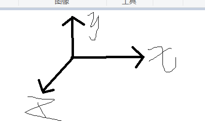
与我们平时数学里面的不相同;