一、min-height,height
1、min-height:该属性值会对元素的高度设置一个最低限制。因此,元素可以比指定值高,但不能比其矮。不允许指定负值。
比如定义了一个盒子的min-height为100px时:
<div style="width: 300px;min-height: 100px;background-color: red;">
</div>
显示效果如下:
如果我们再定义它的height值<100px时,盒子的高度仍然是min-height的值不变:

<div style="width: 300px;min-height: 100px;background-color: red;height: 10px">
</div>
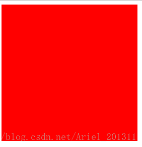
只有height的值>min-height时,盒子的高度才会有所改变:
<div style="width: 300px;min-height: 100px;background-color: red;height: 300px"></div>
2、和height的关系:如上例子所示
3、怎么实现高度自适应:
比如我们写代码时会先习惯性地给盒子一个高度,然后向里面填充内容:
<div style="width: 300px;background-color: red;height: 80px">
	国庆放假啦国庆放假啦国庆放假啦国庆放假啦国庆放假啦国庆放假啦国庆放假啦国庆放假啦国庆放假啦
</div>
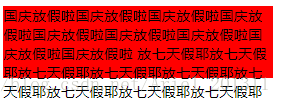
可是当盒子里面的高度越来越多的时候,就会出现溢出问题:

<div style="width: 300px;background-color: red;height: 80px">
    国庆放假啦国庆放假啦国庆放假啦国庆放假啦国庆放假啦国庆放假啦国庆放假啦国庆放假啦国庆放假啦
    放七天假耶放七天假耶放七天假耶放七天假耶放七天假耶放七天假耶放七天假耶放七天假耶放七天假耶
</div>
如果我们遇到这种情况都是靠每次去修改height值的话。代码效率会很低,后期维护起来也比较繁琐,我们能不能让盒子高度随着内容而变化呢?办法总是有的:
方法一:把height值替换为min-height,给min-heigtht设置一个盒子的最小高度
<div style="width: 300px;background-color: red;min-height: 20px"></div>
方法二:
<div style="width: 300px;background-color: red;height: auto;overflow: hidden"></div>
方法三:给盒子一个padding-bottom值
<div style="width: 300px;background-color: red;height: auto;padding-bottom:10px;"></div>
4、这篇博客不错:https://blog.csdn.net/xi_2130/article/details/50179125
二、background参数配置
如:background: url(…/img/nail.png) 0 0/100% 100% no-repeat;
1、background参数:
(1)background-color
(2)background-image
(3)background-repeat(repeat、repeat-x、repeat-y、no-repeat)
(4)background-attachment(scroll、fixed)
(5)background-position(top left、top center、top right、center left、center center、center right、bottom left、bottom center、bottom right、x% y%、xpos ypos)
2、background-position问题:
https://www.cnblogs.com/zxx-foreve1130/p/3964243.html
三、学会灵活使用::after和::before伪类
1、如在一个p标签下加一个下滑线
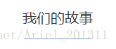
<p>我们的故事</p>

p{
    font-size: 20px;
    margin-top: 20px;
    position: relative;
    padding-bottom: 15px;
    text-align: center;
}

p::before {
    content: '';
    position: absolute;
    right: 0;
    bottom: 0;
    left: 0;
    margin: auto;
    height: 1px;
    width: 97px;
    background-color: #5b9cfa;
}
2、在h3文字上插入一张图片:
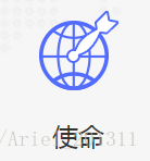
    <h3>使命</h3>

h3 {
    text-align: center;
    padding-top: 100px;
    font-size: 24px;
    position: relative;
    font-family: Avenir;
}
h3::before {
    content: '';
    position: absolute;
    top: 0;
    right: 0;
    left: 0;
    margin: auto;
    width: 73px;
    height: 73px;
    background: url(../img/mission.png) center center/73px 73px no-repeat;
}
四、学会灵活使用absolute和relative
平时在布局的时候,我都习惯用float来组织我的页面,最近在公司做项目的过程中,发现了一些页面很巧妙地使用了absolute和relative来布局实现一些很好看的组件。要是说,整个页面全用它们来布局的话,我个人觉得是不好维护的,但是在一些页面的修饰中,使用它们是合适的。
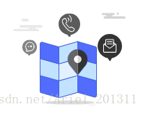
比如在网页中实现这么一个效果:
你以为是之间插入一张图片这么简单吗?当然不是啦,它是由很多个图片组件来合成的,其中就很好地运用了定位知识:
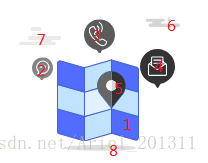
<div class="ver-img">
	<div class="gray"></div>  //图片7
	<div class="black"></div>  //图片6
	....其他一样
</div>
.ver-img {
    position: relative;
    display: inline-block;
    background-repeat: no-repeat;
    background-position: center center;
    min-width: 172px;
    height: 148px;
}

.ver-img > div {
    position: absolute;
    z-index: 2;
}

//其他图片样式定位类似
 .gray {
    width: 42px;
    height: 18px;
    left: 5px;
    top: 24px;
    background: url(../img/contact-gray.svg) 0 top/42px auto  no-repeat;
}
五、CSS3 transition属性
最近做的项目设计了很多网页的动态效果,其中就很多使用了transition属性,由于我现在还在写静态页面,等做完优化了,这部分我再详细回来记笔记,现在粗略写一下。
看过文档,其中一个列子可以帮助理解:
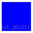
<div></div>
div
{
	width:100px;
	height:100px;
	background:blue;
	transition:width 2s;
	-moz-transition:width 2s; /* Firefox 4 */
	-webkit-transition:width 2s; /* Safari and Chrome */
	-o-transition:width 2s; /* Opera */
}

div:hover
{
	width:300px;
	height:50px;
}
当我们把鼠标移上去的时候,就会发现div的宽度改变成hover里的参数了:
所以我可以大致理解transition属性可以事先定义在某个标签上(p,div,a等等),定义动画所要改变的属性(width、height、color等等)、时常以及动画的效果等等,但是就这样单纯定义在标签上,其实是没有什么效果的,还要有事件去触发它啊,就像例子里的,div:hover就是触发了动画,然后在div:hover里写上动画改变后你想要的样子,这样标签就会从原大小变到触发后的大小了。