一、pandas中的绘图函数
1.series绘制图像
# 准备一个Series
s = Series(np.random.randn(10),index=np.arange(10,110,10))
# 最简单的画个图
s.plot()
plt.show()
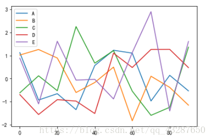
2.DataFrame进行绘图
# 准备一个数据
df = DataFrame(np.random.randn(10,5),columns=list('ABCDE'),index=np.arange(10)*10)
要想将df中的每一列的数据都画出来,有两种方法:
(1)使用matplotlib 中的方法
for each in df:
    df[each].plot() # each是dataframe的列明
    plt.show
(2)直接使用pandas+matplotlib的方法
#直接使用dataframe的方法,图例会自动选择一个放得下的位置取放置
df.plot()
plt.show()
二、画各种图形
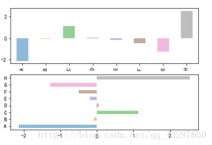
1.条形图、柱状图
fig,axes = plt.subplots(2,1)
# print(plt.subplots(2,1))
s1 = Series(np.random.randn(8),index=list('ABCDEFGH'))
s1.plot(kind='bar',ax=axes[0],alpha=0.5) #第一块211
s1.plot(kind='barh',ax=axes[1],alpha=0.5) #第二块212
plt.show()
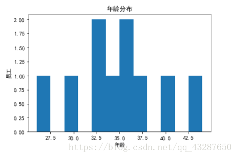
2.直方图
df2 = pd.read_excel('excel/pandas-matplotlib.xlsx','Sheet1')
fig = plt.figure()
ax = fig.add_subplot(111)
ax.hist(df2['Age'],bins=12)
plt.xlabel('年龄')
plt.ylabel('员工')
plt.title('年龄分布')
plt.show()
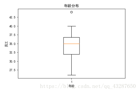
3.箱线图
df2 = pd.read_excel('excel/pandas-matplotlib.xlsx','Sheet1')
fig = plt.figure()
ax = fig.add_subplot(111)
ax.boxplot(df2['Age'])
plt.xlabel('年龄')
plt.ylabel('员工')
plt.title('年龄分布')
plt.show()
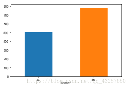
4.条形图
df2 = pd.read_excel('excel/pandas-matplotlib.xlsx','Sheet1')
mysum = df2.groupby('Gender').Sales.sum()
plt.figure()
mysum.plot(kind='bar')
plt.show()
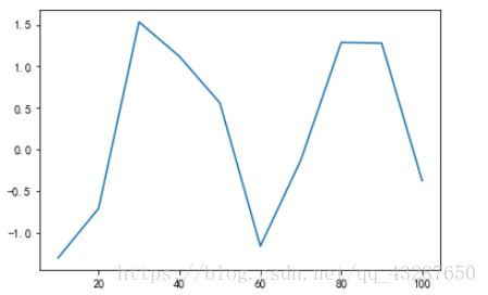
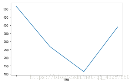
5.折线图
mysum = df2.groupby('BMI').Sales.sum()
plt.figure()
mysum.plot(kind='line')
plt.show()
把他们画到一个画布里
mysum = df2.groupby('Gender').Sales.sum()
fig = plt.figure(figsize=(12,6))
ax1 = fig.add_subplot(121) # 使用了变量之后就用 add_subplot
mysum.plot(kind='bar')

mysum = df2.groupby('BMI').Sales.sum()
ax2 = fig.add_subplot(122)
mysum.plot(kind='line')
plt.show()
plt.show()
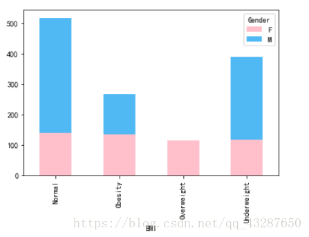
6.簇状堆叠图
mysum = df2.groupby(['BMI','Gender']).Sales.sum()
mysum
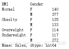
mysum.unstack().plot(kind='bar',stacked=True,color=['pink','#50B9F4']) #默认转的是内层
plt.show()
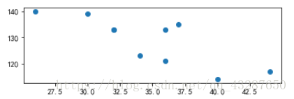
7.散点图
fig = plt.figure()
ax = fig.add_subplot(211)
ax.scatter(df2['Age'],df2['Sales'])
plt.show()
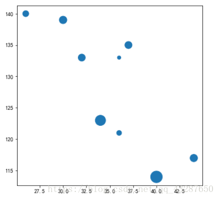
8.气泡图
fig = plt.figure(figsize=(6,6))
ax = fig.add_subplot(111)
ax.scatter(df2['Age'],df2['Sales'],s=df2['Income']) # 第三个参数表示点的大小
plt.show()
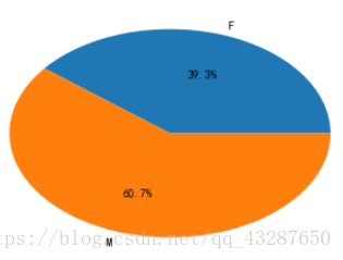
9.饼图
grouped = df2.groupby('Gender').Sales.sum()
plt.figure()
plt.subplot(111)
plt.pie(grouped,labels=grouped.index,autopct='%.1f%%')

plt.show()