总结归纳一下现在学到的纯CSS实现水平垂直居中的方法:
(1)如果元素的宽度是已知的,那么可以利用父类元素设置成position:relative,子类设置为position:absolute
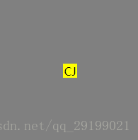
然后定位距离上margin为50%,左50%,再减去元素自身的宽度就可以实现,例子代码:
<div class = "box">
    <div class="content">CJ</div>
</div>
<style>
.box {
    background-color: gray;
    width: 200px;
    height: 200px;
    position: relative;
}
.content {
    background-color: yellow;
    width: 20px;
    height: 20px;
    position: absolute;
    left: 50%;
    top: 50%;
    margin: -10px 0 0 -10px;
	text-align: center;
	vertical-align: middle;
}
</style>
实现效果:
(2)div模块绝对定义水平垂直居中,利用margin: auto实现
div{
   width: 100px;
   height: 100px;
   background: red;
   position: absolute;
   top: 0;
   right: 0;
   bottom: 0;
   left: 0;
   margin: auto;
}
(3)div模块绝对定义水平垂直居中,利用margin负边距实现(常用用法)
div{
            width: 100px;
            height: 100px;
            background: red;
            position: absolute;
            left: 50%;
            top: 50%;
            margin-left: -50px;
            margin-top: -50px;
}(4)div绝对定位水平垂直居中,利用transform变形(IE8以下版本不支持)
div{
            width:100px;
            height: 100px;
            background:red;
            position: absolute;
            left: 50%;    /* 定位父级的50% */
            top: 50%;
            transform: translate(-50%,-50%); /*自己的50% */
}(5)css不定宽高水平垂直居中
<style>
.box{
	     width: 200px;
             height: 200px;
	     background: black;
             display: flex;
             justify-content: center;
             align-items: center;
        }
.content{
            background: green;
            width: 100px;
            height: 100px;
        }
</style>
	<div class = "box">
		<div class = "content"></div>
	</div>
</body>
(6)将父盒子设置为table-cell,就相当于一个td,td是行内元素,无法设置宽高,因此需要嵌套一层,然后必须选择display:inline-block,因此嵌套蹭会被覆盖掉,不推荐使用这种方法。
<div class="box">
    <div class="content">
        <div class="inner">
        </div>
    </div>
</div>

.box {
    background-color: #FF8C00;//橘黄色
    width: 300px;
    height: 300px;
    display: table;
}
.content {
    background-color: #F00;//红色
    display: table-cell;
    vertical-align: middle;//使子元素垂直居中
    text-align: center;//使子元素水平居中
}
.inner {
    background-color: #000;//黑色
    display: inline-block;
    width: 20%;
    height: 20%;
}
(7)flex布局:利用子类设置margin:0 auto,以及父类设置display:flex;align-items:center实现子类垂直水平居中
.box{
    width: -moz-fit-content;
    width: -webkit-fit-content;
    background-color:red;
    width:300px;
    height:300px;
    display: flex;
    align-items: center;
}
.content{
	margin:0 auto;
	width:50%;
	height:50%;
	background: green;
	}