1.画曲(直)线
plt.plot(x, y, color=, lw=, linestyle=,marker=,alpha=)
参数:
x:横轴上的点(数组)
y:纵轴上的点(数组)
color:颜色
'b' |
blue | 'm' |
magenta |
|---|---|---|---|
'g' |
green | 'y' |
yellow |
'r' |
red | 'k' |
black |
'c' |
cyan | 'w' |
white |
lw:线条宽度(int)
linestyle:线条类型
'-' |
solid line style | '-.' |
dash-dot line style |
|---|---|---|---|
'--' |
dashed line style | ':' |
dotted line style |
marker:点类型
'.' |
point marker | 'x' |
x marker |
|---|---|---|---|
'o' |
circle marker | 'D' |
diamond marker |
's' |
square marker | 'd' |
thin_diamond marker |
'p' |
pentagon marker | '+' |
plus marker |
'*' |
star marker | … |
alpha:透明度(int 0- 1)
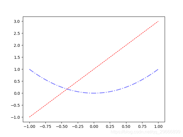
import numpy as np
import matplotlib.pyplot as plt

x = np.linspace(-1, 1, 100)
y1 = np.multiply(2, x) + 1
y2 = x*x
plt.plot(x, y1, color='r', lw=1, linestyle='--', alpha=1)
plt.plot(x, y2, color='b', lw=2, linestyle='-.', alpha=0.5)
plt.show()
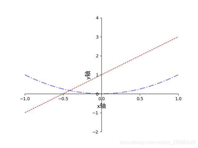
2. 设置坐标轴
import numpy as np
import matplotlib.pyplot as plt

x = np.linspace(-1, 1, 100)
y1 = np.multiply(2, x) + 1
y2 = x * x
plt.plot(x, y1, color='r', lw=1, linestyle='--', alpha=1)
plt.plot(x, y2, color='b', lw=2, linestyle='-.', alpha=0.5)

# 设置坐标轴的取值范围
plt.xlim((-1, 1))
plt.ylim((-2, 4))

# 设置x,y坐标轴刻度。在坐标轴范围内取点,点越多对应的刻度越小
plt.xticks(np.linspace(-1, 1, 5))
plt.yticks(np.linspace(-2, 4, 7))

# 设置坐标轴的lable
# 标签里面必须添加字体变量:fontproperties='SimHei',fontsize=14。不然可能会乱码
plt.xlabel(u'x轴', fontproperties='SimHei', fontsize=14)
plt.ylabel(u'y轴', fontproperties='SimHei', fontsize=14)

# 获取当前的坐标轴
axis = plt.gca()
# 隐藏右边框和上边框
axis .spines['right'].set_color('none')
axis .spines['top'].set_color('none')
# 设置x坐标轴为下边框
axis .xaxis.set_ticks_position('bottom')
# 设置y坐标轴为左边框
axis .yaxis.set_ticks_position('left')

# 设置x轴, y周在(0, 0)的位置
# 参数必须为元组类型,第一个值可选:'outward', 'axes', 'data'分别对应不同的对齐方式
axis .spines['bottom'].set_position(('data', 0))
axis .spines['left'].set_position(('data', 0))
plt.show()
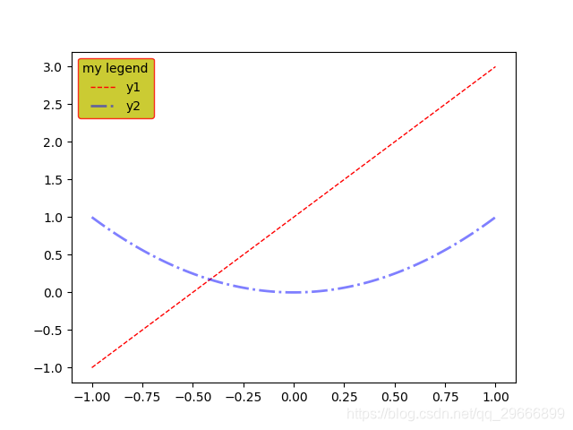
3. 设置legend
plt.legend(loc=, fontsize=, frameon=, edgecolor=, facecolor=, title=)
参数:
loc:图例位置
| 0 | ‘best’ | 6 | ‘center left’ |
|---|---|---|---|
| 1 | ‘upper right’ | 7 | ‘center right’ |
| 2 | ‘upper left’ | 8 | ‘lower center ’ |
| 3 | ‘lower left’ | 9 | ‘upper center ’ |
| 4 | ‘lower right’ | 10 | ‘center’ |
| 5 | ‘right’ |
fontsize: 图例字体大小
int or float or {‘xx-small’, ‘x-small’, ‘small’, ‘medium’, ‘large’, ‘x-large’, ‘xx-large’}
frameon: 图例边框(True or False)
edgecolor: 图例边框颜色
facecolor: 图例背景颜色,若无边框,参数无效
title: 图例标题str
import numpy as np
import matplotlib.pyplot as plt

x = np.linspace(-1, 1, 100)
y1 = np.multiply(2, x) + 1
y2 = x * x
plt.plot(x, y1, color='r', lw=1, linestyle='--', alpha=1)
plt.plot(x, y2, color='b', lw=2, linestyle='-.', alpha=0.5)
# 设置legend
plt.legend(('y1', 'y2'), loc=2, title='my legend', edgecolor='r', facecolor='y')
plt.show()
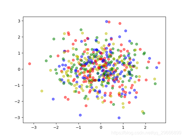
4. 画散点图
plt.scatter()
x = np.random.normal(0, 1, 500)
y = np.random.normal(0, 1, 500)
c = ['r', 'g', 'b', 'y']
plt.scatter(x, y, color=c, alpha=0.5, marker='o')
plt.show()
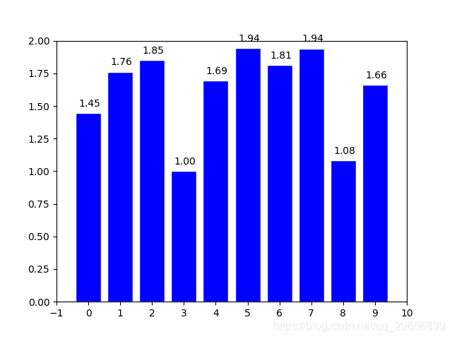
4. 柱状图
plt.bar()
x = np.arange(0, 10, 1)
y = np.random.uniform(1, 2, 10)
plt.bar(x, y, facecolor='b', edgecolor='w')
plt.xlim(-1, 10)
plt.ylim(0, 2)
plt.xticks(np.linspace(-1, 10, 12))
for x0, y0 in zip(x, y):
   plt.text(x0 - 0.3, y0 + 0.05, '%.2f' % y0)
plt.show()