
Android提供的Shader类主要是渲染图像以及一些几何图形。
Shader有几个直接子类:
BitmapShader : 主要用来渲染图像
LinearGradient :用来进行线性渲染
RadialGradient : 用来进行环形渲染
SweepGradient : 扫描渐变—围绕一个中心点扫描渐变就像电影里那种雷达扫描,用来梯度渲染。
ComposeShader : 组合渲染,可以和其他几个子类组合起来使用。
小记:Android控件渲染Shade的实现方式有两种,(一、JAVA代码实现;二、XML配置来实现)
举一种JAVA代码excmple,其余类型的与之类似,亲们自己“度娘 、谷哥 ”:
LinearGradient是线性渐变,用法如下:
Gradient是基于Shader类,所以我们通过Paint的setShader方法来设置这个渐变,代码如下:
Paint p=new Paint();
LinearGradient lg=newLinearGradien(0,0,100,100,Color.RED,Color.BLUE,Shader.TileMode.MIRROR);
Gradient是基于Shader类,所以我们通过Paint的setShader方法来设置这个渐变,代码如下:
p.setShader(lg);
canvas.drawCicle(0,0,200,p); //参数3为画圆的半径,类型为float型。
再看XML布局文件代码:
一:主布局文件代码:
| 1 2 3 4 5 6 7 8 9 10 11 12 13 14 15 16 17 18 19 20 21 22 23 24 25 26 27 28 29 30 31 32 33 34 35 36 37 38 39 40 41 42 43 44 45 46 47 48 49 50 51 52 53 54 55 56 57 58 59 60 61 62 63 64 65 66 67 68 69 |
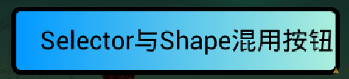
<RelativeLayout xmlns:android="http://schemas.android.com/apk/res/android" xmlns:tools="http://schemas.android.com/tools" android:layout_width="match_parent" android:layout_height="match_parent" android:background="@drawable/background" android:paddingBottom="@dimen/activity_vertical_margin" android:paddingLeft="@dimen/activity_horizontal_margin" android:paddingRight="@dimen/activity_horizontal_margin" android:paddingTop="@dimen/activity_vertical_margin" tools:context=".MainActivity" > <com.xxxx.shadedemo.TextViewBorder android:id="@+id/textView1" android:layout_width="wrap_content" android:layout_height="wrap_content" android:layout_alignParentLeft="true" android:layout_alignParentTop="true" android:layout_marginLeft="22dp" android:layout_marginTop="20dp" android:text=" JAVA实现带四条边框" android:textColor="@android:color/white" android:textSize="25sp" /> <com.xxxxx.shadedemo.TextViewBorderLeftRight android:id="@+id/TextViewBorder01" android:layout_width="wrap_content" android:layout_height="wrap_content" android:textColor="@android:color/white" android:layout_alignLeft="@+id/textView1" android:layout_below="@+id/textView1" android:layout_marginTop="20dp" android:text="JAVA实现带左右边框" android:textSize="25sp" /> <com.xxxxx.shadedemo.TextViewBorderUnder android:id="@+id/TextViewBorder02" android:layout_width="wrap_content" android:layout_height="wrap_content" android:layout_alignLeft="@+id/TextViewBorder01" android:textColor="@android:color/white" android:layout_below="@+id/TextViewBorder01" android:layout_marginTop="33dp" android:text="JAVA代码实现下边框" android:textSize="25sp" /> <TextView android:id="@+id/TextViewBorderUnder01" android:layout_width="wrap_content" android:layout_height="wrap_content" android:layout_alignLeft="@+id/button1" android:layout_below="@+id/TextViewBorder02" android:layout_marginTop="20dp" android:text="Shape XML实现边框" android:background="@drawable/shape_test" android:textColor="@android:color/white" android:textSize="25sp" /> <Button android:id="@+id/button1" android:layout_width="wrap_content" android:layout_height="wrap_content" android:layout_alignLeft="@+id/TextViewBorder02" android:layout_below="@+id/TextViewBorderUnder01" android:layout_marginTop="29dp" android:background="@drawable/shape_selector" android:text="Selector与Shape混用按钮" android:textColor="@android:color/black" /> </RelativeLayout> |
二:上面布局中使用的自定义控件代码及Shape渲染代码分别如下:
2.1:JAVA实现带四条边框(自定义TextView JAVA代码一)
| 1 2 3 4 5 6 7 8 9 10 11 12 13 14 15 16 17 18 19 20 21 22 23 24 25 26 27 28 29 30 31 32 33 34 35 36 37 38 39 40 41 42 43 44 45 46 47 48 49 50 51 52 53 54 55 56 57 58 59 60 61 62 63 64 65 66 67 68 69 70 71 72 73 74 75 76 77 78 79 80 81 82 83 84 85 86 87 88 89 90 91 92 93 94 95 96 97 98 99 100 101 102 103 |
package com.xxxxx.shadedemo; import android.content.Context; import android.graphics.Canvas; import android.graphics.Color; import android.graphics.Paint; import android.util.AttributeSet; import android.widget.TextView; public class TextViewBorder extends TextView { /** * 下面两个方法在构造时需注意: 一:如果是XML文件加载的方式使用自定义控件到布局中是用以下方式, * 二:如果是用纯代码的方式加载自定义的控制到而已中时用第二种方式 */ // 方式一: public TextViewBorder(Context context, AttributeSet attrs) { super(context, attrs); } // 方式二: /* * public TextViewBorder(Context context) { // TODO Auto-generated constructor stub super(context); } */ /** * 1. Rect对象 一个区域对象Rect(left, top, right, bottom) , 是一个左闭右开的区域, * 即是说使用 Rect.contains(left, top)为true, * Rect.contains(right, bottom)为false 2. drawLine方法 drawLine(float startX, float startY, float stopX, float stopY, * Paint paint) 也是一个左闭右开的区间,只会绘制到stopX-1,stopY-1 3. drawRect(Rect r, Paint paint) 当绘制空心矩形时, * 绘制的是一个左闭右闭的区域 * 验证方法:下面就是可以验证左闭右开的区间方法,现在知道为什么要-1 了 */ @Override protected void onDraw(Canvas canvas) { super.onDraw(canvas); Paint paint = new Paint(); paint.setAntiAlias(true); paint.setColor(Color.GREEN); canvas.drawLine(0, 0, this.getWidth() - 1, 0, paint);// 绘制上边框 canvas.drawLine(0, 0, 0, this.getHeight() - 1, paint); // 绘制左边框 canvas.drawLine(this.getWidth() - 1, 0, this.getWidth() - 1, this.getHeight() - 1, paint); // 绘制右边框 canvas.drawLine(0, this.getHeight() - 1, this.getWidth() - 1, this.getHeight() - 1, paint);// 绘制下边框 } /* * 1. Rect对象: * 一个区域对象Rect(left, top, right, bottom) , 是一个左闭右开的区域,即是说使用 Rect.contains(left, top)为true, * Rect.contains(right,bottom)为false * 2.drawLine方法: * drawLine(float startX, float startY, float stopX, float stopY, Paint paint) 也是一个左闭右开的区间, * 只会绘制到stopX-1,stopY-1 * * 验证方法: * * Canvas c = canvas; paint.setColor(Color.RED); c.drawLine(x, y, x+c.getWidth()-1, y, paint); c.drawLine(x, * y+height-1, x+c.getWidth(), y+height-1, paint); paint.setColor(Color.BLUE); c.drawPoint(x+c.getWidth()-1, y, * paint); 说明drawLine是没有绘制到右边最后一个点的 * * 3.drawRect(Rect r, Paint paint) * 当绘制空心矩形时,绘制的是一个左闭右闭的区域 * * 验证方法: * * rect.set(x, y, x+width, y+height); paint.setStyle(Style.STROKE); paint.setColor(Color.BLUE); c.drawRect(rect, * paint); paint.setColor(Color.RED); c.drawLine(x, y, x+width, y, paint); c.drawLine(x, y+height, x+width, * y+height, paint); c.drawLine(x, y, x, y+height, paint); c.drawLine(x+width, y, x+width, y+height, paint); * 当绘制实心矩形时,绘制的是一个左闭右开的区域 * * 验证方法: * * rect.set(x, y, x+width, y+height); paint.setColor(Color.RED); c.drawLine(x, y, x+width, y, paint); c.drawLine(x, * y+height, x+width, y+height, paint); c.drawLine(x, y, x, y+height, paint); c.drawLine(x+width, y, x+width, * y+height, paint); paint.setStyle(Style.FILL); paint.setColor(Color.BLUE); c.drawRect(rect, paint); * 这个规则跟j2me也是一样的,在j2me里,drawRect长宽会多画出1px。SDK的说明是: * * The resulting rectangle will cover an area (width + 1) pixels wide by (height + 1) pixels tall. If either width * or height is less than zero, nothing is drawn. * * 例如drawRect(10,10,100,1)绘制,结果是一个2px高的矩形,用fillRect(10,10,100,1),结果是一个1px高的矩形 * * 以上就是对Android绘图的具体介绍。 */ } /** * 在布局文件中引用 <com.shadedemo.TextViewBorder android:id="@+id/a02_txtKSSJ" android:textColor="#000000" * android:layout_marginLeft="10dip" android:layout_width="100dip" android:layout_height="wrap_content" /> */ |
2.2:JAVA实现带左右边框(自定义TextView JAVA代码二)
| 1 2 3 4 5 6 7 8 9 10 11 12 13 14 15 16 17 18 19 20 21 22 23 24 25 26 27 28 29 30 31 32 33 34 35 36 37 38 39 40 41 42 43 44 45 46 47 48 49 50 51 52 53 54 55 56 57 58 59 60 61 62 63 64 65 66 67 68 69 70 71 72 73 74 75 76 77 78 79 80 81 82 83 84 85 86 87 88 89 90 91 92 93 94 95 96 97 98 99 100 101 102 103 104 105 |
package com.xxxxx.shadedemo; import android.content.Context; import android.graphics.Canvas; import android.graphics.Color; import android.graphics.Paint; import android.util.AttributeSet; import android.widget.TextView; public class TextViewBorderLeftRight extends TextView { /** * 下面两个方法在构造时需注意: 一:如果是XML文件加载的方式使用自定义控件到布局中是用以下方式, * 二:如果是用纯代码的方式加载自定义的控制到而已中时用第二种方式 */ // 方式一: public TextViewBorderLeftRight(Context context, AttributeSet attrs) { super(context, attrs); } // 方式二: /* * public TextViewBorder(Context context) { // TODO Auto-generated constructor stub super(context); } */ /** * 1. Rect对象 一个区域对象Rect(left, top, right, bottom) , * 是一个左闭右开的区域, 即是说使用 Rect.contains(left, top)为true, * Rect.contains(right, bottom)为false 2. drawLine方法 drawLine(float startX, float startY, float stopX, float stopY, * Paint paint) 也是一个左闭右开的区间,只会绘制到stopX-1,stopY-1 3. drawRect(Rect r, Paint paint) * 当绘制空心矩形时,绘制的是一个左闭右闭的区域 * 验证方法:下面就是可以验证左闭右开的区间方法,现在知道为什么要-1 了 */ @Override protected void onDraw(Canvas canvas) { super.onDraw(canvas); Paint paint = new Paint(); paint.setAntiAlias(true); paint.setColor(Color.GREEN); canvas.drawLine(0, 0, 0, getHeight(), paint); // canvas.drawLine(getWidth(), 0, getWidth() - 1, getHeight() - 1, paint); canvas.drawLine(this.getWidth() - 1, 0, this.getWidth() - 1, this.getHeight() - 1, paint); // canvas.drawLine(0, 0, 0, this.getHeight() - 1, paint); // canvas.drawLine(this.getWidth() - 1, 0, this.getWidth() - 1, this.getHeight() - 1, paint); // canvas.drawLine(0, this.getHeight() - 1, this.getWidth() - 1, this.getHeight() - 1, paint); } /* * 1. Rect对象: * 一个区域对象Rect(left, top, right, bottom) , 是一个左闭右开的区域,即是说使用 Rect.contains(left, top)为true, * * Rect.contains(right,bottom)为false * * 2.drawLine方法: * drawLine(float startX, float startY, float stopX, float stopY, Paint paint) 也是一个左闭右开的区间, * 只会绘制到stopX-1,stopY-1 * * 验证方法: * * Canvas c = canvas; paint.setColor(Color.RED); c.drawLine(x, y, x+c.getWidth()-1, y, paint); c.drawLine(x, * y+height-1, x+c.getWidth(), y+height-1, paint); paint.setColor(Color.BLUE); c.drawPoint(x+c.getWidth()-1, y, * paint); 说明drawLine是没有绘制到右边最后一个点的 * * 3.drawRect(Rect r, Paint paint) * 当绘制空心矩形时,绘制的是一个左闭右闭的区域 * * 验证方法: * * rect.set(x, y, x+width, y+height); paint.setStyle(Style.STROKE); paint.setColor(Color.BLUE); c.drawRect(rect, * paint); paint.setColor(Color.RED); c.drawLine(x, y, x+width, y, paint); c.drawLine(x, y+height, x+width, * y+height, paint); c.drawLine(x, y, x, y+height, paint); c.drawLine(x+width, y, x+width, y+height, paint); * 当绘制实心矩形时,绘制的是一个左闭右开的区域 * * 验证方法: * * rect.set(x, y, x+width, y+height); paint.setColor(Color.RED); c.drawLine(x, y, x+width, y, paint); c.drawLine(x, * y+height, x+width, y+height, paint); c.drawLine(x, y, x, y+height, paint); c.drawLine(x+width, y, x+width, * y+height, paint); paint.setStyle(Style.FILL); paint.setColor(Color.BLUE); c.drawRect(rect, paint); * 这个规则跟j2me也是一样的,在j2me里,drawRect长宽会多画出1px。SDK的说明是: * * The resulting rectangle will cover an area (width + 1) pixels wide by (height + 1) pixels tall. If either width * or height is less than zero, nothing is drawn. * * 例如drawRect(10,10,100,1)绘制,结果是一个2px高的矩形,用fillRect(10,10,100,1),结果是一个1px高的矩形 * * 以上就是对Android绘图的具体介绍。 */ } /** * 在布局文件中引用<com.xxxxx.shadedemo.TextViewBorder android:id="@+id/a02_txtKSSJ" android:textColor="#000000" * android:layout_marginLeft="10dip" android:layout_width="100dip" android:layout_height="wrap_content" /> */ |
2.3:JAVA代码实现下边框(自定义TextView JAVA代码三)
| 1 2 3 4 5 6 7 8 9 10 11 12 13 14 15 16 17 18 19 20 21 22 23 24 25 26 27 28 29 30 31 32 33 34 35 36 37 38 39 40 41 42 43 44 45 46 47 48 49 50 51 52 53 54 55 56 57 58 59 60 61 62 63 64 65 66 67 68 69 70 71 72 73 74 75 76 77 78 79 80 81 82 83 84 85 86 87 88 89 90 91 92 93 94 95 96 97 98 99 100 101 102 103 |
package com.xxxxxx.shadedemo; import android.content.Context; import android.graphics.Canvas; import android.graphics.Color; import android.graphics.Paint; import android.util.AttributeSet; import android.widget.TextView; public class TextViewBorderUnder extends TextView { /** * 下面两个方法在构造时需注意: 一:如果是XML文件加载的方式使用自定义控件到布局中是用以下方式, * 二:如果是用纯代码的方式加载自定义的控制到而已中时用第二种方式 */ // 方式一: public TextViewBorderUnder(Context context, AttributeSet attrs) { super(context, attrs); } // 方式二: /* * public TextViewBorder(Context context) { // TODO Auto-generated constructor stub super(context); } */ /** * 1. Rect对象 一个区域对象Rect(left, top, right, bottom) , 是一个左闭右开的区域, * 即是说使用 Rect.contains(left, top)为true,Rect.contains(right, bottom)为false * 2. drawLine方法 drawLine(float startX, float startY, float stopX, float stopY,Paint paint) 也是一个左闭右开的区间, * 只会绘制到stopX-1,stopY-1 3. drawRect(Rect r, Paint paint) 当绘制空心矩形时,绘制的是一个左闭右闭的区域 * 验证方法:下面就是可以验证左闭右开的区间方法,现在知道为什么要-1 了 */ @Override protected void onDraw(Canvas canvas) { super.onDraw(canvas); Paint paint = new Paint(); paint.setAntiAlias(true); paint.setColor(Color.GREEN); // canvas.drawLine(0, 0, this.getWidth() - 1, 0, paint); // canvas.drawLine(0, getHeight(), getWidth() - 1, getHeight(), paint); // canvas.drawLine(this.getWidth() - 1, 0, this.getWidth() - 1, this.getHeight() - 1, paint); canvas.drawLine(0, getHeight() - 1, getWidth() - 1, getHeight() - 1, paint); } /* * 1. Rect对象 * * 一个区域对象Rect(left, top, right, bottom) , 是一个左闭右开的区域,即是说使用 Rect.contains(left, top)为true, * Rect.contains(right,bottom)为false * * 2.drawLine方法 * * drawLine(float startX, float startY, float stopX, float stopY, Paint paint) 也是一个左闭右开的区间, * 只会绘制到stopX-1,stopY-1 * * 验证方法: * * Canvas c = canvas; paint.setColor(Color.RED); c.drawLine(x, y, x+c.getWidth()-1, y, paint); c.drawLine(x, * y+height-1, x+c.getWidth(), y+height-1, paint); paint.setColor(Color.BLUE); c.drawPoint(x+c.getWidth()-1, y, * paint); 说明drawLine是没有绘制到右边最后一个点的 * * 3.drawRect(Rect r, Paint paint) * * 当绘制空心矩形时,绘制的是一个左闭右闭的区域 * * 验证方法: * * rect.set(x, y, x+width, y+height); paint.setStyle(Style.STROKE); paint.setColor(Color.BLUE); c.drawRect(rect, * paint); paint.setColor(Color.RED); c.drawLine(x, y, x+width, y, paint); c.drawLine(x, y+height, x+width, * y+height, paint); c.drawLine(x, y, x, y+height, paint); c.drawLine(x+width, y, x+width, y+height, paint); * 当绘制实心矩形时,绘制的是一个左闭右开的区域 * * 验证方法: * * rect.set(x, y, x+width, y+height); paint.setColor(Color.RED); c.drawLine(x, y, x+width, y, paint); c.drawLine(x, * y+height, x+width, y+height, paint); c.drawLine(x, y, x, y+height, paint); c.drawLine(x+width, y, x+width, * y+height, paint); paint.setStyle(Style.FILL); paint.setColor(Color.BLUE); c.drawRect(rect, paint); * 这个规则跟j2me也是一样的,在j2me里,drawRect长宽会多画出1px。SDK的说明是: * * The resulting rectangle will cover an area (width + 1) pixels wide by (height + 1) pixels tall. If either width * or height is less than zero, nothing is drawn. * * 例如drawRect(10,10,100,1)绘制,结果是一个2px高的矩形,用fillRect(10,10,100,1),结果是一个1px高的矩形 * * 以上就是对Android绘图的具体介绍。 */ } /** * 在布局文件中引用 <com.xxxxx.shadedemo.TextViewBorder android:id="@+id/a02_txtKSSJ" android:textColor="#000000" * android:layout_marginLeft="10dip" android:layout_width="100dip" android:layout_height="wrap_content" /> */ |
2.4:Shape XML实现边框(XML代码)
| 1 2 3 4 5 6 7 8 9 10 11 12 13 14 15 16 17 18 19 |
<?xml version="1.0" encoding="utf-8"?> <shape xmlns:android="http://schemas.android.com/apk/res/android" > <!-- <solid android:color="#cceeff"/> 直接写这个的话,可以给控制添加一个整体的背景哦 --> <stroke android:width="0.5dp" android:color="#22ccff" /> <padding android:left="5dp" android:top="5dp" android:right="5dp" android:bottom="5dp"/> <size android:height="0.5dp" android:width="5dp" /> <!-- 目前没有什么用,可删除,留在这个地方防止乱猜 --> <corners android:radius="10dp" /> <!-- 这个radius里面的值需要个整型,单位用dp,用其它单位亦无影响 --> </shape> |
2.5:Selector与Shape混用控件效果实现
| 1 2 3 4 5 6 7 8 9 10 11 12 13 14 15 16 17 18 19 20 21 22 23 24 25 26 27 28 29 30 31 32 33 34 35 36 37 38 39 40 41 42 43 44 45 46 47 48 49 50 |
<?xml version="1.0" encoding="utf-8"?> <selector xmlns:android="http://schemas.android.com/apk/res/android"> <!-- 今天主要讲的是shape渲染,shape主要类型分四种,效果如下,我们常用rectangle,也就是矩形渲染,其它的都太丑了!! --> <item android:state_pressed="true"> <!--按钮按下时的渲染效果 --> <shape android:shape="oval"> <corners android:radius="10dp" /> <!-- 四个角的角度 --> <!--gradient就是梯度渲染,简单说就是颜色渐变,type为渐变方式,总共三种 linear sweep ridial,常用linear--> <gradient android:endColor="#eebbbb" android:startColor="#9900ee" android:type="linear" /> <!-- padding属性是指定内容与控件边距,这里专门将距左边距设置较大,方便观察 --> <padding android:bottom="5dp" android:left="20dp" android:right="5dp" android:top="5dp" /> <!-- solid填充整个区域,颜色为FFDDFF,如果使用整个区域填充的话,上面的gradient梯度会失效,即:覆盖 --> <!-- <solid android:color="#FFDDFF"/> --> <!-- stroke为需要填充的边框,指定颜色及边框宽度 --> <stroke android:width="3dp" android:color="#000000" /> </shape> <!-- <clip android:clipOrientation="vertical" android:gravity="right" android:drawable="@drawable/ic_launcher" /> --><!-- 试了下没用 --> <!-- <color android:color="#223344"/> --> <!-- <scale android:scaleWidth="15dp" android:scaleHeight=" 5dp" android:scaleGravity="center" /> --> </item> <item> <!-- 默认 --> <shape android:shape="rectangle"> <corners android:radius="10dp" /> <!-- 四个角的角度 --> <!--gradient就是梯度渲染,简单说就是颜色渐变,type为渐变方式,总共三种 linear sweep ridial,常用linear--> <!-- 这个地方一定注意,在使用gradient标签中使用android:type的前提是必须android:gradientRadius="20dp"已经设置,否则会报错 --> <gradient android:endColor="#acefda" android:startColor="#0099ff" android:type="linear" /> <!-- padding属性是指定内容与控件边距,这里专门将距左边距设置较大,方便观察 --> <padding android:bottom="5dp" android:left="20dp" android:right="5dp" android:top="5dp" /> <!-- solid填充整个区域,颜色为FFDDFF,如果使用整个区域填充的话,上面的gradient梯度会失效,即:覆盖 --> <!-- <solid android:color="#FFDDFF"/> --> <!-- stroke为需要填充的边框,指定颜色及边框宽度 --> <stroke android:width="3dp" android:color="#000000" /> </shape> </item> </selector> |
怎么样?看着JAVA自定义TextView代码是不是觉得特别的繁琐?今天的主题就是来解决这个问题的….…^_^………
下面着重来讲一下Selector与Shape混用控件效果Selector实现的细节,(请仔细看下XML里面的注释 O_O)
每个Item过是由Shape来进行渲染生成最终的效果,首先来看根Shape节点的常用属性<shape android:shape=”rectangle”>:
这个shape属性总共分三种 rectangle(矩形)、oval(椭圆) 、line(删除线)、ring(铃,这个存在不知道有什么意义),其效果分别如下:
1.rectangle
2.oval

3.line
4.ring
其中,gradient标签中的type为渐变方式,总共三种 linear sweep ridial,常用linear,其效果分别为(注意:ridial试了无任何效果 T_T)
1.linear效果

2.sweep效果
