版权声明:欢迎交流学习,转载请注明出处。 https://blog.csdn.net/qq_23869697/article/details/84196175
快速绘图学习笔记摘录,部分内容非原创:
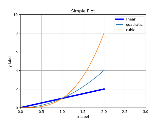
基本的画图
import matplotlib.pyplot as plt
import numpy as np
# 设置 x 轴的坐标
x = np.linspace(0, 2, 100)
# 画图
plt.plot(x, x, label='linear', color='blue', linewidth=4.0, linestyle='-')
plt.plot(x, x**2, label='quadratic')
plt.plot(x, x**3, label='cubic')
# 指定现实范围
plt.axis([0, 3, 0, 10])
# 或者
# plt.xlim(0, 3)
# plt.ylim(0, 10)

# 显示grid
plt.grid(True)
# 标注x,y轴
plt.xlabel('x label')
plt.ylabel('y label')
# 添加标题
plt.title("Simple Plot")
# 添加图例
plt.legend()
# 展示
plt.show()
另外一种画图方式:
import numpy as np
import matplotlib.pyplot as plt

# evenly sampled time at 200ms intervals
t = np.arange(0., 5., 0.2)

# red dashes, blue squares and green triangles
plt.plot(t, t, 'r--', t, t**2, 'bs', t, t**3, 'g^')
plt.show()

画多子图
参考 1:
from matplotlib.ticker import NullFormatter  # useful for `logit` scale
import matplotlib.pyplot as plt
import numpy as np
# Fixing random state for reproducibility
np.random.seed(19680801)

# make up some data in the interval ]0, 1[
y = np.random.normal(loc=0.5, scale=0.4, size=1000)
y = y[(y > 0) & (y < 1)]
y.sort()
x = np.arange(len(y))

# plot with various axes scales
plt.figure(1)

# linear
plt.subplot(221)
plt.plot(x, y)
plt.yscale('linear')
plt.title('linear')
plt.grid(True)

# log
plt.subplot(222)
plt.plot(x, y)
plt.yscale('log')
plt.title('log')
plt.grid(True)


# symmetric log
plt.subplot(223)
plt.plot(x, y - y.mean())
plt.yscale('symlog', linthreshy=0.01)
plt.title('symlog')
plt.grid(True)

# logit
plt.subplot(224)
plt.plot(x, y)
plt.yscale('logit')
plt.title('logit')
plt.grid(True)
# Format the minor tick labels of the y-axis into empty strings with
# `NullFormatter`, to avoid cumbering the axis with too many labels.
plt.gca().yaxis.set_minor_formatter(NullFormatter())
# Adjust the subplot layout, because the logit one may take more space
# than usual, due to y-tick labels like "1 - 10^{-3}"
plt.subplots_adjust(top=0.92, bottom=0.08, left=0.10, right=0.95, hspace=0.25,
                    wspace=0.35)

plt.show()

参考 2:
import matplotlib.pyplot as plt
import numpy as np

np.random.seed(19680801)
data = np.random.randn(2, 100)

fig, axs = plt.subplots(2, 2, figsize=(5, 5))
axs[0, 0].hist(data[0])
axs[1, 0].scatter(data[0], data[1])
axs[0, 1].plot(data[0], data[1])
axs[1, 1].hist2d(data[0], data[1])

plt.show()

关于axes
可以在一个图中任意位置画图

import matplotlib.pyplot as plt
import numpy as np

# Create a new figure of size 8x6 points, using 100 dots per inch
plt.figure(figsize=(8,6), dpi=80)

X = np.linspace(-np.pi, np.pi, 256,endpoint=True)
C, S, T = np.cos(X), np.sin(X), np.tan(X)
# 设置子图原点和宽高
plt.axes([0.0, 0.0, 0.6, 0.6])
plt.plot(X, C, label='cos', color='blue', linewidth=1.0)
plt.axes([0.2,0.2,.6,.6])
plt.plot(X, S, label='sin',  color='red', linewidth=4.0)
plt.axes([0.4,0.4,.6,.6])
plt.plot(X, T, label='tan',  color='green', linewidth=6.0)
plt.show()

https://matplotlib.org/tutorials/introductory/sample_plots.html#sphx-glr-tutorials-introductory-sample-plots-py
http://www.labri.fr/perso/nrougier/teaching/matplotlib/#quick-references
https://matplotlib.org/tutorials/index.html