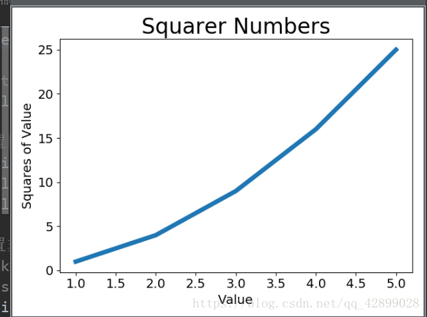
一、绘制一个简单的折线图
import matplotlib.pyplot as plt
# 提供一些输入值  也可以随意输入一些数字
intput_values = [1, 2, 3, 4, 5]
squares = [1, 4, 9, 16, 25] #输入值的平方值
plt.plot(input_value, squares, linewidth=5) #把值传入plot,从而绘制成折线图 linewidth表示线条的粗细

plt.title("Squares Numbers", fontsize=24) #设置图表标题
#给坐标轴添上标签
plt.xlabel("Value", fontsize=14)
plt.ylabel("Value of squares", fontsize=14)
#设置刻度标记的大小
plt.tick_params(axis='both', labelsize=14)#axis='both'影响xy轴上的刻度
# 最后用show方法把图表可视化出来
plt.show()
如图