绘制折线图:参考https://baijiahao.baidu.com/s?id=1608586625622704613
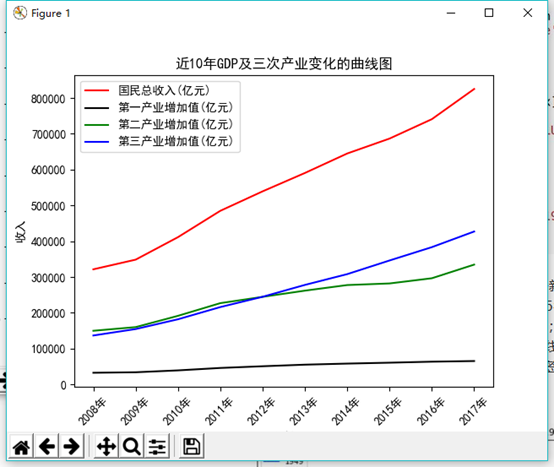
          (3)近10年GDP变化的曲线图,及三次产业GDP变化的曲线图。
数据:
[['指标', '2017年', '2016年', '2015年', '2014年', '2013年', '2012年', '2011年', '2010年', '2009年', '2008年'], ['国民总收入(亿元)', 824828.4, 740598.7, 686449.6, 644791.1, 590422.4, 539116.5, 484753.2, 411265.2, 348498.5, 321500.5], ['国内生产总值(亿元)', 827121.7, 743585.5, 689052.1, 643974.0, 595244.4, 540367.4, 489300.6, 413030.3, 349081.4, 319515.5], ['第一产业增加值(亿元)', 65467.6, 63672.8, 60862.1, 58343.5, 55329.1, 50902.3, 46163.1, 39362.6, 34161.8, 32753.2], ['第二产业增加值(亿元)', 334622.6, 296547.7, 282040.3, 277571.8, 261956.1, 244643.3, 227038.8, 191629.8, 160171.7, 149956.6], ['第三产业增加值(亿元)', 427031.5, 383365.0, 346149.7, 308058.6, 277959.3, 244821.9, 216098.6, 182038.0, 154747.9, 136805.8], ['人均国内生产总值(元)', 59660.0, 53935.0, 50251.0, 47203.0, 43852.0, 40007.0, 36403.0, 30876.0, 26222.0, 24121.0]]
def fun3():
    print(read_excel(r'gdp.xlsx'))
    gdp = read_excel(r'gdp.xlsx')
    color = iter(["red", "black", "green", "blue","yellow"])
    plt.rcParams['font.sans-serif'] = ['SimHei']
    plt.rcParams['axes.unicode_minus'] = False

    for i in range(len(gdp)):
        gdp[i].reverse()

    plt.plot(gdp[0][0:10], gdp[1][0:10], c=next(color), label=gdp[1][10])

    cou = [3, 4, 5]
    for i in cou:
        label = str(gdp[i][10])
        print(label)
        plt.plot(gdp[i][0:10], c=next(color), label=label)

    plt.legend(loc="upper left")
    plt.xticks(rotation=45)
    plt.xlabel("年份")
    plt.ylabel("收入")
    plt.title("近10年GDP及三次产业变化的曲线图")
    plt.show()