版权声明:转载须标明地址 https://blog.csdn.net/AnonymKing/article/details/85338016
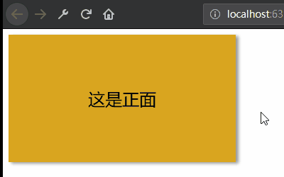
效果图:
<!DOCTYPE html>
<html lang="zh">
<head>
    <meta charset="UTF-8">
    <title>CSS旋转效果</title>
    <style>
        html, body {
            width: 100%;
            height: 100%;
        }

        /*设置外中内三层div的大小一致*/
        .container, .item, .page {
            width: 320px;
            height: 180px;
            line-height: 180px;
            text-align: center;
            font-size: 24px;
        }

        .item {
            /*设置中间层旋转时的动画效果*/
            transition: all .4s ease;
        }

        .page {
            /*配合旋转动画*/
            transition: .4s;
            background-color: goldenrod;
            box-shadow: 4px 2px 4px #999;
        }

        .front {
            opacity: 1;
        }

        .back {
            /*设置位置与正面重合*/
            position: absolute;
            top: 0;
            left: 0;
            /*设置透明 预先旋转180deg*/
            opacity: 0;
            transform: rotateY(180deg);
        }

        .container:hover .item{
            transform: rotateY(180deg);
        }

        .container:hover .front{
            opacity: 0;
        }

        .container:hover .back{
            opacity: 1;
        }
    </style>
    <link rel="manifest" href="./static/manifest.json" />
    <script src="./static/js/sw-server.js"></script>
</head>
<body>

<div class="container">
    <div class="item">
        <div class="page front">这是正面</div>
        <div class="page back">这是反面</div>
    </div>
</div>
</body>
</html>