- 基本概念:标准模型和IE模型
- css如何设置这两种模型
- JS如何设置获取盒模型对应的宽和高
- 实例题(根据盒模型解释边距重叠)
- BFC(边距重叠解决方案)
基本概念
1.盒模的组成:
content,padding,border,margin
2.两种盒模型:一个是标准盒模型,一个是IE的怪异模型。
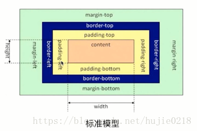
标准模型
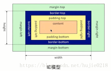
IE的怪异模型
盒模型的宽和高:内容(content)的宽高
IE模型的宽和高:内容(content)+填充(padding)+边框(border)的总宽高
css如何设置两种模型
这里用到了css3的属性box-sizing
/* 标准模型 */
box-sizing:content-box;

 /*IE模型*/
box-sizing:border-box;
JS获取宽高
通过JS获取盒模型对应的宽盒高,有以下几种方法:
1、 dom.style.width/height
这种方式只能取到dom元素内联样式所设置的宽高,也就是说如果该节点的样式是在style标签中或外联的CSS文件中设置的话,通过这种方法是获取不到dom的宽高的。
2、dom.currentStyle.width/height
这种方式获取的是在页面渲染完成后的结果,就是说不管是哪种方式设置的样式,都能获取到。但这种方式只有IE浏览器支持。
3、dom.getBoundingClientRect().width/height
这种方式是根据元素在视窗中的绝对位置来获取宽高的
4、window.getComputedStyle(dom).width/height
这种方式的原理和2是一样的,这个可以兼容更多的浏览器,通用性好一些。
5、dom.offsetWidth/offsetHeight
这个就没什么好说的了,最常用的,是兼容最好的。
边距重叠
什么是边距重叠
如下图,父元素没有设置margin-top,而子元素设置了margin-top: 20px;可以看出,父元素也一起有了边距。
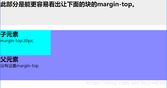
上图的代码
<!DOCTYPE html>
<html lang="en">
<head>
    <meta charset="UTF-8">
    <title>Document</title>
    <style>
        *{
            margin:0;
            padding:0;
        }
        .demo{
            height:100px;
            background: #eee;
        }
        .parent{
            height:200px;
            background: #88f;
        }
        .child{
            height:100px;
            margin-top:20px;
            background: #0ff;
            width:200px;
        }
    </style>
</head>
<body>
    <section class="demo">
        <h2>此部分是能更容易看出让下面的块的margin-top。</h2>
    </section>
    <section class = "parent">
        <article class="child">
            <h2>子元素</h2>
            margin-top:20px;
        </article>
        <h2>父元素</h2>
            没有设置margin-top
    </section>
</body>
</html>
边距重叠解决方案(BFC)
首先要明确BFC是什么意思,其全英文拼写为 Block Formatting Context 直译为“块级格式化上下文”
BFC的原理
内部的box会在垂直方向,一个接一个的放置
每个元素的margin box的左边,与包含块border box的左边相接触(对于从做往右的格式化,否则相反)
box垂直方向的距离由margin决定,属于同一个bfc的两个相邻box的margin会发生重叠
bfc的区域不会与浮动区域的box重叠
bfc是一个页面上的独立的容器,外面的元素不会影响bfc里的元素,反过来,里面的也不会影响外面的
计算bfc高度的时候,浮动元素也会参与计算
怎么取创建bfc
float属性不为none(脱离文档流)
position为absolute或fixed
display为inline-block,table-cell,table-caption,flex,inine-flex
overflow不为visible
根元素
应用场景
自适应两栏布局
清除内部浮动
防止垂直margin重叠
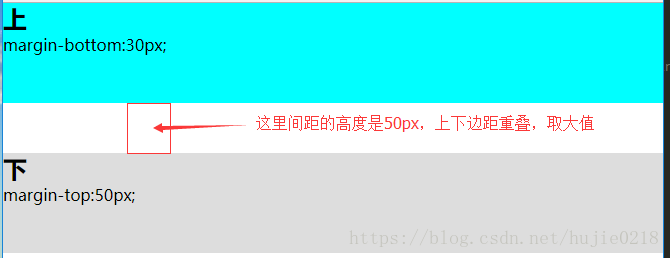
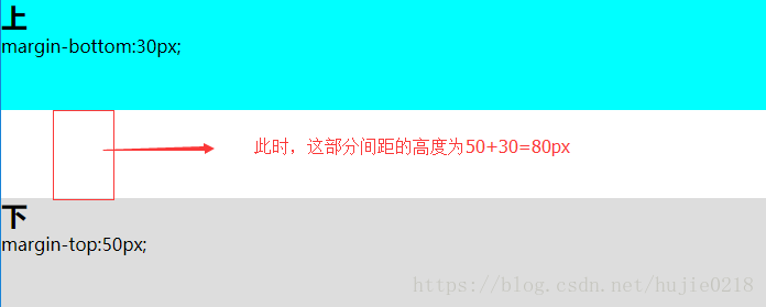
看一个垂直margin重叠例子
<!DOCTYPE html>
<html lang="en">
<head>
    <meta charset="UTF-8">
    <title>Document</title>
    <style>
        *{
            margin:0;
            padding:0;
        }
        .top{
            background: #0ff;
            height:100px;
            margin-bottom:30px;
        }
        .bottom{
            height:100px;
            margin-top:50px;
            background: #ddd;
        }
    </style>
</head>
<body>
    <section class="top">
        <h1>上</h1>
        margin-bottom:30px;
    </section>
    <section class="bottom">
        <h1>下</h1>
        margin-top:50px;
    </section>
</body>
</html>
效果图
用bfc可以解决垂直margin重叠的问题
关键代码
<section class="top">
        <h1>上</h1>
        margin-bottom:30px;
    </section>
    <!-- 给下面这个块添加一个父元素,在父元素上创建bfc -->
    <div style="overflow:hidden">
        <section class="bottom">
            <h1>下</h1>
            margin-top:50px;
        </section>
    </div>
效果图
关于bfc的应用的案例这里就不在一一举出了,大家去网上找一些其他的文章看一下。