1.帮助文档
http://echarts.caixin.com/doc/doc.html#DataZoom
2.柱状图
1.设置透明
color: ['rgba(0,0,0,0)', 'rgba(0,0,0,0)', 'rgba(0,0,0,0)', 'rgba(0,0,0,0)', 'rgba(0,0,0,0)', '#60C0DD'],
注意'rgba(0,0,0,0)' 带引号
2.X轴和Y轴类型
type: 'value', //数值
type: 'category', //字符
柱状图只有一个可以是字符,那么要使得2个都是现实成字符该怎么做呢?
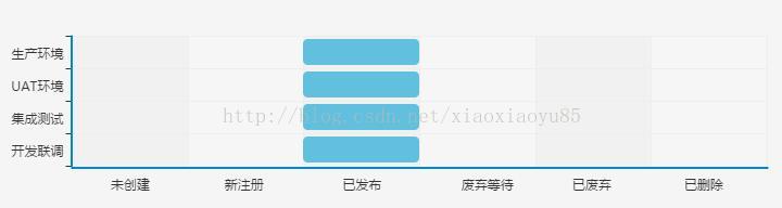
Y轴类型是category,X轴是value,使用formatter的回调函数,进行转换,(Y轴同理,使用\n进行字符位置调整),注意max:3000是最大X轴长度,如果不设置,那么X轴的刻度可能会变化
xAxis: [{
type: 'value',
splitLine: {
show: true
},
splitNumber: 6,
max: 3000,
axisLabel: {
formatter: function(value) {
if(0 == value) {
return ""
}
if(500 == value) {
return "未创建 "
}
if(1000 == value) {
return "新注册 "
}
if(1500 == value) {
return "已发布 "
}
if(2000 == value) {
return "废弃等待 "
}
if(2500 == value) {
return "已废弃 "
}
if(3000 == value) {
return "已删除 "
}
return " ";
}
},
}],
3.修改选中高亮的颜色
itemStyle: {
normal: {
label: {
show: false,
position: 'insideRight'
}
},
//高亮,
emphasis: {
color: 'rgba(0,0,0,0)'
}
},
4.dataZoom
5.使用echars
require.config({
paths: {
echarts: 'http://echarts.baidu.com/build/dist'
}
});
require(
[
'echarts',
'echarts/chart/line' // 使用柱状图就加载bar模块,按需加载
],
function(ec) {
//option写这里
var myChart = ec.init(document.getElementById('apiNumChangeImg'), 'macarons');
myChart.setOption(option);
}
);