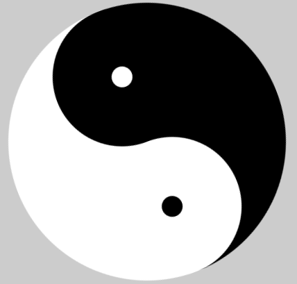
border的功能真的不容小觑,可以实现一些意想不到的特殊符号。今天就用border实现正方形继而实现旋转的八卦图
先上个效果图
<!doctype html>
<html lang="en">
	<head>
		<meta charset="UTF-8">
		<meta name="Generator" content="EditPlus®">
		<meta name="Author" content="ydj">
		<meta name="Keywords" content="">
		<meta name="Description" content="">
		<title>旋转的八卦图</title>
		<style type="text/css">
			*{margin:0;padding:0;}
			ul,ol{list-style:none;}
			a{text-decoration:none;}
			img{boder:0;}
			body{
                overflow:hidden;
				background-color: #ccc;
			}
			.content{
				position: relative;
				width:400px;
				height:200px;
				margin:100px auto;
				border-bottom:200px solid #000;
				border-radius:50%;
				background-color: #fff;
				animation:run 4s linear infinite;
			}
			.content:before,.content:after{
				position:absolute;
				content:"";
				width:30px;
				height:30px;
				border-width:85px;
				border-style:solid;
				border-radius:50%;
			}
			.content:after{
				bottom:-100px;
				border-color:white;
				background-color: black;
			}
			.content:before{
				bottom:-100px;
				right:0;
				background-color: white;
			}
			@keyframes run{
				from{
					transform:rotate(360deg);
				}
				to{
					transform:rotate(0deg);
				}

			};
		</style>
	</head>
	<body>
		<div class="content">
		</div>
	</body>
</html>