自定义button组件,(在cube组件库的基础上再次封装)
MButton.vue
<template>
  <div class="button">
    <cube-button class="selfbtn" primary>
      <slot>{{ text }}</slot>
    </cube-button>
  </div>
</template>

<script>
export default {
  name: 'MButton',
  props: {
    text: String
  }
}
</script>
<!-- Add "scoped" attribute to limit CSS to this component only -->
<style scoped>
.selfbtn{
  width: 90%;
  margin: 30px auto 0 auto;
  border-radius: 8px;
  font-size: 20px;
}
</style>
考虑到这种按钮每个页面都有用到,可以在main.js中引入
import MButton from '@/components/common/MButton.vue'

Vue.component(MButton.name, MButton)
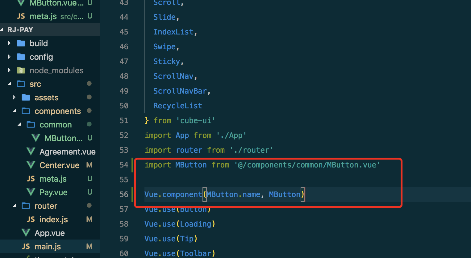
注意:
1,组件引入的位置是在cube-ui的后面;
2,原本也是用Vue.use(MButton),这样会出错,所以换成Vue.component(MButton.name, MButton)就没有问题了
在使用的页面中就可以直接用了
<m-button @click.native="nextFn">下一步</m-button>
注意:
给vue组件绑定事件时候,必须加上native ,不然不会生效(监听根元素的原生事件,使用 .native 修饰符)