一
效果:
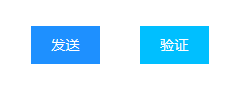
代码:
login-bottom为div,实际可以去掉直接用类来标明button
.login-bottom input[type="button"] {
	font-size: 0.9em;
	color: #fff;
	background: deepskyblue;
	outline: none;
	border: none;
	cursor: pointer;
	padding: 10px 20px;
	-webkit-appearance: none;
}

.login-bottom input[type="button"]:hover {
	background: dodgerblue;
	color: #ffffff;
	transition: 0.5s all ease;
	-webkit-transition: 0.5s all ease;
	-moz-transition: 0.5s all ease;
	/*-- w3layouts --*/
	-o-transition: 0.5s all ease;
	-ms-transition: 0.5s all ease;
}
二
效果:
代码:
<input type="button" class="rount_button blue"/>
.round_button {
	border: 1px solid;
	font: bold 12px/25px Arial, sans-serif;
	text-align: center;
	font-size: 20px;
	width: 60px;
	height: 35px;
	border-radius: 15px;
}

.blue {
	color: dodgerblue;
	background: white;
}

.round_button:hover {
	-webkit-box-shadow: 1px 1px 1px rgba(0, 0, 0, .3), inset 0px 0px 2px
		rgba(0, 0, 0, .5);
	-moz-box-shadow: 1px 1px 1px rgba(0, 0, 0, .3), inset 0px 0px 2px
		rgba(0, 0, 0, .5);
	box-shadow: 1px 1px 1px rgba(0, 0, 0, .3), inset 0px 0px 2px
		rgba(0, 0, 0, .5);
}

.round_button:active {
	-webkit-box-shadow: inset 0px 0px 3px rgba(0, 0, 0, .7);
	-moz-box-shadow: inset 0px 0px 3px rgba(0, 0, 0, .7);
	box-shadow: inset 0px 0px 3px rgba(0, 0, 0, .7);
}