圣杯布局与双飞翼布局的前半部分是相同的:
1)middle、left、right三栏全部浮动(float:left);
2)middle中间栏放在文档流前优先渲染(因为浮动元素会把块级元素的位置空出来);
3)footer元素中要用clear:both;清除浮动;
4)middle中间栏的宽度设为100%;left的margin-left应为-100%;right的margin-left应为-right元素的宽;
此时中间部分(middle)的内容会被左右遮挡,解决这个问题,圣杯布局与双飞翼布局的方法是不同的:
圣杯布局:
1)将left、middle、right放置在一个div中(class='bd');
2)将div的padding-left设为left元素的宽,padding-right设为right元素的宽;
2)此时left、right的位置也会发生改变,需要将其设为相对位置(position:relative),通过设置left或right属性移动元素;
双飞翼布局:
1)将middle中的内容放置在一个div(class='mi_ct')中;
2)将这个div的margin-left设置为left元素的宽,margin-right设置为right元素的宽;
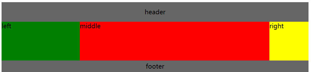
一、圣杯布局
1 <div class="hd">header</div>
2     <div class="bd">
3         <!--middle放在最前面-->
4         <div class="mi">middle</div>
5         <div class="le">left</div>
6         <div class="ri">right</div>
7     </div>
8 <div class="footer">footer</div>
 1     /*header头部*/
 2      .hd {
 3              background-color: #666;
 4              /*内容居中*/
 5              display: flex;
 6              justify-content: center;
 7              align-items: center;
 8              height: 50px;
 9          }
10          /*footer尾部*/
11          .footer {
12              background-color: #666;
13              display: flex;
14              justify-content: center;
15              align-items: center;
16              height: 30px;
17              /*清除浮动*/
18              clear: both;
19          }
20          /*放置left、right、middle*/
21          .bd {
22              padding: 0 100px 0 200px;
23          }
24          /*middle部分*/
25          .mi {
26              background-color: red;
27              float: left;
28              width: 100%;
29              height: 100px;
30          }
31          /*left部分*/
32          .le {
33              background-color: green;
34              float: left;
35              margin-left: -100%;
36              width: 200px;
37              position: relative;
38              left: -200px;
39              height: 100px;
40          }
41          /*right部分*/
42          .ri {
43              background-color: yellow;
44              float: left;
45              margin-left: -100px;
46              width: 100px;
47              position: relative;
48              right: -100px;
49             height: 100px;
50          }
二、双飞翼布局
1 <div class="hd">header</div>
2     <div class="bd">
3         <!--middle放在最前面,中间用div放置内容-->
4         <div class="mi"><div class="mi_ct">middle</div></div>
5         <div class="le">left</div>
6         <div class="ri">right</div>
7     </div>
8 <div class="footer">footer</div>
 1     .hd {
 2             background-color: #666;
 3             display: flex;
 4             justify-content: center;
 5             align-items: center;
 6             height: 50px;
 7         }
 8         .footer {
 9             background-color: #666;
10             display: flex;
11             justify-content: center;
12             align-items: center;
13             height: 30px;
14             clear: both;
15         }
16         .mi {
17             background-color: red;
18             float: left;
19             width: 100%;
20             height: 100px;
21         }
22         /*放置内容部分*/
23         .mi_ct {
24             margin-left: 200px;
25             margin-right: 100px;
26         }
27         .le {
28             background-color: green;
29             float: left;
30             margin-left: -100%;
31             width: 200px;
32             height: 100px;
33         }
34         .ri {
35             background-color: yellow;
36             float: left;
37             margin-left: -100px;
38             width: 100px;
39             height: 100px;
40         }
三、flex布局实现
1) 需在外部用一个div(class='contan')放置所有内容,display设为flex,并且可换行flex-wrap:wrap;
2)头部、尾部宽度为100%,将中间部分(bd)挤到中间;
3)中间(bd)宽度也为100%,display设为flex,使其中内容为三栏布局(left、right宽度固定,中间middle自适应(flex:1));
 1 <div class="contain">
 2     <div class="hd">header</div>
 3     <div class="bd">
 4         <div class="le">left</div>
 5         <!--需按顺序排列,middle不在最前面-->
 6         <div class="mi">middle</div>
 7         <div class="ri">right</div>
 8     </div>
 9     <div class="footer">footer</div>
10 </div>
 1     .contain {
 2             display: flex;
 3             flex-wrap: wrap;
 4             height: 300px;
 5         }
 6         .hd {
 7             background-color: #666;
 8             width: 100%;
 9             height: 15%;
10             display: flex;
11             justify-content: center;
12             align-items: center;
13         }
14         .footer {
15             background-color: #666;
16             width: 100%;
17             height: 10%;
18             display: flex;
19             justify-content: center;
20             align-items: center;
21         }
22         .bd {
23             display: flex;
24             width: 100%;
25             height: 75%;
26         }
27         .mi {
28             background-color: red;
29             flex: 1;
30             display: flex;
31             justify-content: center;
32             align-items: center;
33         }
34         .le {
35             background-color: green;
36             width: 200px;
37             display: flex;
38             justify-content: flex-start;
39             align-items: center;
40         }
41         .ri {
42             background-color: yellow;
43             width: 100px;
44             display: flex;
45             justify-content: flex-end;
46             align-items: center;
47         }