逛了很多文章的总结,相当于一个大汇总,将我主要参考的人放在链接里有大神颜海镜和大神张鑫旭
一、先写一下基础的代码
<!DOCTYPE html>
<html lang="en">
<head>
<meta charset="UTF-8">
<title>Title</title>
<style>
.father{
/*基础代码*/
border:2px solid red;
width:200px;
height:200px;
}
.son{
/*基础代码*/
background-color: yellow;
}
.size{
width:100px;
height: 100px;
}
</style>
</head>
<body>
<div class="father">
<div class="son size">子元素</div>
</div>
</body>
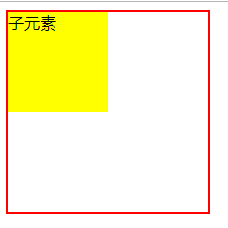
</html>其中的.size是来讨论当子元素有无宽高的解决方法,效果如下:
二、先讨论不定宽高的子元素的居中问题:
方法一:absolute+负margin(这也是我在自学过程中遇到的最多的一种方式)
html代码同上面的基础代码一样,就不写了,写一下css代码:
<style>
        .father{
            /*基础代码*/
            border:2px solid red;
            width:200px;
            height:200px;

            /*不同部分*/
            position:relative;
        }
        .son{
            /*基础代码*/
            background-color: yellow;

            /*不同部分*/
            position: absolute;
            top:50%;
            left:50%;
            margin-left: -50px;/*子元素宽度的一半*/
            margin-top: -50px;/*子元素高度的一半*/
        }
        .size{
            width:100px;
            height: 100px;
        }
</style>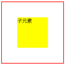
注意点 :要知道子元素的宽高
方法二:absolute + margin:auto (这个我在自学过程中遇到的次数也很多)
html代码也是基础代码就不写了,写下css代码
<style>
        .father{
            /*基础代码*/
            border:2px solid red;
            width:200px;
            height:200px;

            /*不同部分*/
            position:relative;
        }
        .son{
            /*基础代码*/
            background-color: yellow;

            /*不同部分*/
            position: absolute;
            top:0;
            left:0;
            right:0;
            bottom:0;
            margin:auto;
        }
        .size{
            width:100px;
            height: 100px;
        }
    </style>
注意:要知道子元素的宽高
方法三:absolute+calc(其实我的理解这种和第一种差不多)
html代码和基础代码一样就不写了,接下来写css
<style>
        .father{
            /*基础代码*/
            border:2px solid red;
            width:200px;
            height:200px;

            /*不同部分*/
            position:relative;
        }
        .son{
            /*基础代码*/
            background-color: yellow;

            /*不同部分*/
            position: absolute;
            top:calc(50% - 50px);
            left:calc(50% - 50px);
        }
        .size{
            width:100px;
            height: 100px;
        }
    </style>
注意:要知道子元素的宽高,还有就是减号左右要有空格,不然可能出不来效果
二、接下来说不需要知道子元素的宽高的解决方法
既然不需要知道子元素的宽和高,那就将html中的.size去掉
<div class="father">
   <div class="son">子元素</div>
</div>
<style>
.father{
/*基础代码*/
border:2px solid red;
width:200px;
height:200px;
/*不同部分*/
position:relative;
}
.son{
/*基础代码*/
background-color: yellow;
/*不同部分*/
position: absolute;
top:50%;
left:50%;
transform:translate(-50%,-50%);
}
</style>因为都是解决的水平垂直居中问题,所以效果图都是一样的,下面就不截图展示了,如果不放心,大家可以自己动手敲一下代码验证一下。
transform是css3中增加的,没看过的小伙伴可以去阅读一下css3,translate(x,y)指在x轴,y轴的2d移动。
方法二:line-height
html代码依旧是不带.size
<style>
        .father{
            /*基础代码*/
            border:2px solid red;
            width:200px;
            height:200px;

            /*不同部分*/
            line-height: 200px;
            text-align: center;
            font-size: 0px;
        }
        .son{
            /*基础代码*/
            background-color: yellow;

            /*不同部分*/
            font-size: 16px;
            display: inline-block;
            vertical-align: middle;
            line-height: initial;/*默认*/
            text-align: left;
        }
</style>
注意:将子元素vertical-align: middle;是将一个行内元素垂直居中
方法三:利用table特性
<!DOCTYPE html>
<html lang="en">
<head>
    <meta charset="UTF-8">
    <title>Title</title>
    <style>
        .father{
            /*基础代码*/
            border:2px solid red;
            width:200px;
            height:200px;

            /*不同部分*/
            text-align: center;
        }
        .son{
            /*基础代码*/
            background-color: yellow;

            /*不同部分*/
            display: inline-block;
        }
    </style>
</head>
<body>
    <table>
        <tbody>
        <tr>
            <td class="father">
                <div class="son">子元素</div>
            </td>
        </tr>
        </tbody>
    </table>
</body>
</html>
这个table元素特有的性质:tabel单元格中的内容天然就是垂直居中的,只要添加一个水平居中属性就好了,这种解决方法不得当,因为会造成代码的冗余。
方法四:利用给父元素设置display:table-cell
<!DOCTYPE html>
<html lang="en">
<head>
    <meta charset="UTF-8">
    <title>Title</title>
    <style>
        .father{
            /*基础代码*/
            border:2px solid red;
            width:200px;
            height:200px;

            /*不同部分*/
            display: table-cell;
            text-align: center;
            vertical-align: middle;
        }
        .son{
            /*基础代码*/
            background-color: yellow;

            /*不同部分*/
            display: inline-block;
        }
    </style>
</head>
<body>
    <div class="father">
        <div class="son">子元素</div>
    </div>
</body>
</html>
其实这个方法和上一个是一个思路,只是这个就不会造成代码的冗余
方法五:flex
<!DOCTYPE html>
<html lang="en">
<head>
    <meta charset="UTF-8">
    <title>Title</title>
    <style>
        .father{
            /*基础代码*/
            border:2px solid red;
            width:200px;
            height:200px;

            /*不同部分*/
            display: flex;
            justify-content: center;/*水平*/
            align-items: center;/*垂直*/
        }
        .son{
            /*基础代码*/
            background-color: yellow;
        }
    </style>
</head>
<body>
    <div class="father">
        <div class="son">子元素</div>
    </div>
</body>
</html>
方法六:grid
<!DOCTYPE html>
<html lang="en">
<head>
    <meta charset="UTF-8">
    <title>Title</title>
    <style>
        .father{
            /*基础代码*/
            border:2px solid red;
            width:200px;
            height:200px;

            /*不同部分*/
            display: grid;
        }
        .son{
            /*基础代码*/
            background-color: yellow;

            /*不同部分*/
            align-self: center;
            justify-self: center;
        }
    </style>
</head>
<body>
    <div class="father">
        <div class="son">子元素</div>
    </div>
</body>
</html>