常见的头部固定,左侧边栏固定,只是右侧内容变化的这种布局方式是我们经常用到的。
一起来看看吧。
-
html文件
<!DOCTYPE html> <html lang="en"> <head> <meta charset="UTF-8"> <title></title> </head> <body> <!-- 头部 --> <div class="top">头部区域</div> <!-- 内容 --> <div class="content"> <!-- 左侧边栏 --> <ul class="nav"> <li> <a href="page1.html" target="showBox">页面一</a> <a href="page2.html" target="showBox">页面二</a> <a href="page3.html" target="showBox">页面三</a> <a href="page4.html" target="showBox">页面四</a> <a href="page5.html" target="showBox">页面五</a> </li> </ul> <!-- 右侧显示部分 --> <iframe src="page1.html" name="showBox"></iframe> </div> </body> </html> -
css文件
*{ margin: 0; padding: 0; } html,body{ width: 100%; height: 100%; } .top{ width: 100%; height: 100px; background: #323437; border-bottom: 1px solid gray; text-align: center; line-height: 100px; color: #fff; font-size: 20px; } .content{ width: 100%; height: calc(100% - 101px); display: flex; } .nav{ width: 200px; height: 100%; background: #323437; } iframe{ flex: 1; height: 100%; background: #212224; margin: 0; border: 0; } ul li a{ display: block; color: #fff; text-decoration: none; font-size: 20px; text-align: center; padding: 20px 0; } -
页面分为上下两个板块,头部高度固定,宽度占全屏,内容区域通过计算属性 calc计算得出全屏减去头部的高度所剩的大小,然后就是下面内容部分的大小,内容部分采用弹性盒,分为左侧边栏和右边显示部分,左侧边栏固定宽度,右侧占剩余全部大小。右侧显示部分采用iframe框,通过a标签的href指向iframe的name值,这样a标签跳转的页面就能显示在iframe框里。而iframe的src是其实状态要显示的页面。
-
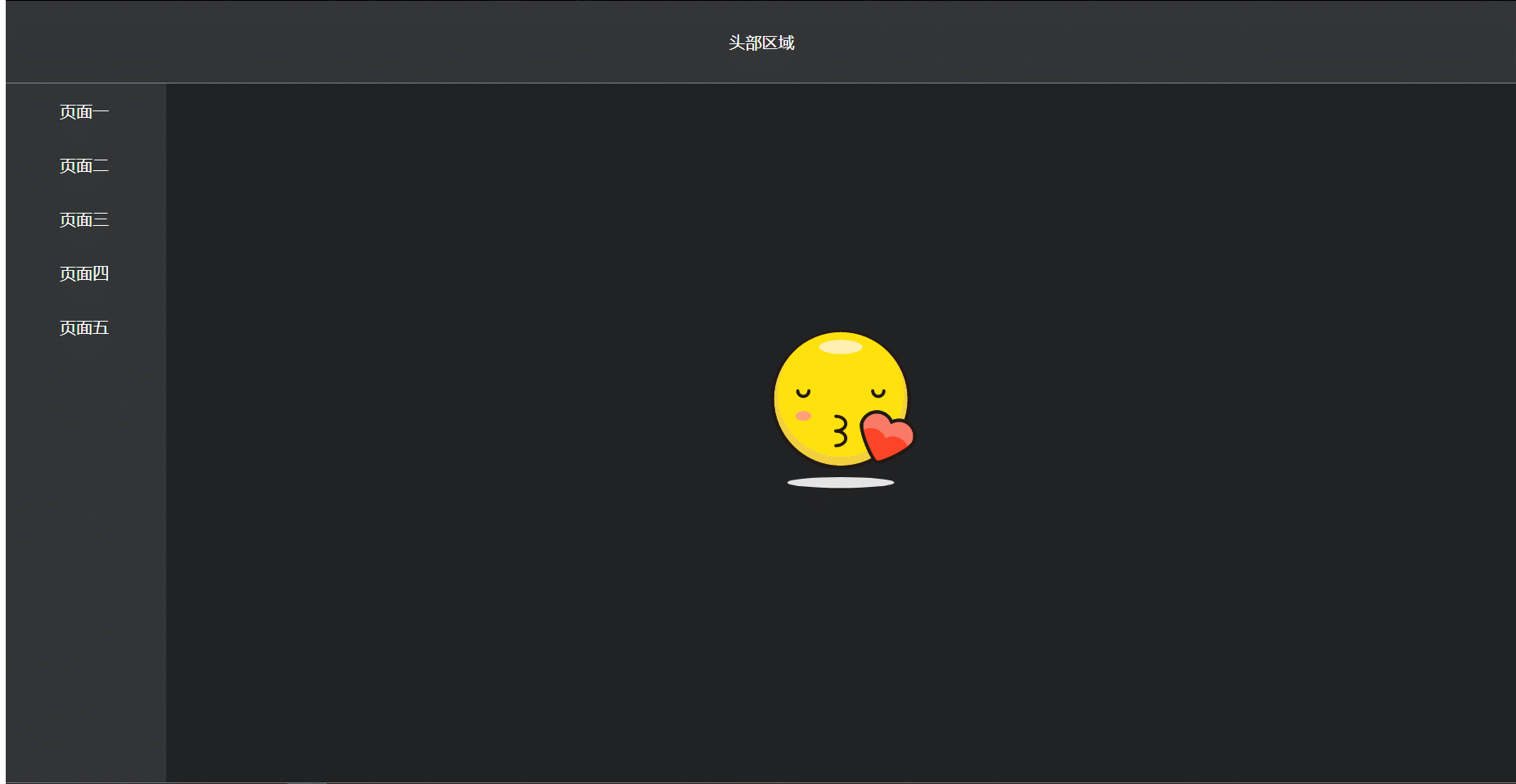
而各个子页面只是放置了简单的图片,即在内容区域需要显示的部分。例如页面一中:

-
-
CSS calc() 函数
-
calc() 函数用于动态计算长度值。
-
需要注意的是,运算符前后都需要保留一个空格,例如:width: calc(100% - 10px);
-
任何长度值都可以使用calc()函数进行计算;
-
calc()函数支持 “+”, “-”, “*”, “/” 运算;
-
calc()函数使用标准的数学运算优先级规则;
-
-
支持版本:CSS3
-
原文:https://blog.csdn.net/qq_43363884/article/details/89466470