css 揭秘
[希]Lea verou 著
css 魔法 译
该书涵盖7大主题,47个css技巧,是css进阶必备书籍,开阔思路,探寻更优雅的解决方案。这本书完全用css渲染出的html写成的(布局、图片、颜色、页码、章节号等)。
涵盖7大主题
- 背景与边框
- 形状
- 视觉效果
- 字体排印
- 用户体验
- 结构与布局
- 过渡与动画
资料
- 书籍注解
- Lea verou博客
- Lea verou github
- O'Reilly的HTMLBook标准
- Atlas 将css用于书籍排印
- Dabblet 在线演示
- 本书在Espresso编辑器写成
- csssecrets all demos
浏览器支持与回退机制
- 提供及时有效的浏览器兼容信息的网站:
浏览器前缀书写:应该把标准语法排在最后,通过层叠机制确保哪条声明最终生效。
tip: 浏览器前缀生成工具:background: rgb(255, 128, 0); /* 回退机制 */ background: -moz-linear-gradient(90deg, yellow, red); /* 火狐 */ background: -o-linear-gradient(90deg, yellow, red); /* Opera */ background: -webkit-linear-gradient(90deg, yellow, red); /* Safari、Chrome*/ background: linear-gradient(0deg, yellow, red);- Autoprefixer:根据 Can i use 数据库判断添加前缀,本地编译。
- 作者开发的-prefix-free:在浏览器中进行特性检测,不需要更新,在真实环境中跑出来的结果。
使用Modernizr工具给根元素()添加辅助类,比如
textshadow或no-textshadow,针对支持或不支持某些特性的浏览器来分别编写样式h1 { color: gray; } .textshadow h1 { color: transparent; text-shadow: 0 0 .3em gray; }尝试的 css 特性非常新,可以试试 @supports 规则实现回退,将其视作浏览器“原生”的 Modernizr。
h1 { color: gray; }

@supports (text-shadow: 0 0 .3em gray) {
  h1 {
    color: transparent;
    text-shadow: 0 0 .3em gray;
  }
}
tip: 慎用 @supports, 存在兼容性
js 实现:做一些特性检测然后给根元素加一些辅助类。如果要检测某个样式属性是否被支持,核心思路就是在任一元素的 element.style 对象上检查该属性是否存在。
var root = document.documentElement; // <html>
if ('textShadow' in root.style) {
  root.classList.add('textshadow');
} else {
  root.classList.add('no-textshadow');
}

// 多个
function testProperty (property) {
  var root = document.documentElement; // <html>
  if (property in root.style) {
    root.classList.add(property.toLowerCase());
    return true;
  }
  root.classList.add('no-' + property.toLowerCase());
  return false;
}
检查某个具体的属性值是否支持,需要把它赋给对应的属性,然后再检查浏览器是否还保存着这个值。
var dummy = document.createElement('p');
dummy.style.backgroundImage = 'linear-gradient(red, tan)';

if (dummy.style.backgroundImage) {
  root.classList.add('lineargradients');
} else {
  root.classList.add('no-lineargradients');
}

// 多个
function testValue(id, value, property) {
  var dummy = document.createElement('p');
  dummy.style[property] = value;

  if (dummy.style[property]) {
    root.classList.add(id);
    return true;
  }
  root.classList.add('no-' + id);
  return false;
}
关于 web 标准
标准的每项规范从最初启动到最终成熟,必经阶段:
- 编辑草案(ED)
- 首个公开工作草案(FPWD)
- 工作草案(WD)
- 候选推荐规范(CR)
- 提名推荐规范(PR)
- 正式推荐规范(REC)
可以认为到第5步就已经是趋于成熟了,到最后阶段只是时间问题。
关于css3、css4及其他传说
- css2 之后,css变得异常庞大,全量更新css版本已不再可能
- css3 是一个全新的版本,将css模块化,以后针对模块进行版本更新,比如
- css 语法(http://w3.org/TR/css-syntax-3)
- css 层叠与继承(http://w3.org/TR/css-cascade-3)
- 全新的模块版本号从1开始:
- css 变形(http://w3.org/TR/css-transforms-1)
- 图像混合效果(http://w3.org/TR/compositing-1)
- 无css4
tip:为什么不会有CSS4了?

css 编码技巧
- DRY:Don't Repeat Yourself。尽量减少改动时要编辑的地方
- 可维护性、可扩展。
举例:
- 当某些值相互依赖时,应当把它们的相互关系用代码表达出来。
font-size: 20px;
line-height: 1.5; // 等同于 line-height: 30px;- 单位:px 改 em、rem,同步放大、缩小
- 颜色:只要把半透明的黑色或白色叠加在主色调上,即可产生主色调的亮色和暗色变体
button {
  padding: .3em .8em;
  border: 1px solid rgba(0, 0, 0, .1);
  background: #58a linear-gradient(hsla(0, 0%, 100%, .2), transparent);
  border-radius: .2em;
  box-shadow: 0 .05em .25em rgba(0, 0, 0, .5);
  color: white;
  text-shadow: 0 -.05em .05em rgba(0, 0, 0, .5);
  font-size: 125%;
  line-height: 1.5;
}

button.cancel {
  background-color: #c00;
}
button.ok {
  background-color: #6b0;
}- 代码易维护
border-width: 10px;
border-left-width: 0;- currentColor,具体可看文章currentColor-CSS3超高校级好用CSS变量
- 继承:inherit 可以用在任何css属性中,而且它总是绑定到父元素的计算值(对伪元素lais来说,则会取生成该伪元素的宿主元素)。
// 举例,在创建提示框的时候,小箭头能够自动继承背景和边框的样式
.callout {
  position: relative;
}
.callout::before {
  content: '';
  position: absolute;
  top: -.4em; left: 1em;
  padding: .35em;
  background: inherit;
  border: inherit;
  border-right: 0;
  border-bottom: 0;
  transform: rotate(45deg);
}
- 相信你的眼睛,而不是数字:视觉错误,有针对性的调整
- 眼睛在看到一个完美垂直居中的物体时,会感觉它并不居中。需要把这个物体从几何学的中心点再稍微往上挪一点
- 圆形的字形(比如0)需要比矩形字形稍微放大一些。圆形占据的宽高和矩形一致,但圆形看着要小一些,因为我们倾向于把圆形感知得比其实际尺寸更小一些。
- 文本容器设置内边距,文字:yolo,四边指定相同,但实际看起来上下空得多。需要减少顶部、底部的内边距。原因在于:字母的形状在两端都比较整齐,而顶部和底部则往往参差不齐。
- 响应式网页设计(灵活有弹性):媒体查询是最后的手段。尽最大努力实现弹性可伸缩的布局,并在媒体查询的各个断点区间内指定相应的尺寸。
- 使用百分比单位,或其他相对单位,比如 vw、vh、vmin、vmax,而非绝对单位px
- 当需要在较大分辨率下得到固定宽度时,使用max-width而不是width。因为能适应较小的分辨率
- 不要忘记伪替换元素(比如img、object、video、iframe等)设置一个max-width,值为100%
- 假如背景图片需要完整地铺满一个容器,不管容器的尺寸如何变化,请设置 background-size:cover.
- 在使用多列文本时,指定 column-width(列宽)而不是指定 column-count(列数),这样它就可以在较小的屏幕上自动显示为单列布局。
- 合理使用简写
- 比如:background: url(tr.png) no-repeat rop right / 2em em;
- 怪异的简写语法:即使是初始值也要写出来,使用/作为分隔。这通常是为了消除歧义。在上面的例子中,top right 显然是 background-position,而 2em 2em 是 background-size。但是,设想一下 50% 50%,解析器就无法解析了。
- 合理使用预处理器
- 使用原生特性,比预处理器提供的版本强大的多
- css 自定义变量
ul {--accent-color: purple;} ol {--accent-color: rebeccapurple;} li {background: var(--accent-color);}- css 值与单位:calc() 函数
- css 颜色:color() 函数
- css 嵌套:正在讨论
- 合理使用预处理器,让代码灵活
- 使用原生特性,比预处理器提供的版本强大的多
背景与边框
- 半透明边框(translucent-borders)
border: 10px solid hsla(0, 0%, 100%, .5);
background: white;
background-clip: padding-box;
- 多重边框(multiple-borders)
box-shadow 方案
background: yellowgreen;
box-shadow: 0 0 0 10px #655,
            0 0 0 15px deeppink,
            0 2px 5px 15px rgba(0, 0, 0, .6);
注意事项:不影响布局,不受 box-sizing 属性影响,outset的区域不响应鼠标事件,改为inset。
outline 方案
background: #655;
outline: 1px dashed #fff;
outline-offset: -10px;
不贴合border-radius
- 灵活的背景定位
background-position 方案
background: url(http://csssecrets.io/images/code-pirate.svg)
          no-repeat bottom right #58a;
background-position: right 20px bottom 10px;
background-origin 方案
background: url(http://csssecrets.io/images/code-pirate.svg)
        no-repeat bottom right #58a;
background-origin: content-box;
background-position是以padding box为准的
calc() 方案
background: url(http://csssecrets.io/images/code-pirate.svg)
          no-repeat bottom right #58a;
background-position: calc(100% - 20px) calc(100% - 10px);- 边框内圆角
background: tan;
border-radius: .8em;
padding: 1em;
box-shadow: 0 0 0 .6em #655;
outline: .6em solid #655;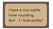
勾股定理:a*a + b*b = c*c
扩张半径需要比描边的宽度值小,但同时要比 (Math.sqrt(2) - 1) * r (根号2 - 1)r 大,r表示border-radius
- 条纹背景
横向
background: linear-gradient(#fb3 50%, #58a 0);
background-size: 100% 30px;
垂直条纹
background: linear-gradient(to right, #fb3 50%, #58a 0);
background-size: 30px 100%;
斜向条纹
background: linear-gradient(45deg,
                #fb3 25%, #58a 0, #58a 50%,
                #fb3 0, #fb3 75%, #58a 0);
background-size: 42.4px 42.4px;
灵活的同色系条纹
background: #58a;
background-image: repeating-linear-gradient(30deg,
        hsla(0,0%,100%,.1), hsla(0,0%,100%,.1) 15px,
        transparent 0, transparent 30px);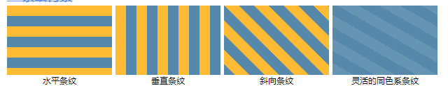
- 复杂背景
网格
background: #58a;
background-image: linear-gradient(white 2px, transparent 0),
                linear-gradient(90deg, white 2px, transparent 0),
                linear-gradient(hsla(0,0%,100%,.3) 1px, transparent 0),
                linear-gradient(90deg, hsla(0,0%,100%,.3) 1px, transparent 0);
background-size: 50px 50px, 50px 50px,
              10px 10px, 10px 10px;
波点: 两层,第二层背景偏移定位置必须是贴片宽高的一半
background: #655;
background-image: radial-gradient(tan 20%, transparent 0),
                  radial-gradient(tan 20%, transparent 0);
background-size: 30px 30px;
background-position: 0 0, 15px 15px;
scss mixin
// scss mixin
@mixin polka($size, $dot, $base, $accent) {
    background: $base;
    background-image: radial-gradient($accent $dot, transparent 0),
                      radial-gradient($accent $dot, transparent 0);
    background-size: $size $size;
    background-position: 0 0, $size/2 $size/2;
}
// 调用
@include polka(30px, 30%, #655, tan);
棋盘: 用两个直角三角形来拼合出我们想要的方块,把第二层渐变在水平和垂直方向均移动贴片长度的一半
.checkerboard {
    background: #eee;
    background-image:
      linear-gradient(45deg, rgba(0,0,0,.25) 25%, transparent 0, transparent 75%, rgba(0,0,0,.25) 0),
      linear-gradient(45deg, rgba(0,0,0,.25) 25%, transparent 0, transparent 75%, rgba(0,0,0,.25) 0);
    background-position: 0 0, 15px 15px;
    background-size: 30px 30px;
}
// scss mixin
@mixin checkerboard($size, $base, $accent: rgba(0, 0, 0, .25)) {
    background: $base;
    background-image: linear-gradient(45deg, $accent 25%, transparent 0, transparent 75%, $accent 0),
                      linear-gradient(45deg, $accent 25%, transparent 0, transparent 75%, $accent 0);
    background-size: 2*$size 2*$size;
    background-position: 0 0, $size $size;
}
// 调用
@include checkerboard(15px, #58a, tan);
棋盘-svg
background: #eee url('data:image/svg+xml,
              <svg xmlns="http://www.w3.org/2000/svg" width="100" height="100" fill-opacity=".25" >\
              <rect x="50" width="50" height="50" />\
              <rect y="50" width="50" height="50" />\
              </svg>');
background-size: 30px 30px;
棋盘-圆锥渐变实现:存在兼容性
background: repeating-conic-gradient(#bbb 0, #bbb 25%, #eee 0, #eee 50%);
background-size: 30px 30px;
调色盘: 圆锥渐变
border-radius: 50%;
background: conic-gradient(red, yellow, lime, aqua, blue, fuchsia, red);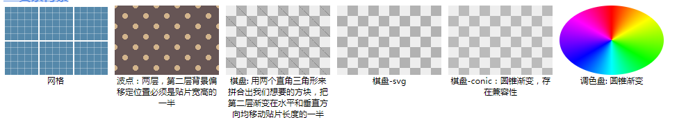
- 连续的图像边框
技巧:背景边框:在石雕背景图片之上,再叠加一层纯白的实色背景
padding: 1em;
border: 1em solid transparent;
background: linear-gradient(white, white) padding-box,
            url(http://csssecrets.io/images/stone-art.jpg) border-box  0 / cover;

width: 21em;
overflow: hidden;
resize: both;
信封
padding: 1em;
border: 16px solid transparent;
border-image: 16 repeating-linear-gradient(-45deg, red 0, red 1em, transparent 0, transparent 2em,
              #58a 0, #58a 3em, transparent 0, transparent 4em);
行军的蚂蚁
.ants {
    padding: 1em;
    border: 1px solid transparent;
    background: linear-gradient(white, white) padding-box,
                repeating-linear-gradient(-45deg, black 0, black 25%, transparent 0, transparent 50%) 0 / .6em .6em;
    animation: ants 12s linear infinite;

    max-width: 20em;
    font: 100%/1.6 Baskerville, Palatino, serif;
}
@keyframes ants { to { background-position: 100% 100% } }
border-image原理:九宫格伸缩发:把图片切割成九块,然后把它们应用到元素边框相应的边和角。
原理体验:border-image
脚注
border-top: .15em solid transparent;
border-image: 100% 0 0 linear-gradient(90deg, currentColor 4em, transparent 0);
padding-top: .5em;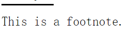
由于后面特别多,就不一一列举了展示图片了,感兴趣的去看源码及效果吧。
形状
- 自适应的椭圆:ellipse
border-radius: 50%;若是宽高一致,就显示为一个圆,宽高不等,就显示一个椭圆。
若border-radius值为宽高小的一边,就表现为小的边为半圆,长的边为直线。
可单独制定水平和垂直半径:用 / 分隔值即可。border-radius: 100px / 75px
- 半椭圆:half-ellipse
border-radius: 50% / 100% 100% 0 0;- 垂直堆成,左上角和右上角半径相同,且半径之和等于整个形状的宽度。
- 顶部的两个圆角占据了整个元素的高度,底部没有任何圆角。
- 四分之一椭圆:quarter-ellipse
border-radius: 100% 0 0 0;- 平行四边形:主要利用 transform:skew()变形:parallelograms
嵌套方案:外层skew变形,但内容变形了,对内容再应用一次反向的 skew() 变形,从而抵消容器的变形。
<a class="button"><div>click me</div></a>

.button { transform: skewX(-45deg); }
.button > div { transform: skewX(45deg); }伪元素方案:parallelograms-pseudo
- 菱形图片
嵌套变形方案:diamond-images
<div class="pic">
  <img src=""adam-catlace.jpg alt="..."/>
</div>

.pic {
    width: 400px;
    transform: rotate(45deg);
    overflow: hidden;
}
.pic > img {
    max-width: 100%;
    transform: rotate(-45deg) scale(1.42);
}裁切路径方案:diamond-clip
.img {
    clip-path: polygon(50% 0, 100% 50%, 50% 100%, 0 50%);
    transition: 1s clip-path;
}
.img:hover {
    clip-path: polygon(0 0, 100% 0, 100% 100%, 0 100%);
}- 切角效果
一个角
background: #58a;
background: linear-gradient(-45deg, transparent 15px, #58a 0);
二个角
background: #58a;
background: linear-gradient(-45deg, transparent 15px, #655 0) right,
            linear-gradient(45deg, transparent 15px, #58a 0) left;
background-size: 50% 100%;
background-repeat: no-repeat;background: #58a;
background: linear-gradient(135deg, transparent 15px, #58a 0) top left,
linear-gradient(-135deg, transparent 15px, #58a 0) top right,
linear-gradient(-45deg, transparent 15px, #58a 0) bottom right,
linear-gradient(45deg, transparent 15px, #58a 0) bottom left;
background-size: 50% 50%;
background-repeat: no-repeat;
// scss mixin
@mixin beveled-corners ($bg, $tl:0, $tr:$tl, $br:$tl, $bl:$tr) {
background: $bg;
background: linear-gradient(135deg, transparent $tl, $bg 0) top left,
linear-gradient(225deg, transparent $tr, $bg 0) top right,
linear-gradient(-45deg, transparent $br, $bg 0) bottom right,
linear-gradient(45deg, transparent $bl, $bg 0) bottom left;
background-size: 50% 50%;
background-repeat: no-repeat;
}
// 调用
@include beveled-corners(#58a, 15px, 5px);弧形切角(内凹圆角):用径向渐变替代上述线性渐变。scoop-corners
background: #58a;
background: radial-gradient(circle at top left, transparent 15px, #58a 0) top left,
            radial-gradient(circle at top right, transparent 15px, #58a 0) top right,
            radial-gradient(circle at bottom right, transparent 15px, #58a 0) bottom right,
            radial-gradient(circle at bottom left, transparent 15px, #58a 0) bottom left;
background-size: 50% 50%;
background-repeat: no-repeat;

// scss mixin
@mixin scoop-corners($bg, $tl:0, $tr:$tl, $br:&tl, $bl:$tr) {
    background: $bg;
    background: radial-gradient(circle at top left, transparent $tl, #58a 0) top left,
                radial-gradient(circle at top right, transparent $tr, #58a 0) top right,
                radial-gradient(circle at bottom right, transparent $br, #58a 0) bottom right,
                radial-gradient(circle at bottom left, transparent $bl, #58a 0) bottom left;
    background-size: 50% 50%;
    background-repeat: no-repeat;
}
// 调用
@include scoop-corners();
内联 svg 与 border-image 方案:bevel-corners
border: 20px solid #58a;
border-image: 1 url('data:image/svg+xml,\
              <svg xmlns="http://www.w3.org/2000/svg"\
              width="3" height="3" fill="%2358a">\
              <polygon points="0,1 1,0 2,0 3,1 3,2 2,3 1,3 0,2"/>\
              </svg>');
background: #58a;
background-clip: padding-box;裁切路径方案:好处:可使用任意类型的背景,比如图片。bevel-corners-clipped
background: #58a;
clip-path: polygon(
            20px 0, calc(100% - 20px) 0, 100% 20px,
            100% calc(100% - 20px), calc(100% - 20px) 100%,
20px 100%, 0 calc(100% - 20px), 0 20px);- 梯形标签页
利用 3D 旋转模拟实现:trapezoid-tabs
nav > a {
    position: relative;
    display: inline-block;
    padding: .3em 1em 0;
}
nav > a::before {
    content: ''; /* 用伪元素来生成一个矩形 */
    position: absolute;
    top: 0; right: 0; bottom: 0; left: 0;
    z-index: -1;
    background: #ccc;
    transform: perspective(.5em) rotateX(5deg);
    transform-origin: bottom;

    background-image: linear-gradient(hsla(0, 0%, 100%, .6), hsla(0, 0%, 100%, 0));
    border: 1px solid rgba(0, 0, 0, .4);
    border-bottom: none;
    box-shadow: 0 .15em white inset;
}
对元素使用了 3D 变形之后,其内部的变形效应是“不可逆转”的。但 2D 变形,内部是可抵消外部的变形效应。
该方案优点:能添加背景、边框、圆角、投影灯,并且,只需要把 transform-origin 改成 bottom left 或 bottom right,就可以立即得到左侧倾斜或右侧倾斜的标签页。
- 简单的饼图
基于 transform 的解决方案:pie-animated
该方案结构最简:只需一个元素作为容器,其他部分由伪元素、变形属性和css渐变实现。
@keyframes spin {
    to { transform: rotate(.5turn); }
}
@keyframes bg {
    50% { background: #655; }
}
.pie {
    width: 100px;
    height: 100px;
    border-radius: 50%;
    background: yellowgreen;
}
.pie::before {
    content: '';
    display: block;
    margin-left: 50%;
    height: 100%;
    border-radius: 0 100% 100% 0 / 50%;
    background-color: inherit;
    transfrom-origin: left;
    animation: spin 3s linear infinite,
               bg 6s step-end infinite;
}制作多个不同比率的静态饼图:pie-static
<div class="pie">20%</div>
<div class="pie">60%</div>

@keyframes spin {
    to { transform: rotate(.5turn); }
}
@keyframes bg {
    50% { background: #655; }
}
.pie {
    position: relative;
    width: 100px;
    line-height: 100px; // line-height 本身就可以起到设置高度的作用
    border-radius: 50%;
    background: yellowgreen;
    background-image: linear-gradient(to right, transparent 50%, #655 0);
    color: transparent;
    text-align: cener;
}
.pie::before {
    content: '';
    position: absolute;
    top: 0; left: 0;
    width: 100%;
    height: 100%;
    border-radius: 0 100% 100% 0 / 50%;
    background-color: inherit;
    transfrom-origin: left;
    animation: spin 3s linear infinite,
               bg 6s step-end infinite;
    animation-play-state: paused;
    animation-delay: inherit;
}

document.querySelectorAll('.pie').forEach(function (pie) {
    var p = parseFloat(pie.textContent);
    pie.style.animationDelay = '-' + p + 's';
})
动画暂停,用负的动画延时(animation-delay: -20s)来直接跳至动画中的任意时间点。
.pie 元素内联样式,伪元素继承 inherit
svg 解决方案:pie-svg
<svg viewBox="0 0 32 32">
    <circle r="16" cx="16" cy="16" />
</svg>

// css
svg {
    width: 100px;
    height: 100px;
    transform: rotate(-90deg);
    background: yellowgreen;
    border-radius: 50%;
}
svg > circle {
    fill: yellowgreen;
    stroke: #655;
    stroke-width: 32;
    stroke-dasharray: 38 100; /* 可得到比率为38%的扇区 */
}
视觉效果
- 单侧投影:shadow-one-side
box-shadow: 0 5px 4px -4px black;box-shadow 第四个长度参数,扩张半径,排在模糊半径参数之后,这个参数会根据你指定的值去扩大或缩小(负值)投影的尺寸。应用一个负的扩张半径,而它的值刚好等于模糊半径,那么投影的尺寸就会与投影所属元素的尺寸完全一致。
- 邻边投影:shadow-2-sides
box-shadow: 3px 3px 6px -3px black;box-shadow: 5px 0 5px -5px black,
-5px 0 5px -5px black;- 不规则投影:drop-shadow
filter: drop-shadow(2px 2px 10px rgba(0, 0, 0, .5));能与点状、虚线、半透明边框、切角、折角等不规则的形状贴合。
可参考文章:CSS3 filter:drop-shadow滤镜与box-shadow区别应用
- 染色效果
滤镜方案:color-tint-filter
img {
    transition: .5s filter;
    filter: sepia(1) saturate(4) hue-rotate(295deg);
}
img:hover,
img:focus {
    filter: none;
}
sepia():给图片增加一种降饱和度的橙黄色染色效果。几乎所有像素的色相值会被收敛到35-40.
saturate():给每个像素提升饱和度
hue-rotate():把每个像素的色相以指定的度数进行偏移。
混合模式方案:color-tint
<a>
  <img src="tiger.jpg"/>
</a>

a { background: hsl(335, 100%, 50%); }
a > img { mix-blend-mode: luminosity; }
当两个元素叠加时,“混合模式”控制了上层元素的颜色与下层颜色进行混合的方式。
luminosity:会保留上层元素的 hsl 亮度信息,并从它的下层吸取色相和饱和度信息。
染色:下层放主色调,上层设置 luminosity 混合模式。
mix-blend-mode:为整个元素设置混合模式
background-blend-mode:为每层背景单独制定混合模式。
- 毛玻璃效果:frosted-glass
body, main::before {
    background: url('tigger.jpg') 0 / cover fixed;
}
main {
    position: relative;
    backgrond: hsla(0, 0%, 100%, .3);
    overflow: hidden;
}
main::before {
    content: '';
    position: absolute;
    top: 0; right: 0; bottom: 0; left: 0;
    filter: blur(20px);
    margin: -30px;
}
由于不能直接对元素本身设置模糊效果,就对一个伪元素进行处理,然后将其定位宿主到元素的下层,它的背景将会无缝匹配
的背景。模糊效果会削减实色像素所能覆盖的范围,削减的幅度正是模糊半径的长度。因此让伪元素相对宿主元素的尺寸向外夸大至少20px
- 折角效果
45° 折角的解决方案:folded-corner
background: #58a; /* 回退样式 */
background: linear-gradient(to left bottom, transparent 50%, rgba(0, 0, 0, .4) 0) no-repeat 100% 0 / 2em 2em, linear-gradient(-135deg, transparent 1.5em, #58a 0);
其他角度解决方案:
.note {
    positon: relative;
    background: #58a;
    background: linear(-150deg, transparent 1.5em, #58a 0);
    border-radius: .5em;
}
.note::before {
    content: '';
    position: absolute;
    top: 0;
    right: 0;
    background: linear-gradient(to left bottom, transparent 50%, rgba(0, 0, 0, .2) 0, rgba(0, 0, 0, .4)) 100% no-repeat;
    width: 1.73em;
    height: 3em;
    transform: translateY(-1.3em) rotate(-30deg);
    transform-origin: bottom right;
    border-bottom-left-radius: inheirt;
    box-shadow: -.2em .2em .3em -.1em rgba(0, 0, 0, .15);
}

// scss mixin
@mixin folded-corner($bg, $size, $angle:30deg) {
    positon: relative;
    background: $bg;
    background: linear($angle - 180deg, transparent $size, $bg 0);
    border-radius: .5em;

    $x: $size / sin($angle);
    $y: $size / cos($angle);

    &::before {
        content: '';
        position: absolute;
        top: 0;
        right: 0;
        background: linear-gradient(to left bottom, transparent 50%, rgba(0, 0, 0, .2) 0, rgba(0, 0, 0, .4)) 100% no-repeat;
        width: $y;
        height: $x;
        transform: translateY($y - $x) rotate(2*$angle - 90deg);
        transform-origin: bottom right;
        border-bottom-left-radius: inheirt;
        box-shadow: -.2em .2em .3em -.1em rgba(0, 0, 0, .15);
    }
}

// 调用
.note {
    @include folded-corner(#58a, 2em, 40deg);
}
字体排印
- 连字符断行:hyphenation
text-align: justify;
hyphens: auto;
两端对齐,英文,有些单词之间的间隔太大,损伤了可读性。实际中,两端对齐总是与连字符断行相辅相成。
文本折行算法:主要是 贪婪算法 和 Knuth-Plass 算法。
贪婪算法:每次分析一行,把尽可能多的单词填充改行,当遇到第一个装不下的单词或音节时,就移至下一行继续处理。
Knuth-Plass 算法:高级很多,把整段文本纳入考虑范围,从而产生出美学上更令人愉悦的效果。但计算性能稍差。
绝大多数桌面文字处理程序采用 Knuth-Plass 算法,处于性能考虑,浏览器采用 贪婪算法。
- 插入换行:line-breaks
<dl>
  <dt>Name:</dt>
  <dd>Lea Verou</dd>

  <dt>Email:</dt>
  <dd>[email protected]</dd>
  <dd>[email protected]</dd>

  <dt>Location:</dt>
  <dd>Earth</dd>
</dl>
dt,dd 块级元素。
在每个 dd 后面添加一个 br 换行,糟糕的结构。使用生成性内容来添加换行,并以此取代br。
有一个 Unicode 字符专门代表换行:0x000A,在 css 中这个字符可以写作 "\000A",或简化为"\A"。
在 html 直接输入换行符,会与响铃的其他空白符合并。保留空白和换行,white-space: pre。
dt, dd { display: inline; }
dd {
    margin: 0;
    font-weight: bold;
}
dd + dt::before {
    content: '\A';
    white-space: pre;
}
dd + dd::before {
    content: ',';
    margin-left: -.2em;
    font-weight: normal;
}- 文本行的斑马条纹:zebra-lines
表格
tr: nth-child(even) {
    background: rgba(0, 0, 0, .2);
}
文本:渐变背景条纹
padding: .5em;
line-height: 1.5;
background: beige;
background: auto 3em;
background-origin: content-box;
background-image: linear-gradient(rgba(0, 0, 0, .2) 50%, transparent 0);
background-size 设置为 line-height 的两倍,每个背景贴片需要覆盖两行代码。
- 调整 tab 的宽度:tab-size
使用 pre 和 code 显示代码,tab 缩进代码,浏览器会把其宽度显示为 8 个字符。
pre { tab-size: 2; }- 连字:ligatures
大多数衬线字体中的 f 和 i ,i 的圆点往往会与 f 的升部发生冲突,导致两者显示不清。为了缓解这种情况,出现连字。设计成 双字形或三字形的单一组合体。
font-variant-ligatures:common-ligatures
                        discretionary-ligatures
                        historical-ligatures;
开启通用连字,关闭酌情连字
font-variant-ligatures: common-ligatures
                        no-discretionary-ligatures
                        no-historical-ligatures;
华丽的 & 符号:ampersands
自定义下划线:
background: linear-gradient(gray, gray) no-repeat;
background-size: 100% 1px;
background-origin: 0 1.15em;
text-shadow: .05em 0 white, -.05em 0 white;- 现实中的文字效果
凸版印刷效果:letterpress
background: hsl(210, 13%, 40%);
color: hsl(210, 13%, 75%);
text-shadow: 0 -1px 1px black;
原理:出现在底部的浅色投影或出现在顶部的暗色投影,会让人产生物体时凹进平面内的错觉;同理,出现在底部的暗色投影或出现在顶部的浅色投影,会让人产生物体从平面上凸起的错觉。
形成错觉的原因:现实世界中光源总是悬在头顶。
空心字效果:stroked-text
background: deeppink;
color: white;
text-shadow: 1px 1px black, -1px -1px black,
1px -1px black, -1px 1px black;文字外发光效果:glow
a {
    background: #203;
    color: white;
    transition: 1s;
}
a:hover {
    color: transparent;
    text-shadow: 0 0 .1em white, 0 0 .3em white;
}

// 或
a:hover {
    filter: blur(.1em);
}文字凸起效果:extruded
background: #58a;
color: white;
text-shadow: 0 1px hsl(0, 0%, 85%),
             0 2px hsl(0, 0%, 80%),
             0 3px hsl(0, 0%, 75%),
             0 4px hsl(0, 0%, 70%),
             0 5px hsl(0, 0%, 65%),
             0 5px 10px black;

// scss mixin
@mixin text-3d($color:white, $depth: 5) {
    $shadows: ();
    $shadow-color: $color;

    @for $i from 1 through $depth {
        $shadow-color: darken($shadow-color, 10%);
        $shadow: append($shadows, 0 ($i * 1px) $shadow-color, comma);
    }

    color: $color;
    text-shadow: append($shadows, 0 ($depth * 1px) 10px black, comma);
}

h1 { @include text-3d(#eee, 4)};环形文字-svg:circular-text
用户体验
- 选用合适的鼠标光标
cursor: not-allowed; // 禁用- 扩大可点击区域:hit-area-border
border: 10px solid transparent;
box-shadow: 0 0 0 1px rgba(0, 0, 0. .3) inset;
background-clip: padding-box;伪元素实现:伪元素可以代表其宿主元素来响应鼠标交互。hit-area
button {
    position: relative;
}
button::before {
    content: '';
    position: absolute;
    top: -10px; right: -10px;
    bottom: -10px; left: -10px;
}- 自定义复选框:checkboxes
:checked,改伪类只在复选框被勾选时才匹配,不论这个勾选状态是由用户交互触发,还是脚本触发。
借助组合选择符来给其他元素设置样式。当 label 元素与复选框关联之后,也可以起到触发开关的作用。
<input type="checkbox" id="awesome"/>
<label for="awesome">Awesome</label>

input[type="checkbox"] + label::before {
    content: '\a0'; /* 不换行空格 */
    display: inline-block;
    vertical-align: .2em;
    width .8em;
    height: .8em;
    margin-right: .2em;
    border-radius: .2em;
    background: silver;
    text-indent: .15em;
    line-height: .65;
}
input[type="checkbox"]:checked + label::before {
    content: '\2713';
    background: yellowgreen;
}

// 不损失可访问性的方式隐藏,不能使用display:none,会把它从键盘tab键切换焦点的队列中完全删除
input[type="checkbox"] {
    position: absolute;
    clip: rect(0, 0, 0, 0);
}

input[type="checkbox"]:focus + label::before {
    box-shadow: 0 0 .1em .1em #58a;
}
input[type="checkbox"]:disabled + label::before {
    background: gray;
    box-shadow: none;
    color: #555;
}
结构与布局
- 自适应内部元素:intrinsic-sizing
<p>Some text [...]</p>
<figure>
  <img src="adamcatlace.jpg" />
  <figcaption>
    The great Sir Adam Catlace was named after Countess Ada Lovelace, the first programmer.
  </figcaption>
</figure>
<p>More text [...]</p>
希望这个 figure 元素能跟 它所包含的图片一样框,而且水平居中。
figure {
    max-width: 300px; /* 回退 */
    max-width: min-content;
    margin: auto;
}
figure > img {
    max-width: inherit;
}
min-content: 解析为这个容器内部最大的不可断行元素的宽度(即最宽的单词、图片或具有固定宽度的盒元素)
- 精确控制表格列宽
table {
    table-layout: fixed;
    width: 100%;
}- 根据兄弟元素的数量来设置样式:styling-sibling-count
通过兄弟元素的总数设置样式
li:only-child {
    /* 只有一个列表项是的样式 */
}
li:first-child:nth-last-child(1) {
/* 相当于li:only-child,第一项同时是最后一项 */
}li:first-child:nth-last-child(4) {
/* 这个元素是父元素的第一个子元素,同时是从后往前数的第四个子元素,即命中一个正好有四个列表项的第一个列表项 */
}li:first-child:nth-last-child(4),
li:first-child:nth-last-child(4) ~ li {
/* 当列表正好是四项时,命中所有列表项 */
}根据兄弟元素的数量范围来匹配元素
li:nth-child(n+b) {
    /* n+b, n从0开始,选中从b个元素开始的所有子元素*/
}
li:nth-child(n+4) {
/* 选中除了第1、第2、第3个子元素之外的所有子元素 */
}li:first-child:nth-last-child(n+4),
li:first-child:nth-last-child(n+4) ~ li {
/* 当列表至少包含四项时,命中所有列表项 */
}-n+b:可以选中开头的b个元素,当列表中有4个或更少的列表项时:
li:first-child:nth-last-child(-n+4),
li:first-child:nth-last-child(-n+4) ~ li {
    /* 当列表最多包含四项时,命中所有列表项 */
}
li:first-child:nth-last-child(n+2):nth-last-child(-n+6),
li:first-child:nth-last-child(n+2):nth-last-child(-n+6) ~ li {
/* 当列表包含2-6项时,命中所有列表项 */
}实际应用篇:伪类匹配列表数目实现微信群头像CSS布局的技巧
- 满幅的背景,定宽的内容:fluid-fixed
定宽内容居中,正常写法
<footer>
  <div class="wrap">内容</div>
</footer>

footer { background: #333; }
.wrap {
    max-width: 900px;
    margin: 1em auto;
}
一层实现:
footer {
    padding: 1em; /* 回退 */
    padding: 1em calc(50% - 450px);
    background: #333
}- 垂直居中
绝对定位方案:
main {
    position: absolute;
    top: 50%;
    left: 50%;
    transform: translate(-50%, -50%);
}
弹性盒子方案:
body {
    display: flex;
    min-height: 100vh;
    margin: 0;
}
main { /* 水平垂直居中 */
    margin: auto;
}
main {
display: flex;
align-items: center;
justify-content: center;
width: 18em;
height: 10em;
}- 紧贴底部的页脚
块级页脚,页面内容足够长在页面底部,页面内容很少,需要紧贴在视口底部。
固定高度的方案:sticky-footer-fixed
main {
    min-height: calc(100vh - 7em)
}更灵活的方案:sticky-footer
body {
    display: flex;
    flex-flow: column;
    min-height: 100vh;
}
main { flex: 1; }
过渡与动画
- 缓动效果:具有回弹效果,利用贝塞尔曲线:bounce
ease-out 是 ease-in 的反向版本。
cubic-bezier(x1, y1, x2, y2),把控制锚点的水平坐标和垂直坐标互换,就可以得到任何调速函数的反向版本。
@keyframes bounce {
    60%, 80%, to {
        transform: translateY(400px);
        animation-timing-function: ease;
    }
    70% { transform: translateY(300px); }
    90% { transform: translateY(360px); }
}
.ball {
    animation: bounce 3s cubic-bezier(.1, .25, 1 ,.25);
}- 逐帧动画:steps():frame-by-frame
@keyframes loader {
    to { background-position: -800px 0; }
}

.loader {
    width: 100px;
    height: 100px;
    background: url(img/loader.png) 0 0;
    animation: loader 1s infinite steps(8);
}
steps() 会根据你指定的步数进量,把整个动画切分为多帧,而且每个动画会在帧与帧之间硬切。
关于steps:CSS3 animation属性中的steps功能符深入介绍
- 打字效果:typing
ch 单位:表示“0”字形的宽度。在等宽字体中,“0”字形的宽度和其他所有字形的宽度一致。用 ch 单位表示宽度,那取值实际上就是字符的数量。
@keyframes typing {
    from { width: 0; }
}
@keyframes caret {
    50% { border-color: transparent; }
}
h1 {
    width: 15ch; /* 文本的宽度 */
    overflow: hidden;
    white-space: nowrap;
    border-right: .5em solid;
    animation: typing 6s steps(15),
               caret 1s steps(1) infinite;

}

document.querySelectAll('h1').forEach(function (h1) {
    var len = h1.textContent.length, s = h1.style;
    s.width = len + 'ch';
    s.animationTimingFunction = "steps("+len+"), steps(1)";
})- 状态平滑的动画:动画暂停、开启,state-animations
@keyframes panoramic {
    to { background-position: 100% 0; }
}
.panoramic {
    width: 150px;
    height: 150px;
    background: url(img/naxos-greece.jpg);
    background-size: auto 100%;
    animation: panoramic 10s linear infnte alternate;
    animation-play-state: paused;
}
.panoramic:hover, .panoramic:focus {
    animation-play-state: running;
}
整张图片从左滚蛋到右侧。
- 沿环形路径平移的动画:circular
沿着环形进行移动,同时保持自己本来的朝向。
每个transform-origin都是可以被两个translate()模拟出来的。下面两段代码是等效的。
transform: rotate(30deg);
transform-origin: 200px 300px;

transform: translate(200px, 300px) rotate(30deg) translate(-200px, -300px);
transform-origin: 0 0;
牢记变形函数并不是彼此独立的。每个变形函数并不是只对这个元素进行变形,而是会把整个元素的坐标系统进行变形,从而影响后面的变形操作。这也说明了为什么变形函数的顺序是很重要的。
@keyframes spin {
    from {
        transform: translateY(150deg) translateY(-50%)
                   rotate(0turn)
                   translateY(-150deg) translateY(50%)
                   rotate(1turn);
    }
    to {
        transform: translateY(150deg) translateY(-50%)
                   rotate(1turn)
                   translateY(-150deg) translateY(50%)
                   rotate(0turn);
    }
}
.avatar { animation: spin 3s infinite linear; }
最后
书中记录的这些效果,都有很详细的启发作用,每个案例都敲一遍,理解了感觉css真的有魔力呢。
向该书的作者致敬,表示感谢。
转载于:https://www.cnblogs.com/EnSnail/p/10805838.html