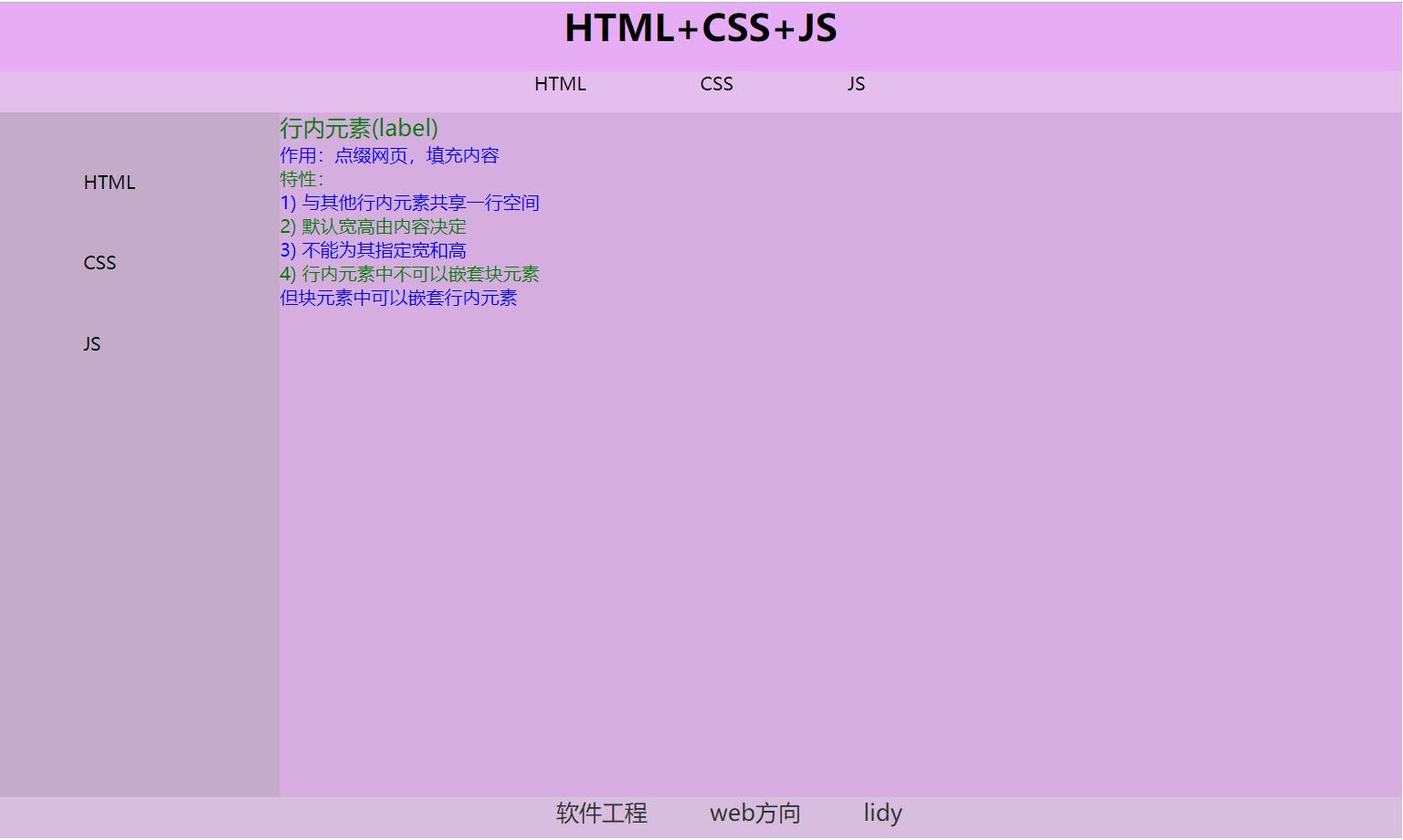
编写一个如下图页面:
实现代码如下:
<!DOCTYPE html>
<html lang="en">
<head>
<meta charset="utf-8">
<title>网页布局及注册表</title>
<style type="text/css">
*{
margin: 0; /*整体去除外边距*/
padding: 0; /*整体去除内边距*/
}
.header{
width: 80%; /* 头部宽度为整个网页80% */
height: 60px; /* 头部高为60像素 */
background-color: #e6adf4; /* 头部底色为#e6adf4 */
}
.header h1{
text-align: center; /* 头部中的h1标签居中显示 */
}
.nav{
width: 80%; /* 导航栏宽度为整个网页80% */
height: 36px; /* 导航栏高度为36像素 */
background-color: #e4beed; /* 导航栏底色为#e4beed */
}
.nav ul{
margin-left: 30%; /* 导航栏下的ul标签与左侧距离为导航栏宽度的30% */
}
.nav li{
float: left; /* 导航栏下的li标签整体向左浮动 */
list-style: none; /*去掉导航栏下的li标签前的小圆点*/
margin-left: 100px; /*导航栏下的li标签与其左侧标签的距离为100像素 */
}
li{
list-style: none; /*去掉所有li标签前的小圆点*/
}
.article{
width: 80%; /* 主体内容宽度为整个网页80% */
height: 600px; /* 主体内容高度为600像素 */
}
.aside{
width: 20%; /* 左侧菜单栏宽度为主体内容宽度的20%*/
height: 600px; /* 左侧菜单栏高度为600像素*/
float:left; /* 左侧菜单栏整体向左浮动,达到使右边内容栏与左侧菜单栏同在一行的目的*/
background-color: #c4abca; /* 左侧菜单栏的底色为#c4abca */
}
.aside ul{
margin-top: 20%; /* 左侧菜单栏下的ul标签距离左侧菜单栏顶部的距离为菜单栏高度的20%*/
margin-left: 30%;/* 左侧菜单栏下的ul标签距离左侧菜单栏左边的距离为菜单栏宽度度的30%*/
}
.aside li{
margin-top: 50px; /*左侧菜单栏下的li标签与其上部标签的距离为50像素 */
}
.section{
width: 80%; /* 右侧内容宽度为主体内容宽度的80%*/
height: 600px; /* 右侧内容栏高度为600像素 */
float:right; /* 右侧菜单栏整体向右浮动,达到使右边内容栏与左侧菜单栏同在一行的目的*/
background-color: #d5aedf; /* 右侧内容栏*/
}
.section p:first-child{
color: red; /* 右边内容下的第一个p标签字体为红色,该优先级低于nth-child(2n+1),故显示绿色*/
font-size: 20px; /* 右边内容下的第一个p标签字体大小为20像素 */
}
.section p:nth-child(2n){
color: blue; /* 右边内容下的第2n个p标签字体为蓝色*/
}
.section p:nth-child(2n+1){
color: green; /* 右边内容下的第2n+1个p标签字体为绿色*/
}
.footer{
width: 80%; /* 底部宽度为网页宽度的80% */
height: 36px; /* 底部高度为36像素 */
background-color: #d7bdde; /* 底部颜色为#d7bdde */
text-align: center; /* 底部内容整体居中显示 */
}
.footer span{
margin-left: 50px; /* 底部下的span标签与其左侧标签的距离为50像素*/
color: #2f2f2f; /* 底部下的span标签的字体颜色为#2f2f2f */
font-size: 20px; /* 底部下的span标签的字体大小为20像素 */
}
</style>
</head>
<body>
<!--头部-->
<div class="header">
<h1>HTML+CSS+JS</h1>
</div>
<!--导航栏-->
<div class="nav">
<ul>
<li>HTML</li>
<li>CSS</li>
<li>JS</li>
</ul>
</div>
<!--主体内容-->
<div class="article">
<!--左侧菜单栏-->
<div class="aside">
<ul>
<li>HTML</li>
<li>CSS</li>
<li>JS</li>
</ul>
</div>
<!--右侧内容-->
<div class="section">
<p>行内元素(label)</p>
<p>作用:点缀网页,填充内容</p>
<p>特性:</p>
<p>1) 与其他行内元素共享一行空间</p>
<p>2) 默认宽高由内容决定</p>
<p>3) 不能为其指定宽和高</p>
<p>4) 行内元素中不可以嵌套块元素</p>
<p>但块元素中可以嵌套行内元素</p>
</div>
</div>
<!--底部-->
<div class="footer">
<span>软件工程</span>
<span>web方向</span>
<span>lidy</span>
</div>
</body>
</html>
