一、圆角、rgba
设置某一个角的圆角,比如设置左上角的圆角:
border-top-left-radius:30px 60px;
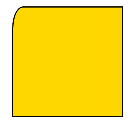
border-top-left-radius: 60px;

同时分别设置四个角:
border-radius:30px 60px 120px 150px;
设置四个圆角相同:
border-radius:50%;
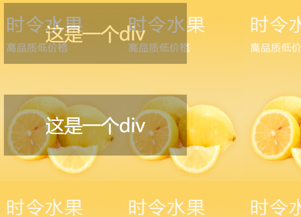
①盒子透明度表示法:
.box
    {
        opacity:0.1;
        /* 兼容IE */
        filter:alpha(opacity=10);
    }
②rgba(0,0,0,0.1) 前三个数值表示颜色,第四个数值表示颜色的透明度
<!DOCTYPE html>
<html lang="en">
<head>
    <meta charset="UTF-8">
    <title>透明度</title>
    <style type="text/css">
        body{
            background: url(images/banner01.jpg);
        }
        .box{
            width: 300px;
            height: 100px;
            background-color: #000;
            color: #fff;
            text-align: center;
            line-height: 100px;
            font-size: 30px;
            /*设置透明度*/
            opacity: 0.3;
            /*兼容IE*/
            filter: alpha(opacity=30);
        }
        .box2{
            width: 300px;
            height: 100px;
            /*设置盒子透明但文字不会变透明*/
            background-color: rgba(0,0,0,0.3);
            color: #fff;
            text-align: center;
            line-height: 100px;
            font-size: 30px;
            margin-top: 50px;
        }
    </style>
</head>
<body>
    <div class="box">这是一个div</div>
    <div class="box2">这是一个div</div>
</body>
</html>
二、transition动画
1、transition-property 设置过渡的属性,比如:width height background-color
2、transition-duration 设置过渡的时间,比如:1s 500ms
3、transition-timing-function 设置过渡的运动方式,常用有 linear(匀速)|ease(缓冲运动)
4、transition-delay 设置动画的延迟
5、transition: property duration timing-function delay 同时设置四个属性
<!DOCTYPE html>
<html lang="en">
<head>
    <meta charset="UTF-8">
    <title>transition动画</title>
    <style type="text/css">
        .box{
            width: 100px;
            height: 100px;
            background-color: gold;
            transition: width 1s ease,height 1s ease 1s,background-color 1s ease 2s;

        }
        .box:hover{
            width: 600px;
            height: 600px;
            background-color: red;
        }
    </style>
</head>
<body>
    <div class="box"></div>
</body>
</html>
如果是多个属性同时的动画,可以合并成下面语句:
      .box{
            width: 100px;
            height: 100px;
            background-color: gold;
            /*transition: width 1s ease,height 1s ease,background-color 1s ease;*/
            transition: all 1s ease;
        }
        .box:hover{
            width: 600px;
            height: 600px;
            background-color: red;
        }
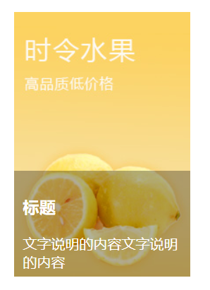
案例:
<!DOCTYPE html>
<html lang="en">
<head>
    <meta charset="UTF-8">
    <title>图片说明</title>
    <style type="text/css">
        .pic_con{
            width: 200px;
            height: 300px;
            margin: 50px auto 0;
            position: relative;
            overflow: hidden;
        }
        .pic_info{
            position: absolute;
            left: 0;
            top: 300px;
            width: 180px;
            height: 100px;
            background-color: rgba(0,0,0,0.3);
            color: #fff;
            padding: 10px;
            transition: all 500ms ease;
        }
        .pic_con:hover .pic_info{
            top:180px;
        }

    </style>
</head>
<body>
    <div class="pic_con">
        <a href=""><img src="images/banner01.jpg" alt=""></a>
        <div class="pic_info">
            <h3>标题</h3>
            <p>文字说明的内容文字说明的内容</p>
        </div>
    </div>
</body>
</html>
三、transform变换
1、translate(x,y) 设置盒子位移
2、scale(x,y) 设置盒子缩放
3、rotate(deg) 设置盒子旋转
4、skew(x-angle,y-angle) 设置盒子斜切
<!DOCTYPE html>
<html lang="en">
<head>
    <meta charset="UTF-8">
    <title>变换</title>
    <!-- 变换不是动画 -->
    <style type="text/css">
        .box{
            width: 200px;
            height: 200px;
            border: 3px solid #000;
            background-color: gold;
            margin: 50px auto 0;
            /*translate位移的性能比定位要高*/
            transform: translate(0px,0px);
            transition: all 1s ease;
        }
        .box:hover{
            transform: translate(30px,30px);
        }
        .box2{
            width: 200px;
            height: 200px;
            border: 3px solid #000;
            background-color: gold;
            margin: 50px auto 0;
            /*放大一倍*/
            transform: scale(1,1);
            transition: all 1s ease;
        }
        .box2:hover{
            transform: scale(2,2);
        }
        .box3{
            width: 200px;
            height: 200px;
            border: 3px solid #000;
            background-color: gold;
            margin: 50px auto 0;
            /*旋转 默认绕着z轴旋转*/
            transform: rotate(0deg);
            transition: all 1s ease;
        }
        .box3:hover{
            transform: rotate(45deg);
        }
        .box4{
            width: 200px;
            height: 200px;
            border: 3px solid #000;
            background-color: gold;
            margin: 50px auto 0;
            /*斜切 不好控制一般不用*/
            transform: skew(0,0);
            transition: all 1s ease;
        }
        .box4:hover{
            transform: skew(45deg,0deg);
        }
    </style>
</head>
<body>
    <div class="box"></div>
    <div class="box2"></div>
    <div class="box3"></div>
    <div class="box4"></div>
</body>
</html>
5、tranform-origin 设置变形的中心点
<!DOCTYPE html>
<html lang="en">
<head>
    <meta charset="UTF-8">
    <title>transform</title>
    <style type="text/css">
        div{
            width: 200px;
            height: 200px;
            border: 3px solid #000;
            background-color: pink;
            margin: 30px;
            float: left;
            transition: all 500ms ease;
        }
        .box2{
            transform-origin: left center;
        }
        .box3{
            transform-origin: left top;
        }
        .box4{
            transform-origin: 50px 50px;
        }
        div:hover{
            transform: rotate(45deg);
        }
    </style>
</head>
<body>
    <div class="box1"></div>
    <div class="box2"></div>
    <div class="box3"></div>
    <div class="box4"></div>
</body>
</html>
6、transform-style flat | preserve-3d 设置盒子是否按3d空间显示
7、translateX、translateY、translateZ 设置三维移动
8、rotateX、rotateY、rotateZ 设置三维旋转
9、scaleX、scaleY、scaleZ 设置三维缩放
10、perspective 设置透视距离
11、backface-visibility 设置盒子背面是否可见