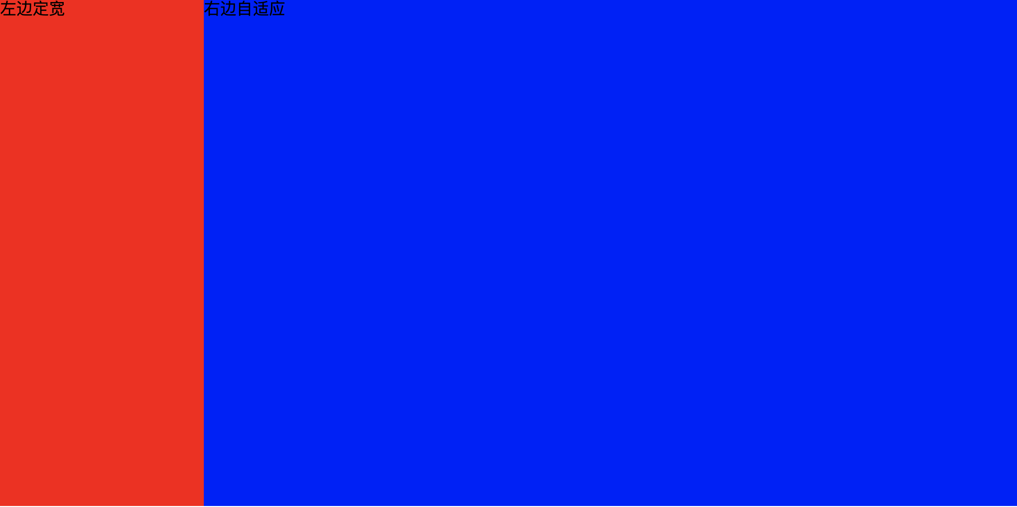
方法1:左边设置绝对定位,右边设置左外边距,大小和左边的宽度相等
//CSS部分:
        .contain{
            position :relative;
            height: 300px;
        }

        .left{
            position: absolute;
            left: 0;
            top: 0;

            width: 200px;
            height: 300px;
            background: red;
        }
        .right{
            /*使用左外边距*/
            margin-left: 200px;
            height: 300px;
            background: blue;
        }

//html部分:
<div class="contain">
     <div class="left">左边定宽</div>
     <div class="right">右边自适应</div>
 </div>
方法2:左边设置左浮动,右边隐藏溢出的内容
.contain{
position :relative;
height: 300px;
}
.left{
float: left;
width: 300px;
height: 300px;
background:red;
}
.right{
overflow: hidden;
background: blue;
height: 300px;
}

<div class="contain">
     <div class="left">左边定宽</div>
     <div class="right">右边自适应</div>
 </div>
方法3:弹性布局
.contain{
   display: flex;
}
.left{
    width: 200px;
    height: 200px;
    background: red;
}
.right{
    flex: 1;
    height: 200px;
    background:blue;
}
方法4:左右都设置浮动,width:calc().contain { position: absolute; width: 100%; height: 100%; } .left { float: left; width: 200px; height: 100%; background-color: #72e4a0; } .right { float: left; width: calc(100% - 200px); height: 100%; background-color: #9dc3e6; }
最终结果: