版权声明:本文为博主原创文章,遵循 CC 4.0 BY-SA 版权协议,转载请附上原文出处链接和本声明。
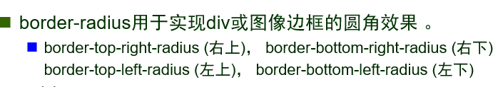
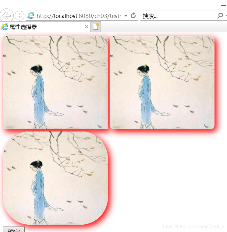
1:圆角边框
- 属性选择器根据元素的属性名或属性值来选择元素,使用一对方括号【】
<html>
<head>
<meta charset="UTF-8">
<title>属性选择器</title>
<style type="text/css">
[title]{
border-radius:30px;/*属性选择器*/
}
img[title="3"]{
border-radius:60px;
}
ul[type]{
color:red;
}
</style>
</head>
<body>
<img src="images/2.jpg"/>
<img src="images/2.jpg" title="2"/>
<img src="images/2.jpg" title="3"/>
<br/>
<input type = "button" value="确定"/>
<ul type="disc">
<li>北京</li>
<li>武汉</li>
</ul>
</body>
</html>
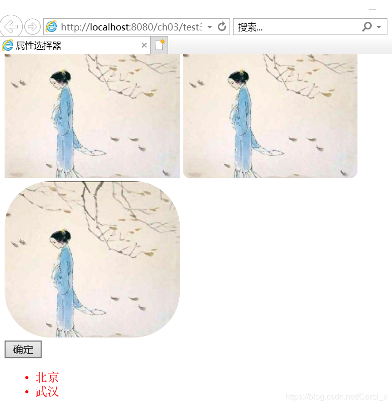
2.最后一个子元素list-child伪类选择器
<!DOCTYPE html>
<html>
<head>
<meta charset="UTF-8">
<title>新闻</title>
<style type="text/css">
* {
	margin: 0;
	padding: 0;
	box-sizing: border-box;/*消除默认内边距的膨胀效果*/
}

ul { /*块级元素*/
	margin: 0 auto;
	margin-top: 20px;
	width: 300px;/*定宽不定高*/
	list-style: none;
	border: 2px solid #1FC195; /*整个列表边框 */
}


ul li {
	font-size: 20px;
	line-height: 40px;
	border-bottom: 1px dashed #1FC195;/* 下边框为点划线 */
	padding-left: 5px;
	white-space:nowrap;
	overflow:hidden;/*超出边框部分隐藏*/
	text-overflow:ellipsis;
}

ul li:last-child {
	margin-bottom: -1px;/*列表边框底线向上收缩了1px*/
}
li {
	font-size: 25px;
}
</style>
</head>
<body>
	<ul class="ul1">
		<li title="电子知识竞赛">我校学子在2019年全国大学生电子科技竞赛获得一等奖</li>
		<li>“2019全民国家体育项目进行中”</li>
		<li title="工程教育专业认证培训">学校举办2020年工程教育专业认证培训研讨会</li>
		<li>学校开展实验室危化品安全专项检测</li>
		<li title="全国少数民族运动会">我校师生喜获第十一届全国少数民族运动会冠军</li>
	</ul>
</body>
</html>
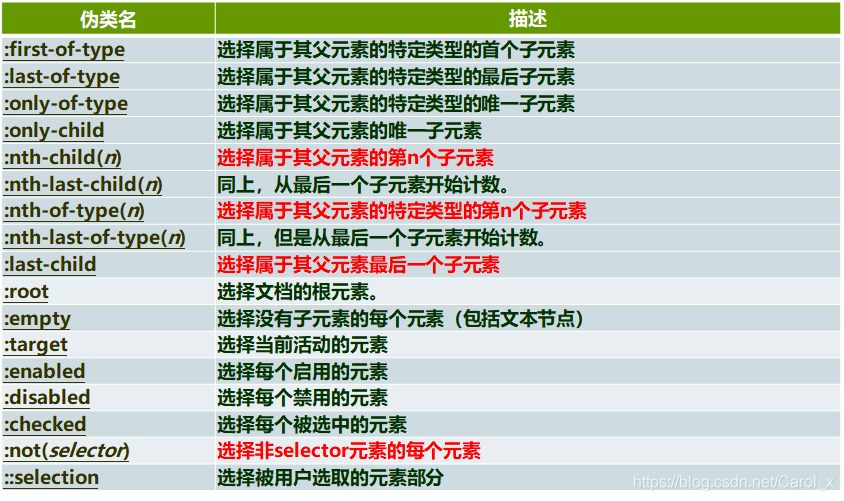
3.伪类选择器
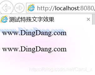
文字阴影效果
- text-shadow属性为文本添加阴影效果
- 格式:text-shadow:h-shadow(水平阴影位置),v-shadow(垂直阴影位置),bluer(模糊距离),color(颜色)
<!DOCTYPE html>
<html>
<head>
<meta charset="UTF-8">
<title>测试特殊文字效果</title>
<style type="text/css">
div{
text-shadow:-1px -1px rgba(197,223,248,0.8),
            -2px -2px rgba(197,223,248,0.8),
            -3px -3px rgba(197,223,248,0.8),
            -4px -4px rgba(197,223,248,0.8),
            -5px -5px rgba(197,223,248,0.8),
            -6px -6px rgba(197,223,248,0.8);
}
p{
text-shadow:0 0 5px #fff,
            0 0 10px #fff,
            0 0 15px #fff,
            0 0 40px #ff00de,
            0 0 70px #ff00de;
}
</style>
</head>
<body>
<div>
www.DingDang.com
</div>
<p>www.DingDang.com</p>
</body>
</html>
4.矩形元素阴影
- css可为矩形元素或文字添加阴影效果
- box-shadow属性为矩形元素添加阴影效果
- box-shadow属性值6个,依次为阴影类型,x轴偏移,y轴偏移,阴影大小,阴影扩展和阴影颜色
img{
box-shadow:5px 5px 20px red/*右偏移5,下偏移5,阴影大小20,颜色红色*/
}
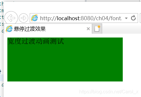
5.转换动画
- 通过css3可以在不使用Flash动画或JS的情况下,为元素从一种样式变换到另一种样式时添加效果
- 样式属性transtition
| 功能|属性名 |描述|
|–|--|–|
| 过渡属性|transition-porerty |规定应用过度css属性的名称|
|过渡时间|transition-duration|定义过度效果花费的时间|
|过渡效果|transition-timing-function|规定过渡效果的时间曲线|
|过渡延迟|transition-delay|规定过渡效果何时开始|
|过渡|transition|简写|
<!DOCTYPE html>
<html>
<head>
<meta charset="UTF-8">
<title>悬停过渡效果</title>
<style type="text/css">
.animation1 { /*定义动画的初始样式*/
	width: 100px;
	height: 100px;
	background: green;
	/* 设置转换动画的时长 */
	transition: width 3s; /* 动画特性设置 */
}

.animation1:hover {
	width: 300px; /*定义动画的最终样式  */
}
</style>
</head>
<body>
	<div class="animation1">宽度过渡动画测试</div>
</body>
</html>
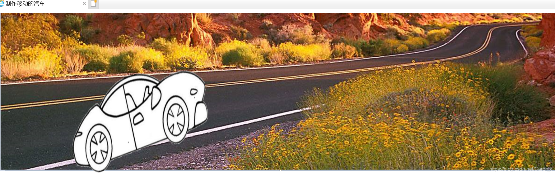
6.变形属性
- 向元素应用2D或3D转换,需要使用scc样式属性transform
- 为实现对元素的旋转,缩放,移动或倾斜效果,可以对transform属性应用以下方法
|功能| 方法名 |描述|
|–|--|–|
|移动|translate() |移动元素,基于x,y坐标重新定义元素|
|缩放|scale()|缩放元素,取值包括正数,负数,小数|
|旋转|rotate()|旋转元素,取值为一个度数|
|倾斜|skew()|倾斜元素,取值为一个度数|
<!DOCTYPE html>
<html>
<head>
<meta charset="UTF-8">
<title>制作移动的汽车</title>
<style type="text/css">
#bj{
background-image:url(D:/download/eclipse_workspace/ch04/WebContent/images/bg.png);
background-repeat:no-repeat;
height:560px;
}
img{
transition:5s linear;/*5s,linear-匀速转换*/
position:absolute;top:130px;/*绝对定位*/
}
img:hover{
transform:translate(385px,-75px);/*转换动画,目标位置*/
}
</style>
</head>
<body>
<div id="bj">
<img src="images/car.png" width="343" height="250"/>
</div>
</body>
</html>
img:hover{
transform:rotate(160deg);
}
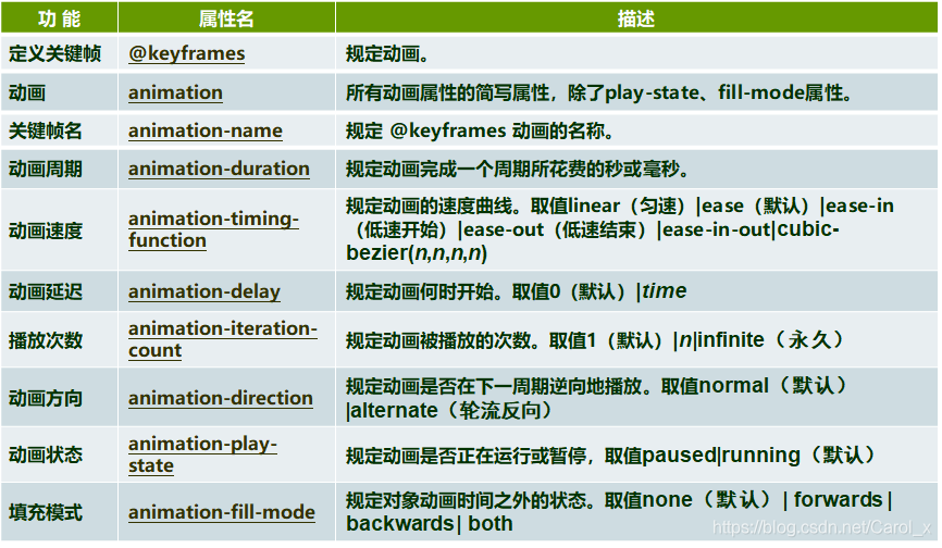
7.动画属性
- 通过CSS3,给元素添加animation属性,可以赋予该元素动画效果
<!DOCTYPE html>
<html>
<head>
<meta charset="UTF-8">
<title>跳动的气球</title>
<style type="text/css">
.goods {
	width: 50%;
	margin: 50px auto; /*div在浏览器窗口里水平居中*/
	text-align: center; /*div里的内容左右居中 */
}

.goods img {
	animation: jump 2s infinite; /*infinite是永久循环的*/
}

@keyframes jump { /*关键帧动画设计*/
0%{
	transform: translate(0px, 0px);
}

50%{
    transform:translate(0px,-50px);
} /*在y轴方向向下跳动*/
100%{
    transform:translate(0px,0px);
} /*在y轴方向向上跳动*/
}
.circular {
	width: 200px;
	height: 50px;
	margin: 0 auto;
	position: relative;
	margin-top: -10px;
	border-radius: 50%;
	box-shadow: 0px 9px rgba(144, 144, 144, 1), 0px 9px 25px
		rgba(0, 0, 0, .7); /*阴影*/
}
</style>
</head>
<body>
	<div class="goods">
		<img src="D:/download/eclipse_workspace/ch04/images/balloons.png" width="220"
			height="220">
		<div class="circular"></div>
	</div>
</body>
</html>
8.加粗样式
- 属性
-webkit-box-reflect,用于实现倒影或镜像效果 - 属性
<mask-box-image>给生成的倒影添加遮罩效果 - 遮罩效果有两种实现方式,一是渐变生成背景图像,二是外部背景图像
<!DOCTYPE html>
<html>
<head>
<meta charset="UTF-8">
<title>倒影与线性渐变</title>
<style type="text/css">
img{
width:500px;
height:200px;
border:1px solid #9CC;/*定义倒影*/
-webkit-box-reflect:below 5px
-webkit-gradient(
linear,/*定义线性渐变*/
left top,left bottom,/*起始点和结束点坐标*/
from(transparent),
color-stop(0.2,transparent),/*控制颜色过渡*/
to(rgba(250.250,250,0.5))
)

}
</style>

</head>
<body>
<img src="images/3.png"/>
</body>
</html>
