媒体查询法响应式布局
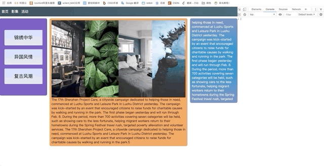
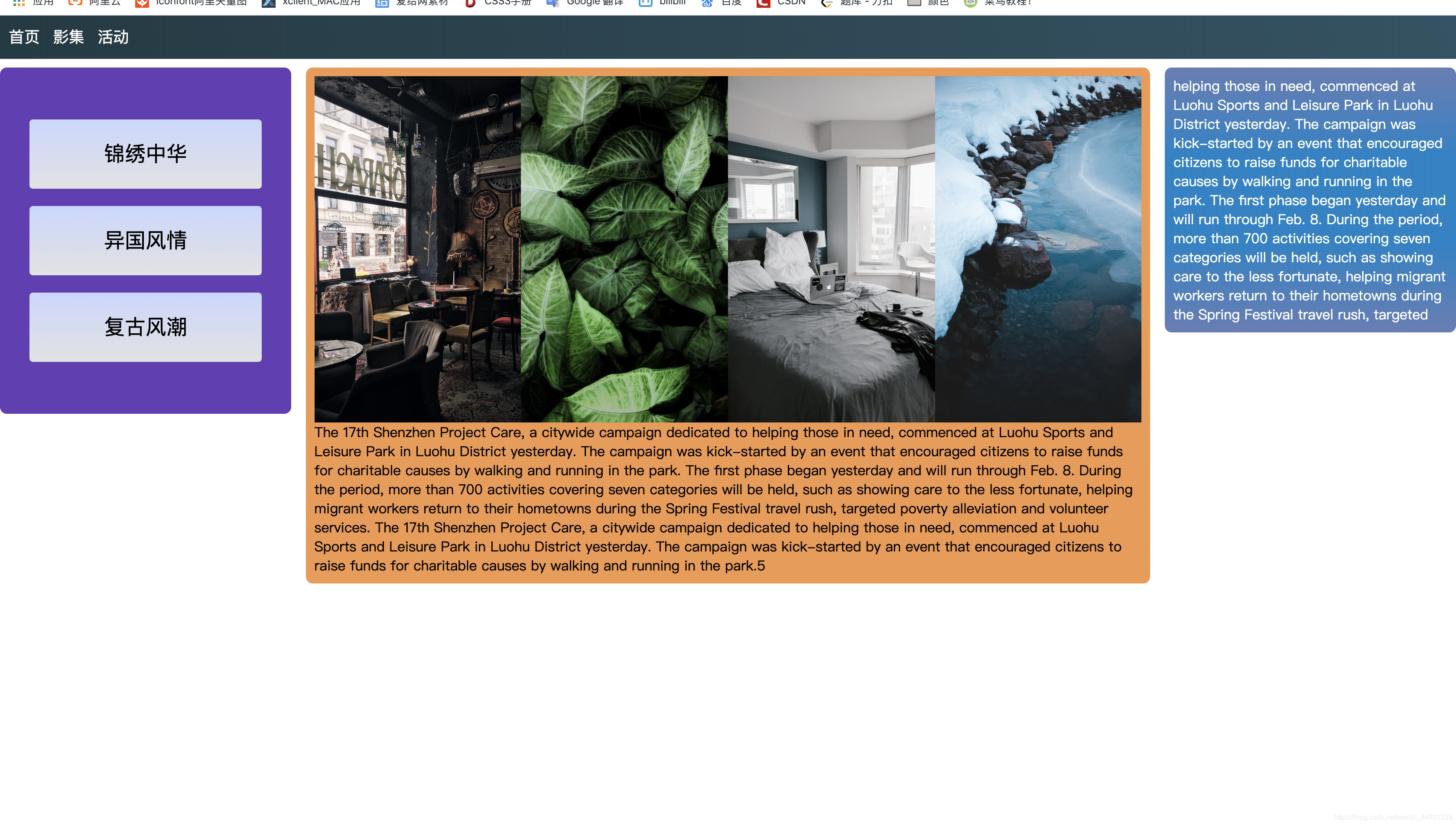
先看看具体的效果如下图,在不同大小的端口适应各种设备:

既然是响应式布局当然得用弹性盒子和定位,比例和百分比才是适应各个设备的关键之一,因为制作的目的主要是理解媒体查询该怎么用这里就没有涉及到js部分。
制作方法:
1. 首先先写pc端口的样式,运用flex和position将基本样式写好。
2. 当写好这个基本样式就是媒体查询的重要步骤之一:先将下列代码添加入html文件head中
<meta name="viewport" content="width=device-width, initial-scale=1.0">
这列代码的作用是让视口形成自适应,首先如果不设置meta viewport标签,那么移动设备上浏览器默认的宽度值为800px,980px,1024px等这些,总之是大于屏幕宽度的。这里的宽度所用的单位px都是指css中的px,它跟代表实际屏幕物理像素的px不是一回事。每个移动设备浏览器中都有一个理想的宽度,这个理想的宽度是指css中的宽度,跟设备的物理宽度没有关系,在css中,这个宽度就相当于100%的所代表的那个宽度。我们可以用meta标签把viewport的宽度设为那个理想的宽度,如果不知道这个设备的理想宽度是多少,那么用device-width这个特殊值就行了,同时initial-scale=1也有把viewport的宽度设为理想宽度的作用。
3. 当写好这个基本样式就是媒体查询的重要步骤其二:将下列这些代码添加入css文件中
@media screen and (max-width:768px){

}
1⃣️代表着手机,小于768px的宽度
@m`edia screen and (min-width:768px) and (max-width:1024px){

}
2⃣️代表着平板,大于768px的宽度却又小于1024px宽度
@media screen and (min-width:1024px){

}
3⃣️代表着pc端,大于1024px宽度
将每个设备需要改变的css样式添加其中,具体可以参考下面源码,比如pc中会有右边的文本块,在平板和手机则让它们隐藏并改变其他块的宽比。
源码
html
<!DOCTYPE html>
<html>

<head>
    <meta charset="UTF-8">
    <meta name="viewport" content="width=device-width, initial-scale=1.0">
    <meta http-equiv="X-UA-Compatible" content="ie=edge">
    <link rel="stylesheet" href="css/res.css">
    <title>Document</title>
</head>

<body>
    <div class="all">
        <header class="head">
            <span>首页</span>
            <span>影集</span>
            <span>活动</span>
            <input type="text" class="h_input" placeholder="search...">
        </header>
        <article class="main">
            <div class="main_1">
                <div class="mleft_1">锦绣中华</div>
                <div class="mleft_2">异国风情</div>
                <div class="mleft_3">复古风潮</div>
            </div>
            <div class="main_2">
                <div class="m2m1">
                    <div class="mmain_1"></div>
                    <div class="mmain_2"></div>
                    <div class="mmain_3"></div>
                    <div class="mmain_4"></div>
                </div>
                <div class="m2m2">
                    The 17th Shenzhen Project Care, a citywide campaign dedicated to
                    helping those in need, commenced at Luohu Sports and Leisure Park in
                    Luohu District yesterday. The campaign was kick-started by an event that
                    encouraged citizens to raise funds for charitable causes by walking and running in the park.
                    The first phase began yesterday and will run through Feb. 8. During the period, more than 700
                    activities covering seven categories will be held, such as showing care to the less fortunate,
                    helping migrant workers return to their hometowns during the Spring Festival travel rush, targeted
                    poverty alleviation and volunteer services.
                    The 17th Shenzhen Project Care, a citywide campaign dedicated to
                    helping those in need, commenced at Luohu Sports and Leisure Park in
                    Luohu District yesterday. The campaign was kick-started by an event that
                    encouraged citizens to raise funds for charitable causes by walking and running in the park.5
                </div>
            </div>
            <div class="main_3">
                helping those in need, commenced at Luohu Sports and Leisure Park in
                Luohu District yesterday. The campaign was kick-started by an event that
                encouraged citizens to raise funds for charitable causes by walking and running in the park.
                The first phase began yesterday and will run through Feb. 8. During the period, more than 700
                activities covering seven categories will be held, such as showing care to the less fortunate,
                helping migrant workers return to their hometowns during the Spring Festival travel rush, targeted
            </div>
        </article>
    </div>
</body>

</html>
css
@media screen and (max-width:768px){
    .main_1{
        top: 0;
        left: 0;
        right: 0;
    }
    .main_3{
        display: none;
    }
    .main_2{
        top: 410px;
        left: 0;
        right: 0;
    }
    .m2m1 div{
        width: 50%;
        height: 50%;
    }
}
@media screen and (min-width:768px) and (max-width:1024px){
    .main_3{
        display: none;
    }
    .main_1{
        left: 0;
        right: 80%;
    }
    .main_2{
        left: 21%;
        right: 0;
    }
    .m2m1 div{
        width: 25%;
        height: 100%;
    }
}
@media screen and (min-width:1024px){
    .h_input{
        display: none;
    }
    .main_1{
        left: 0;
        right: 80%;
    }
    .main_2{
        left: 21%;
        right: 21%;
    }
    .m2m1 div{
        width: 25%;
        height: 100%;
    }

}

body{
    margin: 0;
    padding: 0;
}
.all{
    width: 100%;
    min-width: 330px;
}
.head{
    height: 50px;
    position: relative;
    line-height: 50px;
    background-image: linear-gradient(to right,#203A43,#2C5364);
}
.h_input{
    position: absolute;
    box-sizing: border-box;
    right: 5px;
    top: 5px;
    width: 150px;
    height: 40px;
    border: none;
   border-radius: 4px;
}
.h_input::placeholder{
    font-size: 16px;
}
.head span{
    color: white;
    margin-left: 10px;
    font-size: 18px;
    cursor: pointer;
}
.main{
    position: relative;
    top: 10px;
    display: flex;
    flex-direction: row;
    justify-content: space-around;
}
.main_1{
    position: absolute;
    height: 400px;
    background-color: #673AB7;
    border-radius: 8px;
}
.main_1 div{
    box-sizing: border-box;
    position: absolute;
    left: 10%;
    right: 10%;
    height: 80px;
    font-size: 20px;
    border-radius: 4px;
    background-image: linear-gradient(#C9D6FF,#E2E2E2);
    text-align: center;
    line-height: 80px;
    font-size: 24px;
}
.mleft_1{
   top: 60px;
}
.mleft_2{
    top: 160px;
}
.mleft_3{
    top: 260px;
}
.main_2{
    position: absolute;
    background-color: #F2994A;
    border-radius: 8px;
    padding: 10px;
}
.m2m1{
    height: 400px;
    display: flex;
    flex-wrap: wrap;
}
.m2m1 div{
    background-repeat: no-repeat;
    background-size: cover;
}
.mmain_1{
    background-image: url(../img/picture1.jpeg);
}
.mmain_2{
    background-image: url(../img/picture2.jpeg);
}
.mmain_3{
    background-image: url(../img/picture3.jpeg);
}
.mmain_4{
    background-image: url(../img/picture4.jpeg);
}
.main_3{
    position: absolute;
    padding: 10px;
    left: 80%;
    right: 0;
    color: white;
    background-image: linear-gradient(#667db6,#0082c8,#0082c8,#667db6);
    border-radius: 8px;
    overflow: hidden;
}
