1.CSS3 弹性盒子(Flex Box)
弹性盒子是 CSS3 的一种新的布局模式。
CSS3 弹性盒( Flexible Box 或 flexbox),是一种当页面需要适应不同的屏幕大小以及设备类型时确保元素拥有恰当的行为的布局方式。
引入弹性盒布局模型的目的是提供一种更加有效的方式来对一个容器中的子元素进行排列、对齐和分配空白空间。
2.浏览器支持

3.CSS3 弹性盒子内容
弹性盒子由弹性容器(Flex container)和弹性子元素(Flex item)组成。
弹性容器通过设置 display 属性的值为 flex 或 inline-flex将其定义为弹性容器。
弹性容器内包含了一个或多个弹性子元素。
注意: 弹性容器外及弹性子元素内是正常渲染的。弹性盒子只定义了弹性子元素如何在弹性容器内布局。
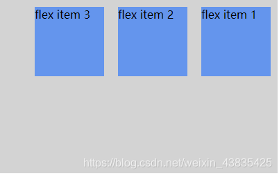
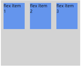
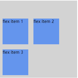
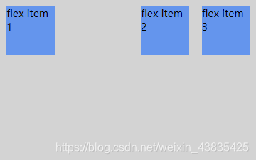
弹性子元素通常在弹性盒子内一行显示。默认情况每个容器只有一行。
以下元素展示了弹性子元素在一行内显示,从左到右:
<!DOCTYPE html>
<html>
<head>
<style>
.flex-container {
    display: -webkit-flex;
    display: flex;
    width: 400px;
    height: 250px;
    background-color: lightgrey;
}

.flex-item {
    background-color: cornflowerblue;
    width: 100px;
    height: 100px;
    margin: 10px;
}
</style>
</head>
<body>

<div class="flex-container">
  <div class="flex-item">flex item 1</div>
  <div class="flex-item">flex item 2</div>
  <div class="flex-item">flex item 3</div>
</div>

</body>
</html>

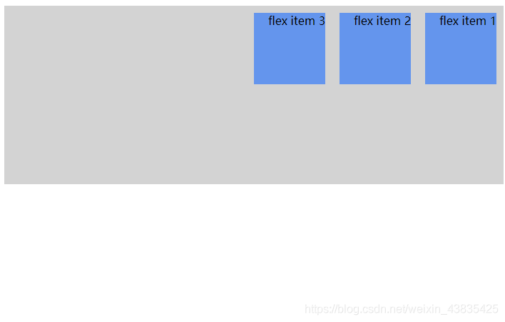
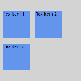
当然我们可以修改排列方式。
如果我们设置 direction 属性为 rtl (right-to-left),弹性子元素的排列方式也会改变,页面布局也跟着改变:
<!DOCTYPE html>
<html>
<head>
<meta charset="utf-8">
<title>菜鸟教程(runoob.com)</title>
<style>
body {
    direction: rtl;
}

.flex-container {
    display: -webkit-flex;
    display: flex;
    width: 400px;
    height: 250px;
    background-color: lightgrey;
}

.flex-item {
    background-color: cornflowerblue;
    width: 100px;
    height: 100px;
    margin: 10px;
}
</style>
</head>
<body>

<div class="flex-container">
  <div class="flex-item">flex item 1</div>
  <div class="flex-item">flex item 2</div>
  <div class="flex-item">flex item 3</div>
</div>

</body>
</html>
4.弹性盒子常用属性
| 属性 | 描述 |
|---|---|
| flex-direction | 指定弹性容器中子元素排列方式 |
| flex-wrap | 设置弹性盒子的子元素超出父容器时是否换行 |
| align-items | 设置弹性盒子元素在侧轴(纵轴)方向上的对齐方式 |
| align-content | 修改 flex-wrap 属性的行为,类似 align-items, 但不是设置子元素对齐,而是设置行对齐 |
| justify-content | 设置弹性盒子元素在主轴(横轴)方向上的对齐方式 |
| flex | 用于指定弹性子元素如何分配空间。 |
| align-self | 设置弹性元素自身在侧轴(纵轴)方向上的对 |
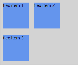
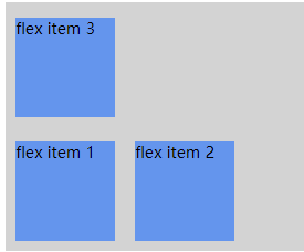
1.flex-direction
flex-direction 属性指定了弹性子元素在父容器中的位置。
语法
| flex-direction:row | row-reverse | column | column-reverse |
|---|
flex-direction的值有:
- row:横向从左到右排列(左对齐),默认的排列方式。
- row-reverse:反转横向排列(右对齐,从后往前排,最后一项排在最前面。
- column:纵向排列。
- column-reverse:反转纵向排列,从后往前排,最后一项排在最上面。
row-reverse
<!DOCTYPE html>
<html>
<head>
<meta charset="utf-8">
<title>菜鸟教程(runoob.com)</title>
<style>
.flex-container {
    display: -webkit-flex;
    display: flex;
    -webkit-flex-direction: row-reverse;
    flex-direction: row-reverse;
    width: 400px;
    height: 250px;
    background-color: lightgrey;
}

.flex-item {
    background-color: cornflowerblue;
    width: 100px;
    height: 100px;
    margin: 10px;
}
</style>
</head>
<body>

<div class="flex-container">
  <div class="flex-item">flex item 1</div>
  <div class="flex-item">flex item 2</div>
  <div class="flex-item">flex item 3</div>
</div>

</body>
</html>
column
<!DOCTYPE html>
<html>
<head>
<meta charset="utf-8">
<title>菜鸟教程(runoob.com)</title>
<style>
.flex-container {
    display: -webkit-flex;
    display: flex;
    -webkit-flex-direction: column;
    flex-direction:column;
    width: 400px;
    height: 250px;
    background-color: lightgrey;
}

.flex-item {
    background-color: cornflowerblue;
    width: 100px;
    height: 100px;
    margin: 10px;
}
</style>
</head>
<body>

<div class="flex-container">
  <div class="flex-item">flex item 1</div>
  <div class="flex-item">flex item 2</div>
  <div class="flex-item">flex item 3</div>
</div>

</body>
</html>

column-reverse
<!DOCTYPE html>
<html>
<head>
<meta charset="utf-8">
<title>菜鸟教程(runoob.com)</title>
<style>
.flex-container {
    display: -webkit-flex;
    display: flex;
    -webkit-flex-direction: column-reverse;
    flex-direction: column-reverse;
    width: 400px;
    height: 250px;
    background-color: lightgrey;
}

.flex-item {
    background-color: cornflowerblue;
    width: 100px;
    height: 100px;
    margin: 10px;
}
</style>
</head>
<body>

<div class="flex-container">
  <div class="flex-item">flex item 1</div>
  <div class="flex-item">flex item 2</div>
  <div class="flex-item">flex item 3</div>
</div>

</body>
</html>

2.justify-content 属性
内容对齐(justify-content)属性应用在弹性容器上,把弹性项沿着弹性容器的主轴线(main axis)对齐。
justify-content 语法如下:
| justify-content: | flex-start | flex-end | center | space-between | space-around |
|---|
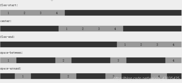
各个值解析:
flex-start:
弹性项目向行头紧挨着填充。这个是默认值。第一个弹性项的main-start外边距边线被放置在该行的main-start边线,而后续弹性项依次平齐摆放。
flex-end:
弹性项目向行尾紧挨着填充。第一个弹性项的main-end外边距边线被放置在该行的main-end边线,而后续弹性项依次平齐摆放。
center:
弹性项目居中紧挨着填充。(如果剩余的自由空间是负的,则弹性项目将在两个方向上同时溢出)。
space-between:
弹性项目平均分布在该行上。如果剩余空间为负或者只有一个弹性项,则该值等同于flex-start。否则,第1个弹性项的外边距和行的main-start边线对齐,而最后1个弹性项的外边距和行的main-end边线对齐,然后剩余的弹性项分布在该行上,相邻项目的间隔相等。
space-around:
弹性项目平均分布在该行上,两边留有一半的间隔空间。如果剩余空间为负或者只有一个弹性项,则该值等同于center。否则,弹性项目沿该行分布,且彼此间隔相等(比如是20px),同时首尾两边和弹性容器之间留有一半的间隔(1/2*20px=10px)。
效果图展示:
flex-end
<!DOCTYPE html>
<html>
<head>
<meta charset="utf-8">
<title>菜鸟教程(runoob.com)</title>
<style>
.flex-container {
    display: -webkit-flex;
    display: flex;
    -webkit-justify-content: flex-end;
    justify-content: flex-end;
    width: 400px;
    height: 250px;
    background-color: lightgrey;
}

.flex-item {
    background-color: cornflowerblue;
    width: 100px;
    height: 100px;
    margin: 10px;
}
</style>
</head>
<body>

<div class="flex-container">
  <div class="flex-item">flex item 1</div>
  <div class="flex-item">flex item 2</div>
  <div class="flex-item">flex item 3</div>
</div>

</body>
</html>

center
<!DOCTYPE html>
<html>
<head>
<meta charset="utf-8">
<title>菜鸟教程(runoob.com)</title>
<style>
.flex-container {
    display: -webkit-flex;
    display: flex;
    -webkit-justify-content: center;
    justify-content: center;
    width: 400px;
    height: 250px;
    background-color: lightgrey;
}

.flex-item {
    background-color: cornflowerblue;
    width: 100px;
    height: 100px;
    margin: 10px;
}
</style>
</head>
<body>

<div class="flex-container">
  <div class="flex-item">flex item 1</div>
  <div class="flex-item">flex item 2</div>
  <div class="flex-item">flex item 3</div>
</div>

</body>
</html>

3.space-between
<!DOCTYPE html>
<html>
<head>
<meta charset="utf-8">
<title>菜鸟教程(runoob.com)</title>
<style>
.flex-container {
    display: -webkit-flex;
    display: flex;
    -webkit-justify-content: space-between;
    justify-content: space-between;
    width: 400px;
    height: 250px;
    background-color: lightgrey;
}

.flex-item {
    background-color: cornflowerblue;
    width: 100px;
    height: 100px;
    margin: 10px;
}
</style>
</head>
<body>

<div class="flex-container">
  <div class="flex-item">flex item 1</div>
  <div class="flex-item">flex item 2</div>
  <div class="flex-item">flex item 3</div>
</div>

</body>
</html>

space-around
<!DOCTYPE html>
<html>
<head>
<meta charset="utf-8">
<title>菜鸟教程(runoob.com)</title>
<style>
.flex-container {
    display: -webkit-flex;
    display: flex;
    -webkit-justify-content: space-around;
    justify-content: space-around;
    width: 400px;
    height: 250px;
    background-color: lightgrey;
}

.flex-item {
    background-color: cornflowerblue;
    width: 100px;
    height: 100px;
    margin: 10px;
}
</style>
</head>
<body>

<div class="flex-container">
  <div class="flex-item">flex item 1</div>
  <div class="flex-item">flex item 2</div>
  <div class="flex-item">flex item 3</div>
</div>

</body>
</html>

align-items 属性
| alitn-item: | flex-start | flex-end | center | baseline | stretch |
|---|
- flex-start:弹性盒子元素的侧轴(纵轴)起始位置的边界紧靠住该行的侧轴起始边界。
- flex-end:弹性盒子元素的侧轴(纵轴)起始位置的边界紧靠住该行的侧轴结束边界。
- center:弹性盒子元素在该行的侧轴(纵轴)上居中放置。(如果该行的尺寸小于弹性盒子元素的尺寸,则会向两个方向溢出相同的长度)。
- baseline:如弹性盒子元素的行内轴与侧轴为同一条,则该值与’flex-start’等效。其它情况下,该值将参与基线对齐。
- stretch:如果指定侧轴大小的属性值为’auto’,则其值会使项目的边距盒的尺寸尽可能接近所在行的尺寸,但同时会遵照’min/max-width/height’属性的限制。
stretch(默认值)
<!DOCTYPE html>
<html>
<head>
<meta charset="utf-8">
<title>菜鸟教程(runoob.com)</title>
<style>
.flex-container {
    display: -webkit-flex;
    display: flex;
    -webkit-align-items: stretch;
    align-items: stretch;
    width: 400px;
    height: 250px;
    background-color: lightgrey;
}

.flex-item {
    background-color: cornflowerblue;
    width: 100px;
    margin: 10px;
}
</style>
</head>
<body>

<div class="flex-container">
  <div class="flex-item">flex item 1</div>
  <div class="flex-item">flex item 2</div>
  <div class="flex-item">flex item 3</div>
</div>

</body>
</html>

flex-start
<!DOCTYPE html>
<html>
<head>
<meta charset="utf-8">
<title>菜鸟教程(runoob.com)</title>
<style>
.flex-container {
    display: -webkit-flex;
    display: flex;
    -webkit-align-items: flex-start;
    align-items: flex-start;
    width: 400px;
    height: 250px;
    background-color: lightgrey;
}

.flex-item {
    background-color: cornflowerblue;
    width: 100px;
    margin: 10px;
}
</style>
</head>
<body>

<div class="flex-container">
  <div class="flex-item">flex item 1</div>
  <div class="flex-item">flex item 2</div>
  <div class="flex-item">flex item 3</div>
</div>

</body>
</html>

flex-end
<!DOCTYPE html>
<html>
<head>
<meta charset="utf-8">
<title>菜鸟教程(runoob.com)</title>
<style>
.flex-container {
    display: -webkit-flex;
    display: flex;
    -webkit-align-items: flex-end;
    align-items: flex-end;
    width: 400px;
    height: 250px;
    background-color: lightgrey;
}

.flex-item {
    background-color: cornflowerblue;
    width: 100px;
    margin: 10px;
}
</style>
</head>
<body>

<div class="flex-container">
  <div class="flex-item">flex item 1</div>
  <div class="flex-item">flex item 2</div>
  <div class="flex-item">flex item 3</div>
</div>

</body>
</html>

center
<!DOCTYPE html>
<html>
<head>
<style>
.flex-container {
    display: -webkit-flex;
    display: flex;
    -webkit-align-items: center;
    align-items: center;
    width: 400px;
    height: 250px;
    background-color: lightgrey;
}

.flex-item {
    background-color: cornflowerblue;
    width: 100px;
    margin: 10px;
}
</style>
</head>
<body>

<div class="flex-container">
  <div class="flex-item">flex item 1</div>
  <div class="flex-item">flex item 2</div>
  <div class="flex-item">flex item 3</div>
</div>

</body>
</html>

baseline
<!DOCTYPE html>
<html>
<head>
<meta charset="utf-8">
<title>菜鸟教程(runoob.com)</title>
<style>
.flex-container {
    display: -webkit-flex;
    display: flex;
    -webkit-align-items: baseline;
    align-items: baseline;
    width: 400px;
    height: 250px;
    background-color: lightgrey;
}

.flex-item {
    background-color: cornflowerblue;
    width: 100px;
    margin: 10px;
}
</style>
</head>
<body>

<div class="flex-container">
  <div class="flex-item">flex item 1</div>
  <div class="flex-item">flex item 2</div>
  <div class="flex-item">flex item 3</div>
</div>

</body>
</html>
4.flex-wrap
| flex-warp: | nowrp | wrap | wrap-reverse | initial | inherit |
|---|
- nowrap - 默认, 弹性容器为单行。该情况下弹性子项可能会溢出容器。
- wrap - 弹性容器为多行。该情况下弹性子项溢出的部分会被放置到新行,子项内部会发生断行
- wrap-reverse -反转 wrap 排列。
nowrap
<!DOCTYPE html>
<html>
<head>
<meta charset="utf-8">
<title>菜鸟教程(runoob.com)</title>
<style>
.flex-container {
    display: -webkit-flex;
    display: flex;
    -webkit-flex-wrap: nowrap;
    flex-wrap: nowrap;
    width: 300px;
    height: 250px;
    background-color: lightgrey;
}

.flex-item {
    background-color: cornflowerblue;
    width: 100px;
    height: 100px;
    margin: 10px;
}
</style>
</head>
<body>

<div class="flex-container">
  <div class="flex-item">flex item 1</div>
  <div class="flex-item">flex item 2</div>
  <div class="flex-item">flex item 3</div>
</div>

</body>
</html>
wrap
<!DOCTYPE html>
<html>
<head>
<meta charset="utf-8">
<title>菜鸟教程(runoob.com)</title>
<style>
.flex-container {
    display: -webkit-flex;
    display: flex;
    -webkit-flex-wrap: wrap;
    flex-wrap: wrap;
    width: 300px;
    height: 250px;
    background-color: lightgrey;
}

.flex-item {
    background-color: cornflowerblue;
    width: 100px;
    height: 100px;
    margin: 10px;
}
</style>
</head>
<body>

<div class="flex-container">
  <div class="flex-item">flex item 1</div>
  <div class="flex-item">flex item 2</div>
  <div class="flex-item">flex item 3</div>
</div>

</body>
</html>
wrap-reverse
<!DOCTYPE html>
<html>
<head>
<meta charset="utf-8">
<title>菜鸟教程(runoob.com)</title>
<style>
.flex-container {
    display: -webkit-flex;
    display: flex;
    -webkit-flex-wrap: wrap-reverse;
    flex-wrap: wrap-reverse;
    width: 300px;
    height: 250px;
    background-color: lightgrey;
}

.flex-item {
    background-color: cornflowerblue;
    width: 100px;
    height: 100px;
    margin: 10px;
}
</style>
</head>
<body>

<div class="flex-container">
  <div class="flex-item">flex item 1</div>
  <div class="flex-item">flex item 2</div>
  <div class="flex-item">flex item 3</div>
</div>

</body>
</html>
5.align-content 属性
align-content 属性用于修改 flex-wrap 属性的行为。类似于 align-items, 但它不是设置弹性子元素的对齐,而是设置各个行的对齐。
语法
| align-content | flex-start | flex-end | center | space-between | space-around | stretch |
|---|
- stretch - 默认。各行将会伸展以占用剩余的空间。
- flex-start - 各行向弹性盒容器的起始位置堆叠。
- flex-end - 各行向弹性盒容器的结束位置堆叠。
- center -各行向弹性盒容器的中间位置堆叠。
- space-between -各行在弹性盒容器中平均分布。
- space-around - 各行在弹性盒容器中平均分布,两端保留子元素与子元素之间间距大小的一半。
flex-start
<!DOCTYPE html>
<html>
<head>
<meta charset="utf-8">
<title>菜鸟教程(runoob.com)</title>
<style>
.flex-container {
    display: -webkit-flex;
    display: flex;
    -webkit-flex-wrap: wrap;
    flex-wrap: wrap;
    -webkit-align-content: flex-start ;
    align-content: flex-start;
    width: 300px;
    height: 300px;
    background-color: lightgrey;
}

.flex-item {
    background-color: cornflowerblue;
    width: 100px;
    height: 100px;
    margin: 10px;
}
</style>
</head>
<body>

<div class="flex-container">
  <div class="flex-item">flex item 1</div>
  <div class="flex-item">flex item 2</div>
  <div class="flex-item">flex item 3</div>
</div>

</body>
</html>
flex-end
<!DOCTYPE html>
<html>
<head>
<meta charset="utf-8">
<title>菜鸟教程(runoob.com)</title>
<style>
.flex-container {
    display: -webkit-flex;
    display: flex;
    -webkit-flex-wrap: wrap;
    flex-wrap: wrap;
    -webkit-align-content: flex-end ;
    align-content: flex-end ;
    width: 300px;
    height: 300px;
    background-color: lightgrey;
}

.flex-item {
    background-color: cornflowerblue;
    width: 100px;
    height: 100px;
    margin: 10px;
}
</style>
</head>
<body>

<div class="flex-container">
  <div class="flex-item">flex item 1</div>
  <div class="flex-item">flex item 2</div>
  <div class="flex-item">flex item 3</div>
</div>

</body>
</html>
center
<!DOCTYPE html>
<html>
<head>
<meta charset="utf-8">
<title>菜鸟教程(runoob.com)</title>
<style>
.flex-container {
    display: -webkit-flex;
    display: flex;
    -webkit-flex-wrap: wrap;
    flex-wrap: wrap;
    -webkit-align-content: center;
    align-content: center;
    width: 300px;
    height: 300px;
    background-color: lightgrey;
}

.flex-item {
    background-color: cornflowerblue;
    width: 100px;
    height: 100px;
    margin: 10px;
}
</style>
</head>
<body>

<div class="flex-container">
  <div class="flex-item">flex item 1</div>
  <div class="flex-item">flex item 2</div>
  <div class="flex-item">flex item 3</div>
</div>

</body>
</html>
space-between
<!DOCTYPE html>
<html>
<head>
<meta charset="utf-8">
<title>菜鸟教程(runoob.com)</title>
<style>
.flex-container {
    display: -webkit-flex;
    display: flex;
    -webkit-flex-wrap: wrap;
    flex-wrap: wrap;
    align-content:space-between;
    width: 300px;
    height: 300px;
    background-color: lightgrey;
}

.flex-item {
    background-color: cornflowerblue;
    width: 100px;
    height: 100px;
    margin: 10px;
}
</style>
</head>
<body>

<div class="flex-container">
  <div class="flex-item">flex item 1</div>
  <div class="flex-item">flex item 2</div>
  <div class="flex-item">flex item 3</div>
</div>

</body>
</html>
space-around
<!DOCTYPE html>
<html>
<head>
<meta charset="utf-8">
<title>菜鸟教程(runoob.com)</title>
<style>
.flex-container {
    display: -webkit-flex;
    display: flex;
    -webkit-flex-wrap: wrap;
    flex-wrap: wrap;
    -webkit-align-content: space-around;
    align-content: space-around;
    width: 300px;
    height: 300px;
    background-color: lightgrey;
}

.flex-item {
    background-color: cornflowerblue;
    width: 100px;
    height: 100px;
    margin: 10px;
}
</style>
</head>
<body>

<div class="flex-container">
  <div class="flex-item">flex item 1</div>
  <div class="flex-item">flex item 2</div>
  <div class="flex-item">flex item 3</div>
</div>

</body>
</html>
6.align-self
align-self 属性用于设置弹性元素自身在侧轴(纵轴)方向上的对齐方式。
| align-self: | auto | flex-start | flex-end | center | baseline | stretch |
|---|
- auto:如果’align-self’的值为’auto’,则其计算值为元素的父元素的’align-items’值,如果其没有父元素,则计算值为’stretch’。
- flex-start:弹性盒子元素的侧轴(纵轴)起始位置的边界紧靠住该行的侧轴起始边界。
- flex-end:弹性盒子元素的侧轴(纵轴)起始位置的边界紧靠住该行的侧轴结束边界
- center:弹性盒子元素在该行的侧轴(纵轴)上居中放置。(如果该行的尺寸小于弹性盒子元素的尺寸,则会向两个方向溢出相同的长度)。
- baseline:如弹性盒子元素的行内轴与侧轴为同一条,则该值与’flex-start’等效。其它情况下,该值将参与基线对齐。
- stretch:如果指定侧轴大小的属性值为’auto’,则其值会使项目的边距盒的尺寸尽可能接近所在行的尺寸,但同时会遵照’min/max-width/height’属性的限制。
以下实例演示了弹性子元素上 align-self 不同值的应用效果:
<!DOCTYPE html>
<html>
<head>
<meta charset="utf-8">
<title>菜鸟教程(runoob.com)</title>
<style>
.flex-container {
    display: -webkit-flex;
    display: flex;
    width: 400px;
    height: 250px;
    background-color: lightgrey;
}

.flex-item {
    background-color: cornflowerblue;
    width: 60px;
    min-height: 100px;
    margin: 10px;
}

.item1 {
    -webkit-align-self: flex-start;
    align-self: flex-start;
}
.item2 {
    -webkit-align-self: flex-end;
    align-self: flex-end;
}

.item3 {
    -webkit-align-self: center;
    align-self: center;
}

.item4 {
    -webkit-align-self: baseline;
    align-self: baseline;
}

.item5 {
    -webkit-align-self: stretch;
    align-self: stretch;
}
</style>
</head>
<body>

<div class="flex-container">
  <div class="flex-item item1">flex-start</div>
  <div class="flex-item item2">flex-end</div>
  <div class="flex-item item3">center</div>
  <div class="flex-item item4">baseline</div>
  <div class="flex-item item5">stretch</div>
</div>

</body>
</html>

7.flex
flex 属性用于指定弹性子元素如何分配空间。
| flex: | auto | auto | none | inherit | [ flex-grow ] | [ flex-basis ] | [ flex-shrink ] |
|---|
- auto: 计算值为 1 1 auto
- initial: 计算值为 0 1 auto
- none:计算值为 0 0 auto
- inherit:从父元素继承
- [ flex-grow ]:定义弹性盒子元素的扩展比率。
- [ flex-shrink ]:定义弹性盒子元素的收缩比率。
- [ flex-basis ]:定义弹性盒子元素的默认基准值。
- 以下实例中,第一个弹性子元素占用了 2/4 的空间,其他两个各占 1/4 的空间:
<!DOCTYPE html>
<html>
<head>
<meta charset="utf-8">
<title>菜鸟教程(runoob.com)</title>
<style>
.flex-container {
    display: -webkit-flex;
    display: flex;
    width: 400px;
    height: 250px;
    background-color: lightgrey;
}

.flex-item {
    background-color: cornflowerblue;
    margin: 10px;
}

.item1 {
    -webkit-flex: 2;
    flex: 2;
}

.item2 {
    -webkit-flex: 1;
    flex: 1;
}

.item3 {
    -webkit-flex: 1;
    flex: 1;
}
</style>
</head>
<body>

<div class="flex-container">
  <div class="flex-item item1">flex item 1</div>
  <div class="flex-item item2">flex item 2</div>
  <div class="flex-item item3">flex item 3</div>
</div>

</body>
</html>

弹性子元素属性 排序 语法
order:用整数值来定义排列顺序,数值小的排在前面。可以为负值。
<!DOCTYPE html>
<html>
<head>
<meta charset="utf-8">
<title>菜鸟教程(runoob.com)</title>
<style>
.flex-container {
    display: -webkit-flex;
    display: flex;
    width: 400px;
    height: 250px;
    background-color: lightgrey;
}

.flex-item {
    background-color: cornflowerblue;
    width: 100px;
    height: 100px;
    margin: 10px;
}

.first {
    -webkit-order: -1;
    order: -1;
}
</style>
</head>
<body>

<div class="flex-container">
  <div class="flex-item">flex item 1</div>
  <div class="flex-item first">flex item 2</div>
  <div class="flex-item">flex item 3</div>
</div>

</body>
</html>

对齐
设置"margin"值为"auto"值,自动获取弹性容器中剩余的空间。所以设置垂直方向margin值为"auto",可以使弹性子元素在弹性容器的两上轴方向都完全居中。
<!DOCTYPE html>
<html>
<head>
<meta charset="utf-8">
<title>菜鸟教程(runoob.com)</title>
<style>
.flex-container {
    display: -webkit-flex;
    display: flex;
    width: 400px;
    height: 250px;
    background-color: lightgrey;
}

.flex-item {
    background-color: cornflowerblue;
    width: 75px;
    height: 75px;
    margin: 10px;
}

.flex-item:first-child {
    margin-right: auto;
}
</style>
</head>
<body>

<div class="flex-container">
  <div class="flex-item">flex item 1</div>
  <div class="flex-item">flex item 2</div>
  <div class="flex-item">flex item 3</div>
</div>

</body>
</html>
完美的居中
以下实例将完美解决我们平时碰到的居中问题。
<!DOCTYPE html>
<html>
<head>
<meta charset="utf-8">
<title>菜鸟教程(runoob.com)</title>
<style>
.flex-container {
    display: -webkit-flex;
    display: flex;
    width: 400px;
    height: 250px;
    background-color: lightgrey;
}

.flex-item {
    background-color: cornflowerblue;
    width: 75px;
    height: 75px;
    margin: auto;
}
</style>
</head>
<body>

<div class="flex-container">
  <div class="flex-item">Perfect centering!</div>
</div>

</body>
</html>

