用CSS来实现颜色的渐变:
<a href="">BUTTON</a>
一、线性渐变:
接下来,对a元素进行样式修改,并选取两种颜色来作为渐变的起点和终点:
    a{
        display: inline-block;
        font-size: 2em;
        border-radius: 0.3em;
        text-decoration: none;
        padding: 1em 2em;
        color: #ffffff;
        background: linear-gradient(#79f296, #27ae60);
    }
- linear-gradient():用于创建一个表示两种或多种颜色线性渐变的图片。
https://developer.mozilla.org/zh-CN/docs/Web/CSS/linear-gradient

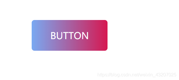
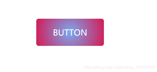
渐变的方向默认是从上到下,如果改为从左到右,可以添加 to right参数:
    a{
        background: linear-gradient(to right, #79a9f2, #d61851);
    }
也可以在方向中加入top或bottom来生成斜向的渐变。
比如使渐变从按钮左上方起始,到右下方终止:
    a{
        background: linear-gradient(to right bottom, #79a9f2, #d61851);
    }

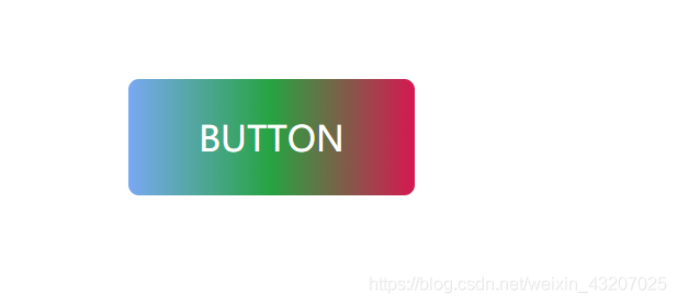
还可以在渐变中加入多个色值点,来形成多样化的色彩效果。
比如,在两种绿色之间加入蓝色:
    a{
        background: linear-gradient(to right, #79a9f2, #26a341, #d61851);
    }
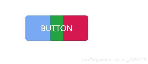
还可以为每个色值点添加位置百分比,更加精确的控制渐变效果。
使得从0%到40%的区域都为蓝色,从60%到100%的区域为红色,剩下的40%到60%的区域则是由蓝色过渡到绿色,再过度到红色。
    a{
        background: linear-gradient(to right, #79a9f2 40%, #26a341, #d61851 60%);
    }

设置40%到60%为绿色
    a{
        background: linear-gradient(to right, #79a9f2 40%, #26a341 40%, #26a341 60%, #d61851 60%);
    }
二、径向渐变:
默认的径向渐变是有中心向四周渐变
    a{
        background: radial-gradient(#79a9f2, #d61851);
    }
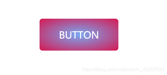
使径向渐变不受元素的影响,始终显示圆形的渐变效果——添加 circle 参数
    a{
        background: radial-gradient(circle, #79a9f2, #d61851);
    }
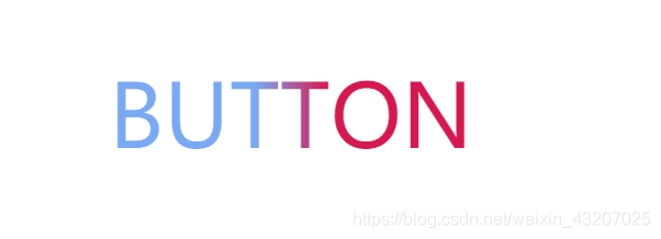
三、文字渐变:
    a{
        font-size: 5em;
        background: linear-gradient(to right, #79a9f2 40%, #d61851 60%);
        background-clip: text;
        -webkit-background-clip: text;
        color: transparent;
    }
- background-clip:设置元素的背景(背景图片或颜色)是否延伸到边框下面。
https://developer.mozilla.org/zh-CN/docs/Web/CSS/background-clip