0.前言
Qt Quick 提供了两个基本的文本输入组件 TextInput 和 TextEdit ,在 Control 模块中提供了以前面两种为基类的 TextField 和 TextArea 。其中,TextInput 和 TextField 类似 QWidgets 里面的 QLineEdit ,可以作为密码框或限制输入内容;而 TextEdit 和 TextArea 类似 QTextEdit ,支持富文本。
虽然与 QWidgets 文本输入控件类似,但是在默认样式上很不同,比如,本文要讲的四个 QML 输入组件只有 TextFiled 有默认的边框,四个组件都需要设置 selectByMouse 属性为 true 才可以用鼠标选取文本块,文本换行需要设置 wrapMode 属性等等。
(下面的代码,我是在 Qt 5.12 中编写的,一些属性可能在旧版本中不支持,具体参见相应版本的Qt文档)
(github链接:https://github.com/gongjianbo/QmlComponentStyle )
目录
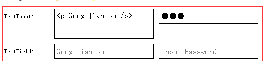
1.TextInput 和 TextField
这两个控件类似QWidgets中的QLineEdit。可以使用validator或inputMask对输入文本做范围限制。validator提供了IntValidator、DoubleValidator、RegExpValidator,如果设置了validator的属性,用户只能输入validator所界定范围的字符。inputMask是个字符串,用来限制你可以输入的字符,可以参考QLineEdit::inputMask。也可以设置echoMode来实现一个密码框,默认为TextInput.Normal,设置为Textlnput.Password就成了一个密码框。其他颜色字体等相关的可以参考后面的代码。
QML的这些文本输入组件还有个特点是,可以定义cursor光标,通过定制cursorDelegate来定制外观,cursorPosition设置或返回光标位置,cursorVisible设置或返回光标的可见状态。cursorRectangle是只读属性,当cursorRectangle变化尺寸,返回光标所在矩形。
代码如下:
Row{
id: textinput_row
spacing: 10
Text {
width: 90
height: 30
verticalAlignment: Text.AlignVCenter
renderType: Text.NativeRendering
text: "TextInput:"
}
//Qt\qt-everywhere-src-5.12.4\qtdeclarative\src\quick\items\qquicktextinput_p.h
ScrollView{
id: textinput_1_view
width: 200
height: 60
background: Rectangle{
border.color: textinput_1.activeFocus? "blue": "black"
border.width: textinput_1.activeFocus? 2: 1
}
clip: true
ScrollBar.horizontal: ScrollBar{ visible: false }
//普通文本输入框
TextInput{
//默认没有背景,这里组合一个rectangle
id: textinput_1
width: textinput_1_view.width
padding: 5
text: "<p>Gong Jian Bo</p>"
//文本颜色
color: "black"
//只读
readOnly: false
//horizontalAlignment: TextInput.AlignLeft
//文本默认顶部对齐
//verticalAlignment: TextInput.AlignVCenter
//光标样式是可以自定义的
cursorDelegate: Rectangle{
width: 2
color: "blue"
property bool cursorRuning: textinput_1.cursorVisible
visible: false
SequentialAnimation on visible {
id: cursorAnimation
running: false
loops: Animation.Infinite
PropertyAnimation { from:true; to: false; duration: 750 }
PropertyAnimation { from:false; to: true; duration: 500 }
}
onCursorRuningChanged: {
cursorAnimation.running=cursorRuning;
visible=cursorRuning;
}
}
//cursorVisible: focus
//默认鼠标选取文本设置为false
selectByMouse: true
//选中文本的颜色
selectedTextColor: "white"
//选中文本背景色
selectionColor: "black"
//超出宽度时开启允许滚动,默认为true
autoScroll: true
//显示模式:Normal普通文本,Password密码,NoEcho无显示,
//PasswordEchoOnEdit显示在编辑时输入的字符,否则与相同TextInput.Password
echoMode: TextInput.Normal
//Password显示的字符,默认是个圆点
//passwordCharacter: "*"
//Password由普通字符到被特殊符号替换的间隔
//passwordMaskDelay: 1000
//输入掩码,参照Widgets版本的的QLineEidt::inputMask,类似正则
//inputMask: ">XXXXX;*"
//字体的属性也比较多,可以自行看文档
font{
family: "SimSun"
pixelSize: 16
}
//截取超出部分
//clip: true
//默认Text.QtRendering看起来比较模糊
renderType: Text.NativeRendering
//文本字符最大允许长度
//maximumLength: 10
//新的输入覆盖光标后面的文本
//overwriteMode: true
//文本换行,默认NoWrap
wrapMode: TextInput.Wrap
//一些只读属性
//一些复制粘贴相关的我略去了
//文本高度
//contentHeight: real
//文本宽度
//contentWidth: real
//与text属性不同,displayText包含来自输入法的部分文本输入
//displayText: string
//文本字符长度
//length: int
//选中的文本
//selectedText: string
//信号
//当按下Return或Enter键时,将发出此信号
onAccepted: {}
//当按下Return或Enter键或文本输入失去焦点时
onEditingFinished: {}
//每当编辑文本时,都会发出此信号
//与textChanged不同的是,编程方式修改文本时不触发此信号
onTextEdited: {}
//其他
//编辑相关的方法,略
}
}
Rectangle{
width: 200
height: 30
border.color: textinput_2.activeFocus? "blue": "black"
border.width: textinput_2.activeFocus? 2: 1
//密码输入框
TextInput{
id: textinput_2
anchors.fill: parent
leftPadding: 5
rightPadding: 5
color: "black"
text: "123"
horizontalAlignment: TextInput.AlignLeft
verticalAlignment: TextInput.AlignVCenter
//光标样式是可以自定义的
//cursorVisible: focus
//默认鼠标选取文本设置为false
selectByMouse: true
//选中文本的颜色
selectedTextColor: "white"
//选中文本背景色
selectionColor: "black"
//超出宽度时开启允许滚动,默认为true
autoScroll: true
//显示模式:Normal普通文本,Password密码,NoEcho无显示,
//PasswordEchoOnEdit显示在编辑时输入的字符,否则与相同TextInput.Password
echoMode: TextInput.Password
//Password显示的字符,默认是个圆点
//passwordCharacter: "*"
//Password由普通字符到被特殊符号替换的间隔
passwordMaskDelay: 1000
//输入掩码,参照Widgets版本的的QLineEidt::inputMask,类似正则
//inputMask: ">XXXXX;*"
//输入限制,如IntValidator,DoubleValidator,RegExpValidator
//我这里配合maximumLength限制了输入为6个数字
validator: RegExpValidator{
regExp: /[0-9]+/
}
//字体的属性也比较多,可以自行看文档
font{
family: "SimSun"
pixelSize: 16
}
//截取超出部分
clip: true
//默认Text.QtRendering看起来比较模糊
renderType: Text.NativeRendering
//文本字符最大允许长度
maximumLength: 6
}
}
}
Row{
id: textfield_row
spacing: 10
Text {
width: 90
height: 30
verticalAlignment: Text.AlignVCenter
renderType: Text.NativeRendering
text: "TextField:"
}
//TextField是四个里面唯一带边框的,并且获得焦点时边框变色
//Qt\qt-everywhere-src-5.12.4\qtquickcontrols2\src\imports\controls\TextField.qml
//Qt\qt-everywhere-src-5.12.4\qtquickcontrols2\src\quicktemplates2\qquicktextfield_p.h
TextField{
id: textfield_1
width: 200
height: 30
color: "black"
leftPadding: 5
rightPadding: 5
//无输入时显示的文本
placeholderText: "Gong Jian Bo"
placeholderTextColor: "gray"
//horizontalAlignment: TextInput.AlignLeft
//和TextInput不一样的是,它默认是VCenter
//verticalAlignment: TextInput.AlignVCenter
//默认鼠标选取文本设置为false
selectByMouse: true
//选中文本的颜色
selectedTextColor: "white"
//选中文本背景色
selectionColor: "black"
//超出宽度时开启允许滚动,默认为true
//autoScroll: true
//字体的属性也比较多,可以自行看文档
font{
family: "SimSun"
pixelSize: 16
}
//截取超出部分
clip: true
//默认Text.QtRendering看起来比较模糊
renderType: Text.NativeRendering
//此属性保留上次焦点更改的原因
//focusReason: enum
//鼠标hover事件
//hoverEnabled: true
//底框,这里根据焦点设置颜色
background: Rectangle {
border.width: textfield_1.activeFocus ? 2 : 1
color: "white"
border.color: textfield_1.activeFocus ? "blue" : "black"
}
//信号
//长按时会发出此信号(延迟取决于平台插件)
onPressAndHold: { /*event*/ }
//当用户按下文本字段时,将发出此信号
onPressed: { /*event*/ }
//当用户释放文本字段时,将发出此信号
onReleased: { /*event*/ }
}
TextField{
id: textfield_2
width: 200
height: 30
color: "black"
leftPadding: 5
rightPadding: 5
//无输入时显示的文本
placeholderText: "Input Password"
placeholderTextColor: "gray"
//默认鼠标选取文本设置为false
selectByMouse: true
//选中文本的颜色
selectedTextColor: "white"
//选中文本背景色
selectionColor: "black"
//超出宽度时开启允许滚动,默认为true
//autoScroll: true
//作为密码框
//显示模式:Normal普通文本,Password密码,NoEcho无显示,
//PasswordEchoOnEdit显示在编辑时输入的字符,否则与相同TextInput.Password
echoMode: TextInput.Password
//Password显示的字符,默认是个圆点
//passwordCharacter: "*"
//Password由普通字符到被特殊符号替换的间隔
passwordMaskDelay: 1000
//输入掩码,参照Widgets版本的的QLineEidt::inputMask,类似正则
//inputMask: ">XXXXX;*"
//字体的属性也比较多,可以自行看文档
font{
family: "SimSun"
pixelSize: 16
}
//截取超出部分
clip: true
//默认Text.QtRendering看起来比较模糊
renderType: Text.NativeRendering
//底框,这里根据焦点设置颜色
background: Rectangle {
border.width: textfield_2.activeFocus ? 2 : 1
color: "white"
border.color: textfield_2.activeFocus ? "blue" : "black"
}
}
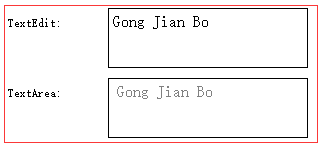
}2.TextEdit 和 TextArea
这两个控件类似QWidgets中的QTextEdit,大部分设置和前面的两个类似。此外,可以使用textFormat属性指定文本格式,默认为纯文本(TextEdit.PlainText),可以设置为富文本(TextEdit.RichText)还是自动检测(TextEdit.AutoText)来支持富文本。textDocument属性,可以结合QSyntaxHighlighter来实现语法高亮。
代码如下:
    Row{
        id: textedit_row
        spacing: 10

        Text {
            width: 90
            height: 30
            verticalAlignment: Text.AlignVCenter
            renderType: Text.NativeRendering
            text: "TextEdit:"
        }

        //Qt\qt-everywhere-src-5.12.4\qtdeclarative\src\quick\items\qquicktextedit_p.h
        ScrollView {
            id: textedit_1_view
            width: 200
            height: 60
            background: Rectangle{
                border.color: textedit_1.activeFocus? "blue": "black"
                border.width: textedit_1.activeFocus? 2: 1
            }
            clip: true
            ScrollBar.horizontal: ScrollBar{ visible: false }

            TextEdit{
                id: textedit_1
                width: textedit_1_view.width
                padding: 5
                color: "black"
                text: "<p>Gong Jian Bo</p>"
                //支持富文本
                textFormat: TextEdit.RichText
                //光标样式是可以自定义的
                //cursorVisible: focus
                //鼠标选取文本默认为false
                selectByMouse: true
                //键盘选取文本默认为true
                selectByKeyboard: true
                //选中文本的颜色
                selectedTextColor: "white"
                //选中文本背景色
                selectionColor: "black"
                //超出宽度时开启允许滚动,默认为true
                //字体的属性也比较多,可以自行看文档
                font{
                    family: "SimSun"
                    pixelSize: 16
                }
                //截取超出部分
                //clip: true
                //默认Text.QtRendering看起来比较模糊
                renderType: Text.NativeRendering
                //文本换行,默认NoWrap
                wrapMode: TextEdit.Wrap

                //其他
                //富文本链接相关的我就不写了
            }
        }
    }

    Row{
        id: textarea_row
        spacing: 10

        Text {
            width: 90
            height: 30
            verticalAlignment: Text.AlignVCenter
            renderType: Text.NativeRendering
            text: "TextArea:"
        }

        ScrollView {
            id: textarea_1_view
            width: 200
            height: 60
            background: Rectangle{
                border.color: textarea_1.activeFocus? "blue": "black"
                border.width: textarea_1.activeFocus? 2: 1
            }
            clip: true
            ScrollBar.horizontal: ScrollBar{ visible: false }

            //Qt\qt-everywhere-src-5.12.4\qtquickcontrols2\src\imports\controls\TextArea.qml
            //Qt\qt-everywhere-src-5.12.4\qtquickcontrols2\src\quicktemplates2\qquicktextarea_p.h
            TextArea{
                id: textarea_1
                width: textarea_1_view.width
                padding: 5
                color: "black"
                //无输入时的提示文本
                placeholderText: "Gong Jian Bo"
                placeholderTextColor: "gray"
                //text: "<p>Gong Jian Bo</p>"
                //支持富文本
                textFormat: TextEdit.RichText
                //光标样式是可以自定义的
                //cursorVisible: focus
                //鼠标选取文本默认为false
                selectByMouse: true
                //键盘选取文本默认为true
                selectByKeyboard: true
                //选中文本的颜色
                selectedTextColor: "white"
                //选中文本背景色
                selectionColor: "black"
                //超出宽度时开启允许滚动,默认为true
                //字体的属性也比较多,可以自行看文档
                font{
                    family: "SimSun"
                    pixelSize: 16
                }
                //截取超出部分
                //clip: true
                //默认Text.QtRendering看起来比较模糊
                renderType: Text.NativeRendering
                //文本换行,默认NoWrap
                wrapMode: TextEdit.Wrap
            }
        }
    }
3.后记
目前代码只对样式进行了定制,没有组合信号和方法来展示实际应用。滚动条还小问题,除了TextArea,其他的在点击所在行才有焦点。此外TextField和TextArea默认可以被全局tab切换焦点,另外两个需要自己实现。如果你有其他问题,欢迎留言。
要吐槽的是,因为QML的基础组件都是通过C++代码实现的,有一些用起来或定制起来不方便的地方要去改源码也比较麻烦。
4.参考
Qt文档及源码:链接略
博客:https://blog.csdn.net/kanchuan1905/article/details/53839930
