我是完全根据这里仿制了一个作为备忘,可以点击这里查看原始版本
代码如下:
1、res/values/attrs.xml
<?xml version="1.0" encoding="utf-8"?>
<resources>

    <declare-styleable name="RoundProgressBar">
        <attr name="roundColor" format="color" />
        <attr name="roundProgressColor" format="color" />
        <attr name="roundWidth" format="dimension"></attr>
        <attr name="textColor" format="color" />
        <attr name="textSize" format="dimension" />
        <attr name="max" format="integer"></attr>
        <attr name="textIsDisplayable" format="boolean"></attr>
        <attr name="style">
            <enum name="STROKE" value="0"></enum>
            <enum name="FILL" value="1"></enum>
        </attr>
    </declare-styleable>

</resources>
2、具体实现
public class RoundProgressBar extends View {
private Paint mPaint;
private int mRoundColor;
private int mProgressColor;
private int mTextColor;
private int mTextSize;
private float mRounWidth;
private int mMaxProgress;
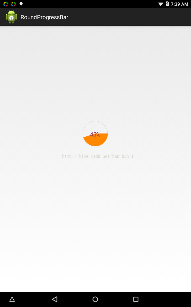
private int mCurrentProgress = 45;
private boolean mTextIsDisplayable;
private int mStyle = 1;
private static final int STROKE = 0;
private static final int FILL =1;
public RoundProgressBar(Context context) {
this(context, null);
}
public RoundProgressBar(Context context, AttributeSet attrs) {
this(context, attrs, 0);
}
public RoundProgressBar(Context context, AttributeSet attrs,
int defStyleAttr) {
super(context, attrs, defStyleAttr);
mPaint = new Paint();
TypedArray typedArray = context.obtainStyledAttributes(attrs, R.styleable.RoundProgressBar);
mRoundColor = typedArray.getColor(R.styleable.RoundProgressBar_roundColor, Color.RED);
mProgressColor = typedArray.getColor(R.styleable.RoundProgressBar_roundProgressColor, Color.GREEN);
mTextColor = typedArray.getColor(R.styleable.RoundProgressBar_textColor, Color.BLUE);
mTextSize = typedArray.getDimensionPixelSize(R.styleable.RoundProgressBar_textSize, 15);
mRounWidth = typedArray.getDimensionPixelSize(R.styleable.RoundProgressBar_roundWidth, 5);
mMaxProgress = typedArray.getInt(R.styleable.RoundProgressBar_max, 100);
mTextIsDisplayable = typedArray.getBoolean(R.styleable.RoundProgressBar_textIsDisplayable, true);
mStyle = typedArray.getInt(R.styleable.RoundProgressBar_style, STROKE);
typedArray.recycle();
}
@Override
protected void onDraw(Canvas canvas) {
super.onDraw(canvas);
// Draw outer circle
int center = getWidth() / 2;
int radius = (int) (center - mRounWidth / 2);
mPaint.setColor(mRoundColor);
mPaint.setStyle(Paint.Style.STROKE);
mPaint.setStrokeWidth(mRounWidth);
mPaint.setAntiAlias(true);
canvas.drawCircle(center, center, radius, mPaint);
// Draw progress
mPaint.setStrokeWidth(mRounWidth);
mPaint.setColor(mProgressColor);
RectF oval = new RectF(center - radius, center - radius,
center + radius, center + radius);
switch (mStyle) {
case STROKE:
mPaint.setStyle(Paint.Style.STROKE);
canvas.drawArc(oval, 0, 360 * mCurrentProgress / mMaxProgress, false, mPaint);
break;
case FILL:
mPaint.setStyle(Paint.Style.FILL_AND_STROKE);
if (mCurrentProgress != 0) {
canvas.drawArc(oval, 0, 360 * mCurrentProgress / mMaxProgress, true, mPaint);
}
break;
default:
break;
}
mPaint.setStrokeWidth(0);
mPaint.setColor(mTextColor);
mPaint.setTextSize(mTextSize);
mPaint.setTypeface(Typeface.DEFAULT);
int percent = (int) (((float) mCurrentProgress / (float) mMaxProgress) * 100);
float textWidth = mPaint.measureText(percent + "%");
if (percent != 0 && mTextIsDisplayable) {
canvas.drawText(percent + "%", center - textWidth / 2, center + mTextSize / 2, mPaint);
}
}
public int getRoundColor() {
return mRoundColor;
}
public void setRoundColor(int roundColor) {
this.mRoundColor = roundColor;
}
public int getProgressColor() {
return mProgressColor;
}
public void setProgressColor(int progressColor) {
this.mProgressColor = progressColor;
}
public int getTextColor() {
return mTextColor;
}
public void setTextColor(int textColor) {
this.mTextColor = textColor;
}
public int getTextSize() {
return mTextSize;
}
public void setTextSize(int textSize) {
this.mTextSize = textSize;
}
public float getRounWidth() {
return mRounWidth;
}
public void setmRounWidth(float mRounWidth) {
this.mRounWidth = mRounWidth;
}
public synchronized int getMaxProgress() {
return mMaxProgress;
}
public synchronized void setMaxProgress(int maxProgress) {
if (maxProgress < 0) {
throw new IllegalArgumentException("Max Progress not less than 0");
}
this.mMaxProgress = maxProgress;
}
public synchronized int getCurrentProgress() {
return mCurrentProgress;
}
public synchronized void setCurrentProgress(int currentProgress) {
if (currentProgress < 0) {
throw new IllegalArgumentException("Progress not less than 0");
}
if (currentProgress > mMaxProgress) {
currentProgress = mMaxProgress;
}
if (currentProgress <= mMaxProgress) {
this.mCurrentProgress = currentProgress;
postInvalidate();
}
}
public boolean isTextIsDisplayable() {
return mTextIsDisplayable;
}
public void setTextDisplayable(boolean displayable) {
this.mTextIsDisplayable = displayable;
}
public int getStyle() {
return mStyle;
}
public void setStyle(int style) {
this.mStyle = style;
}
}
<FrameLayout xmlns:android="http://schemas.android.com/apk/res/android"
    xmlns:android_custom="http://schemas.android.com/apk/res/com.example.demo"
    xmlns:tools="http://schemas.android.com/tools"
    android:layout_width="match_parent"
    android:layout_height="match_parent"
    tools:context="com.example.gaussianblur.MainActivity" >

    <com.example.demo.RoundProgressBar
        android:id="@+id/roundProgressBar"
        android:layout_width="80dip"
        android:layout_height="80dip"
        android:layout_marginBottom="78dp"
        android:layout_gravity="center"
        android_custom:roundColor="#D1D1D1"
        android_custom:roundProgressColor="@android:color/holo_orange_dark"
        android_custom:roundWidth="4dip"
        android_custom:textColor="#9A32CD"
        android_custom:textIsDisplayable="true"
        android_custom:textSize="18sp" />


</FrameLayout>