Regression Analysis
- Introduction
- House Dataset
- Visualizing dataset
- Implement by yourself
- regression model via scikit-learn
- Fitting a robust regression model using RANSAC
- Evaluating the performance of linear regression models
- Using regularized methods for regression
- polynomial regression
- Decision tree regression
- Random forest regression
学习目标:
- Exploring and visualizing datasets
- Looking at different approaches to implement linear regression models
- Training regression models that are robust to outliners
- Evaluating regression models and diagnoing common problems
- Fitting regression models to nonlinear data
Introduction
Trivial!

House Dataset
import pandas as pd

df = pd.read_csv('https://raw.githubusercontent.com/rasbt/'
                 'python-machine-learning-book-2nd-edition'
                 '/master/code/ch10/housing.data.txt',
                 header=None,
                 sep='\s+')

df.columns = ['CRIM', 'ZN', 'INDUS', 'CHAS',
              'NOX', 'RM', 'AGE', 'DIS', 'RAD',
              'TAX', 'PTRATIO', 'B', 'LSTAT', 'MEDV']
df.head()

Visualizing dataset
Exploratory Data Analysis
1. Scatterplot matrix
import matplotlib.pyplot as plt
import seaborn as sns
cols = ['LSTAT', 'INDUS', 'NOX', 'RM', 'MEDV']

sns.pairplot(df[cols], height=2.5)
plt.tight_layout()
# plt.savefig('images/10_03.png', dpi=300)
plt.show()

Using this scatterplot matrix, we can now quickly eyeball how the data is distributed and whether it contains outliers.
2.Heat map
import numpy as np

%matplotlib inline

cm = np.corrcoef(df[cols].values.T)
#sns.set(font_scale=1.5)
hm = sns.heatmap(cm,
                 cbar=True,
                 annot=True,
                 square=True,
                 fmt='.2f',
                 annot_kws={'size': 15},
                 yticklabels=cols,
                 xticklabels=cols)
hm.set_ylim(5.0, 0)
plt.tight_layout()
# plt.savefig('images/10_04.png', dpi=300)
plt.show()

Implement by yourself
It’s very similar to the Gradiant descent, as follows:
def lin_regplot(X, y, model):
    plt.scatter(X, y, c='steelblue', edgecolor='white', s=70)
    plt.plot(X, model.predict(X), color='black', lw=2)
    return
lin_regplot(X_std, y_std, lr)
plt.xlabel('Average number of rooms [RM] (standardized)')
plt.ylabel('Price in $1000s [MEDV] (standardized)')

#plt.savefig('images/10_06.png', dpi=300)
plt.show()

print('Slope: %.3f' % lr.w_[1])
print('Intercept: %.3f' % lr.w_[0])
----------------------------------------------
Slope: 0.695
Intercept: -0.000
num_rooms_std = sc_x.transform(np.array([[5.0]]))
price_std = lr.predict(num_rooms_std)
print("Price in $1000s: %.3f" % sc_y.inverse_transform(price_std))
---------------------------------------------
Price in $1000s: 10.840
regression model via scikit-learn
from sklearn.linear_model import LinearRegression
slr = LinearRegression()
slr.fit(X, y)
y_pred = slr.predict(X)
print('Slope: %.3f' % slr.coef_[0])
print('Intercept: %.3f' % slr.intercept_)
------------------------------------------------
Slope: 9.102
Intercept: -34.671
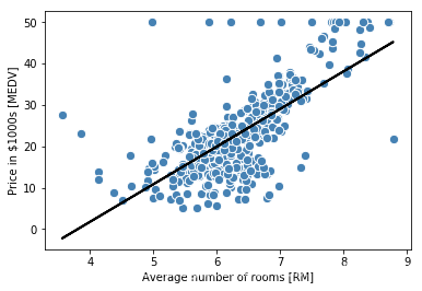
lin_regplot(X, y, slr)
plt.xlabel('Average number of rooms [RM]')
plt.ylabel('Price in $1000s [MEDV]')

#plt.savefig('images/10_07.png', dpi=300)
plt.show()
Fitting a robust regression model using RANSAC
RAMdom SAmple Consensus(RAMSAC) algorithm fits a regression model to a subset of the data, the so-called inliners.
from sklearn.linear_model import RANSACRegressor

ransac = RANSACRegressor(LinearRegression(),
                         max_trials=100,
                         min_samples=50,
                         loss='absolute_loss',
                         residual_threshold=5.0, #这个选择是因问题而异的
                         random_state=0)


ransac.fit(X, y)

inlier_mask = ransac.inlier_mask_#bool
outlier_mask = np.logical_not(inlier_mask)

line_X = np.arange(3, 10, 1)
line_y_ransac = ransac.predict(line_X[:, np.newaxis])
plt.scatter(X[inlier_mask], y[inlier_mask],
            c='steelblue', edgecolor='white',
            marker='o', label='Inliers')
plt.scatter(X[outlier_mask], y[outlier_mask],
            c='limegreen', edgecolor='white',
            marker='s', label='Outliers')
plt.plot(line_X, line_y_ransac, color='black', lw=2)
plt.xlabel('Average number of rooms [RM]')
plt.ylabel('Price in $1000s [MEDV]')
plt.legend(loc='upper left')

#plt.savefig('images/10_08.png', dpi=300)
plt.show()

Evaluating the performance of linear regression models
1.Prediction
from sklearn.model_selection import train_test_split

X = df.iloc[:, :-1].values
y = df['MEDV'].values

X_train, X_test, y_train, y_test = train_test_split(
    X, y, test_size=0.3, random_state=0)

slr = LinearRegression()
slr.fit(X_train, y_train)
y_train_pred = slr.predict(X_train)
y_test_pred = slr.predict(X_test)
2.Visualization by residual plots
plt.scatter(y_train_pred,  y_train_pred - y_train,
            c='steelblue', marker='o', edgecolor='white',
            label='Training data')
plt.scatter(y_test_pred,  y_test_pred - y_test,
            c='limegreen', marker='s', edgecolor='white',
            label='Test data')
plt.xlabel('Predicted values')
plt.ylabel('Residuals')
plt.legend(loc='upper left')
plt.hlines(y=0, xmin=-10, xmax=50, color='black', lw=2)
plt.xlim([-10, 50])
plt.tight_layout()

# plt.savefig('images/10_09.png', dpi=300)
plt.show()

MSE and
from sklearn.metrics import r2_score
from sklearn.metrics import mean_squared_error

print('MSE train: %.3f, test: %.3f' % (
        mean_squared_error(y_train, y_train_pred),
        mean_squared_error(y_test, y_test_pred)))
print('R^2 train: %.3f, test: %.3f' % (
        r2_score(y_train, y_train_pred),
        r2_score(y_test, y_test_pred)))
-------------------------------------------------
MSE train: 19.958, test: 27.196
R^2 train: 0.765, test: 0.673
Which shows that our model is overfitting.
Using regularized methods for regression
1. Ridge regression
Ridge regression is an L2 penalized model where we simply add the squared sum of the weight to our least-squares cost function:
Here:
from sklearn.linear_model import Ridge
ridge = Ridge(alpha=1.0)
2.LASSO
Least Absolute Shrinkage and Selection Operator.
Depending on the regularization strengh, certain weights can become zero, which makes the LASSO also useful as a supervied feature selection technique.
Here:
from sklearn.linear_model import Lasso

lasso = Lasso(alpha=0.1)
lasso.fit(X_train, y_train)
y_train_pred = lasso.predict(X_train)
y_test_pred = lasso.predict(X_test)
print(lasso.coef_)
------------------------------------
[-0.11311792  0.04725111 -0.03992527  0.96478874 -0.          3.72289616
 -0.02143106 -1.23370405  0.20469    -0.0129439  -0.85269025  0.00795847
 -0.52392362]
print('MSE train: %.3f, test: %.3f' % (
        mean_squared_error(y_train, y_train_pred),
        mean_squared_error(y_test, y_test_pred)))
print('R^2 train: %.3f, test: %.3f' % (
        r2_score(y_train, y_train_pred),
        r2_score(y_test, y_test_pred)))
----------------------------------------------
MSE train: 20.926, test: 28.876
R^2 train: 0.753, test: 0.653
3. Elastic Net
Elastic Net has a compromise between Ridge regression and the LASSO is the Elastic Net, which has a L1 penalty to generate sparsity and a L2 penalty to overcome some of the limitations of the LASSO, such as the number of selected variables.
from sklearn.linear_model import ElasticNet
elanet = ElasticNet(alpha=1.0, l1_ratio=0.5)
polynomial regression
1. A simple toy example
Note that although we can use polynomial regression to model a nonlinear relationship, it’s still considered a multiple linear regression model because of the linear regression coefficients .
X = np.array([258.0, 270.0, 294.0,
              320.0, 342.0, 368.0,
              396.0, 446.0, 480.0, 586.0])\
             [:, np.newaxis]

y = np.array([236.4, 234.4, 252.8,
              298.6, 314.2, 342.2,
              360.8, 368.0, 391.2,
              390.8])

from sklearn.preprocessing import PolynomialFeatures

lr = LinearRegression()
pr = LinearRegression()
quadratic = PolynomialFeatures(degree=2)
X_quad = quadratic.fit_transform(X)
#1 x x^2
# fit linear features
lr.fit(X, y)
X_fit = np.arange(250, 600, 10)[:, np.newaxis]
y_lin_fit = lr.predict(X_fit)

# fit quadratic features
pr.fit(X_quad, y)
y_quad_fit = pr.predict(quadratic.fit_transform(X_fit))

# plot results
plt.scatter(X, y, label='training points')
plt.plot(X_fit, y_lin_fit, label='linear fit', linestyle='--')
plt.plot(X_fit, y_quad_fit, label='quadratic fit')
plt.legend(loc='upper left')

plt.tight_layout()
#plt.savefig('images/10_10.png', dpi=300)
plt.show()

y_lin_pred = lr.predict(X)
y_quad_pred = pr.predict(X_quad)
print('Training MSE linear: %.3f, quadratic: %.3f' % (
        mean_squared_error(y, y_lin_pred),
        mean_squared_error(y, y_quad_pred)))
print('Training R^2 linear: %.3f, quadratic: %.3f' % (
        r2_score(y, y_lin_pred),
        r2_score(y, y_quad_pred)))
-------------------------------------------------
Training MSE linear: 569.780, quadratic: 61.330
Training R^2 linear: 0.832, quadratic: 0.982
2. Nonlinear in Housing dataset
X = df[['LSTAT']].values
y = df['MEDV'].values

regr = LinearRegression()

# create quadratic features
quadratic = PolynomialFeatures(degree=2)
cubic = PolynomialFeatures(degree=3)
X_quad = quadratic.fit_transform(X)
X_cubic = cubic.fit_transform(X)

# fit features
X_fit = np.arange(X.min(), X.max(), 1)[:, np.newaxis]

regr = regr.fit(X, y)
y_lin_fit = regr.predict(X_fit)
linear_r2 = r2_score(y, regr.predict(X))

regr = regr.fit(X_quad, y)
y_quad_fit = regr.predict(quadratic.fit_transform(X_fit))
quadratic_r2 = r2_score(y, regr.predict(X_quad))

regr = regr.fit(X_cubic, y)
y_cubic_fit = regr.predict(cubic.fit_transform(X_fit))
cubic_r2 = r2_score(y, regr.predict(X_cubic))


# plot results
plt.scatter(X, y, label='training points', color='lightgray')

plt.plot(X_fit, y_lin_fit,
         label='linear (d=1), $R^2=%.2f$' % linear_r2,
         color='blue',
         lw=2,
         linestyle=':')

plt.plot(X_fit, y_quad_fit,
         label='quadratic (d=2), $R^2=%.2f$' % quadratic_r2,
         color='red',
         lw=2,
         linestyle='-')

plt.plot(X_fit, y_cubic_fit,
         label='cubic (d=3), $R^2=%.2f$' % cubic_r2,
         color='green',
         lw=2,
         linestyle='--')

plt.xlabel('% lower status of the population [LSTAT]')
plt.ylabel('Price in $1000s [MEDV]')
plt.legend(loc='upper right')

#plt.savefig('images/10_11.png', dpi=300)
plt.show()

3. Data Transformation
We could propose that a log transformation of the LSTAT feature variable and the square root of MEDV may project the data onto a linear feature space suitable for a linear regression.
X = df[['LSTAT']].values
y = df['MEDV'].values

# transform features
X_log = np.log(X)
y_sqrt = np.sqrt(y)

# fit features
X_fit = np.arange(X_log.min()-1, X_log.max()+1, 1)[:, np.newaxis]

regr = regr.fit(X_log, y_sqrt)
y_lin_fit = regr.predict(X_fit)
linear_r2 = r2_score(y_sqrt, regr.predict(X_log))

# plot results
plt.scatter(X_log, y_sqrt, label='training points', color='lightgray')

plt.plot(X_fit, y_lin_fit,
         label='linear (d=1), $R^2=%.2f$' % linear_r2,
         color='blue',
         lw=2)

plt.xlabel('log(% lower status of the population [LSTAT])')
plt.ylabel('$\sqrt{Price \; in \; \$1000s \; [MEDV]}$')
plt.legend(loc='lower left')

plt.tight_layout()
#plt.savefig('images/10_12.png', dpi=300)
plt.show()

Decision tree regression
Information Gain(IG):
Here,
is the feature to perform the split.
is the number of samples in the parent node.
is the impurity function.
is the subset of training samples in the parent noed.
Here,
is the number of training samples at node
.
is the training subset at node
.
is the true target value.
is the predicted target value(sample means):
from sklearn.tree import DecisionTreeRegressor

X = df[['LSTAT']].values
y = df['MEDV'].values

tree = DecisionTreeRegressor(max_depth=3)
tree.fit(X, y)

sort_idx = X.flatten().argsort()#返回数组的索引值

lin_regplot(X[sort_idx], y[sort_idx], tree)#其实就是从小到大排列了一下
plt.xlabel('% lower status of the population [LSTAT]')
plt.ylabel('Price in $1000s [MEDV]')
#plt.savefig('images/10_13.png', dpi=300)
plt.show()

Limitation
It does not capture the continuity and differentiability of the desired prediction.
Random forest regression
X = df.iloc[:, :-1].values
y = df['MEDV'].values

X_train, X_test, y_train, y_test = train_test_split(
    X, y, test_size=0.4, random_state=1)
from sklearn.ensemble import RandomForestRegressor

forest = RandomForestRegressor(n_estimators=1000,
                               criterion='mse',
                               random_state=1,
                               n_jobs=-1)
forest.fit(X_train, y_train)
y_train_pred = forest.predict(X_train)
y_test_pred = forest.predict(X_test)

print('MSE train: %.3f, test: %.3f' % (
        mean_squared_error(y_train, y_train_pred),
        mean_squared_error(y_test, y_test_pred)))
print('R^2 train: %.3f, test: %.3f' % (
        r2_score(y_train, y_train_pred),
        r2_score(y_test, y_test_pred)))
-------------------------------------------------
MSE train: 1.642, test: 11.052
R^2 train: 0.979, test: 0.878
plt.scatter(y_train_pred,
            y_train_pred - y_train,
            c='steelblue',
            edgecolor='white',
            marker='o',
            s=35,
            alpha=0.9,
            label='training data')
plt.scatter(y_test_pred,
            y_test_pred - y_test,
            c='limegreen',
            edgecolor='white',
            marker='s',
            s=35,
            alpha=0.9,
            label='test data')

plt.xlabel('Predicted values')
plt.ylabel('Residuals')
plt.legend(loc='upper left')
plt.hlines(y=0, xmin=-10, xmax=50, lw=2, color='black')
plt.xlim([-10, 50])
plt.tight_layout()

# plt.savefig('images/10_14.png', dpi=300)
plt.show()

Over!
Thank you for your precise time and patience and also thanks for the book by Sabastian Raschka!!!
