1、HTML5文档类型
Bootstrap 使用了一些 HTML5 元素和 CSS 属性,因此需要使用 HTML5 文档类型,开头定义如下:
<!DOCTYPE html>
<html>
    <head>
        <meta charset="UTF-8">
        <title></title>
    </head>
    <body>
    </body>
</html>
2、移动设备优先
Bootstrap 3 的设计目标是移动设备优先,然后才是桌面设备。为了确保适当的绘制和触屏缩放,需要在 <head> 之中添加 viewport 元数据标签:
<meta name="viewport" content="width=device-width, initial-scale=1">
"viewport":设备上用来显示网页的那部分区域,通常都有一个默认值
"content":宽度为设备的理想宽度
"initial-scale=1":初始缩放值

还可以添加其它属性对最大/小缩放值和是否允许缩放进行设置:
<meta name="viewport" content="width=device-width, initial-scale=1, maximum-scale=1, user-scalable=no">
3、响应式图像(可以让图像按比例缩放,不超过其父元素的尺寸)
<img src=" " class="img-responsive" alt="响应式图像">
4、全局显示(<body>元素)
body {
  font-family: "Helvetica Neue", Helvetica, Arial, sans-serif;//字体样式
  font-size: 14px;//字体大小
  line-height: 1.428571429;//行高
  color: #333333;//字体颜色
  background-color: #ffffff;//背景颜色
}
5、链接样式
a:hover,//悬停
a:focus {
  color: #2a6496;
  text-decoration: underline;//添加下划线
}

a:focus {
  outline: thin dotted #333;
  outline: 5px auto -webkit-focus-ring-color;
  outline-offset: -2px;
}
创建BootStrap的链接:
<!DOCTYPE html>
<html lang="zh-CN">
  <head>
    <meta charset="utf-8">
    <meta http-equiv="X-UA-Compatible" content="IE=edge">
    <meta name="viewport" content="width=device-width, initial-scale=1">
    <title>Bootstrap入门</title>
      <link href="../css/bootstrap.min.css" rel="stylesheet">
      <script src="../js/jquery-1.8.3.js"></script>
      <script src="../js/bootstrap.js"></script>
    <![endif]-->
  </head>
      <body>
     <a href="new_file.html">BootStrap的链接</a>
      </body>
</html>
鼠标悬停时:

鼠标未悬停:

6、排版
使用 @font-family-base、 @font-size-base 和 @line-height-base 属性作为排版样式。
7、Normalize.css
使用Normalize.css增强跨浏览器表现的一致性。
8、布局容器
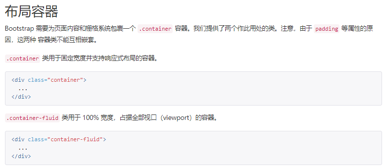
两种布局容器的对比:
