有这么个需求:在一个容器的右上角放置一个图标,当这个容器的宽度改变时,图标始终在容器的右上角。如下图所示:

第一幅图片width为200px, 第二幅图片width为600px
我们一步步实现此效果。
1)容器和图标显示在一行
用inline-block就可以了,代码如下:
<!doctype html>
<html>
<head>
<meta charset="utf-8">
<title>position</title>
<style>
.div1{
    width: 200px;
    height: 200px;
    background-color: gray;
    display: inline-block;
}

.topRight{
    width: 80px;
    height: 80px;
    background-color: rgb(216, 77, 170);
    display: inline-block;
}

</style>
</head>

<body>
<div class="div1"> </div>
<div class="topRight">topRight</div>
<script>

</script>
</body>
</html>
渲染出来的效果如下:

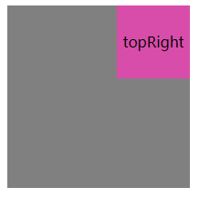
2)设置图标为绝对定位
position 设置为absolute,代码如下:
扫描二维码关注公众号,回复:
9113970 查看本文章

<!doctype html>
<html>
<head>
<meta charset="utf-8">
<title>position</title>
<style>
.div1{
    width: 200px;
    height: 200px;
    background-color: gray;
    display: inline-block;
}

.topRight{
    width: 80px;
    height: 80px;
    background-color: rgb(216, 77, 170);
    display: inline-block;
    position: absolute;
}

</style>
</head>

<body>
<div class="div1"> </div>
<div class="topRight">topRight</div>
<script>

</script>
</body>
</html>
渲染出来的效果如下:
图标设置为absolute后脱离了文档流,并且跟在容器的后边(跟随性)。另外由于inline-block导致的容器和图标之间的小间距也没有了(都脱离文档流了,小间距自然也就没有了)。
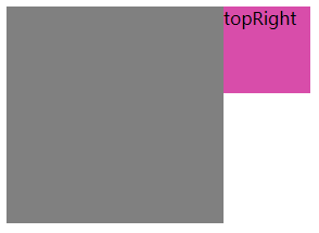
3)再把图标移动到容器的右上角即可
设置margin-left为图标的宽度的负值即可,代码如下:
<!doctype html>
<html>
<head>
<meta charset="utf-8">
<title>position</title>
<style>
.div1{
    width: 200px;
    height: 200px;
    background-color: gray;
    display: inline-block;
}

.topRight{
    width: 80px;
    height: 80px;
    background-color: rgb(216, 77, 170);
    display: inline-block;
    position: absolute;
    margin-left: -80px;
    text-align: center;
    line-height: 80px;
}

</style>
</head>

<body>
<div class="div1"> </div>
<div class="topRight">topRight</div>
<script>

</script>
</body>
</html>
最终渲染出来的效果如下:
当我们改变容器宽度时,图标始终在容器的右上角。所以说上述方式具有自适应性。
