前言:
- 前面已经写过Numpy、pandas,数据分析三剑客就剩下matplotlib了
- 用pip安装matplotlib的时候不知道为什么出了[WinError 87],只好手动安装,步骤在这里。
安装好matplotlib之后就随便用用看看有什么好玩的。使用Jupyter可以直接把图生成在页面上。
import matplotlib
import pandas as pd
import numpy as np
数据可视化
Pandas 的数据可视化使用 matplotlib 为基础组件。更基础的信息可参阅 matplotlib 相关内容。本节主要介绍 Pandas 里提供的比 matplotlib 更便捷的数据可视化操作。
线型图
Series 和 DataFrame 都提供了一个 plot 的函数。可以直接画出线形图。
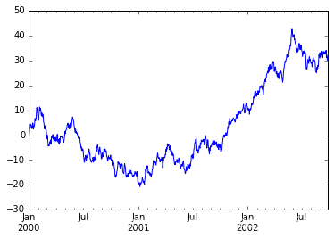
ts = pd.Series(np.random.randn(1000), index=pd.date_range('1/1/2000', periods=1000))
ts = ts.cumsum()
ts.describe()

[Out:]
count    1000.000000
mean      -15.295693
std        13.609060
min       -40.083112
25%       -26.555117
50%       -13.070779
75%        -4.082425
max        11.133501
dtype: float64
使用plot()方法绘图
ts.plot();
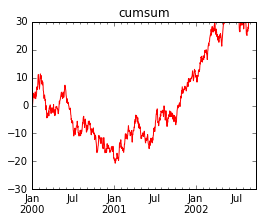
给定title,设置线体样式style,指定y轴坐标ylim,指定图片大小figsize
# ts.plot? for more help
ts.plot(title='cumsum', style='r-', ylim=[-30, 30], figsize=(4, 3));
更多style:
| 字符 | 描述 |
|---|---|
| ‘-’ | 实线样式 |
| ‘–’ | 短横线样式 |
| ‘-.’ | 点划线样式 |
| ‘:’ | 虚线样式 |
| ‘.’ | 点标记 |
| ‘,’ | 像素标记 |
| ‘o’ | 圆标记 |
| ‘v’ | 倒三角标记 |
| ‘^’ | 正三角标记 |
| ‘<’ | 左三角标记 |
| ‘>’ | 右三角标记 |
| ‘1’ | 下箭头标记 |
| ‘2’ | 上箭头标记 |
| ‘3’ | 左箭头标记 |
| ‘4’ | 右箭头标记 |
| ‘s’ | 正方形标记 |
| ‘p’ | 五边形标记 |
| ‘*’ | 星形标记 |
| ‘h’ | 六边形标记1 |
| ‘H’ | 六边形标记2 |
| ‘+’ | 加号标记 |
| ‘x’ | X标记 |
| ‘D’ | 菱形标记 |
| ‘d’ | 窄菱形标记 |
| ‘|’ | 竖直线标记 |
| ‘_’ | 水平线标记 |
以及颜色缩写
| 字符 | 颜色 |
|---|---|
| 'b | 蓝色 |
| 'g | 绿色 |
| 'r | 红色 |
| 'c | 青色 |
| 'm | 品红色 |
| 'y | 黄色 |
| 'k | 黑色 |
| 'w | 白色 |
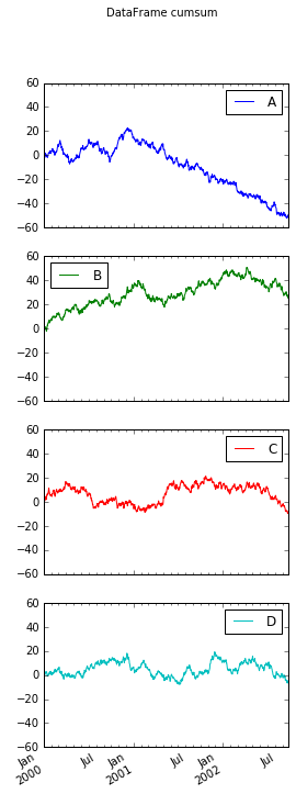
构造1000行4列的DataFrame
df = pd.DataFrame(np.random.randn(1000, 4), index=ts.index, columns=list('ABCD'))
df = df.cumsum()
df.describe()

[Out:]
A	B	C	D
count	1000.000000	1000.000000	1000.000000	1000.000000
mean	51.990014	-18.674476	53.110189	-2.162240
std	29.169795	12.869232	27.169108	5.888237
min	-0.042837	-41.647090	-4.793408	-14.653007
25%	28.637957	-32.757807	32.587833	-6.719513
50%	41.773233	-12.875555	52.429776	-2.457030
75%	82.884002	-7.854751	78.647795	2.462142
max	105.062104	3.169023	95.598810	13.215038
根据每一列画出单独图subplots
# df.plot? for more help
df.plot(title='DataFrame cumsum', figsize=(4, 12), subplots=True, sharex=True, sharey=True);
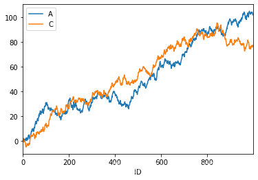
df['ID'] = np.arange(len(df))
df.plot(x='ID', y=['A', 'C'])
柱状图
df = pd.DataFrame(np.random.rand(10, 4), columns=['A', 'B', 'C', 'D'])
df

[Out:]
A	B	C	D
0	0.560815	0.436623	0.140987	0.859090
1	0.769000	0.970060	0.197618	0.264342
2	0.831866	0.135285	0.536257	0.551072
3	0.698514	0.967225	0.346590	0.352452
4	0.552502	0.962830	0.785556	0.085609
5	0.229587	0.936545	0.215518	0.000504
6	0.596842	0.386716	0.385878	0.327201
7	0.328011	0.366872	0.983212	0.995695
8	0.122507	0.140954	0.325839	0.645794
9	0.189820	0.877107	0.623421	0.754679
绘制柱状图
df.iloc[1].plot.bar()

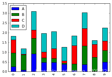
叠加到一起的柱状图stacked
df.plot.bar(stacked=True)
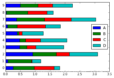
横向柱状图
df.plot.barh(stacked=True)
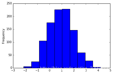
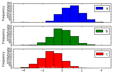
直方图
直方图是一种对值频率进行离散化的柱状图。数据点被分到离散的,间隔均匀的区间中,绘制各个区间中数据点的数据。
df = pd.DataFrame({'a': np.random.randn(1000) + 1, 'b': np.random.randn(1000),
                   'c': np.random.randn(1000) - 1}, columns=['a', 'b', 'c'])
绘制直方图hist,被分割的条数bins
df['a'].plot.hist(bins=10)
df.plot.hist(subplots=True, sharex=True, sharey=True)
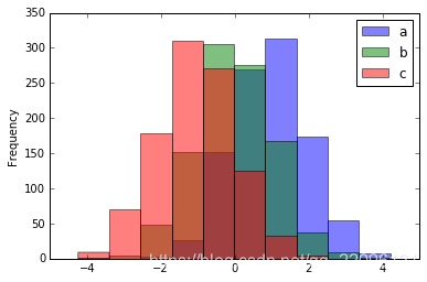
设置透明alpha
df.plot.hist(alpha=0.5)
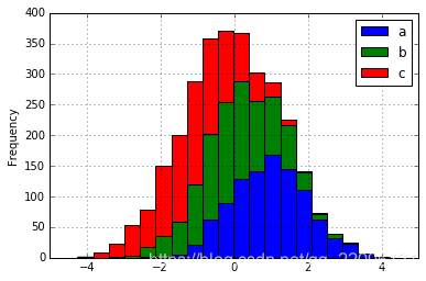
当所有数据叠加一起的时候符合正态分布
df.plot.hist(stacked=True, bins=20, grid=True)
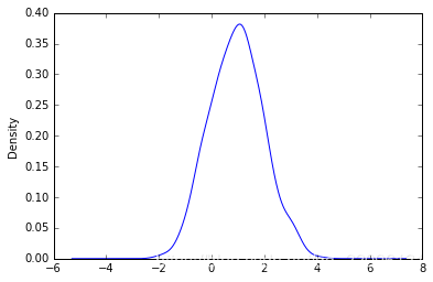
密度图
正态分布(高斯分布)就是一种自然界中广泛存在密度图。比如我们的身高,我们的财富,我们的智商都符合高斯分布。
绘制密度图
df['a'].plot.kde()
df.plot.kde()

# 平均数为高斯分布的中点
df.mean()

[Out:]
a    0.947151
b   -0.026500
c   -1.039657
dtype: float64

# 方差为高斯分布的宽度
df.std()

[Out:]
a    1.014101
b    1.028685
c    1.030285
dtype: float64
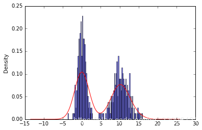
带密度估计的规格化直方图
n1 = np.random.normal(0, 1, size=200) # N(0, 1)
n2 = np.random.normal(10, 2, size=200) # N(10, 4)
s = pd.Series(np.concatenate([n1, n2]))
s.describe()

[Out:]
count    400.000000
mean       5.172248
std        5.397582
min       -3.644105
25%        0.061406
50%        3.691510
75%       10.250011
max       16.031112
dtype: float64
同时绘制直方图和密度图
s.plot.hist(bins=100, alpha=0.5, normed=True)
s.plot.kde(style='r-')
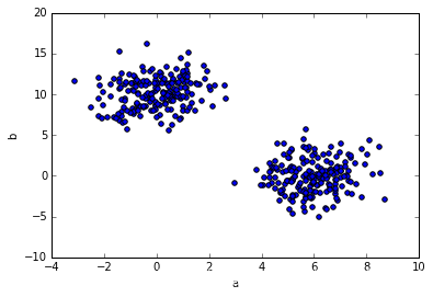
散布图
散布图是把所有的点画在同一个坐标轴上的图像。是观察两个一维数据之间关系的有效的手段。
df = pd.DataFrame(np.random.rand(10, 4), columns=['a', 'b', 'c', 'd'])
df.plot.scatter(x='a', y='b');

df = pd.DataFrame({'a': np.concatenate([np.random.normal(0, 1, 200), np.random.normal(6, 1, 200)]),
                  'b': np.concatenate([np.random.normal(10, 2, 200), np.random.normal(0, 2, 200)]),
                  'c': np.concatenate([np.random.normal(10, 4, 200), np.random.normal(0, 4, 200)])})
df.describe()

[Out:]
a	b	c
count	400.000000	400.000000	400.000000
mean	2.974366	5.035267	5.011259
std	3.158428	5.492017	6.572784
min	-3.149143	-5.022496	-13.671181
25%	0.079920	-0.130532	-0.128582
50%	2.800326	5.587717	4.901682
75%	5.923731	10.139781	10.002299
max	8.688234	16.233516	19.855104


df.plot.scatter(x='a', y='b')
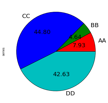
饼图
s = pd.Series(3 * np.random.rand(4), index=['a', 'b', 'c', 'd'], name='series')
s

[Out:]
a    0.505096
b    0.295620
c    2.855217
d    2.716670
Name: series, dtype: float64

s.plot.pie(figsize=(6,6))

s.plot.pie(labels=['AA', 'BB', 'CC', 'DD'], colors=['r', 'g', 'b', 'c'],
           autopct='%.2f', fontsize=20, figsize=(6, 6))
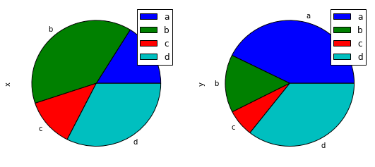
df = pd.DataFrame(3 * np.random.rand(4, 2), index=['a', 'b', 'c', 'd'], columns=['x', 'y'])
df

[Out:]
	x	y
a	1.115819	2.348513
b	2.681690	0.816831
c	0.855954	0.380417
d	2.235465	1.958050


df.plot.pie(subplots=True, figsize=(9, 4))
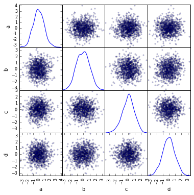
高级绘图
高级绘图函数在 pandas.tools.plotting 包里。
from pandas.tools.plotting import scatter_matrix
df = pd.DataFrame(np.random.randn(1000, 4), columns=['a', 'b', 'c', 'd'])
scatter_matrix(df, alpha=0.2, figsize=(6, 6), diagonal='kde');
s = pd.Series(0.1 * np.random.rand(1000) + 0.9 * np.sin(np.linspace(-99 * np.pi, 99 * np.pi, num=1000)))
y = np.linspace(-99 * np.pi, 99 * np.pi, num=1000)
s.plot.
from pandas.tools.plotting import lag_plot

s = pd.Series(0.1 * np.random.rand(1000) + 0.9 * np.sin(np.linspace(-99 * np.pi, 99 * np.pi, num=1000)))
lag_plot(s);

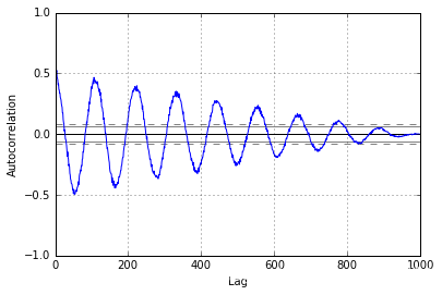
from pandas.tools.plotting import autocorrelation_plot

s = pd.Series(0.7 * np.random.rand(1000) + 0.3 * np.sin(np.linspace(-9 * np.pi, 9 * np.pi, num=1000)))
autocorrelation_plot(s);