//样式++
<style>
/*animation: name duration timing-function delay iteration-count direction;
animation-name 规定需要绑定到选择器的 keyframe 名称。。
animation-duration 规定完成动画所花费的时间,以秒或毫秒计。
animation-timing-function 规定动画的速度曲线。
animation-delay 规定在动画开始之前的延迟。
animation-iteration-count 规定动画应该播放的次数。
animation-direction 规定是否应该轮流反向播放动画。*/
a {
display: inline-block;
text-align: center; cursor: pointer; background: #e1e1e1;
color: #999; padding: 1em; margin: 1em; text-decoration: none;
}
.magnify, .small { transition-duration: 0.3s; }
.magnify:hover, .magnify:focus, .magnify:active {
transform: scale(1.1); /*scale改变为原来的几倍*/
}
.small:hover, .small:focus, .small:active { transform: scale(0.9); }
@@keyframes for-bigsmall {
25% {transform: scale(1.1); }
75% { transform: scale(0.9); }
}
.for-bigsmall:hover, .for-bigsmall:focus, .for-bigsmall:active {
animation: for-bigsmall 1s linear infinite;
/*animation-name: for-bigsmall;
animation-duration: 1s;
animation-timing-function: linear;linear 动画从头到尾的速度是相同的
animation-iteration-count: infinite;infinite 循环播放动画*/
}
@@keyframes for-magnify {
to {transform: scale(1.1); }
}
.for-magnify:hover, .for-magnify:focus, .for-magnify:active {
animation: for-magnify 0.3s linear infinite alternate; /*alternate动画应该轮流反向播放*/
}
@@keyframes for-small {
to { transform: scale(0.9); }
}
.for-small:hover, .for-small:focus, .for-small:active {
animation: for-small 0.3s linear infinite alternate; /*alternate动画应该轮流反向播放*/
}
.wave-magnify, .wave-small { transition-duration: 0.5s; }
.wave-magnify:hover, .wave-magnify:focus, .wave-magnify:active {
transform: scale(1.2);
transition-timing-function: cubic-bezier(0.47, 2.02, 0.31, -0.36); /*cubic-bezier 自定义过渡效果的速度曲线*/
}
.wave-small:hover, .wave-small:focus, .wave-small:active {
transform: scale(0.9);
transition-timing-function: cubic-bezier(0.47, 2.02, 0.31, -0.36);
}
.slant {
transition-duration: 0.3s;
/*transform-origin: 0 100%; 允许你改变被转换元素的位置*/
}
.slant:hover, .slant:focus, .slant:active {
transform: skew(10deg); /*skew倾斜转换*/
}
@@keyframes LRightYY {
16.65% {
-webkit-transform: translateX(8px); transform: translateX(8px);
}
33.3% {
-webkit-transform: translateX(-6px); transform: translateX(-6px);
}
49.95% {
-webkit-transform: translateX(4px); transform: translateX(4px);
}
66.6% {
-webkit-transform: translateX(-2px); transform: translateX(-2px);
}
83.25% {
-webkit-transform: translateX(1px); transform: translateX(1px);
}
100% {
-webkit-transform: translateX(0); transform: translateX(0);
}
}
.LRightYY:hover, .LRightYY:focus, .LRightYY:active {
animation: LRightYY 1s ease-in-out 1;
}
@@keyframes UpbelowYY {
16.65% { transform: translateY(8px); }
33.3% { transform: translateY(-6px); }
49.95% { transform: translateY(4px); }
66.6% { transform: translateY(-2px); }
83.25% { transform: translateY(1px); }
100% { transform: translateY(0); }
}
.UpbelowYY:hover, .UpbelowYY:focus, .UpbelowYY:active {
animation: UpbelowYY 1s ease-in-out 1;
}
@@keyframes YY {
16.65% { transform: translate(8px,-8px); }
33.3% { transform: translate(-6px.6px); }
49.95% { transform: translate(4px,-4px); }
66.6% { transform: translate(-2px,2px); }
83.25% { transform: translate(1px,-1px); }
100% { transform: translate(0,0); }
}
.YY:hover, .YY:focus, .YY:active { animation: YY 1s ease-in-out 1; }
.SlowAlterBac {
transform: translateZ(0); position: relative;
transition-property: color; transition-duration: 0.3s;
}
.SlowAlterBac:before {
content: "";position: absolute; z-index: -1; top: 0;
left: 0; right: 0; bottom: 0; background: #000;
transform-origin: 0 50%;transform: scaleX(0);
transition: transform 0.3s ease-out;
}
.SlowAlterBac:hover, .SlowAlterBac:focus, .SlowAlterBac:active {
color: white;
}
.SlowAlterBac:hover:before, .SlowAlterBac:focus:before, .SlowAlterBac:active:before {
transform: scaleX(1);
}
.InvertedImage {
transform: translateZ(0); position: relative; transition: transform 0.3s;
}
.InvertedImage:before {
position: absolute; z-index: -1; content: ''; top: 100%;
left: 5%;height: 10px; width: 90%;opacity: 0;
background: radial-gradient(ellipse at center, rgba(0, 0, 0, 0.35) 0%, rgba(0, 0, 0, 0) 80%);
transition-duration: 0.3s; transition-property: transform, opacity;
}
.InvertedImage:hover, .InvertedImage:focus, .InvertedImage:active {
transform: translateY(-5px);
}
.InvertedImage:hover:before, .InvertedImage:focus:before, .InvertedImage:active:before {
opacity: 1; transform: translateY(5px);
}
</style>
//盒子++
<body>
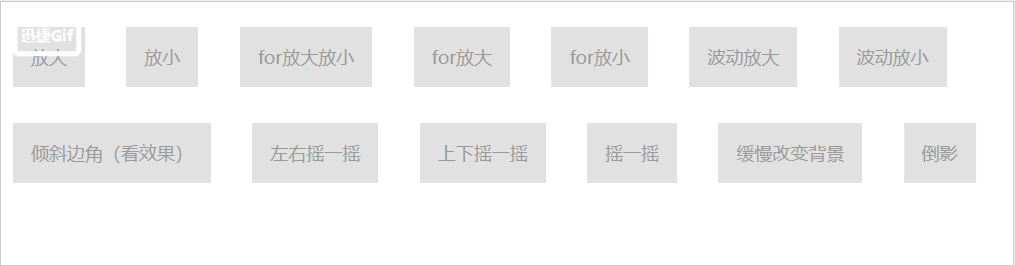
<a href="#" class="magnify">放大</a>
<a href="#" class="small">放小</a>
<a href="#" class="for-bigsmall">for放大放小</a>
<a href="#" class="for-magnify">for放大</a>
<a href="#" class="for-small">for放小</a>
<a href="#" class="wave-magnify">波动放大</a>
<a href="#" class="wave-small">波动放小</a><br>
<a href="#" class="slant">倾斜边角(看效果)</a>
<a href="#" class="LRightYY">左右摇一摇</a>
<a href="#" class="UpbelowYY">上下摇一摇</a>
<a href="#" class="YY">摇一摇</a>
<a href="#" class="SlowAlterBac">缓慢改变背景</a>
<a href="#" class="InvertedImage">倒影</a>
</body>