立方体菜单
写在前面,本人非专业前端,对于css实现的特效感兴趣,因此代码出现不入眼的地方还望见谅和批评。(欢迎关注感兴趣的加微信公众号获取资源–文章结尾贴图)
初始化html框架
<!DOCTYPE html>
<html lang="en">
<head>
    <meta charset="UTF-8">
    <title>立方体菜单</title>
    <style>
        * {
            margin: 0;
            padding: 0;
        }

        .div_outer {
            perspective: none;
            -webkit-perspective: none;
            perspective-origin: 50% 50%;
        }

        .warp {
            width: 1000px;
            height: 1000px;
            margin: 250px auto;
            position: relative;
            transform-style: preserve-3d;
        }

        .box {
            width: 100%;
            height: 100%;
            border: 2px solid #303133;

            text-align: center;
            font-weight: bold;
            color: #fff;

            position: absolute;
            top: 150px;
            left: 150px;

            border-radius: 1.2rem;

            box-shadow: #303133 0 0 1rem
        }

        .box1 {
                background: #303133;
                transform: rotateY(0deg) translateZ(500px);
            }

            .box2 {
                background: #303133;
                transform: rotateY(0deg) translateZ(-500px);
            }

            .box3 {
                background: #303133;
                transform: rotateX(90deg) translateZ(-500px);
            }

            .box4 {
                background: #303133;
                transform: rotateX(90deg) translateZ(500px);
            }

            .box5 {
                background: #303133;
                transform: rotateY(90deg) translateZ(500px);
            }

            .box6 {
                background: #303133;
                transform: rotateY(90deg) translateZ(-500px);
            }

            .box ul {
                list-style: none;
                width: 100%;
                height: 100%;
                display: flex;
                flex-wrap: wrap;
            }

            .box ul li {
                height: 25%;
                width: 25%;
            }

            .box ul li i {
                font-size: 1rem;
                margin: 1.5rem auto;
            }
    </style>
</head>
<body>
<div class="cube_div">
    <div class="div_outer">
        <div id="menu" class="warp">
            <div class="box box1">
                <ul>
                    <li></li>
                    <li></li>
                    <li></li>
                    <li><i class="">首页</i></li>
                    <li class="to_left"><i>左边</i></li>
                    <li class="to_right"><i>右边</i></li>
                    <li class="to_top"><i></i>上边</li>
                    <li class="to_bottom"><i>下边</i></li>
                    <li><i class=""></i></li>
                    <li><i class=""></i></li>
                    <li><i class=""></i></li>
                    <li><i class=""></i></li>
                    <li><i class=""></i></li>
                    <li><i class=""></i></li>
                    <li><i class=""></i></li>
                    <li><i class=""></i></li>
                </ul>
            </div>
            <div class="box box2">

            </div>
            <div class="box box3">

            </div>
            <div class="box box4">

            </div>
            <div class="box box5">

            </div>
            <div class="box box6">

            </div>
        </div>
    </div>
</div>
</body>
</html>
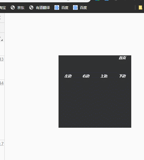
上面代码创造了六个面进行,分别作为立方体的6个面。
这里面采用了16个小块分割成每一面可以容纳16个点击菜单的面。
调试展示的效果可以看到下面的效果:

添加点击旋转动作
- 这里面把点击左边旋转作为案例,其余的面动作方式原理一致
定义to_left样式,因为当前位置旋转旋转的所有的角度都是0,点击旋转的目的是为了选项左侧的90度
因此这里的点击附加的动作需要执行向左旋转90deg
.warp.to_left {
    animation-name: to_left;
    -webkit-animation-name: to_left;

    animation: to_left 1s ease;
    -webkit-animation: to_left 1s ease;

    animation-fill-mode: both;
    -webkit-animation-fill-mode: both;

}

@keyframes to_left {
    to {
        -webkit-transform:rotateY(90deg);
        transform: rotateY(90deg);
    }
}
@-webkit-keyframes to_left {
    to {
        -webkit-transform:rotateY(90deg);
        transform: rotateY(90deg);
    }
}
同时要求点击返回回到原来的界面
.warp.left_back {
    animation: left_back 1s ease;
    -webkit-animation: left_back 1s ease;

    animation-fill-mode: both;
    -webkit-animation-fill-mode: both;
}

@keyframes left_back {
    from {
        -webkit-transform:rotateY(90deg);
        transform: rotateY(90deg);
    }
    to {
        -webkit-transform:rotateY(0deg);
        transform: rotateY(0deg);
    }
}
@-webkit-keyframes left_back {
    from {
        -webkit-transform:rotateY(90deg);
        transform: rotateY(90deg);
    }
    to {
        -webkit-transform:rotateY(0deg);
        transform: rotateY(0deg);
    }
}
看一下基础版的演示效果
源代码获取(WX代号CUBE_002)