首先要肯定,代码:
<Button ToolTip="Set_Label" Name="set_label1" Click="set_label_Click" Height="45" VerticalAlignment="Stretch" Width="45" HorizontalAlignment="Stretch">
    <Image Stretch="UniformToFill" Name="Recogimg" Source="E:/梁栋凯/software/PstPro2016/PstPro2016/Images/set.png" />
</Button >
是正确的。这里对Background的设置,就是用于添加一张背景图片。
这样的代码,编译绝对没有问题。但一运行,马上报错。报的是XML解析的错误。
找来找去,问题在于图片 “set.png" 上。图片是存在的,但问题在于它还没有被包含进项目中,所以运行就出错了。在VS中,将图片包含进项目,或是将路径改成绝对路径,就一切OK。
这种错误,不报找不到图片,却报XML解析错误,真让人丈二金刚,摸不着头脑。
出处:https://blog.csdn.net/u010159842/article/details/51672024
=============================================================================================
只是想做一个很简单的图片按钮而已,不需要那么复杂。
<Button x:Name="btn" Width="145" Height="30" HorizontalAlignment="Center" Margin="5"  VerticalAlignment="Top" Command="{Binding BtnCommand}">
    <Button.Background>
        <ImageBrush ImageSource="图片路径" Stretch="Fill"/>
    <Button.Background/>
</Button>
出处:https://blog.csdn.net/qq_18995513/article/details/54310732
=============================================================================================
在WPF中,如果要想给按钮控件Button加上图片,最直接的做法是修改控件模板,在模板中加入想要的图片,代码如下图所示:
<Button x:Name="btn" Width="23" Height="23" Click="btn_Click">
     <Button.Template>
         <ControlTemplate>
             <Grid>
                 <Image Margin="2" Source="Image/help1.png" />
             </Grid>
         </ControlTemplate>
     </Button.Template>
 </Button>
但是这样做有一个弊端——每次需要用到图片按钮的时候都要去修改模板。因为上面的示例代码中,模板代码过于精简,所以乍看之下似乎这种做法也没有什么不好。但是在实际的应用中,按钮控件的模板往往复杂得多,比如,有很多的Trigger事件,往往需要根据鼠标或按钮的状态来调整控件的图片、字体、背景等状态。因此,如果每次应用图片控件的时候都修改模板,很可能会导致xaml文件的代码量爆炸。
                                <Button Name="BtnOpenWin" FontSize="30" Width="160" Height="100" ToolTip="{Binding DispName}"  VerticalAlignment="Stretch" HorizontalAlignment="Stretch"
                                    cm:Message.Attach="[Event Click] = [Action BtnOpenWin(BtnOpenWin)]" >
                                    <Button.Template>
                                        <ControlTemplate>
                                            <Image Margin="2" Stretch="Fill" Source="{Binding ImageURL}"  />
                                        </ControlTemplate>
                                    </Button.Template>
                                </Button>
一个可行的解决方案为,封装一个用于图片按钮的自定义按钮控件,该控件继承自Button控件,但是额外增加了一些用户图片绑定的依赖属性,同时在控件的默认外观模板中,通过TemplateBinding的方式绑定到依赖属性上,这样在使用的时候便可以直接通过绑定的方式设置图片按钮需要显示的图片,不再需要修改控件模板。
其实现方式如下:
一 代码结构
如图所示,

采用自定义控件(CustomControl)的方式对Button控件进行封装。其中ImageButton.xaml为默认控件模板,ImageButton.cs为控件的逻辑控制文件,其中包含了ImageButton控件所需要的新的依赖属性,包括图片源属性等。

二 模板代码
<ResourceDictionary
    xmlns="http://schemas.microsoft.com/winfx/2006/xaml/presentation"
    xmlns:x="http://schemas.microsoft.com/winfx/2006/xaml"
    xmlns:local="clr-namespace:CustomControl">

    <Style TargetType="{x:Type local:ImageButton}">
        <Setter Property="Cursor" Value="Hand"/>
        <Setter Property="Template">
            <Setter.Value>
                <ControlTemplate TargetType="{x:Type local:ImageButton}">

                    <Border Background="{TemplateBinding Background}"
                            BorderBrush="{TemplateBinding BorderBrush}"
                            BorderThickness="{TemplateBinding BorderThickness}">
                        <Grid x:Name="grid" Background="{TemplateBinding Background}">
                            <Border x:Name="PART_Border" Background="{TemplateBinding Background}" BorderBrush="{TemplateBinding BorderBrush}" BorderThickness="{TemplateBinding BorderThickness}" CornerRadius="{TemplateBinding CornerRadius}"/>

                            <Grid HorizontalAlignment="{TemplateBinding HorizontalContentAlignment}">
                                <StackPanel HorizontalAlignment="Center" Orientation="{TemplateBinding IconContentOrientation}" VerticalAlignment="Center" Margin="{TemplateBinding Padding}">
                                    <Grid HorizontalAlignment="Center" VerticalAlignment="{TemplateBinding VerticalContentAlignment}">
                                        <Image x:Name="PART_Icon" Source="{TemplateBinding Icon}" Height="{TemplateBinding IconHeight}" Width="{TemplateBinding IconWidth}"/>
                                        <Image x:Name="PART_MouseOverIcon" Visibility="Collapsed" Source="{TemplateBinding IconMouseOver}"  Height="{TemplateBinding IconHeight}" Width="{TemplateBinding IconWidth}"/>
                                        <Image x:Name="PART_PressIcon" Visibility="Collapsed" Source="{TemplateBinding IconPress}"  Height="{TemplateBinding IconHeight}" Width="{TemplateBinding IconWidth}"/>
                                    </Grid>
                                    <TextBlock x:Name="PART_Content" Text="{TemplateBinding Content}"
                                               HorizontalAlignment="{TemplateBinding HorizontalContentAlignment}"
                                               VerticalAlignment="{TemplateBinding VerticalContentAlignment}"
                                               SnapsToDevicePixels="{TemplateBinding SnapsToDevicePixels}"
                                               Margin="{TemplateBinding IconContentMargin}"
                                               Foreground="{TemplateBinding Foreground}"
                                               TextTrimming="CharacterEllipsis"/>
                                </StackPanel>
                            </Grid>
                        </Grid>
                    </Border>

                    <ControlTemplate.Triggers>

                        <Trigger Property="IsMouseOver" Value="True">
                            <Setter Property="Foreground" TargetName="PART_Content" Value="{Binding MouseOverForeground,RelativeSource={RelativeSource FindAncestor, AncestorType={x:Type local:ImageButton}}}"/>
                            <Setter Property="Background" TargetName="PART_Border" Value="{Binding MouseOverBackground,RelativeSource={RelativeSource FindAncestor, AncestorType={x:Type local:ImageButton}}}"/>
                            <Setter Property="BorderBrush" TargetName="PART_Border" Value="{Binding MouseOverBorderBrush,RelativeSource={RelativeSource FindAncestor, AncestorType={x:Type local:ImageButton}}}"/>
                            <Setter Property="Visibility" TargetName="PART_MouseOverIcon" Value="Visible"/>
                            <Setter Property="Visibility" TargetName="PART_Icon" Value="Collapsed"/>
                            <Setter Property="Visibility" TargetName="PART_PressIcon" Value="Collapsed"/>
                        </Trigger>

                        <Trigger Property="IsPressed" Value="True">
                            <Setter Property="Foreground" TargetName="PART_Content" Value="{Binding MouseDownForeground,RelativeSource={RelativeSource FindAncestor, AncestorType={x:Type local:ImageButton}}}"/>
                            <Setter Property="Background" TargetName="PART_Border" Value="{Binding MouseDownBackground,RelativeSource={RelativeSource FindAncestor, AncestorType={x:Type local:ImageButton}}}"/>
                            <Setter Property="BorderBrush" TargetName="PART_Border" Value="{Binding MouseDownBorderBrush,RelativeSource={RelativeSource FindAncestor, AncestorType={x:Type local:ImageButton}}}"/>
                            <Setter Property="Visibility" TargetName="PART_PressIcon" Value="Visible"/>
                            <Setter Property="Visibility" TargetName="PART_Icon" Value="Collapsed"/>
                            <Setter Property="Visibility" TargetName="PART_MouseOverIcon" Value="Collapsed"/>
                        </Trigger>

                        <Trigger Property="IsEnabled" Value="False">
                            <Setter Property="Opacity" Value="0.5" />
                        </Trigger>

                        <Trigger Property="Text" SourceName="PART_Content" Value="">
                            <Setter Property="Visibility" TargetName="PART_Content" Value="Collapsed"/>
                        </Trigger>

                        <Trigger Property="Text" SourceName="PART_Content" Value="{x:Null}">
                            <Setter Property="Visibility" TargetName="PART_Content" Value="Collapsed"/>
                        </Trigger>
                    </ControlTemplate.Triggers>
                </ControlTemplate>
            </Setter.Value>
        </Setter>
    </Style>
</ResourceDictionary>
然后通过触发器,当鼠标悬停或按下的时候,控制相关图标的显示隐藏以及文字的背景色、前景色和边框颜色。
三 自定义依赖属性
在ImageButton.cs中定义依赖属性,这些依赖属性包含了图片按钮控件的边框、前景色、背景色,图片等属性。在复写的OnApplyTemplate方法中,会判断如果某些依赖属性的值为null,则使用默认属性。
public class ImageButton : Button
{
    static ImageButton()
    {
        DefaultStyleKeyProperty.OverrideMetadata(typeof(ImageButton), new FrameworkPropertyMetadata(typeof(ImageButton)));
    }

    public override void OnApplyTemplate()
    {
        base.OnApplyTemplate();
        if (this.MouseOverBackground == null)
        {
            this.MouseOverBackground = Background;
        }
        if (this.MouseDownBackground == null)
        {
            if (this.MouseOverBackground == null)
            {
                this.MouseDownBackground = Background;
            }
            else
            {
                this.MouseDownBackground = MouseOverBackground;
            }
        }
        if (this.MouseOverBorderBrush == null)
        {
            this.MouseOverBorderBrush = BorderBrush;
        }
        if (this.MouseDownBorderBrush == null)
        {
            if (this.MouseOverBorderBrush == null)
            {
                this.MouseDownBorderBrush = BorderBrush;
            }
            else
            {
                this.MouseDownBorderBrush = MouseOverBorderBrush;
            }
        }
        if (this.MouseOverForeground == null)
        {
            this.MouseOverForeground = Foreground;
        }
        if (this.MouseDownForeground == null)
        {
            if (this.MouseOverForeground == null)
            {
                this.MouseDownForeground = Foreground;
            }
            else
            {
                this.MouseDownForeground = this.MouseOverForeground;
            }
        }
    }

    #region Dependency Properties

    /// <summary>
    /// 鼠标移上去的背景颜色
    /// </summary>
    public static readonly DependencyProperty MouseOverBackgroundProperty
        = DependencyProperty.Register("MouseOverBackground", typeof(Brush), typeof(ImageButton));

    /// <summary>
    /// 鼠标按下去的背景颜色
    /// </summary>
    public static readonly DependencyProperty MouseDownBackgroundProperty
        = DependencyProperty.Register("MouseDownBackground", typeof(Brush), typeof(ImageButton));

    /// <summary>
    /// 鼠标移上去的字体颜色
    /// </summary>
    public static readonly DependencyProperty MouseOverForegroundProperty
        = DependencyProperty.Register("MouseOverForeground", typeof(Brush), typeof(ImageButton), new PropertyMetadata(null, null));

    /// <summary>
    /// 鼠标按下去的字体颜色
    /// </summary>
    public static readonly DependencyProperty MouseDownForegroundProperty
        = DependencyProperty.Register("MouseDownForeground", typeof(Brush), typeof(ImageButton), new PropertyMetadata(null, null));

    /// <summary>
    /// 鼠标移上去的边框颜色
    /// </summary>
    public static readonly DependencyProperty MouseOverBorderBrushProperty
        = DependencyProperty.Register("MouseOverBorderBrush", typeof(Brush), typeof(ImageButton), new PropertyMetadata(null, null));

    /// <summary>
    /// 鼠标按下去的边框颜色
    /// </summary>
    public static readonly DependencyProperty MouseDownBorderBrushProperty
        = DependencyProperty.Register("MouseDownBorderBrush", typeof(Brush), typeof(ImageButton), new PropertyMetadata(null, null));

    /// <summary>
    /// 圆角
    /// </summary>
    public static readonly DependencyProperty CornerRadiusProperty
        = DependencyProperty.Register("CornerRadius", typeof(CornerRadius), typeof(ImageButton), null);

    //图标
    public static readonly DependencyProperty IconProperty
        = DependencyProperty.Register("Icon", typeof(ImageSource), typeof(ImageButton), null);

    //鼠标移上去的图标图标
    public static readonly DependencyProperty IconMouseOverProperty
        = DependencyProperty.Register("IconMouseOver", typeof(ImageSource), typeof(ImageButton), null);

    //鼠标按下去的图标图标
    public static readonly DependencyProperty IconPressProperty
        = DependencyProperty.Register("IconPress", typeof(ImageSource), typeof(ImageButton), null);

    //图标高度
    public static readonly DependencyProperty IconHeightProperty
        = DependencyProperty.Register("IconHeight", typeof(double), typeof(ImageButton), new PropertyMetadata(24.0, null));

    //图标宽度
    public static readonly DependencyProperty IconWidthProperty
        = DependencyProperty.Register("IconWidth", typeof(double), typeof(ImageButton), new PropertyMetadata(24.0, null));

    //图标和内容的对齐方式
    public static readonly DependencyProperty IconContentOrientationProperty
        = DependencyProperty.Register("IconContentOrientation", typeof(Orientation), typeof(ImageButton), new PropertyMetadata(Orientation.Horizontal, null));

    //图标和内容的距离
    public static readonly DependencyProperty IconContentMarginProperty
        = DependencyProperty.Register("IconContentMargin", typeof(Thickness), typeof(ImageButton), new PropertyMetadata(new Thickness(0, 0, 0, 0), null));

    #endregion

    #region Property Wrappers

    public Brush MouseOverBackground
    {
        get
        {
            return (Brush)GetValue(MouseOverBackgroundProperty);
        }
        set { SetValue(MouseOverBackgroundProperty, value); }
    }

    public Brush MouseDownBackground
    {
        get
        {
            return (Brush)GetValue(MouseDownBackgroundProperty);
        }
        set { SetValue(MouseDownBackgroundProperty, value); }
    }

    public Brush MouseOverForeground
    {
        get
        {
            return (Brush)GetValue(MouseOverForegroundProperty);
        }
        set { SetValue(MouseOverForegroundProperty, value); }
    }

    public Brush MouseDownForeground
    {
        get
        {
            return (Brush)GetValue(MouseDownForegroundProperty);
        }
        set { SetValue(MouseDownForegroundProperty, value); }
    }

    public Brush MouseOverBorderBrush
    {
        get { return (Brush)GetValue(MouseOverBorderBrushProperty); }
        set { SetValue(MouseOverBorderBrushProperty, value); }
    }

    public Brush MouseDownBorderBrush
    {
        get { return (Brush)GetValue(MouseDownBorderBrushProperty); }
        set { SetValue(MouseDownBorderBrushProperty, value); }
    }

    public CornerRadius CornerRadius
    {
        get { return (CornerRadius)GetValue(CornerRadiusProperty); }
        set { SetValue(CornerRadiusProperty, value); }
    }

    public ImageSource Icon
    {
        get { return (ImageSource)GetValue(IconProperty); }
        set { SetValue(IconProperty, value); }
    }

    public ImageSource IconMouseOver
    {
        get { return (ImageSource)GetValue(IconMouseOverProperty); }
        set { SetValue(IconMouseOverProperty, value); }
    }

    public ImageSource IconPress
    {
        get { return (ImageSource)GetValue(IconPressProperty); }
        set { SetValue(IconPressProperty, value); }
    }

    public double IconHeight
    {
        get { return (double)GetValue(IconHeightProperty); }
        set { SetValue(IconHeightProperty, value); }
    }

    public double IconWidth
    {
        get { return (double)GetValue(IconWidthProperty); }
        set { SetValue(IconWidthProperty, value); }
    }

    public Orientation IconContentOrientation
    {
        get { return (Orientation)GetValue(IconContentOrientationProperty); }
        set { SetValue(IconContentOrientationProperty, value); }
    }

    public Thickness IconContentMargin
    {
        get { return (Thickness)GetValue(IconContentMarginProperty); }
        set { SetValue(IconContentMarginProperty, value); }
    }

    #endregion
}
四 控件的应用
应用控件的时候,只需要简单的绑定控件的相关属性即可。
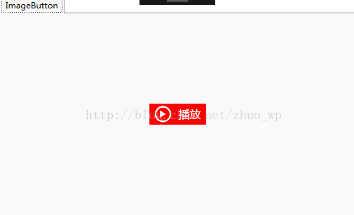
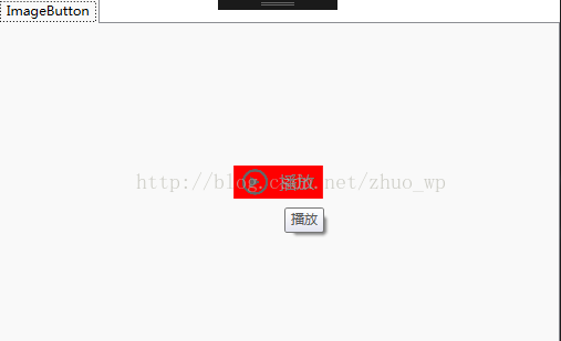
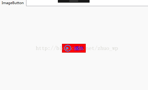
 <control:ImageButton x:Name="btn_Image"
                                         HorizontalContentAlignment="Center"
                                         VerticalContentAlignment="Center"
                                         Background="Red"
                                         Margin="5,0,5,0" ToolTip="播放" Content="播放"
                                         Height="30" Width="80"
                                         Icon="Images\BroadcastWhite.png"
                                         IconMouseOver="Images\BroadcastGray.png"
                                         IconPress="Images\BroadcastBlue.png"
                                         IconHeight="24"
                                         IconWidth="24"
                                         FontSize="16"
                                         IconContentMargin="10,0,0,0"
                                         Foreground="#FFFFFF"
                                         MouseOverForeground="Gray"
                                         MouseDownForeground="Blue"/>
让我们看看效果图吧:
正常状态:

鼠标悬停状态:

鼠标按下状态:

出处:https://blog.csdn.net/zhuo_wp/article/details/78350760
=============================================================================================
=============================================================================================