本篇内容:
盒子模型CSS
border
box-sizing
表格细线
圆角边框
padding内边距
margin外边距
盒子居中
盒子阴影
盒子模型CSS主要指的是div标签的布局
一个div的宽高就是盒子长宽,border就像盒子的厚度,padding就像盒子内容与盒子的距离,margin是盒子与其他盒子之间的间隙。
border
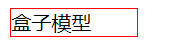
border是div的边框。
<style>
div {
    border:1px solid red;
}
</style>
<body>
    <div>盒子模型</div>
</body>
实现效果:
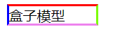
还可以单独对上、下、左、右边框 分别设置样式
<style>
div {
    border-top: 2px solid red;
    border-left: 2px solid blue;
    border-right: 2px solid lawngreen;
    border-bottom: 2px solid violet;
    width: 100px;
}
</style>
<body>
<div>盒子模型</div>
</body>
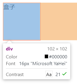
box-sizing
box-sizing是比较好用的一个盒子属性
<style>
div{
	/*box-sizing: border-box;*/
	border: 1px solid red;
	width: 100px;
	height: 100px;
}
</style>
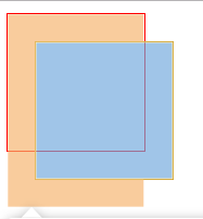
未使用该属性时的效果:
<style>
div{
	box-sizing: border-box;
	border: 1px solid red;
	width: 100px;
	height: 100px;
}
</style>
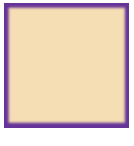
加上box-sizing: border-box之后的效果:
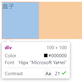
简单来讲就是加上这个属性,就把border的宽度算在盒子以内,即left-border+width+right-border=100px.(如果有内外边距,也算在100px以内)
表格细线
<style>
/* table{
    border-collapse: collapse;
} */
td,th{

    border: 1px solid red;
}
</style>
<table>
    <tr>
        <th>姓名</th>
        <th>学号</th>
        <th>班级</th>
    </tr>
    <tr>
        <td>小王</td>
        <td>1</td>
        <td>一班</td>
    </tr>
    <tr>
        <td>小白</td>
        <td>2</td>
        <td>二班</td>
    </tr>
</table>
但我们写了一个简单的表格之后,效果如下:
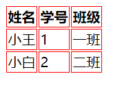
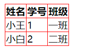
但是不够美观,于是对table设置 border-collapse: collapse; 让它自动合并边框
<style>
table{
    border-collapse: collapse;
}
td,th{

    border: 1px solid red;
}
</style>
实现效果:
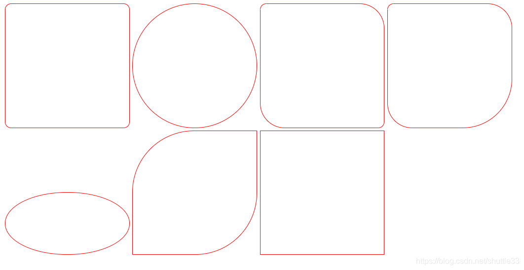
圆角边框
<style>
div {
    width: 200px;
    height: 200px;
    border: 1px solid red;
    display: inline-block;
}
div:first-child{
    /* 表示四个角都是10px的弧度 */
    border-radius: 10px;
}
div:nth-child(2){
    /* 表示四个角都是50%高度和宽度的弧度 则会变成一个圆形 */
    border-radius: 50%;
}
div:nth-child(3){
    /* 表示左上角和右下角都是10px,右上角和左下角是40px */
    border-radius: 10px 40px;
}
div:nth-child(4){
    /* 表示左上角是10px,右上角和左下角是40px 右下角是80px*/
    border-radius: 10px 40px 80px;
}
div:nth-child(5){
    /* 表示左上角是10px,右上角是40px 右下角是80px 左下角是100px*/
    border-radius: 10px 40px 80px 100px;
}
div:nth-child(6){
    /* 表示四个角都是10px的弧度 */
    border-radius: 100%;
    height: 100px;
}
div:nth-child(7){
    /* 表示四个角都是10px的弧度 */
    border-radius: 100px 0;
}
</style>
显示效果:
padding内边距
设置内边距的方法:padding:xpx
<style>
div {
    height: 100px;
    width: 100px;
    border: 1px solid red;
    padding: 10px;
}
</style>
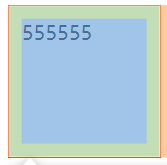
F12使用chrome的开发者工具查看,绿色部分就是padding
- padding也可以分别设置上下左右的内边距,设置方法与border一致。
- padding: top right bottom left
- 当这个语法只设置一个值a,则所有内边距都是a,如padding:10px。
- 当这个语法设置两个值,padding:10px 20px,则上下内边距为10px,二左右内边距为20px。
- 当这个语法设置三个值,padding:10px 20px 30px,则上内边距为10,右内边距为20px,下内边距为30px。
- 当这个语法设置四个值,则分别是上右下左内边距。
- margin也适用以上原则