时光荏苒,岁月如梭。愉快的周末又到啦!经过这一周的时间,我们学到了移动端的布局。
简单说一下哈,移动端布局简单分为两种布局方式:
-
流式布局。
它的好处是在大屏的情况下,可以显示更多的内容。
坏处是在宽屏情况下我们的显示比例会变得有些不协调。 -
rem布局。
好的,到了咱们今天要说的rem布局啦!
它的好处是在不同设备下(也就是屏幕的大小)内容结构会比较协调。也就是我们的内容会随着屏幕的大小进行缩放。
当然啦!失之东隅收之桑榆,就是在我们的屏幕变大的情况下显示的内容不会变多。
rem 的布局原理以及用法。
好啦!接下来我们简单的介绍一下rem 的布局原理以及用法。
首先呢,我们来说一下 rem 的单位,rem 这么特殊,它的单位肯定要不同啦!哈哈!
-
在rem布局中它的宽和高的单位分别是 “vw” “vh”。首先呢,我们脑子里面要有一种思想,就是不管我们的移动端屏幕是多大的,都把它们看成一百份,宽看成一百份,而我们的1个 vw 就是整个宽度的1份(也可以说是 1 %) 。
现在我们进行一下假设:
假设我们的屏幕大小是375px(苹果6)——> 100 vw ——> 1 vw ==3.75px。
假设我们的屏幕大小是414px(苹果6p)——> 100 vw ——> 1 vw ==4.14px。
上面就是不同的屏幕大小通过换算得到的 1vw 等于的像素大小。
苹果6 ——> html的font-size 等于多少呢?
首先 1vw ==3.75px,那么多少个 vw 等于 100px呢?我们用100px / 3.75px 得到的结果就是26.66667个,也就是说100px ==26.66667vw。
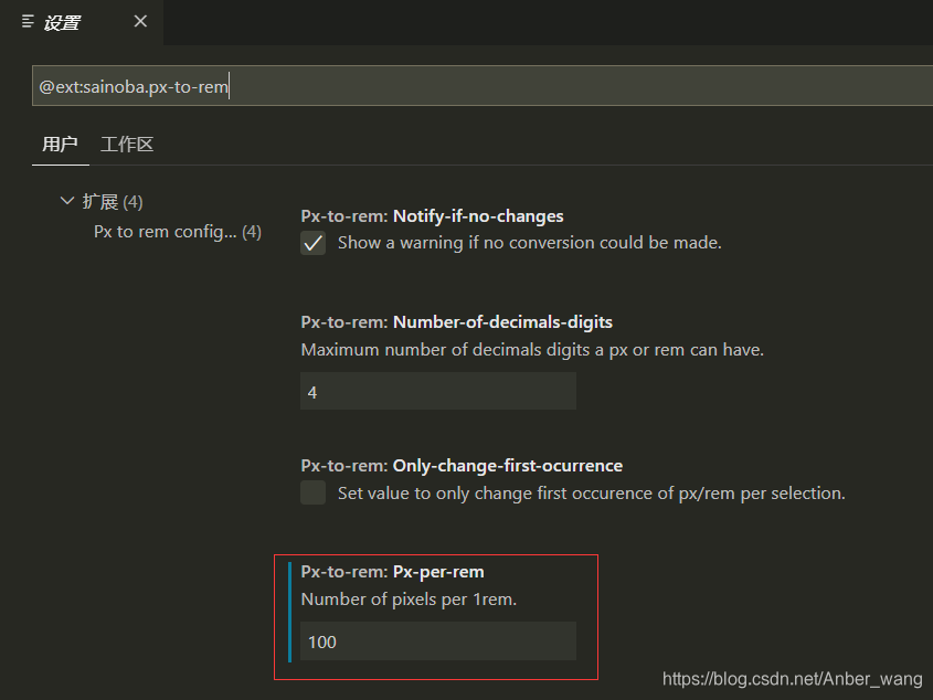
为了换算方便,我们可以到vsCode中去下载一个插件 -> px to rem -> 在设置把对应的font-size设置下。 -> alt + z:进行px转rem的操作。红色区域是26.66667vw等于多少 px。如图
-
简单的只通过 vw 单位是没办法实现rem 的布局的。我们还需要一种能够让它自动识别屏幕大小的工具。
JavaScript语言
因为还没学到,我这里就简单的用图片表示啦。如图:
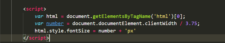
图片里面的3.75是苹果6里面 1vw所等于的像素大小。可以进行更换。
下面是一个实例,请看:
<head>
        <meta charset="UTF-8">
        <meta name="viewport" content="width=device-width, initial-scale=1.0">
        <title>Document</title>
        <link rel="stylesheet" href="./食物库/iconfont/iconfont.css">
        <style>
            *{margin: 0;padding: 0;}
            ul , li{list-style: none;}
            a{text-decoration: none;}
            input{background:none;outline:none;border:0px;}
            img{width: 100%;display: block;}
            /* html{font-size: 26.66667vw;} */

            .conment{width: 345px;margin: 0 auto;}

            #header{height: 64px;background:#02D1C5 ;}
            #header .header-top{height: 15px;}
            #header .header-name{height: 49px;position: relative;}
            #header .header-name a{display: inline-block;position: absolute;left: 13px;bottom: 13px;font-size: 18px;color: white;}
            #header .header-name li{font-size: 18px;color: white;position: absolute;left: 160px;bottom: 13px;}


            #nav .nav-sousuo{width: 250px;height: 25px;border-radius: 12px;background-color:#AAAAAA ;position: relative;margin: 9px 48px 16px 47px;opacity: .3;}
            #nav .nav-sousuo a{position: absolute;color: gray;font-size: 20px;left: 8px;bottom: 2px;}
            #nav .nav-sousuo input{width: 250px;height: 25px;position: absolute;text-align: center;}

            #list{height: 35px;}
            #list .list-column{display: flex;justify-content: space-between;}
            #list .list-column a{color:#AAAAAA;font-size: 16px;font-weight: 400;font-family: PingFangSC-Regular;position: relative;}
            #list .list-column a.active:after{ content:""; width:100%; height:3px; display: block;  border-radius: 2px; position: absolute; bottom:-4px; left:50%; transform: translateX(-50%);background:rgba(241,151,22,1);}
            #list .list-column a.active{color: #02D1C5;}

            #shop{}
            #shop > div{height: 70px;border-bottom: 1px solid #AAAAAA;}
            #shop .shop-1{display: flex;justify-content: space-between;align-items: center;}
            #shop .shop-1 div:first-of-type{display: flex;}
            #shop .shop-1 div:first-of-type > a{width: 40px;height: 40px;display: block;}
            #shop .shop-1 div:first-of-type ul{margin-left: 9px;}
            #shop .shop-1 div:first-of-type ul li:first-of-type{font-size: 14px;color: #333333;}
            #shop .shop-1 div:first-of-type ul li:last-of-type{font-size: 12px;color: #666666;}
            #shop .shop-1 div:last-of-type{width: 15px;height: 15px;background: red;border-radius: 50%;}

            #shop .shop-2{display: flex;justify-content: space-between;align-items: center;}
            #shop .shop-2 div:first-of-type{display: flex;}
            #shop .shop-2 div:first-of-type > a{width: 40px;height: 40px;display: block;}
            #shop .shop-2 div:first-of-type ul{margin-left: 9px;}
            #shop .shop-2 div:first-of-type ul li:first-of-type{font-size: 14px;color: #333333;}
            #shop .shop-2 div:first-of-type ul li:last-of-type{font-size: 12px;color: #666666;}
            #shop .shop-2 div:last-of-type{width: 15px;height: 15px;background: yellow;border-radius: 50%;}

            #shop .shop-3{display: flex;justify-content: space-between;align-items: center;}
            #shop .shop-3 div:first-of-type{display: flex;}
            #shop .shop-3 div:first-of-type > a{width: 40px;height: 40px;display: block;}
            #shop .shop-3 div:first-of-type ul{margin-left: 9px;}
            #shop .shop-3 div:first-of-type ul li:first-of-type{font-size: 14px;color: #333333;}
            #shop .shop-3 div:first-of-type ul li:last-of-type{font-size: 12px;color: #666666;}
            #shop .shop-3 div:last-of-type{width: 15px;height: 15px;background: yellow;border-radius: 50%;}

            #shop .shop-4{display: flex;justify-content: space-between;align-items: center;}
            #shop .shop-4 div:first-of-type{display: flex;}
            #shop .shop-4 div:first-of-type > a{width: 40px;height: 40px;display: block;}
            #shop .shop-4 div:first-of-type ul{margin-left: 9px;}
            #shop .shop-4 div:first-of-type ul li:first-of-type{font-size: 14px;color: #333333;}
            #shop .shop-4 div:first-of-type ul li:last-of-type{font-size: 12px;color: #666666;}
            #shop .shop-4 div:last-of-type{width: 15px;height: 15px;background: green;border-radius: 50%;}

            #shop .shop-5{display: flex;justify-content: space-between;align-items: center;}
            #shop .shop-5 div:first-of-type{display: flex;}
            #shop .shop-5 div:first-of-type > a{width: 40px;height: 40px;display: block;}
            #shop .shop-5 div:first-of-type ul{margin-left: 9px;}
            #shop .shop-5 div:first-of-type ul li:first-of-type{font-size: 14px;color: #333333;}
            #shop .shop-5 div:first-of-type ul li:last-of-type{font-size: 12px;color: #666666;}
            #shop .shop-5 div:last-of-type{width: 15px;height: 15px;background: green;border-radius: 50%;}

            #shop .shop-6{display: flex;justify-content: space-between;align-items: center;}
            #shop .shop-6 div:first-of-type{display: flex;}
            #shop .shop-6 div:first-of-type > a{width: 40px;height: 40px;display: block;}
            #shop .shop-6 div:first-of-type ul{margin-left: 9px;}
            #shop .shop-6 div:first-of-type ul li:first-of-type{font-size: 14px;color: #333333;}
            #shop .shop-6 div:first-of-type ul li:last-of-type{font-size: 12px;color: #666666;}
            #shop .shop-6 div:last-of-type{width: 15px;height: 15px;background: green;border-radius: 50%;}

            #shop .shop-7{display: flex;justify-content: space-between;align-items: center;}
            #shop .shop-7 div:first-of-type{display: flex;}
            #shop .shop-7 div:first-of-type > a{width: 40px;height: 40px;display: block;}
            #shop .shop-7 div:first-of-type ul{margin-left: 9px;}
            #shop .shop-7 div:first-of-type ul li:first-of-type{font-size: 14px;color: #333333;}
            #shop .shop-7 div:first-of-type ul li:last-of-type{font-size: 12px;color: #666666;}
            #shop .shop-7 div:last-of-type{width: 15px;height: 15px;background: red;border-radius: 50%;}
        </style>
    </head>
    <body>
        <div id="main">
            <div id="header">
                <div class="header-top"></div>
                <div class="header-name">
                    <a href="#" class="iconfont icon-zuojiantou
                    "></a>
                    <li>食物库</li>
                </div>
            </div>
            <div id="nav" class="conment">
                <li class="nav-sousuo">
                    <a href="#" class="iconfont icon-sousuo"></a>
                    <input type="text" placeholder="搜索食物热量">
                </li>
            </div>
            <div id="list" class="conment">
                <ul class="list-column">
                    <a href="#" class="active">主食</a>
                    <a href="#">蔬菜</a>
                    <a href="#">水果</a>
                    <a href="#">肉蛋类</a>
                    <a href="#">豆制品 </a>
                </ul>
            </div>
            <div id="shop" class="conment">
                <div class="shop-1">
                    <div>
                        <a href="#"><img src="./img/list-1.png" alt=""></a>
                        <ul>
                            <li>玉米(鲜)</li>
                            <li>112卡/100克</li>
                        </ul>
                    </div>
                    <div></div>
                </div>
                <div class="shop-2">
                    <div>
                        <a href="#"><img src="./img/list-2.png" alt=""></a>
                        <ul>
                            <li>油条</li>
                            <li>388卡/100克</li>
                        </ul>
                    </div>
                    <div></div>
                </div>
                <div class="shop-3">
                    <div>
                        <a href="#"><img src="./img/list-3.png" alt=""></a>
                        <ul>
                            <li>花卷</li>
                            <li>214卡/100克</li>
                        </ul>
                    </div>
                    <div></div>
                </div>
                <div class="shop-4">
                    <div>
                        <a href="#"><img src="./img/list-4.png" alt=""></a>
                        <ul>
                            <li>红薯</li>
                            <li>61卡/100克</li>
                        </ul>
                    </div>
                    <div></div>
                </div>
                <div class="shop-5">
                    <div>
                        <a href="#"><img src="./img/list-5.png" alt=""></a>
                        <ul>
                            <li>燕麦片</li>
                            <li>338卡/100克</li>
                        </ul>
                    </div>
                    <div></div>
                </div>
                <div class="shop-6">
                    <div>
                        <a href="#"><img src="./img/list-6.png" alt=""></a>
                        <ul>
                            <li>小米粥</li>
                            <li>46卡/100克</li>
                        </ul>
                    </div>
                    <div></div>
                </div>
                <div class="shop-7">
                    <div>
                        <a href="#"><img src="./img/list-7.png" alt=""></a>
                        <ul>
                            <li>米饭</li>
                            <li>468卡/100克</li>
                        </ul>
                    </div>
                    <div></div>
                </div>
            </div>
        </div>
    </body>
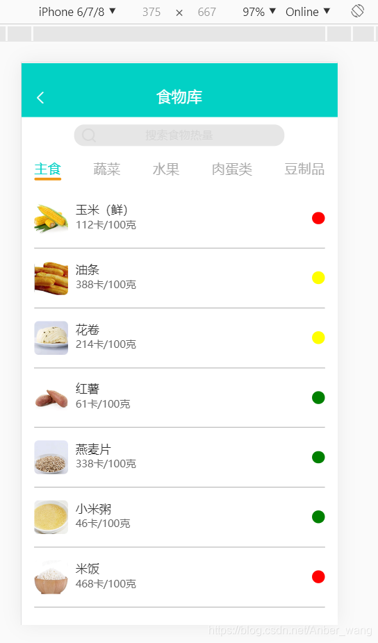
现在代码显示的是一个移动端页面,还没有转换成vw单位前的代码,接下来是转换成rem后的代码(这里的仅是css的代码,body里面的代码和上面的通用):
<style>
*{margin: 0;padding: 0;}
ul , li{list-style: none;}
a{text-decoration: none;}
input{background:none;outline:none;border:0rem;}
img{width: 100%;display: block;}
html{font-size: 26.66667vw;}
.conment{width: 3.45rem;margin: 0 auto;}
#header{height: 0.64rem;background:#02D1C5 ;}
#header .header-top{height: 0.15rem;}
#header .header-name{height: 0.49rem;position: relative;}
#header .header-name a{display: inline-block;position: absolute;left: 0.13rem;bottom: 0.13rem;font-size: 0.18rem;color: white;}
#header .header-name li{font-size: 0.18rem;color: white;position: absolute;left: 1.6rem;bottom: 0.13rem;}
#nav .nav-sousuo{width: 2.5rem;height: 0.25rem;border-radius: 0.12rem;background-color:#AAAAAA ;position: relative;margin: 0.09rem 0.48rem 0.16rem 0.47rem;opacity: .3;}
#nav .nav-sousuo a{position: absolute;color: gray;font-size: 0.2rem;left: 0.08rem;bottom: 0.02rem;}
#nav .nav-sousuo input{width: 2.5rem;height: 0.25rem;position: absolute;text-align: center;}
#list{height: 0.35rem;}
#list .list-column{display: flex;justify-content: space-between;}
#list .list-column a{color:#AAAAAA;font-size: 0.16rem;font-weight: 400;font-family: PingFangSC-Regular;position: relative;}
#list .list-column a.active:after{ content:""; width:100%; height:0.03rem; display: block; border-radius: 0.02rem; position: absolute; bottom:-0.04rem; left:50%; transform: translateX(-50%);background:rgba(241,151,22,1);}
#list .list-column a.active{color: #02D1C5;}
#shop{}
#shop > div{height: 0.7rem;border-bottom: 0.01rem solid #AAAAAA;}
#shop .shop-1{display: flex;justify-content: space-between;align-items: center;}
#shop .shop-1 div:first-of-type{display: flex;}
#shop .shop-1 div:first-of-type > a{width: 0.4rem;height: 0.4rem;display: block;}
#shop .shop-1 div:first-of-type ul{margin-left: 0.09rem;}
#shop .shop-1 div:first-of-type ul li:first-of-type{font-size: 0.14rem;color: #333333;}
#shop .shop-1 div:first-of-type ul li:last-of-type{font-size: 0.12rem;color: #666666;}
#shop .shop-1 div:last-of-type{width: 0.15rem;height: 0.15rem;background: red;border-radius: 50%;}
#shop .shop-2{display: flex;justify-content: space-between;align-items: center;}
#shop .shop-2 div:first-of-type{display: flex;}
#shop .shop-2 div:first-of-type > a{width: 0.4rem;height: 0.4rem;display: block;}
#shop .shop-2 div:first-of-type ul{margin-left: 0.09rem;}
#shop .shop-2 div:first-of-type ul li:first-of-type{font-size: 0.14rem;color: #333333;}
#shop .shop-2 div:first-of-type ul li:last-of-type{font-size: 0.12rem;color: #666666;}
#shop .shop-2 div:last-of-type{width: 0.15rem;height: 0.15rem;background: yellow;border-radius: 50%;}
#shop .shop-3{display: flex;justify-content: space-between;align-items: center;}
#shop .shop-3 div:first-of-type{display: flex;}
#shop .shop-3 div:first-of-type > a{width: 0.4rem;height: 0.4rem;display: block;}
#shop .shop-3 div:first-of-type ul{margin-left: 0.09rem;}
#shop .shop-3 div:first-of-type ul li:first-of-type{font-size: 0.14rem;color: #333333;}
#shop .shop-3 div:first-of-type ul li:last-of-type{font-size: 0.12rem;color: #666666;}
#shop .shop-3 div:last-of-type{width: 0.15rem;height: 0.15rem;background: yellow;border-radius: 50%;}
#shop .shop-4{display: flex;justify-content: space-between;align-items: center;}
#shop .shop-4 div:first-of-type{display: flex;}
#shop .shop-4 div:first-of-type > a{width: 0.4rem;height: 0.4rem;display: block;}
#shop .shop-4 div:first-of-type ul{margin-left: 0.09rem;}
#shop .shop-4 div:first-of-type ul li:first-of-type{font-size: 0.14rem;color: #333333;}
#shop .shop-4 div:first-of-type ul li:last-of-type{font-size: 0.12rem;color: #666666;}
#shop .shop-4 div:last-of-type{width: 0.15rem;height: 0.15rem;background: green;border-radius: 50%;}
#shop .shop-5{display: flex;justify-content: space-between;align-items: center;}
#shop .shop-5 div:first-of-type{display: flex;}
#shop .shop-5 div:first-of-type > a{width: 0.4rem;height: 0.4rem;display: block;}
#shop .shop-5 div:first-of-type ul{margin-left: 0.09rem;}
#shop .shop-5 div:first-of-type ul li:first-of-type{font-size: 0.14rem;color: #333333;}
#shop .shop-5 div:first-of-type ul li:last-of-type{font-size: 0.12rem;color: #666666;}
#shop .shop-5 div:last-of-type{width: 0.15rem;height: 0.15rem;background: green;border-radius: 50%;}
#shop .shop-6{display: flex;justify-content: space-between;align-items: center;}
#shop .shop-6 div:first-of-type{display: flex;}
#shop .shop-6 div:first-of-type > a{width: 0.4rem;height: 0.4rem;display: block;}
#shop .shop-6 div:first-of-type ul{margin-left: 0.09rem;}
#shop .shop-6 div:first-of-type ul li:first-of-type{font-size: 0.14rem;color: #333333;}
#shop .shop-6 div:first-of-type ul li:last-of-type{font-size: 0.12rem;color: #666666;}
#shop .shop-6 div:last-of-type{width: 0.15rem;height: 0.15rem;background: green;border-radius: 50%;}
#shop .shop-7{display: flex;justify-content: space-between;align-items: center;}
#shop .shop-7 div:first-of-type{display: flex;}
#shop .shop-7 div:first-of-type > a{width: 0.4rem;height: 0.4rem;display: block;}
#shop .shop-7 div:first-of-type ul{margin-left: 0.09rem;}
#shop .shop-7 div:first-of-type ul li:first-of-type{font-size: 0.14rem;color: #333333;}
#shop .shop-7 div:first-of-type ul li:last-of-type{font-size: 0.12rem;color: #666666;}
#shop .shop-7 div:last-of-type{width: 0.15rem;height: 0.15rem;background: red;border-radius: 50%;}
</style>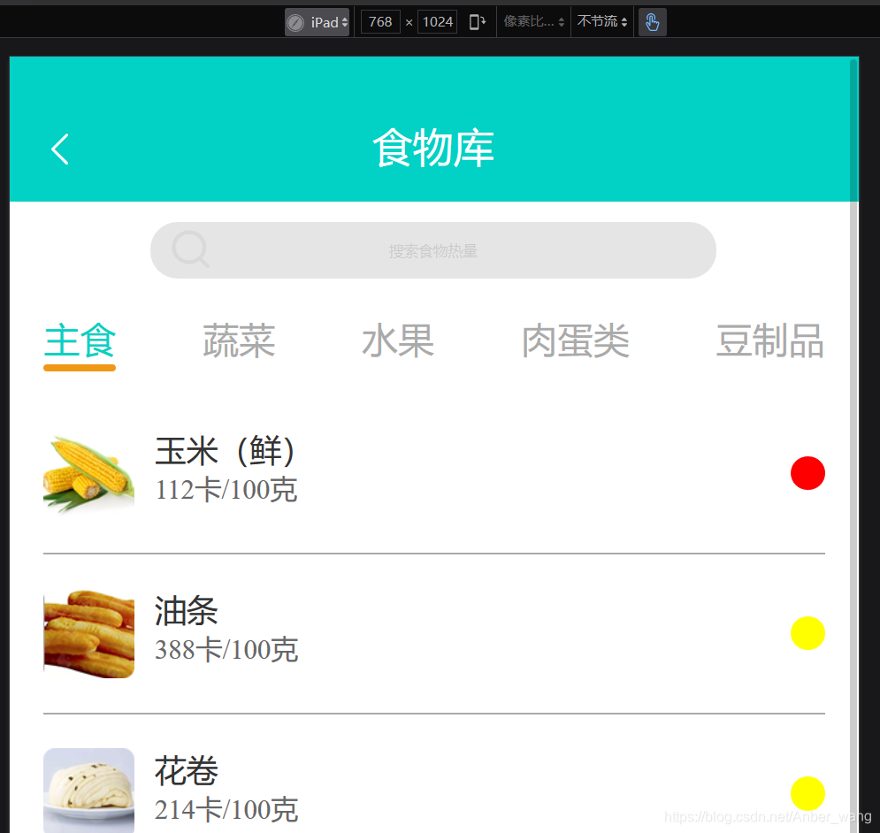 看,这是转换为rem布局后在 ipad 上面显示的页面,是等比缩放的,并没有出现比例失调的问题。当然这只是图片的一部分,由于设备原因没截全图,我们这里就是 “管中窥豹可见一斑”,哈哈,这里是褒义哈!
最后,总结一下。当我们做rem布局的时候,没有必要一开始就用rem里面的单位来写代码。完全可以用流式布局的思路来思考问题。等到最后我们把css代码统一选中按“alt+z”,当然要提前调试我们code里面的数值,上面有。
新人小白,如有问题,欢迎评论指点,谢谢。
